#27: Spewing Rubik’s Cubes by Kimberly Hermesch
Spewing Rubik’s Cubes by Kimberly Hermesch
In The Museum of Bad Art – Masterworks, by Michael Frank and Louise Reilly Sacco
This analysis copyright Scott M. McDaniel, 2010.
The Image
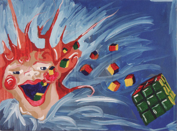
This painting is… awesome. It’s a great example from the collection of the Museum of Bad Art. It fills me with wonder. I wonder what on earth the artist was thinking, because I certainly can’t tell from the painting. It’s horrific. Yet… you can’t look away. Like many pieces of art, this image poses more questions than it answers. It’s a visual train accident that spins our heads on their rubber necks. Somehow mixed metaphors seem appropriate. As its source implies, this is one bad painting, and I’ll go into why below. But you know what? I’m glad somebody made it.
That “somebody,” according to MoBA Curator-In-Chief Michael Frank is Kimberly Hermesch. The museum acquired it at a thrift store in 2007. In an e-mail, Frank said that after the painting was featured in the Boston Globe Sunday Magazine in June of 2008, the following letter appeared in the July 20 edition:
“I am speechless. I just opened the Globe Magazine and saw a painting I made for a co-worker six or seven years ago staring back at me. Not only that, but it won(?) worst of the worst in your reader poll! I completed the piece for a friend who was a master Rubik’s solver. He apparently decided to give it to a thrift store, where it was found by the curator of the Museum of Bad Art…I’m honored. I contacted the museum and spoke to a staffer, who will sign me up as a member. Only fitting considering I’m in the gallery.” Kimberly Hermesch, Watertown, MA
The book also says that it’s oil on canvas and 2 feet by 1.5 feet. We know in our gut that it’s a bad painting the moment we see it. But why is it bad? What about it is so bad that it qualifies for the MoBA collection? Let’s see.
The Design
Conventional wisdom has it that when you’re doing a painting, viewers should be able to tell the basics of what’s going on by the silhouette alone. It’s a core part of the composition. Let’s take a look at the silhouette.
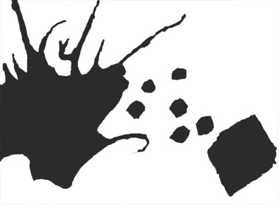
That’s pretty indecipherable – kind of an asymmetrical Rorschach blot. The cube on the right approaches a recognizable shape, but overall we can’t tell what the main figures are based on the silhouette. Now let’s look at the placement of items according to the golden section.

Usually we look for the key items of interest to either appear on the intersections of the four lines here or to clearly take up certain blocks. The face actually does take up the lower left rectangles here. It may be pure accident, and it may be that the artist does have enough of a grasp of design to give the face a decent size compared to the rest of the picture. The other focal point, though, is the largest cube. It doesn’t seem to have any relation to the grid, which makes me think that the placement of the face was a lucky break.
One problem with that cube is that it forms a tangent with the edge of the painting. It usually works better if the edge of the picture clearly cuts off the elements that don’t fit completely inside. That way we know there is more to the object outside what we see. As it is, it looks like the artist started work on the cube without deciding how big it would be.
Let’s look at one other aspect of the design: how Koch directs our eyes around the painting. Many other illustrations that we’ve looked at are laid out so that our gazes follow edges, contrasts, and objects around the painting in a big loop. Sometimes there are several interlocking loops. For examples, see the analyses for Brian Bolland, David Weisner, and Mort Künstler. Occasionally, though, we do see paintings that direct our eyes off the canvas, like David Mack’s.
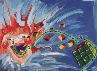
I’ve put a (1) at the place of highest contrast – the face’s mouth. My gaze follows its lower curve and then travels along the arc of cubes (2) to the large cube on the right (3). Once at the large cube, though, our eyes have no place to go. Either we keep going off the picture or follow the edge of the cube down past the tangent and off the bottom. Maybe if we’re lucky the horizontal light streak at the bottom will bring us back to the face. For the most part, though, Koch leaves us stranded on the right edge of the picture.
The Values and Color
Speaking of contrast and eye movement, let’s see how it looks in greyscale, with the saturation dropped to zero.
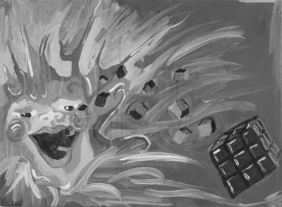
The face of the large cube is darkest, but the contrast is fairly low with its background. Even though the face’s mouth isn’t as dark as the cube, the contrast there is greater. That’s why our eyes start over with the face. Values do the heavy lifting when it comes to defining shape and mass. Squint your eyes a bit and look at that greyscale version above. Do you see any shapes? A square, maybe, though certainly not a cube. One of the things that makes this a bad painting is that the values are all over the map but don’t work to create overall forms.
Most of the paintings I’ve analyzed use brightness like they’re on a tight budget. That is, more often than not when we sample the colors and plot them on a color wheel only a few are even above 50% brightness. They’re dark paintings with bits of lighter colors in key places to give us the illusion of mass and objects. The reverse can be true also – if the painting is mostly bright then we’ll see a few darker colors here and there to create the illusion.
The problem with the painting is that its brightness levels are all over the place and are used indiscriminately. Look at the color wheel here. I reduced the image to 32 colors and plotted them on the wheel. The further out a dot is, the brighter it is. What do you notice?
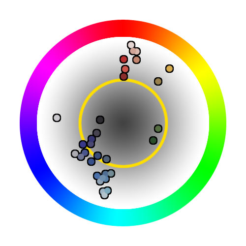
On balance there are more bright colors than dark ones, but the range is wide. If I had to give it an average, I’d say it’s pretty close to that yellow 50% brightness ring. That might be OK if Koch had used the lights and darks form cohesive shapes, but no such luck.
In terms of color scheme, Koch seems to have concentrated in the blues and reds. They are complementary, and that may have been purposeful. The occasional yellow and green spots, though, keep me from saying that there’s a clear color scheme in play. The chart doesn’t explicitly show saturation, but you can see from the colors of the dots that Koch generally went with saturated colors. As with brightness, it’s often best to keep yourself on a strict saturation budget, using it to highlight the areas of focus.
The Perspective
Guidelines of perspective tell us to establish a horizon and then create vanishing points. As parallel lines recede toward the vanishing point, they converge. At the very least, parallel lines going away from us should get closer to each other. Let’s look at the cube.
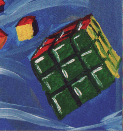
We’d expect the edges of the yellow side of the cube to converge a little bit on the back side. Instead they get further apart. We’d also expect the green part of the cube to be a square. Actually it’s a rhombus. Each cube, in fact, exists in its own dimension of perspective. Van Gogh’s Bedroom is an example of an artist playing with the guidelines of perspective, but in his case it seems purposeful.
The Concept
Here is a detail of the face.
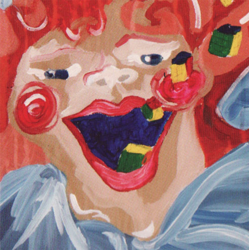
To paraphrase, not just any bad painting descends to the Museum of Bad Art’s low standards. It’s true that the execution of this idea is bad. But what about the idea itself? As my daughter might say, “It’s so random!” The word I’d use is “bizarre.” “Enigma” might be good. It’s hard to say exactly what, but there is a hint of a concept there – some statement or illustration of a thought. If this were an ordinary concept executed badly this picture would be worth nothing more than a brief shake of the head. If it were abstract doodles that represented nothing we’d pass right by.
The thing that makes me stop and look at this painting is that the idea is there. It’s like trying to see through the cloth just before a sculpture is unveiled. What makes me linger is that combination of the random, the bizarre, and the strange idea obscured by a veil of technique. It’s wonderful in the sense that it inspires wonder, and it’s awesome in the sense that it inspires awe. And in that sense, I’m glad it’s here.
The Elements
To wrap up we’ll go through Lee Moyer’s Elements of a Successful Illustration.
Focus: The initial focus is on the face, with the second one being all the way across the painting on the right edge.
Composition and Design: The design is not completely hopeless, but the odds are against it. The face’s width does take up the smaller section of the golden ratio, horizontally.
Palette: There is almost a color scheme based on the complementary colors of red and blue. Enough other colors are there, though, to muddy the waters.
Value: All over the place, but not used with any plan or pattern.
Mass: There is little sense of mass. Values and consistent edges are nowhere in sight.
Texture: The large, quick brush strokes provide a texture.
Symbolism: Lord, I hope not.
Micro/Macro: I find it odd that the green squares on the large cube have a highlight, indicating a light source. Nothing else does, though.
Ornament: The tendrils emerging from the head may or may not be hair. They appear to be an attempt at ornament.
Narrative: This is an imaginary narrative in the same way that “i” is the square root of negative 1.
Juxtaposition: Rubik’s cubes and a laughing gargoyle are not something you see every day.
Stylization: I have no idea what to say for this one.
Character: The face might belong to Pennywise, but there’s little indication of personality.
Tension: Is the laughing man barfing Rubik’s cubes or are they… no, never mind. The tension is of the WTF variety.
Line: Edges are here, but no lines.
Research/Reference: No idea. None, I hope.
Vignette: This is a vignette in the sense that the background is abstract. The silhouette, though, makes no sense.
Perspective: Wonky and inconsistent.
That’s it for this round. Next week I’ll do something old, but I’m not sure what yet. Maybe Dulac.
My goodness, you spent more time writing about this than I did painting it. I’d love to have you critique something of mine that I actually believe in. Let me know if you’re interested.
Kim