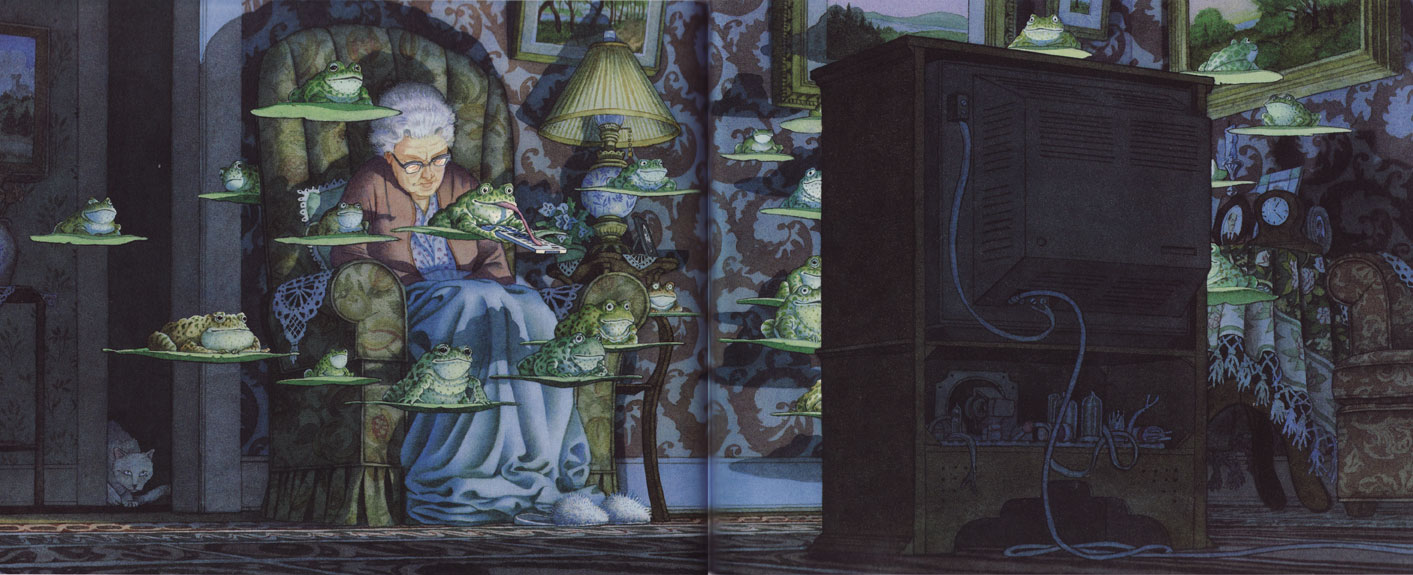
#17: Tuesday, by David Wiesner
Pages 18-19 from Tuesday, by David Wiesner
Copyright David Wiesner
This analysis copyright 2009, Scott M. McDaniel
The Image

Click here to see a larger version.
I came across David Wiesner’s book Tuesday in my illustration class about a year ago. I loved the book and have since gotten it for a number of kids in the family, including me. It won the Caldecott award for children’s illustrated books in 1992 from the American Library Association. In an interview for BookPage.com, he says,
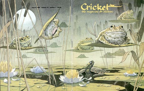
“I was working on the March cover, and two themes in this particular issue were St. Patrick’s Day and frogs—a lot of green. St. Patrick’s Day didn’t seem all that interesting, so I thought I’d do something with frogs. All my books start in my sketchbooks, and the frogs were very interesting and fun to draw. They’re very squishy and bumpy, very odd-looking things.” Reminiscent of 1950s science fiction/flying saucer movies, “[the lilypad] became a sort of magic carpet, flying around. So I did the cover, and I liked the painting. But once again, I wanted to spend more time with what I created. I thought more and more about flying frogs, and started seeing frogs in front of the TV, chasing the dog, floating by the window, etc. And I just organized them, and they created this sequence. It came together incredibly fast. In that case, it grew out of this sort of arbitrary suggestion.”
The Houghton Mifflin site also has a guided tour of his process in creating the painting that’s well worth a look. All the images in the book, including this one, are watercolor paintings.
The book is a (mostly) wordless comic. The target audience is all ages, including those who can’t yet read. Wiesner had a few goals with the image. He’s got to advance the story. He wants to intrigue us and slow us down with a double-page spread. He needs to communicate the passage of time. And he wants to amuse us with the spectacle of the flying frogs. While doing all of that he must give us a coherent pleasing picture that guides our eyes to accomplish all of those things. Here are some of the ways he does that.
The Values
This is a pretty dark picture. Maybe that’s to be expected if your only light source is a television in the middle of the night. To give us a clear place to start our visual tour, Wiesner makes the old woman the focal point and makes her the brightest thing in it. I’ve used the Posterize function in Photoshop to show just three levels of brightness to illustrate the point.

I see two contenders for the place our eye lands first. The brightest spot is the woman’s forehead. But there’s also a clear line of contrast at the edge of the TV. I looked at the woman first because human faces are a pattern that jumps out at us before other things. As we’ll see below, though, even if I’d looked first at the television I’d have quickly wound up on the old woman.
Composition
Double-page spreads present an interesting problem in that they have to work as a single unit, but you’ve also got two individual pages to deal with. Notice, for example, that Wiesner puts virtually nothing at the halfway point, where the book’s gutter lies. Below, I’ve put the golden section grid on both the entire painting and just the left side.


The alignments work either way. In the two-page spread, we see that the television’s side lies on the right vertical golden section. Compositionally the dark TV balances the brighter woman. The right edge of the woman herself is just next to the left vertical golden section line. The lower grouping of frogs watching the TV line up along the lower horizontal line nicely. When we look at just the left page, we now have the right vertical line going right through the sleeping woman, while the left line marks the edge of her chair. It’s quite the cool trick to get them all to line up that way.
One other thing to consider here is the point-of-view. How often do you have a TV set up in the middle of the room like that? Usually they’re pushed up against a wall. Perhaps we are on the wall. Though, as we should remember from last week’s look at Magritte, there is of course no wall. The scene is quiet, so we don’t have a tilted horizon or extreme bird’s-eye or worm’s-eye point of view amping up the image.
Guiding the Eye
Both the values and the composition drive our eyes to the sleeping lady. Where to go next? Wiesner gives us several options – sort of a “Choose Your Own Adventure” path through the picture. He sets up a several intersecting loops.

Loop 1: Starting at the woman’s face at (1), we move to the frog clicking the remote and go over to that line of high contrast I mentioned earlier, (2). Following that line up we follow a cluster of frogs from the top of the TV over to the lampshade, (3). The shadow on the lampshade brings us back down to the woman’s face at (1).
Loop 2: Or, we keep going over the woman’s head where the frog and lillypad take us over to (4). The frogs themselves form the loop that brings us back to the TV through (5) to (2) and (6). If we end up at (2) we resume Loop 1.
Loop 3: If, on the other hand, we look over at the back of the TV, (6), we have a line that takes all the way to the right side of the picture. We emerge on the other side and travel up the tablecloth to the couple of frogs there at (7). The top of the TV takes us back to Loop 1 via (8).
Wiesner’s point here, I think, isn’t to keep us rigidly on the rails of this visual track but rather to make sure that when we first look at the painting we’ve got visual access to all of its parts. There are plenty of details and easter eggs to look at, which I’ll talk about below. If we only spend a few seconds on this page, though, we’ll understand that the woman is sleeping and the frogs are having some fun channel surfing.
The Palette
The setting is nighttime and the principle subject of the book is frogs. What do you think the color palette is going to be like? Sampled down to 32 colors and plotted on the color wheel below, we see that you’re right.

The further out from the center, the more saturated the color. You can see the brightness of each sampled dot in its circle. While there’s not a specific color scheme in play as defined by a triad, we can certainly see that we don’t have much saturation and that more of the colors are dark than light. Also, there are slightly more blues and greens than reds, but overall it’s a balanced palette.
The Details
What I think makes this image is the richness of detail and setting. Younger kids may not have memories of elderly relatives in essentially Victorian homes, but I certainly do. I recognize the type of wallpaper, the furniture, and even that kind of television. Wiesner here has really thought through this image and the woman’s character. He manages to include all of this while still keeping the focus on the woman and the frogs (mainly through brightness and contrast). The details are there for us if we slow down, though. While they’re not as bright and don’t pop, I think they’re what takes this from an amusing concept to a truly engaging picture.
Here are some of details of the picture:

A closer look at the sleeping grandma and the frog with the talented tongue.

The cat, who is none-too-sure about what’s going on.

The one frog not looking at the TV but instead contemplating a career as a weekly art critic.

The back of the TV, which shows what you can do with a limited set of values. This TV adds character to the woman because it’s an older one.

Finally I wanted to show the lamp. Like the TV, this is the style of furniture I saw in my grandmother’s house growing up. That this woman would choose a lamp like that tells me things about her that Wiesner suggests but can’t know for sure himself. For someone without that cultural background this image probably resonates just a little less.
Wiesner pays attention to all of the details here. Every frog has its own individual expression. Each piece of furniture or decoration says something about character. This type of illustration is about getting the viewer to build a complete model in their heads. The best illustrations not only make that easy, but they involve the viewer in the act by pulling on shared assumptions and cultural backgrounds. This way, the viewer’s model includes things the artist can’t know and didn’t specifically intend. For a brief while, that model is every bit as real to us as the one coming in through the rest of our senses.
The Elements
To wrap up we’ll go through Lee Moyer’s Elements of a Successful Illustration.
Focus: The focus is on the sleeping woman and the frog with the remote control.
Composition and Design: We have dark and light balanced (woman and TV). Not only does the entire painting fit with the golden section grid, but so does the left page. On the right side, which is not the focus, the fit is less clear.
Palette: The palette does not favor one color over the others. Saturation is low.
Value: It’s a dark painting overall, with the brightest spots reserved for the sleeping woman.
Mass: The sense of mass comes mainly through lighting and shadows. The TV is the clear light source, but we get a good sense that the frogs are floating in space because of their cast shadows.
Texture: The wallpaper and upholstery patterns are great. They provide interest without overwhelming other details, and they contribute to the woman’s character too.
Symbolism: I don’t see much symbolism here. As an all ages book I think it’s purpose is to provide a sense of wonder and delight. Maybe the frogs represent the sleeping woman’s inner turmoil about her enslavement to the television broadcasting oligarchs. Or not.
Micro/Macro: This one is about choosing what to render fully and what to leave as suggestion to best immerse the viewer in the scene. There are lots of details in this scene, but for now let’s think about the cat. The darkness around it frames the cat and makes us more likely to notice it even without high contrast. If we saw shadowy hints of other rooms back there we wouldn’t be as likely to notice the cat.
Ornament: The only ornament in the painting appears as part of the scene itself. It’s abundant there, though. Look at the carpet – Wiesner could have easily left that plain, and painting the pattern at that angle is no easy task.
Narrative: As part of an ongoing story this painting has its place in a larger narrative. On its own we know that frogs are floating around. We also know that the old lady fell asleep while watching TV. The cat is freaked out, and many of the frogs have an implied story too. There’s one peeking out from behind the lady’s chair, for example. Is it afraid of the TV or what’s on it? The frog looking at the painting obviously has an artistic flair, but it also communicates that the frogs are all over the place curiously inspecting everything.
Juxtaposition: The frogs are fantastic and it’s funny to see them set in such a mundane situation as this. It’s amusing that it’s all going on right in front of the woman, who is oblivious.
Stylization: The frogs are a great mix of realism and cartoon expression. Some of them have quite realistic frog eyes, and they tend to look disinterested. Wiesner changes out those pupils for smaller dots on others, though, which gives them a more surprised or fascinated expression. Frogs don’t really do that – people do.
Character: There’s a clear sense of character for the old lady (clothing, setting, situation), the cat (posture, expression), and many of the frogs (expression, position, posture).
Tension: The tension in the picture revolves around whether the woman will wake up to see frogs or not. If not, what will she think when she finds the TV on a different station and the remote control on the floor? The tension in the book overall is simple – what will happen with all these frogs?
Line: As Wiesner says in the creative process part of the Houghton Mifflin web site, he uses drawings with clear lines while prepping the painting. The watercolor painting itself uses lines sparingly. You can see them in the back of the TV and as a light outline around some of the objects.
Research/Reference: Wiesner obviously did research on frogs and anatomy. The creative process mentioned site mentioned above gives a neat glimpse into his approach, which even uses sculpture to help get the lighting right.
Vignette: The woman’s figure comes across cleanly, even with the frogs in front of her. We know she’s asleep not only from the fact that her eyes are closed but from her entire posture.
Perspective: The main tools of perspective are occlusion and cast shadows. Take a look at how the frogs cast shadows on the old lady and how she casts shadow on the wall behind. Getting these shadow patterns right is critical to the perception of space.
That’s it for this week. Next up we have a piece called Hymn by Yigit Koroglu that uses texture quite well to produce the realism.
… [Trackback] …
[…] Informations on that Topic: scottmcd.net/artanalysis/?p=167 […] …