#40: Buddha by Osamu Tezuka
Drawings from Buddha, by Osamu Tezuka. Copyright by Tezuka Productions.
This analysis copyright Scott McDaniel, 2012.
The Image, Part 1
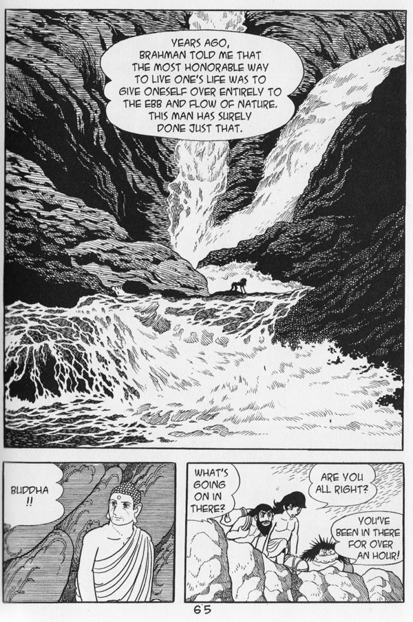
Not too long ago I started working on some drawings in which I needed to draw water, mountains, and trees in ink. For example, in Fairy Tales I tackled both up-close and mid-distance forest and trees. In Knotwork in the Skye mountains and water were the problem of the day.
While I’m not completely happy with the results, I thought I’d share some of the drawings by Osamu Tezuka that I referred to several times to try to work out doing nature with ink. All three of the main pictures I’m showing here are from his Buddha series. The one above is from Volume 8, the last one. Now, when I look at that I’d call it fairly realistic. But when you start looking at the individual parts we can see how he’s combining abstract patterns and textures to construct it.
Let’s take a look at the water. At a glance we can see the waterfalls and that there are rapids. We can also tell where the rapids are running faster and where they’re running not quite as fast. This first example is from the left side of the drawing, where the water is running over a large stone.
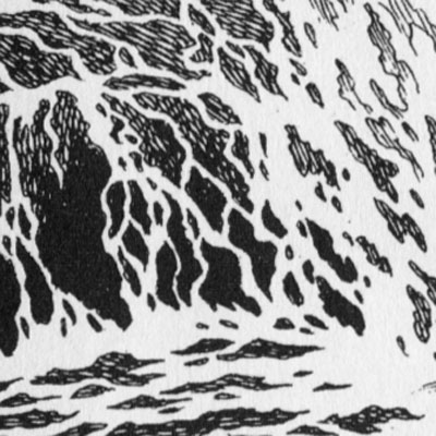
If this were out of context of the larger drawing, could you tell what it is? I see jagged veins of white connecting to each other, and then textured dark areas. But what does each one represent? Why does that read as water in the larger context. To help us along a little bit, here is a photo my father-in-law took of some the type of water Tezuka was drawing:
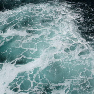
Looking at this, it seems that the white areas are foam and the dark areas are the water. Tezuka has also given the foaming areas a direction, so we can tell when the water transitions from falling down over a rock to landing in a pool. Still, he’s not trying to draw each vein of foam perfectly. Looked at close up, they’re abstract patterns. Let’s take a look at the water on the lower right side.
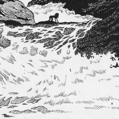
To contrast with the earlier detail, this one gets rid of the veins altogether and just uses motion lines to indicate the flow. In context, this reads as even more foam and churn – so much that we can no longer see any specifics at all. My first instinct would have been to go in and try to draw even more chaos and texture in there, but this is certainly more effective.
There’s also lots of interesting stuff going on with the rock surface and texture. These rocks have been worn down by the water – they’re curved and don’t show jagged parts. What do you see in there in terms of how Tezuka has used pure black areas interspersed with hatching? What does the direction of the hatching (and number of directions) communicate about the surface?
The Image: Part 2
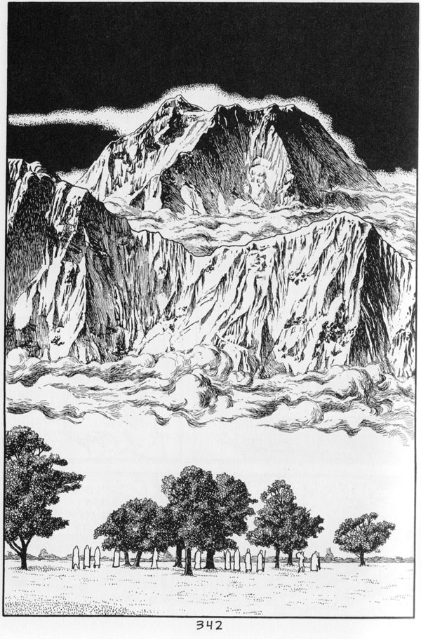
Here’s the second of the three pictures. This one also lets us look at rock and mountain surface, though from further away. Let’s take a look at a detail of some of the mountains.
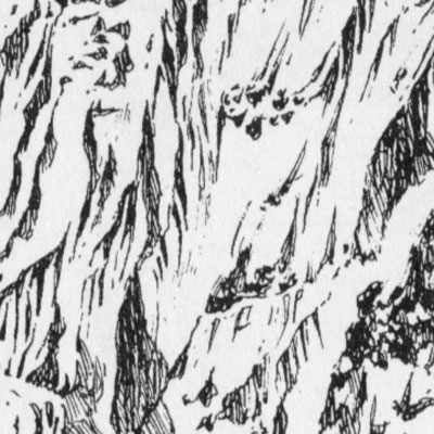
Not so different from the water above, we’re seeing patches and almost vein-like textures. Here, though, the veins are the shadow. I imagine him drawing those almost as contour drawings, without the shading in the shapes, and then when it came time for the inking he chose some to fill in completely and others to hatch. I also see at least two levels of shading going on – one is at a large scale and shows the structure of the mountain overall, while others form more of the texture pattern in specific areas that conveys the idea of “rock.”
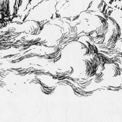
Moving down the picture a little bit we come to clouds. I’ve been practicing clouds for a long time with marker/brush and ink and still have a ways to go, so it was interesting to see what Tezuka does with them here. Throughout Buddha he treats them in many different ways, but I particularly like this one. Clouds often break down into smaller and larger spheres and ovals, fractal like. We can see that most clearly at the top and the middle of the detail. As we move down, though, those structures break down and become more swirly until it just shows swirling lines. At the bottom of the detail (and below in the main picture) the clouds just fade out with no defined bottom outline or texture. That was something I had to train myself out of – giving clouds an outline on the bottom.
Looking back at the mountain, clouds, and plain, which perspective techniques does Tezuku use? How often do we see a mountain rising above clouds like that? What’s the weather like? How does he use relative size cues and occlusion to make that mountain seem so huge and so distant?
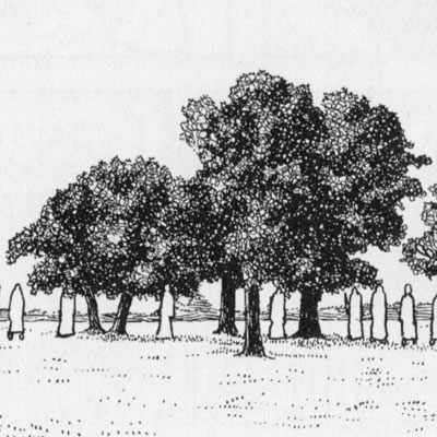
Now lets look at the trees in the relative foreground. I’ve been focused on trees a lot lately – there are so many different kinds and arrangements. I do think it’s helpful to do gestures of trees just like it is for human figures. These trees aren’t very close to us – they’re in the middle ground. So, we’re close enough to see their shape and silhouette, but not close enough to really get a sense of fully rounded objects. The trunks and limbs, for example, are mostly silhouette. That canopies, on the other hand, do show some form. Still, it’s a subtle mix of blacks and texture. The texture of scribbles stands in for the leaves, which Tezuka doesn’t draw individually. Under all of this, though, we can still see branch structure and foliage structure, so they’re certainly not random squiggles.
The Image: Part 3
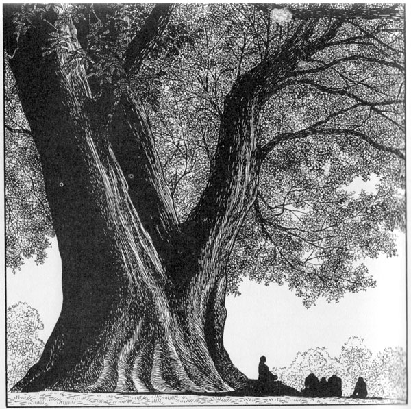
Since I’m short on time right now I’ll just leave this here for you and ask a few questions.
- What does the hatching and directions of the lines tell us about the tree trunk?
- How does Tezuka draw our eye to the people seated beneath the tree – the focus of the image?
- Why would Tezuka put so little detail on the focal point – the people – and so much in the tree?
- The darkest area of the tree trunk forms a V that points down. Why?
- What purpose does the distant foliage serve to the focal people?
- What does Tezuka do with branch structure and leaves
Two analyses related to this one in terms of ink and nature are one about Albrecht Dürer and one about Charles Vess.
That’s it for now. On a personal note, I haven’t been doing these analyses lately for several reasons, but the main one is lack of time. The day job has been sucking up more time, and I’ve wanted to focus on creating art, not just deconstructing it. I do plan to continue these, but they will still be irregular. And, they’ll be shorter. I’ve had my eye on The High Priestess by lauraborealisis for a while, but I’m also tempted by the freaky bizarreness of Illustionist by xeeming (both at DeviantArt).