#26: Daredevil by David Mack
Page from Daredevil, by David Mack.
From Kabuki Reflections #5, 2005.
This analysis copyright Scott M. McDaniel, 2010.
The Image
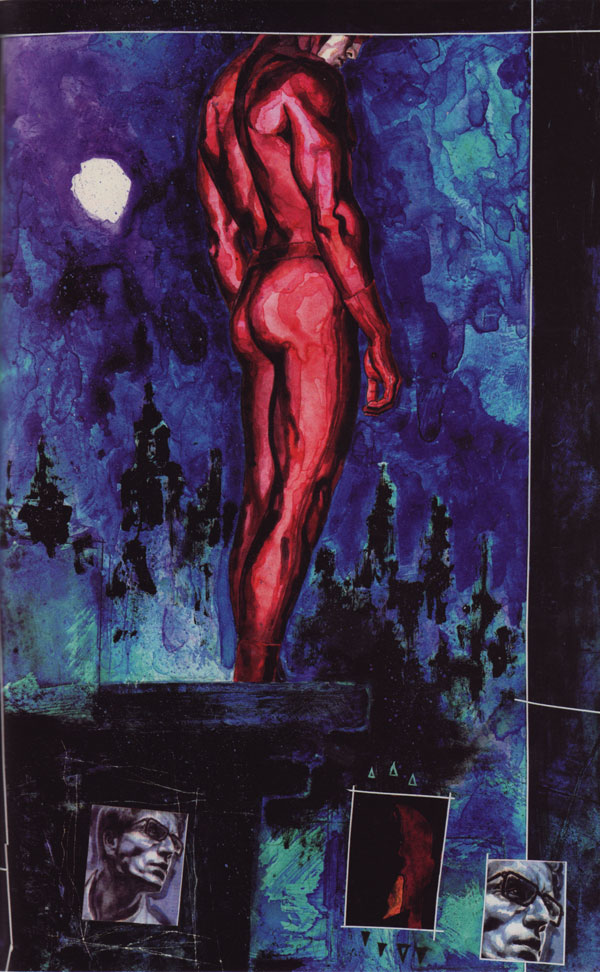
This painting is from David Mack and Brian Michael Bendis’ Daredevil story Wake Up. I happened by Mack’s table at the New York Comic Con last year and liked the art on the Kabuki books he had out on his table. At first I wanted to do a Kabuki painting for the analysis, but as I was looking for one I realized that he sets up a rhythm and visual language that builds on itself. It’s a case of the individual parts being strong, but the sum being more than those parts. Eventually I settled on this image from his sketchbook series Reflections because it seems more self-contained. Then again, I haven’t read much Daredevil so maybe I’m just not bringing outside context.
(As a side note, David himself impressed me at the NYCC. Despite the chaos that is the exhibit hall floor in artist’s alley, he had the time to talk to a total stranger without seeming hurried. I appreciated that, and the goodwill there probably also helped me along toward picking up the rest of the Kabuki series.)
Here’s what Mack has to say about this painting:
First, I added gesso to the pencil drawing (everywhere except the figure so that the water color would react differently on the gesso to give the figure a contrast in texture from the background sky and foreground building). I added white tape and razor scratches to outline the panels.
The Rhythm: Figure
Mack likes rhythm. We’ll look at it at several levels in this painting, but he also extends it to repeating motifs across pages and issues. He uses it to create his own “visual language,” as Scott McCloud might say. For now, though, we can see an excellent example of rhythm in the figure itself.
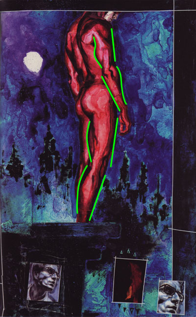
One of the principles on display is setting straighter edges against more curved edges. It helps that the human body is set up like that – while a bulging biceps is curved the relaxed triceps is straighter. The picture above shows that in action, as well as opposing groups in the forearm and legs. Playing straight against curved edges in a picture sets up a more pleasing visual impression – try experimenting with it to see.
If the opposing muscle groups is a fine-grained level of rhythm, we can also see more examples of it in the figure at a higher level.
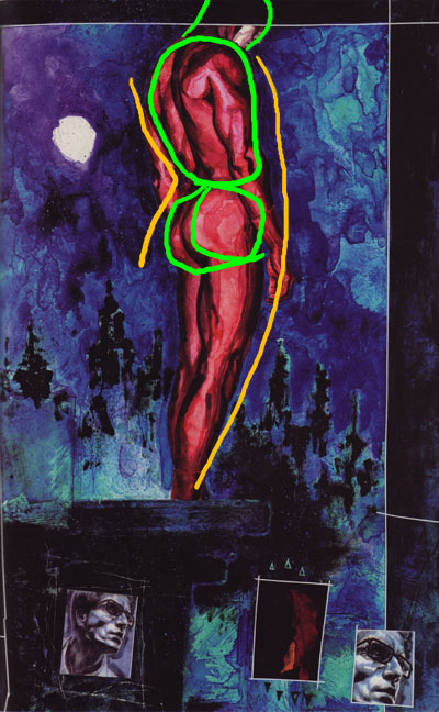
This picture shows the overall curve of the body. As with most drawings of the figure that look natural, the main body masses aren’t lined up perfectly (green). As George Bridgman shows us, there is a back-and-forth tilt to the body’s main masses: head, torso, and pelvis. Particularly the relationship between the torso and pelvis (orange) shows a curve on the front and a straighter line on the back. At the transition between torso and pelvis we see the uninterrupted curve on one side and a crease or corner on the other.
If we look at the figure from Mike Mattesi’s perspective, we’ll also see rhythm in the lines of force in the drawing. Where is the weight falling and where does that force change direction?
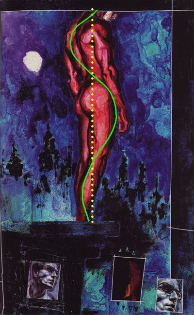
In this case we see that the main lines of force oscillate back and forth, but there is also a clear center of balance.
The Rhythm: Background & Repetition
As you’ll find if you read Kabuki among others, Mack uses repetition to set up ideas. Sometimes it’s the same actual drawing or painting. Other times it will be a pencil sketch followed by a collage followed by a watercolor of a character in the same pose with the same objects. In this painting there are three panels at the bottom of the page that use this technique.
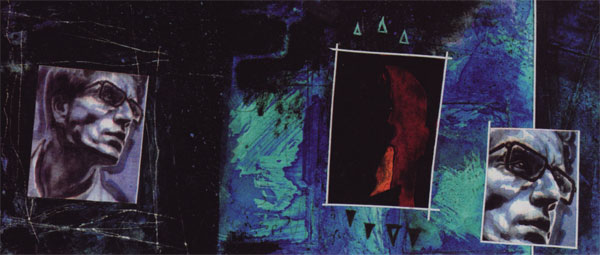
The first and third panel are the same image with a different size and cropping. The center image is of Daredevil in shadows. One of the nice things about setting up a rhythm is that it lets you break it for a targeted effect. I see these alternations here:
- Light, dark, light
- Blue, red, blue
- Lit, in shadow, lit (slightly different from light-dark-light)
- Looking left, right, and left
- Determination, defeat, determination
The triangles above and below the second panel call it out as different – a counterpoint to the others. If you look at much of Mack’s work you’ll also see that he incorporates them as a graphic element regularly – another aspect of repetition.
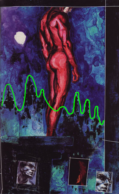
Now let’s look at another rhythm Mack sets up – the background buildings. They’re certainly impressionistic, but their spacing, height, and direction contrast with the straight edge of the building on which Daredevil stands.
The Direction & Design
See how the skyline dips on the right side of the picture? There are plenty of other elements that lead our eye to that part of the page. The building’s edge, the gaze of the person in the first and third panel, Daredevil’s posture, and even some of the abstract textures contribute.
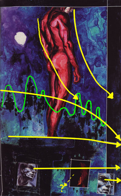
Why is the focus of attention off the painting? I’m not sure, but I have a couple of guesses. The entire mood of this painting is brooding contemplation – a low point. That fits with the focus being down. Also, in comic books it’s generally a good idea to focus the attention there on a layout to get the person to turn the page and continue the story. I don’t know if that’s what Mack intended here, but it wouldn’t surprise me.
Just because it seems I have to look at it every week, here’s the picture with the golden ratio grid overlaid.
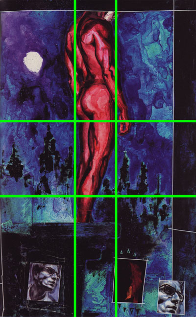
Daredevil takes up the two center and upper rectangles. The moon-symbol-blob is right in the center of the upper left rectangle. Because it’s so bright it gives our eyes a place to start and sweep over the rest of the image on the way to the lower right corner.
The Color & Value
Obviously Mack uses a limited palette and dark values for this painting. Here’s what it looks like with the saturation zeroed out.
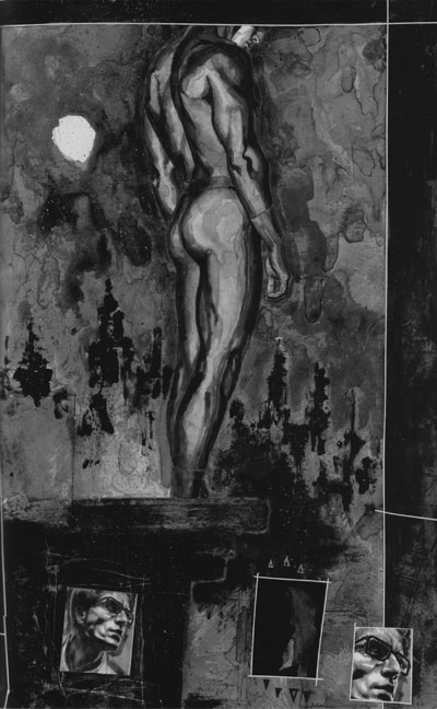
There’s really not that much brightness variation at all. As I said, the moon-thing is brightest while parts of the building and background are darkest. Usually we see brightness used to draw attention to the picture’s focus by putting high contrast at the key places. Not so here, though. Instead, Mack uses hue – red for the figure and blues for just about everything else. I sampled the image to 32 colors and then plotted them on the color wheel below.
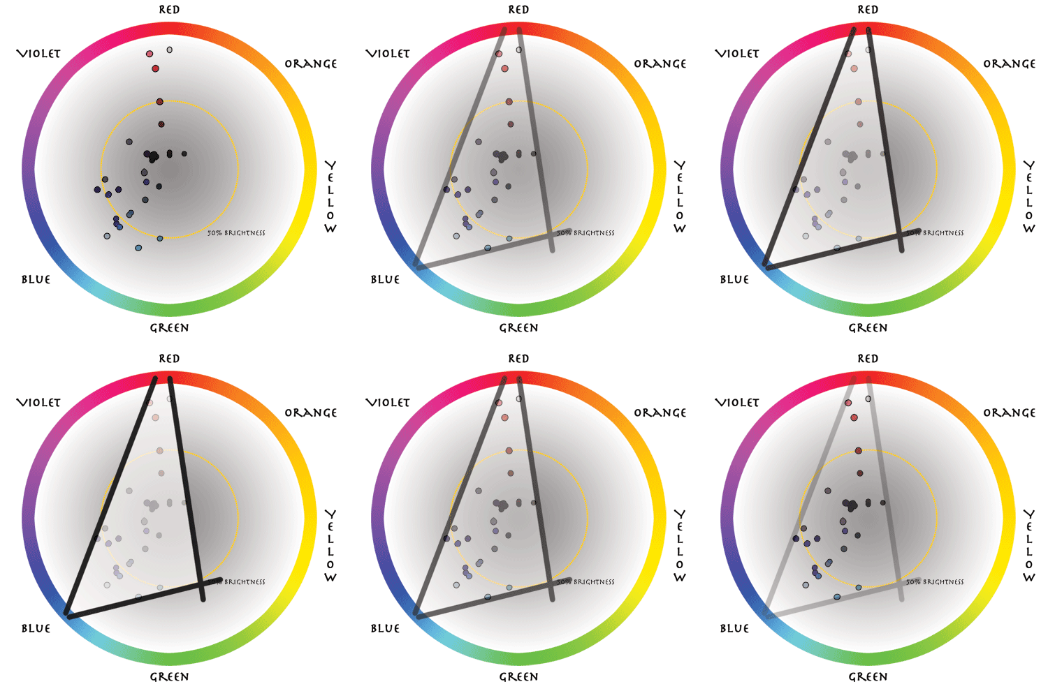
The further out in the circle the dot is, the brighter the color. It’s easy to see how dark most of the colors are; only a few go much beyond the 50% ring. The colors do form a triad (triangle on the color wheel), but really it’s mostly reds and shades of blue. Color-wise, a couple of yellows would complete the triad if they were needed.
The Texture
The last thing I want to talk about is the texture that Mack uses in the painting. Here are a couple of details that show the area in the upper right and Daredevil’s upper figure.
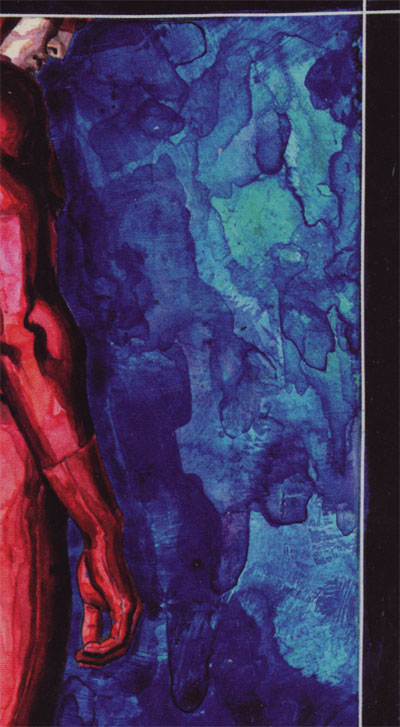
This set of textures is abstract and provides interesting shapes and interactions all on their own. The whole region accomplishes the purpose of guiding our eye down and to the right because of the “border” with the darker background on the left side of this detail. It’s other purpose, I believe, is to give us something of visual interest to look at if our eye decides to settle there. Personally, I like it.
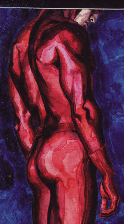
Here we see similar shapes and watercolor bleeding effects. This time, though, Mack controls them to define the form of the legs, arms, and anatomy. What we see, then, is texture and watercolor technique used for its own sake in the first example and purposefully in the second.
The Elements
To wrap up we’ll go through Lee Moyer’s Elements of a Successful Illustration.
Focus: The visual focus of what’s there is the figure of Daredevil standing on a rooftop.
Composition and Design: Our eyes start at the moon and move down and to the left through the image. Mack does this with everything from the page’s textures to the figure’s pose and panel designs.
Palette: Blues and reds with moderate saturation.
Value: Dark overall. Mack uses value to define form on Daredevil, but unlike many illustrations it’s not the most important part of making the figure stand out.
Mass: Daredevil is the only part of the main picture that appears to be solid and 3D. The person in panels 1 and 3 does as well.
Texture: This is mainly a watercolor painting, and Mack does a great job with making texture serve his purpose. He also uses tape and razor scratches around the panels for additional texture.
Symbolism: I’m not familiar with the story, but here’s an obvious bit to me: Daredevil is blind. The fact that the overall panel cuts off his head just below his eyes is surely not accidental. It also suggests that he’s not just physically blind but that he can’t see his way out of whatever situation he’s in
Micro/Macro: This isn’t the kind of painting to show lots of realistic detail. The man in panels 1 and 3, though, is more detailed and realistic than the main picture.
Ornament: I mentioned the triangles that Mack put above and below the second panel. They are a very simple ornament, but they can do a lot of work. For example, they form arrows that direct attention or – in this case – give an impression of being pulled in different directions. They also form a border to outline and emphasize something.
Narrative: Though I haven’t read the story, I’d say that this picture’s narrative purpose is to provide a down beat between more intense scenes. Those may be action scenes, but I suspect that the intensity may be more along a dramatic or emotional line than straight up fighting.
Juxtaposition: The most obvious juxtaposition to me is the one between the man in panels 1 and 3 with Daredevil in panel 2, who is in the dark and looking the other direction.
Stylization: Mack has a distinctive style with a propensity for watercolor and multimedia. The non-traditional panel borders, for example, are no surprise when you’ve seen other examples of his work. Repetition and rhythm is also a fundamental part of his style. MC Mack?
Character: This is a character study, and we certainly get a sense of his mood from the posture and from the lighting in the panels.
Tension: The tension here seems to be internal. Whatever his situation is, there are no easy choices.
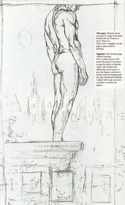
Line: The most obvious lines here are the razor scratches. They’re not a major component of the finished piece, but take a look at the preparatory drawing below for the initial line drawing.
Research/Reference: Mack also includes a preparatory drawing in Kabuki Reflections #5. There were several changes on the way to the final piece. The one I notice first is the person sitting on the right side of the picture.
Vignette: This painting is more than a vignette, but only just. There is enough of a background and setting to know that it’s an urban environment and skyline.
Perspective: Perspective isn’t a major part of the painting, but the background buildings do certainly seem to be far away. That’s mainly because they are so indistinct, especially compared to the main figure.
That’s it for this time. Next up, a painting from the masterwork collection at MoBA.