#11: The Hindenburg, Mort Künstler
By Mort Künstler, 1975
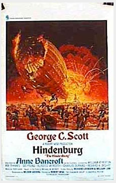
Movie Poster for Universal Pictures’ The Hindenburg
The Illustration
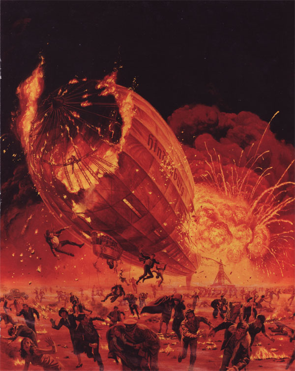
Mort Künstler is best known these days for his Civil War prints and paintings. He’s had a long career as an illustrator, however. Illustration magazine devoted its 24th issue to him, where I found this gouache and oil painting for a movie poster of The Hindenburg. The original is 28 3/8 inches by 24 3/4 inches. Here’s what it looked like in context.
I first came across him because my in-laws, who are Civil War enthusiasts, have several of his prints hanging in their house, including one of his best known, Until We Meet Again. I chose this image because it’s not a Civil War painting and because it’s both dramatic and interesting from a visual standpoint. I also thought it would be interesting to stretch beyond the realm of comics for a bit.
Künstler’s Values
The focal point is the explosion. For starters it’s the brightest part of the picture. The interesting thing is, though, that it’s not actually all that bright. Here’s the greyscale version.
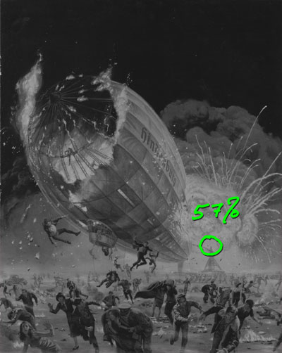
I’ve circled the brightest part of the explosion. My version of Photoshop tells me that the brightness level there (on my scan) is only 57%. Then, by sampling down to 16 colors and putting them on the color wheel we see this.
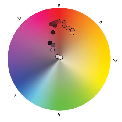
This color wheel doesn’t show brightness, but rather saturation. The fire and explosion, then, is depicted more with saturation than brightness. The dots I’ve plotted do indicate the brightness of the sample, though. You can see it’s a pretty dark image. Why was I so surprised that the brightest part had a value of 57%? Perceptually, I think we expand the value range of an image beyond what the light itself indicates. It means we can communicate brightness effectively in a limited range and trust that the viewer will still read it correctly.
Using Perspective
Back to the focus. Brightness and saturation aren’t the only things driving our attention to the explosion. The extreme foreshortening does as well, and the vanishing point is right in the explosion.
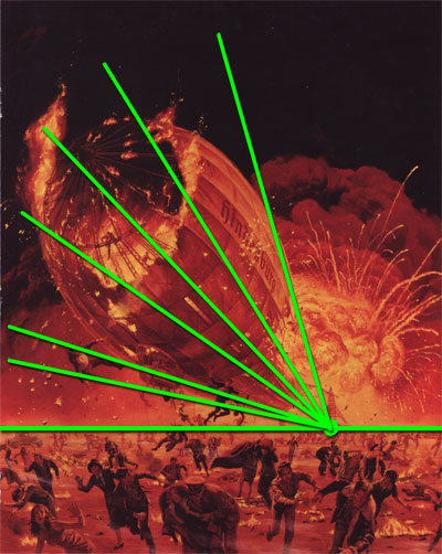
Even in pictures without strong perspective, if there is a vanishing point to be found we will tend to seek it out after our eyes are attracted by contrast and brightness. So, even when looking at the dirigible, our eyes want to go back to that vanishing point.
The panicked crowd also guides our eyes back to the explosion. I’ll get to that in a second, but first I thought I’d check out the perspective there as well. We don’t see clear lines leading back to the vanishing point, but the people do line up according to it. Wherever they are, people’s heads are about 1.5 heads below the horizon line.
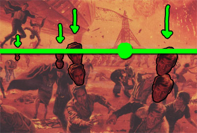
Compare the guy on the right – the closest one with the largest head – to the person trailing him. Then there’s the guy helping the woman just behind that. When dealing with crowds like this, it’s a handy way to check that your people are proportional to each other and the scene. Also, look at the blanket that the woman is holding. I’ll come back to it in a moment.
Guiding the Eyes
Here’s the path my eye takes with this picture.
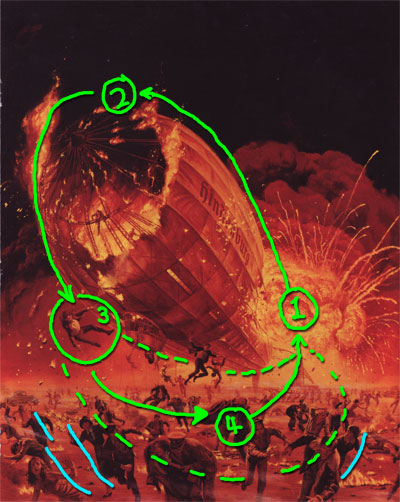
I start at (1), which is the explosion. A clear curved edge takes my eye up over the dirigible to the burning part at (2). Here, the fabric is burned away, but the flame just to the left picks up my gaze and routes it down to the guy falling off at (3). From here I see three alternate paths. The falling guy is about to land on a couple of darker figures who take my eye to the right. The woman’s coat at (4) points our gaze back to the explosion at (1). If my eye follows the underside of the dirigible, there’s a falling figure to act as an anchor point and then I wind back up at (1). If my gaze goes further down, the series of darker figures guides me back to (1) as well. Even the furthest out figures (the blue lines) put us back on the path. What looked like panicked confusion is clearly designed to keep us in the picture.
Details, Rendering, and Reference
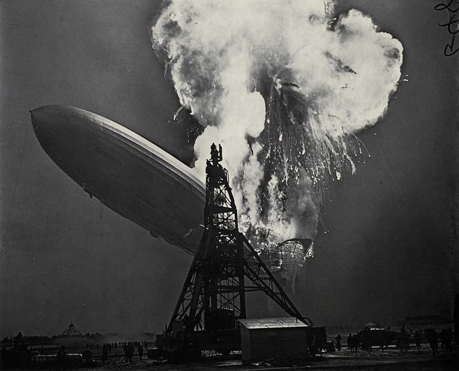
While I don’t know exactly which photos and/or movie footage of the actual Hindenburg disaster that Künstler used, the story in Illustration tells of his diligence in getting things right. That doesn’t mean a slavish devotion to photo reference, but it does mean research to get the little things right from costume to the way the explosion looked. Here’s one photo of the disaster.
Here is another one, from Wikipedia.
For his painting, Künstler took the the streamers you can see in the photo above and gave them a different trajectory, but they were there. Here are two details, one of the main explosion and one of the nearby smoke.
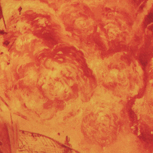
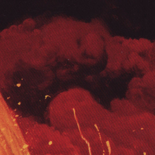
I like that you can see clear form on the various fireballs in the explosion. The smoke is similar, but darker and a little more like clouds. There are clearly defined parts and fuzzier parts. The bright flecks of burning debris are also evident in the historical photo.
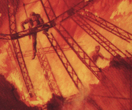
One thing that makes this an effective movie poster is the level of detail. Each member of the crowd is thought out, even down to the group of men pulling on a rope in the background. These things invite you to stop and look at the poster, spend more time with it. Here is a detail of two men still up in the framework.
The Elements
Let’s run down Lee Moyer’s list of The Elements of a successful illustration.
Focus: It’s that explosion, as mentioned above.
Composition and Design: The composition is really very simple, as befits an image that’s supposed to be taken in at a glance. People shouldn’t be hunting around a movie poster to understand it. While the details may invite the viewer to stay awhile, the basic composition itself is quite simple and effective.
Palette: The limited palette is reds and oranges with relatively high saturation but low values. It fits the mood of a disaster movie quite well.
Value: It’s quite dark. Even within the limited value range, though, Künstler uses value to give mass and roundness to people, the dirigible, the explosion, and the smoke.
Mass: Communicated mainly through value. The dirigible is your basic cylinder, and the tower is a tall pyramid.
Texture: Look back at the texture of the brush strokes in the explosion.
Symbolism: This isn’t highly symbolic. It’s an action scene designed to pique interest in the movie.
Micro/macro: The many small details add up. Look at the level of rendering of different members of the crowd. Many of them are barely visible, but none of them are stiff and all of them are doing something specific with gesture and pose.
Ornament: There’s not a lot of ornament in the picture – at least not like Mucha used. The text of the poster all appeared outside the image.
Narrative: Narrative is a real strength of this one. Not only does the scene have a narrative as a whole, but all the people in it do too.
Character: If I had more time I’d see if the people with visible faces line up to the movie cast – I’ll be they do. Künstler did that in his posters for The Poseidon Adventure and the original Taking of Pelham 123. That’s not really what Moyer means by this, though. It’s more about whether the people shown come across as unique individuals or bland cyphers. No cyphers here.
Tension: BOOM!
Line: Künstler isn’t using line much here. There’s chiaroscuro to show most edges, particularly the upper part of the dirigible. Another reason I picked this one is its contrast with the heavily lined pieces I’ve done lately.
Research/reference: Künstler takes his time to thoroughly research his paintings. The article in Illustration describes how he got a commission to do paint a Kansas farm scene. His wife says, “This kid from Brooklyn came home a different person. He walked around with a farmer’s hat on, and, if it was available, he would have been chewing on straw. For an entire month all he did was talk about threshing harvesting, silos, machinery, and fertilizer until I was ready to scream.” I need to keep this in mind the next time I feel annoyed that it’s taking too long to dig up that perfect reference picture on Google.
Vignette: While this isn’t a character vignette, there is a clear silhouette in play of the dirigible against the explosion.
Perspective: Künstler uses perspective not only to make the scene look realistic, but also to drive our attention to the focus.
Fun: My fun with this was getting to see a whole new side to Künstler that I hadn’t seen before. It was a really tough choice as to which of his illustrations to critique. As for the fun he had painting it, I’m not sure. I hope he had fun with it – he was certainly committed to producing a quality image.
That’s it for now. Next time I’m going to do a piece I found here on DA. It’s rare to see a fantasy image that concentrates on feelings of joy and wonder, but Garden of Giants by :iconzancan: does just that.