#41: Akira by Katsuhiro Otomo
Akira by Katsuhiro Otomo, Episode 069 Title Page
Young Magazine (March 17th, 1986)
This analysis copyright 2013 by Tyrell Cannon.
The Image

(Click image to view full-size.)
Note: I’d like to welcome Tyrell Cannon, who serves up a guest analysis of a chapter break from Katsuhiro Otomo’s Akira. I met Tyrell at the Small Press Expo this year, and I picked up his experimental comic Simon, which I heartily recommend. On to the analysis! — Scott McD.
Katsuhiro Otomo has been one of my biggest influences ever since taking on comics as my artform of choice. He’s a master of illustration and storytelling, making him one of the greatest manga artists living today (as evidenced by his recent awarding of the medal with purple ribbon from the emperor of Japan). In my current comic series, Victus, I’m focusing on the format of black and white ink drawings, with no color. In the past I have also used screentones (or halftone) patterns to add depth and value to the drawings. I think working without color offers its own unique challenges, which is a constant learning opportunity.
Katsuhiro Otomo works in black and white in his comic series Akira, which is widely considered to be his magnum opus. The work has been translated into many languages, reprinted, and adapted into an animated film. If you don’t know the story, it follows Japanese youth’s with telekinetic powers, one of which (Akira) has brought about the destruction of Neo-Tokyo (twice!). The main characters are friends Kaneda and Tetsuo, whose telekinetic powers drive him insane. Of course this is over-simplifying it, but gives you some context for the image in question.
We see Tetsuo, atop a pile of rubble from the destroyed city of Neo-Tokyo. The clouds have cleared, as the carnage has momentarily ended. Testuo takes steps away from the viewer, towards the horizon, re-introducing himself into this transformed landscape. He seems almost victorious, rising literally above the clouds. This chapter break comes at a point in the story where Tetsuo has come to understand his powers and seems almost almost enlightened. As our eye moves down the image though, we see that the clouds off in the distance are still dark and foreboding. This could simultaneously mean the storm has passed or another is on the approach. He is stepping over the rubble leading him into the sky, but we can see the tower ends so he has nowhere to go but back down to the destroyed city. You get a sense of resurrection and peace, but also tension with the elements, indicating an uncertain future. It really encapsulates the story up to this point.
Otomo employs a number of techniques to produce what I think is an incredible chapter title page. Let’s take a look at some key areas.
Composition
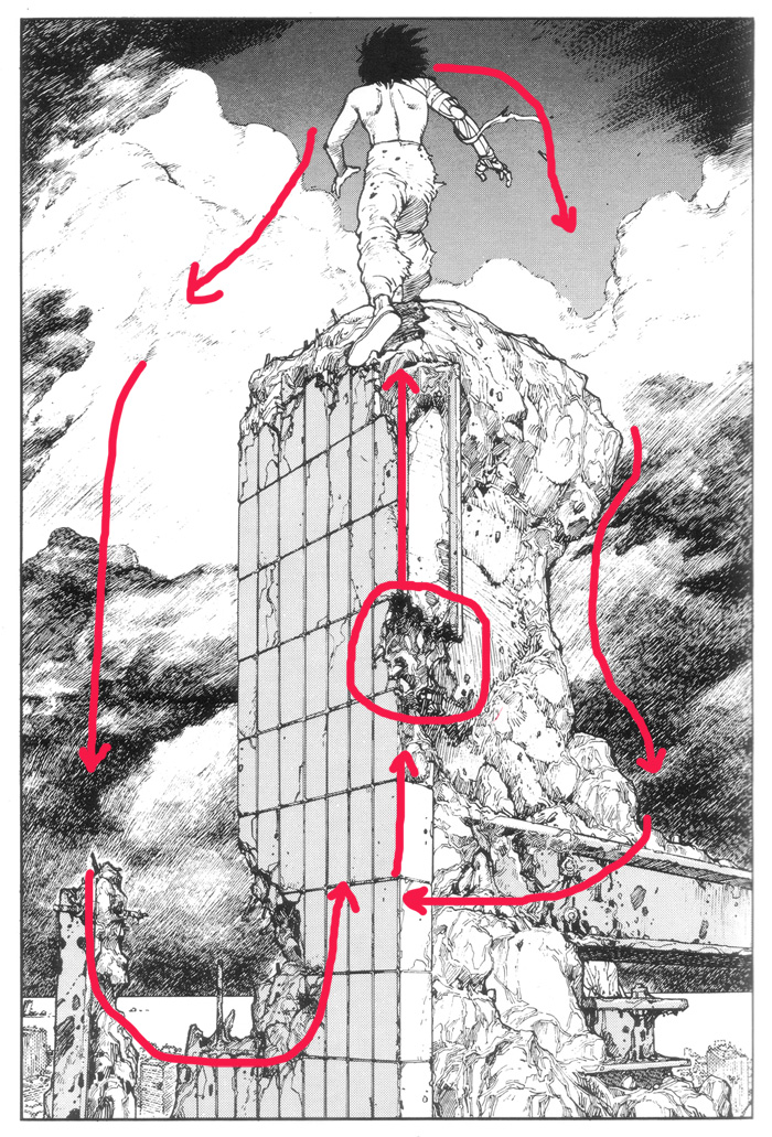
This is a very uncommon and interesting composition. I think it’s spectacular in that it reads very well from top left or from top right. This is cool, as a japanese reader would be approaching the image from the top right and an english speaking reader would be approaching it from the top left. However, what stands out is that although the focus of the page is Tetsuo, he is not the first thing your eye is drawn to. For me, my eye is immediately drawn to the pillar of rubble, particularly the missing section right in the middle. However from there I immediately follow the pillar up to Testuo’s feet, then up his spine to his head and arms. Once you are there, the arms point you back down and around, through the dark areas, which wrap down and then back up to that center focal point. it’s like two circles overlapping in a Venn diagram. It creates a wonderful circular pattern directing the viewer’s eye through the image repeatedly. Compositions like this are key in slowing down the viewer to sit and ponder all aspects of the image in question. Which is probably why I was enamoured enough with this image to write this post.
Linework
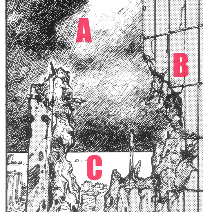
Otomo uses a variety of line weights and qualities to describe the various objects, environment and figure. On the figure, Otomo generally uses a rounded line, with emphasis on the outline of Tetsuo’s shape. The only real shading present is horizontal lines on the leg that’s extended away from the viewer, showing that light is coming from above. Each line on the figure is used to define the shape of the body or the cloth, with no extraneous lines. In the clouds, we see him using a much more free and sketchy line (see below, A). It’s almost like a dry-point technique, with some lines being made when the pen nib was low on ink. This gives the clouds a more organic and ephemeral feel. He uses these “sketchy” lines to build up value in the lower clouds. The lines are shorter and vary in angles of direction to show the shape of the cloud formations.
In the rubble pile, we can really see how different types of lines describe a different type of material. On the left side of the pile, we see the remnant of a destroyed building. Straight consistent lines indicate the brick or tile shapes that hint at the previous architecture (B). As we move to the right side, we see Otomo using a different line than he did in the figure and in the clouds. The stone/concrete pile is shown with straight, but short lines, with the pile outlined in a heavier line (similar to the figure). As this is a structure that is designed (by some architect of neo-tokyo) but has been ravaged by the fierce elements that destroyed the city, it’s fitting that the line is reminiscent of both the left side (pre-destroyed building) and the clouds in the background which have destroyed it (C). you also get a sense that the rubble is possibly wet or sticky, with dark drips coming off the I-beams.
Otomo also uses two different techniques on either side of the pillar to separate it from the background. On the left, the edge is a fairly thin line. Otomo let’s the combination of a very straight line, along with the tone dots to separate it from t sketchy hatched clouds. However on the right, the rubble lines are a bit closer to resembling the background, so Otomo has thrown in a harder thicker outline on the rubble pillar.
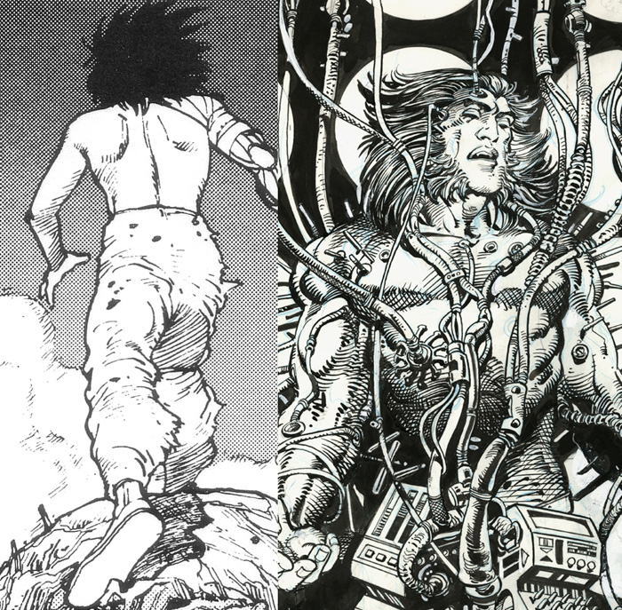
It’s important to point out here as well that in the rubble and on the figure, there are basically no intersecting lines of shading. This is a different style than ‘cross-hatching’. Otomo allows the line weights, lengths, and frequency to portray the light, dark and texture of the piece. As a comparison, here is a Barry Windsor-Smith image that uses the more standard cross-hatching pattern to show shading next to a section of our image:
Light & Dark
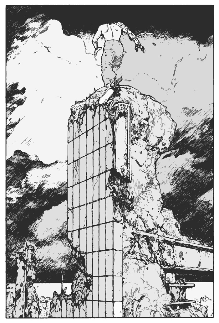
Without the use of color, an artist is challenged with finding ways to show differences in value, light, and texture using only black ink or white paper. This particular drawing uses almost no areas of solid black, other than tetsuo’s hair. Every other value is mostly described with line (except the use of screentone described later). If we bump up the contrast and run the image through a filter to remove the small lines, we can see the dark areas form symmetrical oval shapes, with Tetsuo near the top of each.
Screentone
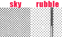
Screentones are the half-tone-like dot patterns used commonly in Japanese manga. Otomo only uses two different densities of screentone for this drawing; in the sky and in the rubble. I think it’s a very spartan use of the tones, to add depth to the drawing. The rubble’s tones push it into the front of the white ocean water and white parts of clouds in the background. It also serves to emphasize the dimensionality of the rubble pile, as it ends right on the corner.
In the sky, the Screentone puts the clouds (literally) in space. The top of the clouds are white, showing that light is peaking through, so having the screentone in that section serves to push the clouds forward.
The very faint building shapes in the middle ground give the impression that there is an entire city below, without extraneous detail. He saves the detail for the pile of rubble. This may be reverze ziptone.
Elements
To wrap up, I’m going to keep Scott’s tradition of examining this image using Lee Moyer’sElements of a Successful Illustration.
Focus: Otomo uses a central focal point to enhance your overall reading of the image, but push your eye to the main figure of Tetsuo.
Composition and Design: The overlapping circle composition encourages a cyclical reading of the scene, freezing it in time for contemplation.
Palette: Otomo utilizes black lines primarily, with screentones used sparingly.
Value: Value is used mostly to define the composition, with the darkest areas framing the composition.
Mass: The outline of the figure and objects vary slightly to show the volume of the shapes, with minimal hatching.
Texture: Otomo uses different types of lines (long, thin, round, angular, short) to enhance the inherent textures of the subjects portrayed, emphasizing the difference between organic and inorganic matter.
Symbolism: Tetsuo almost seems to be rising above the clouds in the composition, while his forward motion shows that he’s entering the chaos below again. You get the feeling of re-birth and triumph from the image.
Micro/Macro: Most of the heavy details are used in the rubble. There is a lot of lines in the clouds, but more for showing shaped than detail. The buildings in the middle ground are very sparse with detail.
Ornament: Otomo seems to be having a blast with drawing the rubble.
Narrative: Again, within the context of the story, it mirrors Tetsuo’s shift in character from a boy to something more.
Juxtaposition: Man made structures are placed in direct opposition to the elements of nature, with a human at the top center.
Stylization: This could be seen as using many manga style staples, though this symmetrical composition is not common.
Character: Tetsuo is seen from behind, mostly in white, taking calm steps forward.
Tension: I think the majority of the tension comes from the looming clouds, mixed with the visible destruction in the foreground.
Line: Otomo’s lines are subtle and spartan on his figures. There are very few extraneous marks. But his use of line in the rubble is much more dense, although every line still has a purpose.
Research/Reference: Not sure how much reference Otomo uses. I would guess most of his figures are not using photo reference, considering the crazy angles he often shows them from.
Vignette: The clouds serve double duty as decorative borders for the image.
Perspective: There is a very clear foreground, middle ground, and background, inviting you into this post-even scene of destruction.
Thanks to Scott for allowing me to wax eloquent about Mr. Otomo. By viewing other’s art with a critical eye, I hope I can grow as an artist and create my own images to be analyzed.
