#38: Gala Contemplating… by Salvador Dali
Gala Contemplating the Mediterranean Sea which at Twenty Meters Becomes the Portrait of Abraham Lincoln (Homage to Rothko) by Salvador Dali, 1976.
This scan from the book Dali by Paul Moorhouse.
The Image

In 1992 I was just starting graduate school in visual perception. One of the things they showed us in our first days was this painting by Salvador Dali. The professor showed it on a slide projector, and asked us what it was. Of course, we all described the woman looking through the window. With a flourish, he spun the focus on the slide projector’s lens, and we suddenly saw something else – Abraham Lincoln as seen on the U.S. $5 bill.
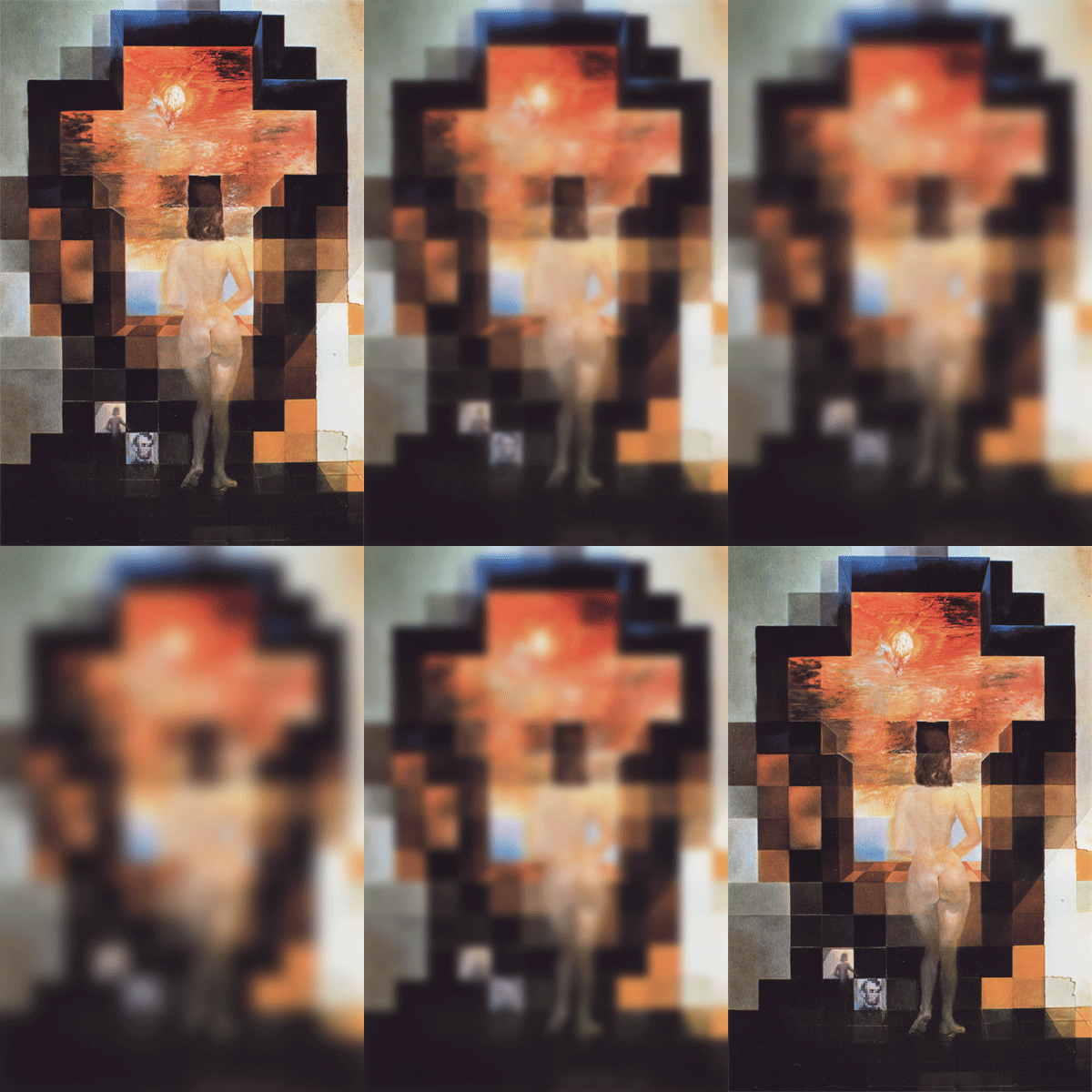
Today we’re used to seeing things like photomosaics that take lots of individual photographs, shrink them, and put them together to create a completely different picture. It’s the same principle at work here, but Dali did this in 1976. How did he do it without computers to do all the figuring for him? Even more, how did he do it while at the same time creating a painting that follows principles of composition, the golden section, and values to create a painting that works whether it’s blurred or not? That’s what we’ll look at in this analysis, and we’ll wrap it up with lessons that apply to all painting, not just tricks or optical illusions.
How All This Works
Let’s start with a simple question. Take any random painting. How often does the value (brightness) of the picture change? As you go from left to right right through the middle, for example, the value gets lighter and darker as you pass from background to foreground, as you pass over fine details, and as you go from foreground to background again. At some points the change is slow and gradual. At other points the brightness goes up and down rapidly.
To rephrase the question, what’s the frequency of those value shifts as you cross the space of the painting? This concept is called spatial frequency. Here are a couple of examples.

In this example the brightness changes every 100 pixels. This is a fairly low spatial frequency – there is only room for 4 bands in this 400 pixel wide graphic. Now let’s look at an example with a higher spatial frequency.

In this one, the brightness changes every 25 pixels, so here we have 16 bands. Great, you say, but so what? Well, our retinas and optic nerves have two subsystems. One of them processes high spatial frequencies and color particularly well (the parvocellular pathway). The other processes low spatial frequencies, form, and depth particularly well (the magnocellular pathway).
Those graphics up there are awfully simple. When we look at something as complicated as a painting, though, we’ve actually got brightness changes going on at different rates and in all directions. A complete picture has brightness changes over great distances (low frequency) as well as brightness changes over small distances (high frequency). They interact with each other to produce a composite, like the graphic below that shows the examples I provided combined.

It’s our visual system that separates the low and high frequency changes and processes them differently. There’s a wonderful article by Peter Habja called The Power of the High Pass Filter that has more about how low and high frequencies interact and what that high-pass filter is in Photoshop. It also covers some of how our visual system separates and processes the information.
Other articles of interest include Icon Analysis that talks about the role of spatial frequency when designing icons for computer programs and Michael Bach’s site on optical illusions, which also has an entry on this painting.
When Frequencies Don’t Agree
Usually when we look at a scene the low spatial frequency and high spatial frequency information match and reinforce each other. In Dali’s painting, though, they don’t match. When there’s a conflict, the high frequency information wins. It effectively masks out the low spatial frequencies.
Fine detail in a picture is part of the high frequency information because the brightness levels change rapidly with all the lines and edges. So when we’re close to Dali’s painting that’s what we see. When we move away, though, we can no longer make out all that fine detail, and all that’s left is the completely different picture (Lincoln) that’s in the low frequencies. I’ve simulated the effect above by doing a Gaussian Blur on the picture. It’s a low pass filter, effectively removing all the high frequency stuff from the picture – the same thing that happens when you stand 30 feet away from the physical painting.
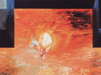
Here are some examples of the high frequency pieces that mask the underlying picture. First up is the highlight on Lincoln’s forehead. Incidentally, it is a reference to one of Dali’s other famous paintings, St. John of the Cross.
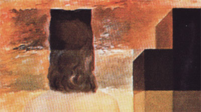
Next up we have Lincoln’s eye, which here is the head of (Dali’s wife). The relatively crisp edges of her head and the block above it disappear when the image is blurred.
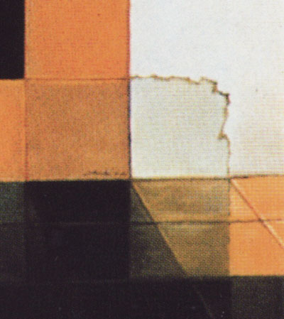
Finally, here’s an example of some detail work that doesn’t really mask much of anything but enhances the illusion of realism when we’re up close.
At a high level that’s what’s going on in the visual system when we look at the painting. But how did Dali figure all this out?
The Art, The Science, and The Math
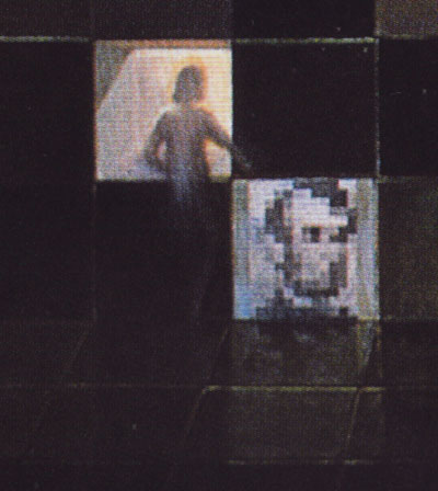
In 1973 a couple of researchers named Harmon & Julesz published a paper in Science about spatial frequency, vision, and face recognition. To show how low frequencies are important to basic understanding and recognition of faces, they used a picture of Lincoln from the $5 bill and sampled it down to a 16 x 16 grid. Dali saw this and realized that if he used that grid and made sure each cell had the right value overall, we would see Lincoln.
Dali also understood (whether from the Harmon & Julesz paper or others) that high frequencies convey details and, more importantly, interfere with the low frequencies. So, he used their picture as the starting point and made sure each cell had the right brightness. Then he added details within those cells that changed the brightness rapidly within the cells but didn’t change their overall value. To drive the point home (Dali was many things, but subtle wasn’t one of them), he included the original picture of Lincoln right in the painting.
The Compisition and Values
Let’s look at the values of the painting. I’ve highlighted a couple of areas to comment on below.
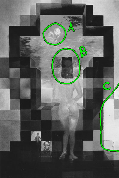
A: Here we have St. John of the Cross as the highlight on Lincoln’s forehead. It’s critical that this is one of the brightest parts of the painting. Dali also used high color saturation here, but in this version it’s easier to see that it is indeed relatively bright. (Color, by the way, is processed more with the high frequency information, so high saturation may also interfere with the low frequencies somewhat as well.)
B: Here we have Gala’s head again. Along with the block above it, this forms Lincon’s eye and nose.
C: This area is critical negative space. Lincoln’s hair, beard, and clothes are all dark, and this area helps define the outside of his face and beard.
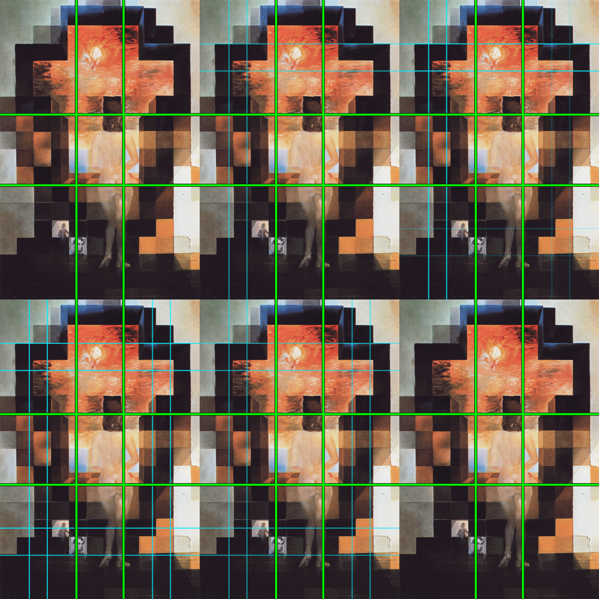
Finally, according to the book I scanned the painting from, Dali was fascinated by the golden section and mathematical principles. He specifically worked them into his paintings, and this one is no exception. Below I’ve put the golden section grid over the painting. Then I’ve further subdivided the corner quadrants into their golden sections. It’s interesting to see what lines up and what doesn’t.
The Moral of the Story
Playing with spatial frequencies can produce some really weird effects and fun illusions. I don’t know about yours, but most of my paintings aren’t of optical illusions. These principles, however, lead to some key lessons about painting and drawing in general.
- Intricate detail happens in the high spatial frequencies.
- Form and three dimensionality happen in the low spatial frequencies.
- High spatial frequencies mask low frequencies.
Therefore, if you want your picture to have a clear feeling of depth and form, don’t overload it with detail. Instead, leave areas of your painting open to simply show the changes in value that convey that depth. Use highly detailed areas judiciously, and you create the illusion of a fully detailed scene. (Our eyes can only see spot detail anyway, so our brains are used to filling stuff in.)
If, on the other hand, you’re not interested in depth and form for a particular picture then it’s perfectly fine to go to town on the detail work.
The Elements
To wrap up we’ll go through Lee Moyer’s Elements of a Successful Illustration.
Focus: The focus of the painting is Gala, Dali’s wife, as she gazes out over a sea.
Composition and Design: Dali carefully composed the painting to work differently in both the low spatial frequencies and the high spatial frequencies. He did it without the aid of computers in 1976.
Palette: The highest saturation is in the sky where we see St. John of the Cross. It’s a warm palette with just a touch of blue thrown in on either side of Gala to help draw our focus to her.
Value: Dali set the values of the large blocks in the painting first so that we would see Lincoln from a distance. Then within each block he was free to vary the values as much as he wanted so long as he didn’t stray too far from base value and kept the changes rapid using lots of clear edges.
Mass: Despite his restrictions in value Dali manages to achieve mass in both views of the painting. Although we see mass and form, though, it’s not the point of the painting. Plenty of others carry it further.
Texture: The texture in the orange sky is neat, and it’s also an example of high spatial frequencies. The value variations there happen quite quickly and get lost when we step back.
Symbolism: The window is in the shape of a cross, for one.
Micro/Macro: The role of detail plays an unusual role in this painting, but the lessons we learn from it explain why it’s not good to overload a painting with detail. It can interfere with our recognition of mass and form, and therefore in understanding what we’re even looking at.
Ornament: Ornament is not present in great amounts here, but you could consider the small Lincoln in the painting and the small version of Gala to be one.
Narrative: Not much here, just a woman gazing through a window.
Juxtaposition: Juxtaposition is not the focus of the painting in a narrative sense or traditional composition sense. It’s sure there in the spatial frequency domain though.
Stylization: While not his most famous painting, I’m sure you weren’t surprised when you saw it to see that it’s a Dali. The surreality and even palette are recognizably his.
Character: Character is not an emphasis here. We can read contentment and calm in Gala, though.
Tension: There is no narrative tension, but there is a tension between the spatial frequencies. When viewed close, we can almost tell that there is something unusual going on, but we can’t quite spot it.
Line: Edges and contrast are critical parts and help define Lincoln.
Research/Reference: Dali was interested in visual perception and actively kept up with the scientific literature on it. This interest formed the basis of this picture.
Vignette: We have no trouble seeing the main figure and identifying her silhouette.
Perspective: The painting’s vanishing point is in the center of Gala’s back.
That’s it for this one. I’ve gotten a number of new books and will be considering what’s next, from Rowena to Velasquez to Michael Whelan.
[…] abraham lincoln, salvador dalí, gala » noticia original Esta entrada fue publicada en General. Guarda el enlace permanente. ← Mis dudas sobre la […]
[…] » noticia original […]
[…] #38: Gala Contemplating… by Salvador Dali […]
[…] #38: Gala Contemplating… by Salvador Dali […]
[…] Gala Contemplating… by Salvador Dali […]
[…] post espectacular que analiza una pintura increíble de Dalí (gracias a Kurioso por pasar el […]
[…] » noticia original […]
[…] #38: Gala Contemplating… by Salvador DaliMar 20, 2011 … Gala Contemplating the Mediterranean Sea which at Twenty Meters Becomes the Portrait of Abraham Lincoln (Homage to Rothko) by Salvador Dali, … […]
[…] Gala contemplando … por Salvador Dalí […]
[…] Gala contemplating the Mediterranean sea which at twenty meters becomes Portrait of Abraham Lincoln […]