#37: Tanar of Pellucidar by Frank Frazetta
1973, Copyright Ace Books
Cover for the book by Edgar Rice Burroughs
This image from Legacy: Paintings and Drawings by Frank Frazetta
The Image
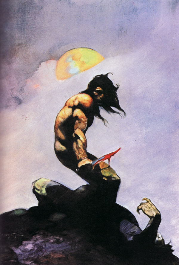
I’ve been wanting to do a Frank Frazetta analysis for quite a while, and finally it’s time. He was amazingly fast and produced many, many paintings. I thought about doing the iconic Death Dealer image, but picked this one instead because of its simplicity. I’ve been trying to learn more about silhouettes and values against a background, and this image makes good use of both concepts.
Values and Contrasts
Here is a black and white version of the picture reduced to 4 grey values in Photoshop.
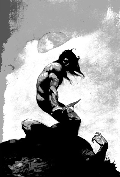
The form is still there and is fully identifiable. The main figure is generally darker than the background, but a few of the edges are light. Along the back in particular the values are pretty close to the background, so we have an edge between two light areas. This version of the picture shows where Frazetta uses light-to-light transitions and where he uses light-to-dark transitions.
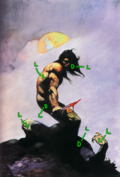
Edges
I tend to want to define every edge in my drawings and find it difficult to choose which ones to lose or de-emphasize. Somehow, Frazetta’s warrior is anchored firmly to the ground despite the fact that we don’t have any definition or form of the lower legs at all. This guy has no feet. Here’s the detail:
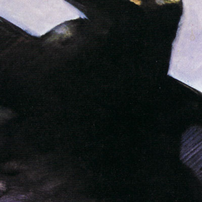
Yet we do have clear edges and contrasts on the upper body:
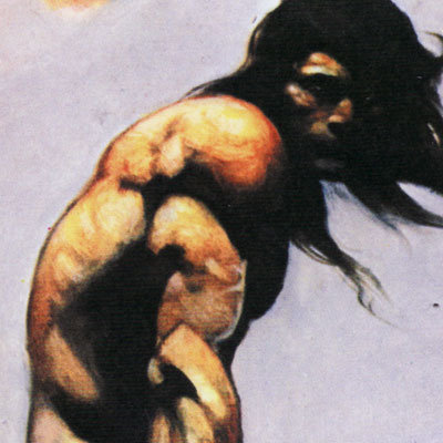
So what effect does the transition from clearly defined edges to no edges have? Perceptually, it pulls us into the image and makes us complete it mentally. We use closure to fill in the bits we don’t see. Of course, all the bits we do see must line up perfectly or the illusion breaks. (See the Magritte analysis for more on this.)
I recently learned the term “lost edges” from this post on reddit. The person there says that low contrast edges help anchor a figure to the background and seem to really be a part of the setting. Perhaps the similar values let the background seem to bleed into and merge with parts of the figure. So, our visual system perceives them as part of a larger unit. Around the figure’s contour we have lost edges at the feet and lower legs. Inside the figure we have plenty of lost edges. For example, check out the right edge of the face and the hair.
The Composition
Frazetta describes how he likes to approach image composition this way:
I want the viewer’s eye to go right where I want it to – then I want it to move around and take in everything else. I want to lead you into the picture, take you directly to a certain point, and send you on from there to find all the neat little things that I’ve done.
This picture has relatively few elements, and it’s easy to pick out the way edges and contrasts line up to suggest paths for the eyes.
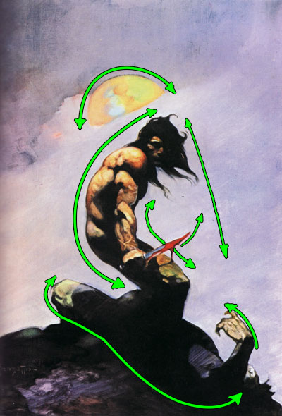
That moon hints at an otherworldly setting, but a large part of its purpose is to frame the warrior and guide us back down to him. It also helps that there is nothing else in the upper corners to grab our attention and spin it on out of the painting.
Like Donato Giancola, Frazetta mentions that he likes to start with very basic shapes, nearly abstract. “When I paint I compose these wonderful shapes that are almost abstract. I’m more concerned with achieving a balance and rhythm than I am with subject matter. Once I’ve achieved that balance I start in on the details.”
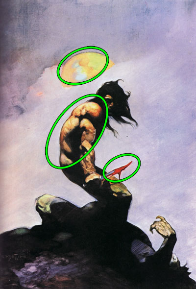
Even though it’s not strictly composition, I’ll throw in a note about the saturation here. Frazetta uses it to reinforce the focus of the painting that he defines with the contrasts and silhouette. The three areas of greatest saturation are the moon, the warrior’s back, and the blood on his knife.
The Figures
Something I noticed while picking a picture to analyze is that so many of Frazetta’s paintings happen to feature a great pose that doesn’t seem to be posed. Pinups, for example, show people in “vogue” positions that aren’t natural but instead are meant to be looked at. I don’t see Frazetta’s figures doing that kind of pose. Nevertheless, they’re always dramatic and often high-energy. Somehow, he get’s that vogue posture but makes it seem like a natural stance or expression.
For some reason, I often mentally compare Boris Vallejo and Frazetta. This is one area where they differ radically in their approach. Many of Vallejo’s paintings are specifically posed. See my analysis of Vallejo’s Snake Women for an example. (NSFW, by the way.)
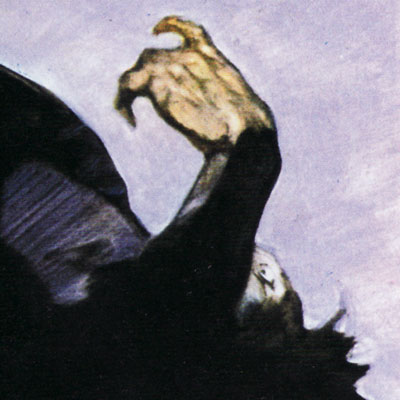
Tanar here (that’s his name) is starting to relax but is still at the ready. We see little of his expression, but his whole posture shows tension, readiness, and relief. The victim’s posture is hard to see, but we can tell enough (closure again) to see pain and death. Here are the basic flow lines of both figures.
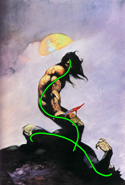
Frazetta gets loose, life-like gestures for his characters (even Mr. Victim). Speaking of the victim, we know nothing about him. He still has character, though, if only through this snippet of expression.
Storytelling
A key decision of any illustration is choosing the moment to illustrate. In the book this scan is from, Frazetta describes his approach to dealing with his often violent subjects:
My paintings have a lot of action but they aren’t especially violent: there’s the suggestion of mayhem without being explicit. … If I wanted to I could paint something so brutal and violent that it would make you sick – I don’t need that.
The point is that if we show the moments just before or after the main action and let our viewer infer what happened, we pull our viewer into the situation. They become an active participant because they’re creating the story too – they’re more engaged and find the picture more engaging.
In this illustration, the only information we really have is:
- Blood dripping from a knife
- Two characters’ postures
- One character’s clothing (or lack thereof) and hairstyle
- The survivor’s body type
- Mr. Victim’s partial facial expression
- The survivor’s partial facial expression
So, it’s not like we’re being given loads of detail here for a carefully constructed scene. Still, from these tidbits we know we’re in a barbarian setting and are viewing the aftermath of what was probably a short, painful fight. We probably don’t want to mess with the survivor, I’d guess that life is cheap to him. You see how already I’m filling in my own details here.
The Elements
To wrap up we’ll go through Lee Moyer’s Elements of a Successful Illustration.
Focus: Frazetta combines high contrast in the figure’s upper body and hair with color saturation to make the warrior the focus.
Composition and Design: There’s a clear silhouette overall, and Frazetta uses both light-to-dark and light-to-light edges to fit the figures into the overall scene. The basic design elements are simple and pleasing as abstract shapes.
Palette: The moon and figure are warm against a cool, desaturated background. The saturated red of the blood ensures that we won’t miss that either.
Value: Values define mass and form, with some edges being clear and crisp while others are less so.
Mass: The shading of the main figure does a great job of defining his overall form and also showing anatomy.
Texture: Check out the moon and sky’s textures, plus the texture of the foreground rocky hill.
Symbolism: I don’t think Frazetta was big on symbolism. Put another way, this picture symbolizes life, death, and the end of a knife fight.
Micro/Macro: Frazetta isn’t one for loads of detail. Still, we see the veins on the warrior’s hands and Mr. Victim’s eye. He worked very fast, though, and as he says, “When I start slashing away from scratch Im having a pretty good time because I’m watching this thing materialize. But when I get to being about 85% done is when things slow down to a crawl. Working on the edges, pulling the whole picture together, can take longer than I like.”
Ornament: This painting isn’t strong on ornament. Maybe the moon, but that’s about it.
Narrative: Tanar has come out on top of what was probably a quick, brutal encounter.
Juxtaposition: Let’s see, there’s survival and death here. From a shapes perspective the moon nicely offsets the main figure.
Stylization: Here’s a quote from Burne Hogarth to his students (from the same book with the scan): “Godammit, you guys quit trying to paint like Frazetta! There can be only one Frazetta and he’s it!”
Character: Whether he’s a badass fighter or an underhanded sneak, this guy isn’t someone to mess with.
Tension: The main tension I see is in Tanar’s figure. He’s won, but he’s still realizing it.
Line: Take a look at the line along Tanar’s back. It’s a light-to-light transition, but Frazetta has put a little bit of darkness along the border. How would the picture be different if he hadn’t?
Research/Reference: Here is a watercolor rough that Frazetta did in preparation for the painting:
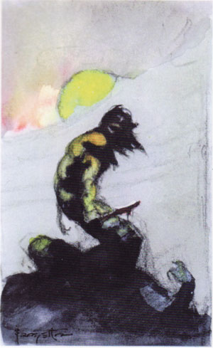
Vignette: This painting has a strong silhouette and feels quite a bit like a vignette save for the filled in background.
Perspective: The moon and background provide some depth. The lighting also provides depth in the way it wraps around the forms.