#23: Prince, by Brian Bolland
Prince, by Brian Bolland, copyright 1991.
This analysis by Scott M. McDaniel, copyright 2010.
The Image
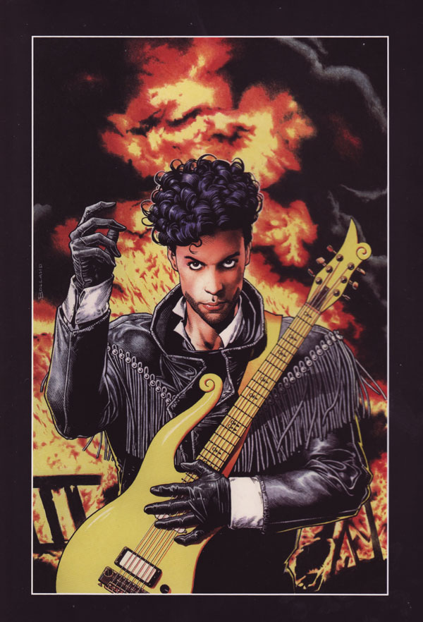
Brian Bolland was one of a wave of artists from the U.K. who crossed the pond and made a name for himself in the American comics industry. He’s best known (to me) for his work on Judge Dredd, creating several iconic characters including Judge Death. I picked up his book The Art of Brian Bolland recently, and of all the great artwork in there this was the piece that jumped out at me. I’m not even a particular fan of Prince’s music, but this is just one cool portrait. It’s in a comic style, but a quite realistic and detailed one compared to most superhero rags. For this analysis I’ll focus on the composition of the portrait, the colors and values, and the linework.
Here’s what Bolland has to say about the painting:
“Andy Helfer commissioned this Prince cover from me in 1991. After it was published the Artist Formerly Known By That Name bought it off me. Paid me quite handsomely for it, too. Andy asked me to do a second one. I started it, but this was one of the occasions in my career when I’d agreed to do something, but when I finally had to put pen to paper I realized I’d rather bite my own head off and eat it. Not because I dislike Prince particularly. I just couldn’t find a grain of enthusiasm for the job. I had to explain myself to Andy and offer my humble apology – and he graciously let me off.”
The Composition
There are several things to look at about the composition, but I’ll start with one of the key parts of any character portrait: the silhouette. Here is a version of the painting that cycles through the original, a silhouette of the figure, and a silhouette of figure and background.

As you can see here, the figure itself is easily identifiable as a guitar player. In fact, if you’re familiar with Prince’s look, you may even be able to identify him just from that. It’s a dramatic pose, but it’s also structured in a specific way to keep our eyes moving around the image. More on that in a second. When we make the dark parts of the background a silhouette too we see that a major function of the explosion and fire is to frame the figure’s silhouette and make it pop out that much more. So we’ve got a good, solid foundation for a portrait.
Now let’s look at the values to see where the areas of highest contrast are.
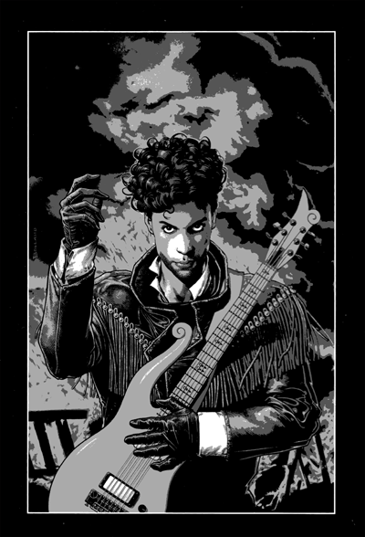
The brightest parts are on Prince’s face – particularly his eyes and cheek – and the cuff of the lower hand. While the cuff has stark contrast, it’s the face that pulls me in to look at first. Even though the contrast isn’t quite as strong as the cuff’s, our brains are just primed to see other human faces, especially ones that are looking right at us.
So let’s look at those eyes. The brow falls on the upper golden section division, and Prince’s head takes up the center column between the vertical golden section divisions.
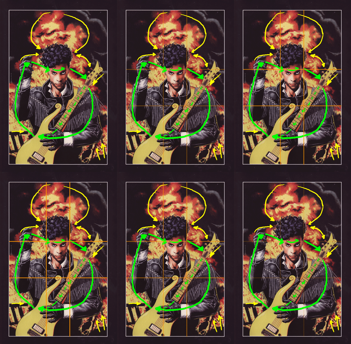
From the eyes, Bolland sets us up in a loop. I went around it clockwise. There’s a dark bit in the explosion just to the right of Prince’s head. It’s contrast pulls the eye over to the guitar’s neck. Now, the neck itself forms a clear line and our eyes may follow it down to the guitar’s body, or we can continue down Prince’s arm to the contrast of the sleeve cuff. We end up at the cuff and Prince’s hand either way.
From the hand it’s a short jump up to Prince’s other elbow and then up to the wrist and hand. That hand is great! The forefinger points us at Prince’s head in general, but the middle finger shoots us straight over to his eyes. To underscore the point, there’s a black streak in the fire that extends from that middle finger right toward the brow, almost as if Prince’s hand was sending out the fire and smoke.
The yellow lines in the picture above show lines and paths that point toward the main figure. So, if our eyes wander too far afield Bolland catches the gaze and gently brings it back in. One other point here – if the dark part of the smoke around the edges is negative space, then we have two dark triangles on either side pointing right at Prince’s hair. It may be easier to see them in the silhouette version of the picture above.
Even though the subject matter is simple – a single person with a backdrop of fire, the portrait’s composition is rock solid: a clear silhouette placed according to the golden section, with multiple lines and patterns that guide our eye around the picture.
The Palette
Let’s take a look at the colors Bolland uses. They form what’s called a tetrad on the color wheel. I took the painting and sampled it down to 32 colors, and then plotted them on the wheel below. The closer in to the center a color is, the darker it is, and the further out the brighter it is. Just like Mort Künstler’s picture of the Hindenburg, which also features explosions and fire, we see right away that most of the colors are dark, not bright.
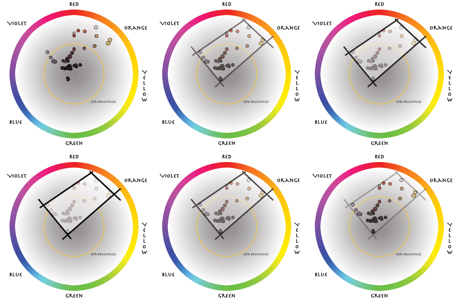
I haven’t shown saturation on the plot, but the colors are generally desaturated. The most saturated one had a value of 68% according to my Photoshop eyedropper tool, and most of them were in the 10% – 25% range. In the Michael Kaluta and Lee Moyer analysis of Starstruck, I showed how all of the colors fit within a triangle on the color wheel. That kind of color scheme is called a triad. When they fit within a rectangle or square it’s called a tetrad. Bolland’s scheme falls between reddish orange and yellowish-orange on the one end and indigo and blue on the other. The colors themselves don’t extend far into the indigo-blue part, though. So, dark desaturated reds and violets account for most of the figure and smoky background while the more saturated oranges dominate the explosion.
Something else relating to color and value that Bolland manipulates is the flatness of the color. Here are two details, one of Prince’s face and one of the end of his guitar neck.
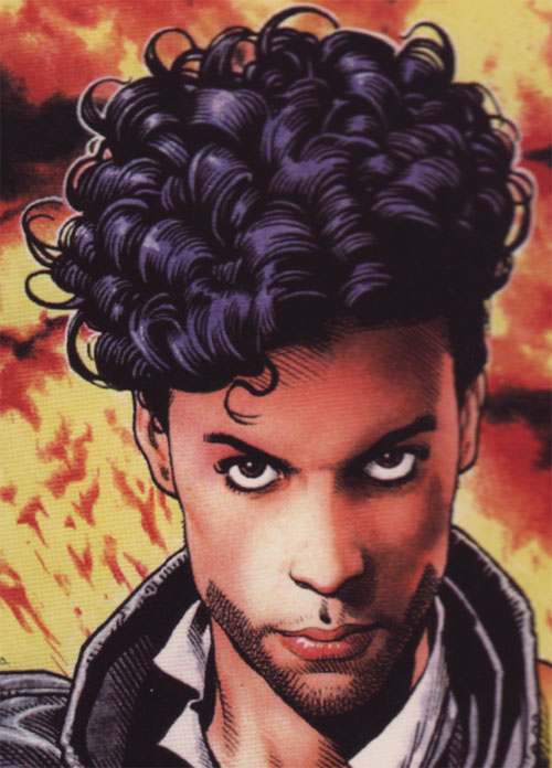
In the detail above, Bolland uses both hue (color) variation and values variation to give Prince’s face a rounded out, 3D feel. On the other hand…
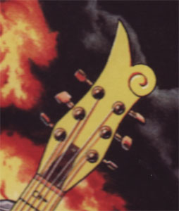
… he uses a flat color on the guitar’s neck. Why the difference? I think the reason is that Prince’s face is the focus – it’s more important for us to spend time looking at the face than the guitar. The guitar is important to Prince’s identity, of course, and how he holds it informs his character. Visually, though, it’s the face that’s important, so elsewhere Bolland dials back both the detail and the color/values variations.
The Line
Let’s take a look at a couple of other detail images. Bolland clearly underplays his linework here, but it underlies and supports the painting like scaffolding. The image would be completely recognizable and look professionally complete without any color at all.
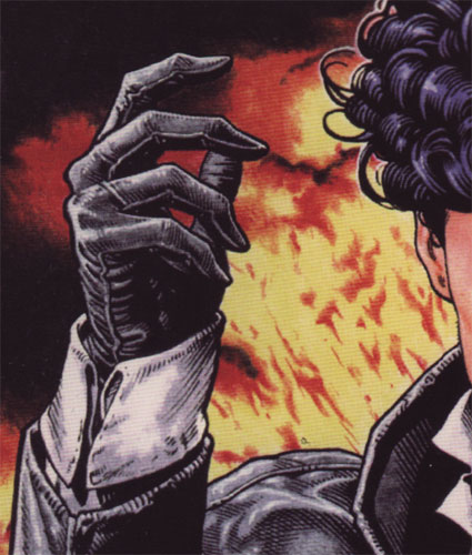
In this detail of Prince’s hand, we can see how the lines not only form outline but also take care of basic shading. The linework contributes to the values in addition to the color. First look at the cuff, sleeve, and glove where it’s next to the flame background. There is a medium weight line there defining the outline. Then, thinner weight lines provide us details like seams on the glove and the outline of the leather jacket’s sleeve end and the cuffs. Finally, Bolland uses feathering and cross hatching to shade the sides of the cuff and the wrinkles in the leather jacket. Of course, Bolland knew he was going to color this so he didn’t do as much shading with lines as he otherwise would have. Still, the inks take care of some basic values that would let us parse the picture even without the color.
Finally, here’s a detail of the fringe along Prince’s jacket. It’s just incredibly detailed work.
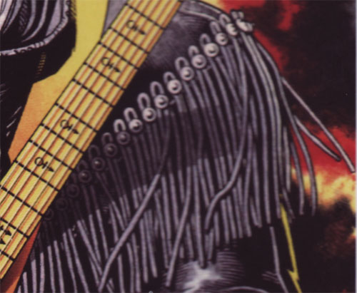
Bolland has done the linework for each strand of the fringe. Just a couple of other things while we’re looking at this one – I like the androgyny symbol on the guitar’s neck. I don’t know if it’s on Prince’s actual guitar or not, but it’s a nice touch. Second, I love how the guitar neck’s shadow wraps around Prince’s jacket. Just that little bit lends mass to both the guitar and Prince’s torso.
The Elements
To wrap up we’ll go through Lee Moyer’s Elements of a Successful Illustration.
Focus: The main focus is Prince’s face and hands. Bolland gives those elements the most detail and de-emphasizes detail and color variation in other places.
Composition and Design: Bolland grounds the composition with a clear silhouette, and then uses contrast to guide our eyes to Prince’s face. From there he sets up a simple loop. He also points at Prince’s head with a couple of big black triangles.
Palette: A tetrad with red and orange on one end and blue and indigo on the other. Did he consciously say, “I’m going to use a tetrad for this painting!” I’d guess no, but that he had a clear idea in his head of what he wanted to do with the color that corresponded to that pattern on the color wheel.
Value: Bolland uses the coloring to handle most of the value definition, but the linework scaffolding is there that uses feathering and cross hatching for the basic definition.
Mass: Some areas of the painting are flat, like the guitar neck. Instead, Bolland uses color and value to establish mass and solidity in the areas of focus. He also uses shadow, like that of the guitar neck across the fringe on the jacket.
Texture: Texture in the painting comes from the flame and smoke, and it also comes from the linework that underlies the painting. See the fringe for example, or the cuff of the raised hand.
Symbolism: The fire and explosion means that Prince is cool and dramatic. The androgyny symbol on the guitar neck reflects Prince’s identity. And in a weird twist I’ll throw out the idea that the guitar itself is more a symbol of a guitar than an actual one.
Micro/Macro: Bolland is very careful with where he chooses to put his detail work. It’s the hands, face, and jacket. Just about everything else is symbolic (like the guitar) or just suggested (like the debris in the fire).
Ornament: Prince’s jacket offers a great deal of finely detailed ornament to look at.
Narrative: Personally, I hope there’s not much actual story going on in this piece. I’d hate to think of an oblivious Prince about to be consumed by the fire he inadvertently set with his coolness.
Juxtaposition: I don’t know if this is what Moyer really means by juxtaposition, but look at the juxtaposition of light and dark as you go down the center of the painting. There is a rhythm there of light-dark-light-dark as you move down. The alternate placement of light and dark isn’t really something that we notice consciously, but it still makes the picture seem organized and coherent.
Stylization: The drawing doesn’t deviate far from realism, but there it does have a bit of caricature to it. The underlying style of pen and ink comic drawing is there what with the thicker outlines, thinner detail lines, and shading styles common to Bolland’s work.
Character: Bolland tells us about Prince’s character through pose and expression, through the guitar and how he holds it, and through clothing. The expression is aggressive – he’s looking straight at us. The pose is dramatic, but not particularly aggressive. Androgyny is part of Prince’s public persona, and there’s a nod to that in the hair and clothing style as well as the symbol on the guitar.
Tension: There’s not narrative tension, but there’s clearly dramatic tension. What are we to do with this intense gaze? And hey, explosions are always good.
Line: I need to mix up the order of these things from time to time. I’ve already commented on line in the main part above as well as in the stylization section. So instead I’ll say this: go look at Brian Bolland’s other work, particularly the black and white comic work. He’s got it all when it comes to line.
Research/Reference: Maybe it’s personal limitation, but I don’t see how you do a portrait like this without at least reference of the person’s face. There’s no indication in the book, though, of how much or how little reference Bolland used.
Vignette: Vignette is key to a portrait like this, and Bolland makes the silhouette and pose the foundation of the painting.
Perspective: There are really only two layers of depth here: Prince and the background explosion.
All right, that’s it for this go-round. Next up is something new for me – a venture into the abstract with Android Jones’ gorgeous Mind Machine. See you then.
Edit: Brian sent this comment along and permission to post it. I think it’s often the case that artists internalize many of these principles and don’t consciously think about them while they’re working. Here’s what he had to say:
Thanks for that Scott. I wasn’t thinking consciously about any of those things while I was doing it. Possibly subconsciously. The Golden Section is something I’ve never studied so I only vaguely know about. Something either looks right to me or it doesn’t. I’ve never heard of a “tetrad”. I have a very unsophisticated philosophy when it comes to color. Saturated colors contrast with desaturated ones. I usually reserve the bright colors for the foreground details because they ping out whereas muted colors fall back. Complimentary colors contrast with each other. I’ll sometimes leave one primary color out altogether but use it in a small place designed to draw the viewer’s eye to that detail. You’re right about Prince’s face being more modeled than some of the flatter areas because it’s the part that’s supposed to attract your attention. But then again, maybe I just lost interest in the outer extremities of the picture – or I ran out of time. You also have to remember I worked from photographic reference on the face. Even the fire was swiped from a photo. So the light and dark shapes in the latter that lead your eye round the picture are purely accidental. Happy accidents occur. The placing of the hands and the guitar are all mine and, yes, there are lines of thrust that lead your eye round the picture.
Really interesting analysis – thank you! I have this comic book (and Prince’s other one as well) and never spent so much time analyzing the cover. I really enjoyed reading your commentary!
P.S. – Prince does indeed have his love symbol on the necks of several of his guitars. Bolland got a lot of great detail!
Thanks. Now it falls into place – I knew that the glyph was called Love Symbol #2 but hadn’t figured out what the first one was. Now I know. 🙂
[…] Piper-ass twin doing battle with magic guitars and superpowers in between bangin’ hoes. (And: yes. That is a Brian “The Killing Joke” Bolland […]