#39: Flights of Fancy by James Gurney
Flights of Fancy by James Gurney, copyright 1996.
From Color and Light: A Guide for the Realist Painter, p. 181.
This analysis copyright Scott M. McDaniel, 2011
The Image
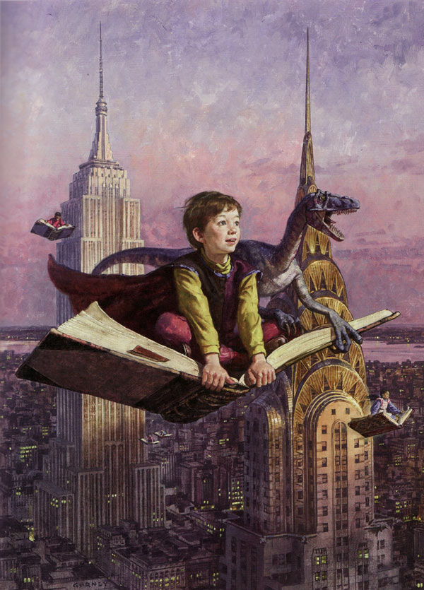
Before I say anything else, if you’re an artist you should go buy both of James Gurney’s books about painting. If you like the approach this blog takes to analyzing paintings, you’ll love Gurney’s approach in these books. The one this painting is from is Color and Light: A Guide for the Realist Painter, and his first one is Imaginative Realism: How to Paint What Doesn’t Exist. (As a former technical writer I also like the presentation – each topic is a 2-page spread with a summary up-front, clear text, and a number of illustrations.) OK, plug over, but they’ve both helped me out tremendously.
This analysis is all about contrast. Not just contrast between values, but all sorts of contrast. If you want to create a focus – an area of interest – you need to set up some sort of pattern and then selectively break it. The contrast between the rest of the pattern and the special part draws the attention. That contrast can be values, but in this painting we’ll also look at contrast in lines of direction, saturation, and hue. In his book, Gurney uses this painting to illustrate several points about lighting conditions at dawn or dusk. The first thing that jumped out at me, though, was contrast in the direction of the edges.
The Lines of Direction
This graphic cycles among three views – one that accents the horizontal and vertical edges, one that accents the diagonal edges, and one that accents curved edges.
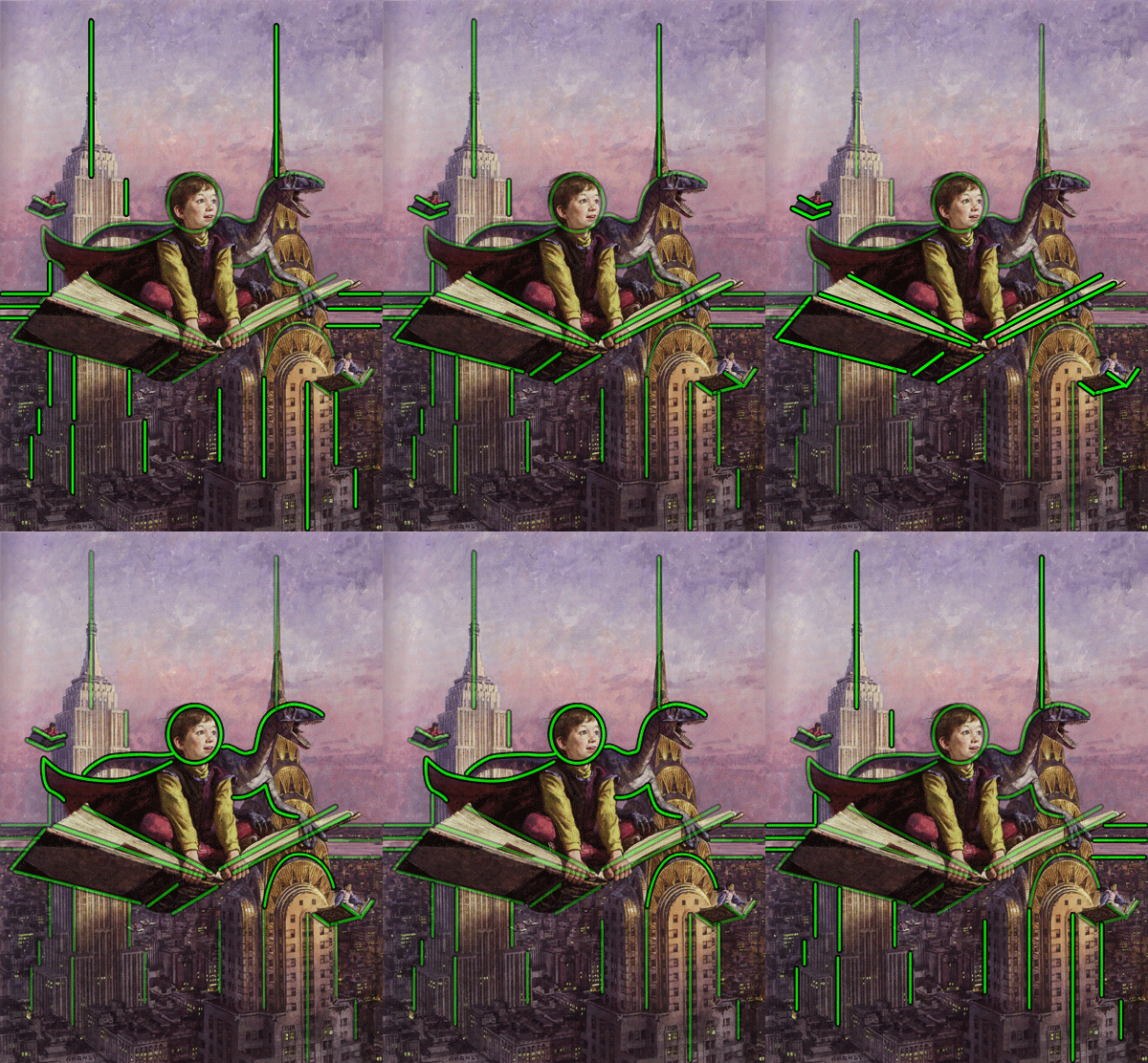
The edges of the background elements – the horizon, the buildings, and the city below are almost all either horizontal or vertical. We see them especially in the area of city-scape texture at the bottom of the painting. While there are diagonal edges there for perspective, they have little brightness contrast so they don’t jump out. So these horizontal and vertical edges form the background pattern that Gurney sets up. The only noticeable deviation from this pattern is at the focal point. The flying books have diagonal lines at the bases and the pages. Even the prominent curves of the Chrysler Building are right next to the large flying book. (Donato Gianola’s The Archer of the Rose uses a similar directional strategy. In that case most of the lines are diagonal from upper left to lower right, with the archer at the focus breaking the pattern.)
The Values and Edges
Let’s go back to the usual meaning of contrast – brighter against darker edges. If we look at it from the viewpoint of setting up a pattern and then selectively breaking it, we’d expect to see an overall value level to the painting with the focus having areas significantly brighter and darker than the rest. Or perhaps there would be an overall pattern to the values and the area of focus breaks that pattern. Take a look at the greyscale version of the painting below.
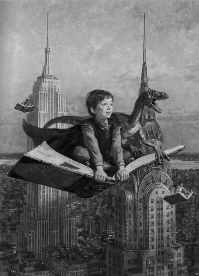
Overall we have a brighter top part of the painting and a darker lower part. The city below has fallen into shadow, while the sky has the golden light Gurney used the painting to illustrate in the book. It’s basic, but the upper part being bright and the lower part dark sets up a basic, large-scale pattern for the picture. The posterized version below shows 4 levels and brings out the focal figure’s contrast even more.
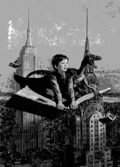
Gurney puts the boy, book, and dinosaur at the division between the two areas. Further, he inverts the brightness. The book’s pages are bright and contrast with the dark area below, while most of the boy’s outfit is dark and contrasts against the brighter area above. The light source is to our right and in front of the picture plane a bit. In other words, the sun shines most obviously on the boy’s face. While it’s not so much breaking a pattern, the boy’s face is part of the focus simply because we’re attuned to faces.
The Saturation
Conventional wisdom has it that we should hold back on the intense colors and instead put the highest color saturation at the focus. Put another way, we should set up a pattern of desaturated colors and then selectively break it by putting the highly intense colors where we want people to look. This line of thinking suggests that it would also be effective to have intense color over most of the picture and then desaturate the focal area. I’m not completely sure about this approach, but it might be fun to play with. James Jean’s The Last Castle uses this approach to an extent, though there’s certainly more going on than just saturation.
The image below is a saturation map of Flights of Fancy. The dark areas are desaturated – close to grey in the original image. Lighter areas are saturated – they have more intense color. (This post at the CG Society forms shows how to do this in Photoshop.)
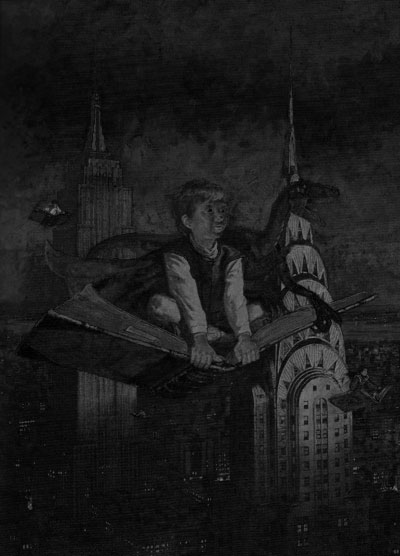
The first thing I see is just how desaturated the picture really is. According to my Photoshop eyedropper, the city in shadow is rarely over 20% saturated. Even the dots of light coming from windows aren’t more than 30%. The sky areas tend to be in the 5 – 30% saturated range, more saturated closer to the horizon. The two areas that stand out as the most saturated are the boy’s sleeves and the Chrysler building. The sleeves are part of the focus and the Chrysler building is right next to the area of focus. Even the sleeves though, are only about 50% saturated. I did find one place that was about 75% saturated: the boy’s left knee (our right).
The Color
That is, the hue, since we just covered saturation. In Color and Light: A Guide for the Realist Painter, Gurney discusses gamut masks. The gamut is the portion of the color wheel from which we draw the colors in a painting. The mask part is a tool – a reminder for us not to pick colors outside our color scheme. For Flights of Fancy, I’ve reverse-engineered the gamut by reducing the painting to 16 colors and plotting them (by eye) on a “Yrmby” color wheel. (This version of it shows darker colors toward the center and brighter ones toward the outside. It doesn’t represent saturation.) Gurney is far more rigorous in his book than I am here, but we can still easily see what’s going on.
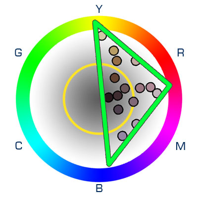
Apropos to the time of day in the painting (and Gurney’s point in the book), the colors are generally warm and include yellows, reds, and magentas. There are no greens and cyans at all. Gurney uses blue sparingly, as an accent color in the boy’s sleeve/collar trim, the dinosaur, and the clothing of one of the distant figures. To my eye the city in shadow is cooler than the sky above, making for a nice color temperature contrast to reinforce the value contrast. There’s other neat stuff going on as well, such as the blues benefiting from successive contrast, which you can read more about in Color and Light.
By the way, an accent color only really works if you’ve set up a general color pattern using other colors and then judiciously introduce the accent to break the pattern.
A Few Details
In this analysis I’ve concentrated on patterns of different stripes (so to speak), but there are a few things I really like about this painting that have little to do with patterns. The first goes to the painting’s purpose as a poster for book festival in New York. The boy’s posture and expression completely sell the wonder and joy of a good book. The painting could be composed flawlessly using all these other techniques I’ve been talking about, but without nailing that subtle character aspect the whole thing wouldn’t fly. Take a look at that expression – I love seeing expressions like that in fantasy illustrations.
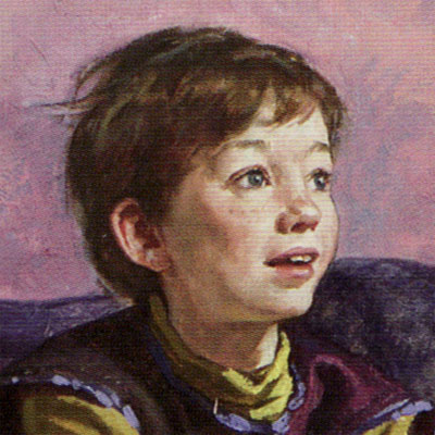
On a different topic, here is a detail of the cityscape that’s in shadow. I find architecture intimidating, especially when it verges on texture like this (something that only more practice will solve.)

I notice some parts of it being impressionistic while other parts are a little more clear. Even the impressionistic parts follow consistent perspective. I also see that the windows aren’t just dots of uniform yellow color, but that they vary within each window giving the illusion of depth into the buildings.
The Elements
To wrap up we’ll go through Lee Moyer’s Elements of a Successful Illustration.
Focus: The clear focus of the painting is the boy, the flying book, and the dinosaur.
Composition and Design: The composition works based on a lot of factors, including values, hue, saturation, and directions of the edges. I particularly like how the figure’s values are bright on the bottom and darker toward the top – opposite the approach to the background.
Palette: The painting’s gamut fits that of twilight, and we see from the gamut that it is almost entirely yellows, reds, and magentas with a few blue accents.
Value: The boy’s face is one of the brightest spots in the painting. The upper part is brighter than the lower part, which is in shadow.
Mass: Values also convey the impression of weight and solidity to the boy, book, and dinosaur. Another part of the illusion is the way Gurney fades out the crispness of many edges. Because the edge of the boy’s knee against the cloak disappears as you move down, for example, we don’t get an impression of a cutout figure slapped onto cloak background.
Texture: The texture in the sky is neat. It suggests clouds without actually showing them explicitly.
Symbolism: The flight metaphor is quite strong in this one. I think that’s especially appropriate if your audience is children.
Micro/Macro: The cityscape is a great example of conveying a detailed impression without actually providing the details. Gurney saves the detail work for the objects of focus – another example of a pattern selectively broken.
Ornament: I like how Gurney’s signature is worked into the cityscape.
Narrative: We’re left to infer how this scene came about. For some reason I’m reminded of David Wiesner’s frogs in his book Tuesday.
Juxtaposition: If you’re familiar with Gurney’s Dinotopia, the dinosaur on the book won’t surprise you.
Stylization: This painting is a good example of Gurney’s approach to realistic fantasy. I prefer this realistic style because it lets us focus on the fantastic part of the image – the wonder and the awe.
Character: We know little about the boy, but his posture, expression, and clothing combine to tell us a lot about him in this moment. I think the clothing is more about how he sees himself, even though he’s lost to the experience of flying otherwise.
Tension: This painting isn’t about tension or suspense. I suppose there’s the possibility that the boy will devour the dinosaur after a vicious struggle…
Line: Edge directions help point our attention to the focal points, and the selective blurring of edges helps to create depth and a feeling that the figures are a natural part of the background scene.
Research/Reference: Gurney describes his preparation and research techniques in his first book, Imaginative Realism. Sometimes it may seem like a lot of work and setup, but you can’t argue with the paintings. One thing I’ve been learning about illustration over the last four years is that good research and reference matters just as much or more to the finished work than outright drawing/painting skill.
Vignette: The two main characters of the painting – the boy and the dinosaur – are clear and stand out well. While a silhouette of the two of them may be difficult to decipher, we do clearly see the boy’s head, arms, and hands. Closure fills in the rest, so we have no trouble seeing him. See the Magritte and Leyendecker analyses for more on closure.
Perspective: Gurney uses traditional perspective aids like vanishing points, an obvious horizon, relative size, and occlusion to convey depth.
That’s it for this round. I’m thinking of one of the wonderful landscapes in Osamu Tezuka’s Buddha series for the next one, but who knows at this point.
[…] when I checked his site Gurney had a link to Scott McDaniel’s blog, Ideas Made of Light. McDaniel calls himself “. . . someone who is looking at what other artists have done so I […]