#2: The Last Castle, by James Jean
The Last Castle
By James Jean, Copyright DC/Vertigo
This analysis copyright 2009, Scott M. McDaniel
The Image
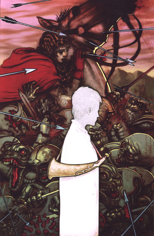
This is the cover for the issue of Fables titled “The Last Castle,” a prestige issue that tells the story of Boy Blue’s last stand against the forces of the Adversary as the fables were driven out of the Homelands. Fables is a great comic that uses characters from classic fairy tales. Shown here are Boy Blue (grown up from the Little Boy Blue nursery rhyme) and Red Riding Hood on the horse. The goblins are the army of the Adversary.
I picked this image partly because it’s a nice example of a conceptual illustration. It’s not showing just one specific scene but rather combines three scenes to give an overall sense of story. That’s a technique I’d like to work on and improve.
Storytelling and Layers of Reality
I see three main layers to this image. The first is Boy Blue. He’s depicted as calm in the face of battle – a center of sanity in the midst of chaos. It’s reinforced by his reflective posture. The other elements in this layer are the arrows that are flying all around him. One even seems like it’s about to strike him, but I doubt it will. There’s little indication of depth in this layer, so I suspect the arrow will pass in front of him or behind him. The other cool thing about this first layer is the graphic nature of it. The arrows and Boy Blue himself have a thick outline and little detail. Even Boy Blue’s horn has very little detail compared to the rest of the image. More on that in a bit, but in looking at Jean’s other covers it’s obvious that he likes to mix icons and symbols in with realistic painting. That contrast between graphic/symbolic and the realistic elements is an important part of his style for these covers.
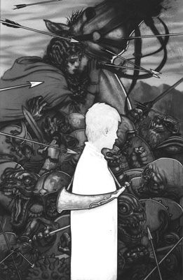
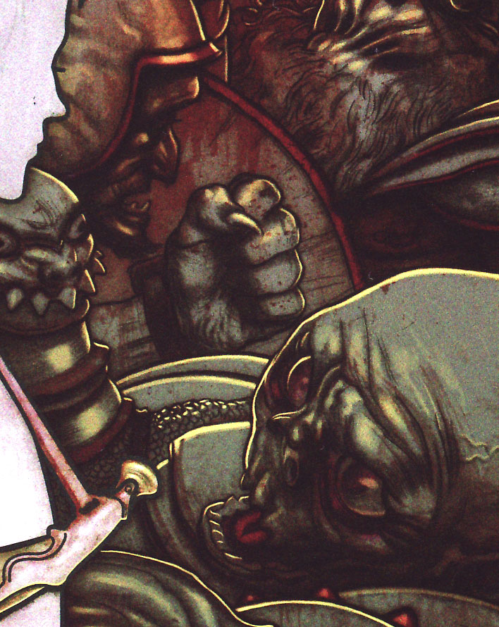
The second layer, depth-wise, is the host of goblins. This looks to be in the midst of battle – there’s confusion everywhere. Helmets, swords, claws, teeth, and armor. There’s lots of detail here, but Boy Blue obviously isn’t literally standing in their midst. Unlike Boy Blue, there are no strong outlines and there is a lot more detail. The colors are mainly greys and greens with red highlights. Look at the grayscale version – you’ll see that the goblins are fairly dark overall. So their layer is dark and desaturated with lots of detail.
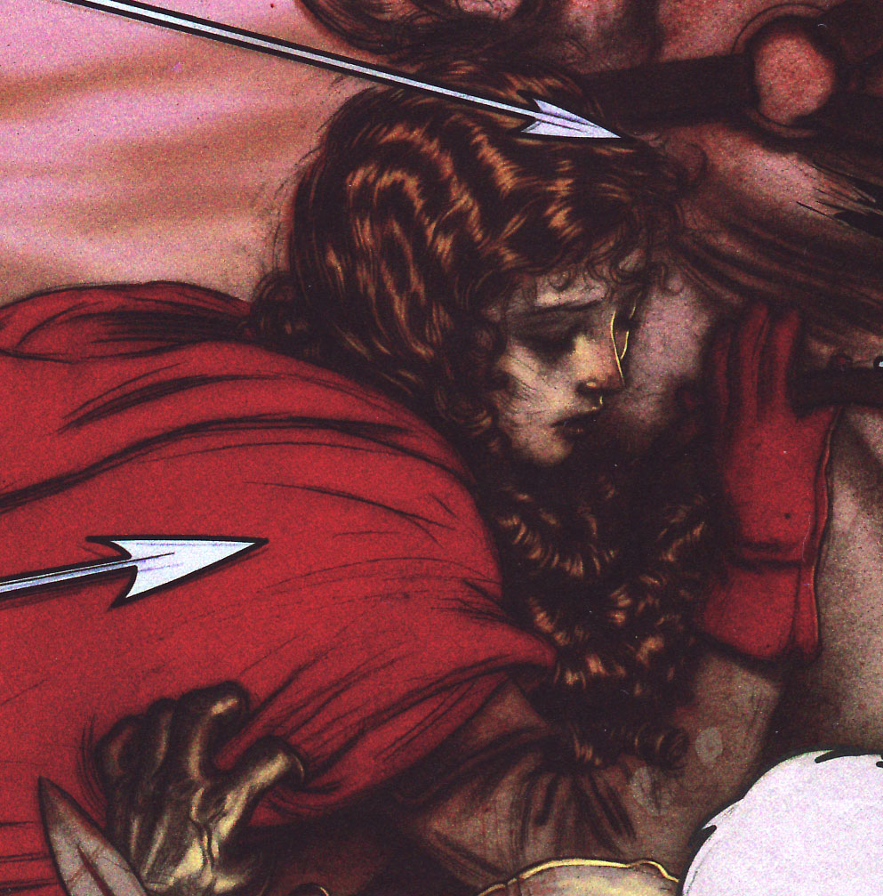
Finally there’s the third layer with Red Riding Hood and the background. These are warm colors, mainly reds and browns. I went back and forth on whether the goblins and Red Riding Hood were part of the same scene and decided they weren’t. That horse and those goblins don’t share the same ground, based on their sizes. Arguably they have different lighting, too, with Red’s light source being to the right based on the horse’s highlights while the goblins’ light source is above and to the front.
Just for added fun, the layers interact with each other just a little bit. In the lower right, one of the graphical arrows has embedded itself in a more realistic looking morning star from one of the goblins. There’s a goblin hand clutching at Red Riding Hood’s cloak. And the right side of the horse’s neck and face has a heavy outline reminiscent of Boy Blue’s. These things are conscious and purposeful – they serve to tie the whole image together even while depicting three different scenes from the story.
Contrast and Guiding the Eye
In the last analysis of Doré’s illustration from Dante’s Divine Comedy, just about everything in the image guided the eye right to its focal point. Those techniques are present here but aren’t as frequent. Instead Jean uses contrast to make Boy Blue pop out of the image at us. Look back up at the grayscale version and you’ll see how bright he is compared to the dark goblin background. The outline around him only increases the contrast.
Jean uses another type of contrast, too. Typically in an illustration you put the highest level of detail on the focal point. That reinforces the brightness contrast. Here, though, Jean purposefully reverses it. All of the detail is in the goblin layer, and there is so much of it that it forms a texture of sorts. The lack of texture in Boy Blue and his horn draws our attention to him. Here’s a detail image showing some of the detail in the goblin hoard. You can also see Boy Blue’s lack of detail.
While I do think the brightness contrast and the details contrast is mainly responsible for guiding your eye to Boy Blue, there are other elements that help. To start with, there’s that big arrow pointing right at him from the left side. Whether it hits him or not, it makes our eyes hit him. Another arrow points up at him from the lower right. Red Riding Hood’s lower arm goes right to Boy Blue’s head, as does her glove. Her eyes are directed down in his direction, and there is also a goblin on the right side looking in his direction.
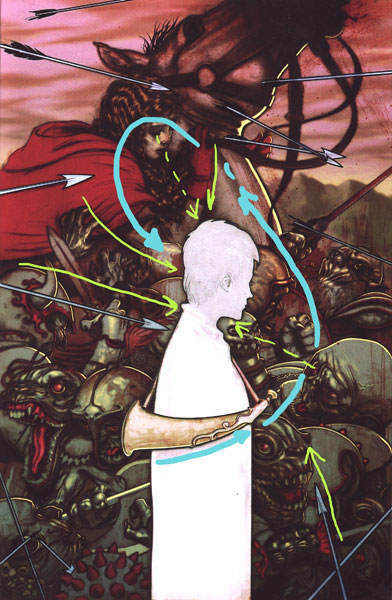
Now that my eyes are on Boy Blue, what next? The blue arrows show how my eye follows the image. The horn takes me over to the goblin looking back at him and then a shield that’s just behind the goblin. My eyes continue up the horse’s neck to Red Riding Hood, then back down her arms to Boy Blue. Only as they take time to wander the image do I start picking out other details like individual pieces of goblin armor or the mountains in the background.
The Elements
I wrap up each of these analyses with a quick run through Lee Moyer’s excellent essay on the elements of a successful illustration. See The Elements, copyright Lee Moyer.
Focus: Through both contrast and eye guidance, the focus is first Boy Blue and then Red Riding Hood.
Composition and Design: Jean plays different layers here to have Boy Blue be centrally framed by goblins and Red Riding Hood. He also mixes graphical elements (Boy Blue and arrows) with realistic ones (Goblins, Red Riding, Hood).
Palette: The goblins are dark and greenish while Red Riding Hood is browns and reds. Boy Blue is not, in fact, white but rather a very pale blue. The colors unify their respective layers and also work well together.
Values: Jean uses values to separate the three layers and, specifically, call out Boy Blue.
Mass: He makes Boy Blue and the arrows flat on purpose. The goblins and Red Riding Hood, though get their sense of mass through lighting and the fact that the details wrap around forms well (ornamentation on helmets, for example).
Texture: I mentioned the mass of detail in the goblins forming a kind of texture. Objects have their texture of course, but I also thought I’d mention areas of dry brush and spattered red paint that suggest flying blood in the battle without depicting it literally. Look just below the horse’s reins.
Symbolism: Given that it’s a cover for Fables, there is certainly the symbolism of Boy Blue and Red Riding Hood. The goblins recall standard fantasy monsters.
Micro/Macro: This element is about getting just the right details in that give the illusion of full details everywhere. This is fun to look at since Jean is specifically playing with details and texture. I think I’ll point out the little bit of hair and the ear on Boy Blue – they keep him from being completely flat. He doesn’t read as a silhouette because of them.
Ornament: Compare the ornament on Boy Blue’s horn with all the ornament on the goblin’s armor. The arrows also serve as a kind of ornament.
Narrative: I’ve read the comic so I know how the image here relates to the story overall. Without that, though, you still understand that a woman is in peril and (possibly) fleeing hordes of monsters. Boy Blue’s posture and demeanor show that he is calm, reflective, and level-headed in the face of this battle. Still, he probably doesn’t expect to survive it.
Line: Jean uses line as a design element to separate Boy Blue into his own layer in the image. It ties the horse to Boy Blue, and it appears occasionally in the more realistic portions of the painting.
Research/Reference: I got this from the book of Fables covers. There you can see two of his preparatory drawings – he had the composition in place from the start. I don’t know what other prep or reference he used.
Vignette: The shape of Boy Blue against the background of goblins is the key part of this image and one of the reasons it captured my attention.
Perspective: There is no vanishing point, and the three layers don’t even share a common horizon. Instead the sense of depth comes from the way objects overlap each other and from the coloring. There’s a bit of atmospheric perspective with the background mountains.
Fun: For me part of the fun is analyzing the picture and looking at the ways the various layers interact. The fact that he uses detail to define the background texture, for example, shows someone who is playing with the form and enjoying his work.
Next week I’ll pull something from Deviant Art. Any suggestions?