#4: Couple Descending Staircase, by J.C. Leyendecker
Arrow Collar Ad
by J. C. Leyendecker, 1932, Oil on canvas
from the book J.C. Leyendecker by Laurence S. Cutler and Judy Goffman Cutler
The Image
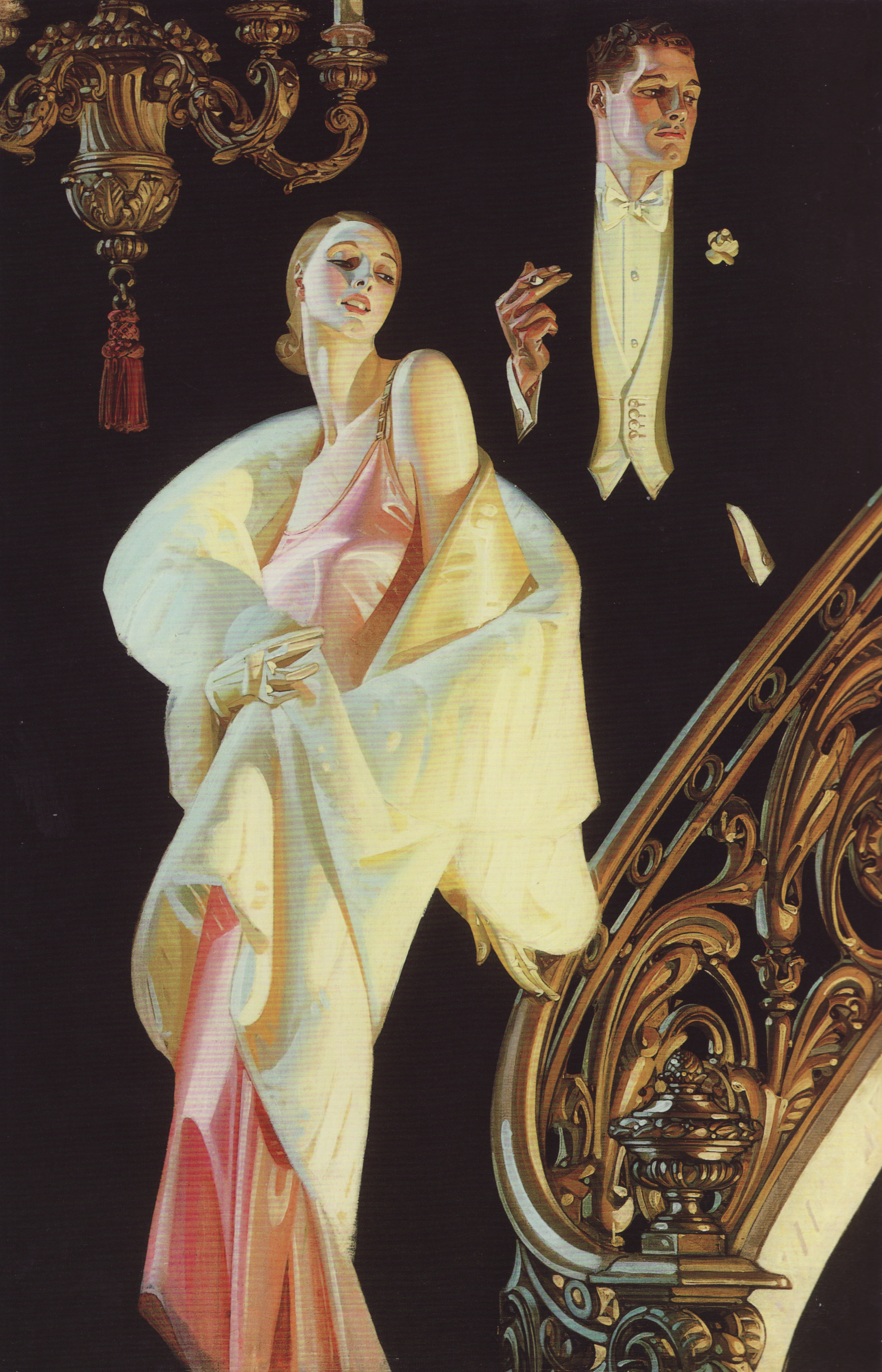
J. C. Leyendecker is one of the key players in modern advertising, though few have heard his name. Working with Cluett, Peabody, and Company (the makers of Arrow collars), Leyendecker proposed not just one ad, but an entire campaign. He helped them work out the look and feel of the “Arrow man” and demonstrated the power of branding. This image is one of the Arrow collar ads, and it shows an emphasis not on the shirt or collar itself, but instead on an ideal. The ideal is that of the upper-class American man, at the same time masculine and refined.
Ideals are abstract, though. Let’s look at how he constructs this image to communicate that ideal.
Composition
Since part of the ideal Leyendecker wanted to communicate was strength and elegance, he starts off with a strong, elegant composition. It’s simple and immediately obvious:
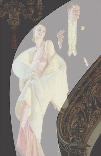
In all three of the previous analyses I’ve drawn arrows showing how background elements guide your eye to the central focus. But here, there is no background. The closest thing I see to that is the tassel that leads the eye down to the woman. Rather than many different things pointing to her and, secondarily to him, the technique that brings our eye to the right place is the curve in the picture above. It’s a frame of gold against black that puts the couple squarely in the spotlight.
The lady is the main focus of the picture. She is the brightest element of it and is in high contrast against the black background. Once we look at her, though, we follow the curve back up to the man. The tilt of her head and her shoulder lead our eye back up to his hand. (Doesn’t he know those things’ll kill you?) Also note that he is above her in the picture, making him the more powerful of the two. That fits with the image that Leyendecker is portraying.
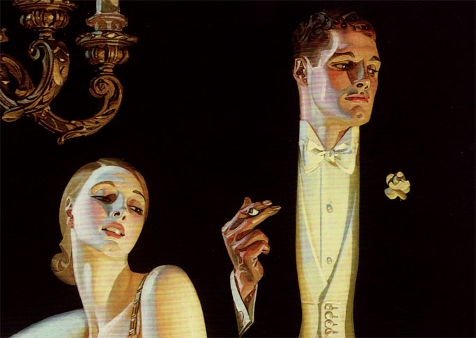
(Note: My scanner introduced some artifacts here – those red bands. I’ll see if I can get a better scan and replace it.)
What keeps our eye on him is the fact that he’s not all there. We can obviously see that, but we still perceive a complete person. Once we’ve come to terms with the fact that he’s a complete person who’s been hacked to bits, we achieve closure.
Closure
Back in the day (my day, at least) I majored in Psychology, and perception in particular. The Gestalt psychologists introduced the idea of closure. Basically, if we have incomplete visual information, our brains try to fill in the missing parts. You’ve probably all seen diagrams like these:

(Source: http://commons.wikimedia.org/wiki/File:Reification.jpg)
In A, of course, there is no triangle. Just three black Pac Men. In C there is no morning star, and so on. So, if things line up we go ahead and fill in the background details. This is why we see a monster creeping behind a tree as a single object behind the tree rather than two pieces of a monster bisected by the tree.
In this image, Leyendecker uses closure to make us perceive the man, even though he’s really just a few separate pieces. At first glance, I might be tempted to think, “Oh cool! Less work!” I’d be wrong, of course. You need to draw the complete person to be sure everything lines up right. Let’s look at what happens if Leyendecker were to have been lazy and gotten the various parts off by just a bit:
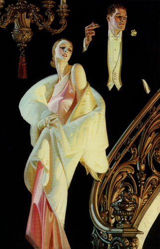
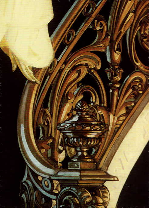
The fact that he’s playing with closure adds a neat visual element to the picture. It’s so obvious that we realize he’s doing it and get some pleasure from figuring out the trick. He’s using it another way, though, and that’s the staircase. Wait, what staircase? There is no staircase in this image, just as there is no background wall or ceiling. All we see is the railing, but that plus the couple’s relative positions is enough to make us instantly understand that they’re slowly descending the stairs, surveying their domain. Here is a detail showing us the only real clue that they’re on the staircase.
For more on how closure works in comics and images, see Scott McCloud’s book Understanding Comics.
The trick with using closure is knowing what to leave out and what to include. In this case Leyendecker has stripped it down to a bare minimum. They’re very compelling parts, though – simple, elegant, and undeniable. Just like the Arrow brand.
Colors and Lighting
Actually, I’m going to keep going on the closure thing for a second. That chandelier – what’s it doing there? Well, it helps fill in the setting, of course. It’s another piece of information to tell us about the opulence on display. Compositionally it frames the couple and balances the stair railing. Logically, though, how often is a chandelier placed in a curved stairwell? And something else – it doesn’t seem to be giving off any light. The lighting on the couple is coming from the left and right, not above. So the reason for the chandelier is purely for compositional balance and for closure. For some reason, I like that.
I often hear that it’s not good to use black in an image because it tends to flatten them out. It’s hard to tell without the actual painting in front of me, but based on the scan from the book I believe that the black here is in fact a very dark red – almost black but not quite.
Like I said earlier, I see a strong light source to the left and a little behind the couple. That accounts for the facial highlights along the man’s temple and cheeks and for the side of the woman’s head. That light source seems to be bright, white, and at a mid-range. There’s another light source to the right. This one seems to me to be yellow and further away. We don’t see any highlights from it, but look at her shoulder and wrap in particular. The shadows just to the left of their noses show where neither of the light sources reached.
The colors themselves are warm. Compared to the black background they really come forward. In fact, the only real color that’s not orange, gold, or yellow is the pink dress. To me the color scheme indicates warmth, comfort, and opulence, and that fits right in with the Arrow brand that Leyendecker is communicating.
The Elements
All right, time once again to go through Lee Moyer’s Elements of a Successful illustration. Here we go:
Focus: The focus is first the woman and then the man. Leyendecker accomplishes this by framing them with the staircase and chandelier. The lack of background keeps us from getting distracted.
Composition and Design: The composition is smooth and simple, a strong arc of black set against the gold staircase and chandelier.
Palette: Warm. The colors suggest comfort and elegance.
Values: The woman is the brightest object, and her contrast with the background makes us look at her first. The sharp contrast between the white portions of the man’s outfit and the black background make him easy to identify using closure.
Mass: Two light sources define the forms. Looking at the detail of their faces shows how Leyendecker identified planes, lit, and colored them to give solidity.
Texture: From the detail showing the bottom of the stair railing, look at the highlight on the railing. It’s a smooth arc. In fact, you don’t see fine detail anywhere on that railing. The smooth simplicity creates a texture and look for the painting that carries through to Leyendecker’s other works as well.
Symbolism: As an advertisement, this image doesn’t call on ancient myths or common literary devices. Remember, though, that it was painted soon after the Great Depression started. The entire purpose of the piece is to evoke a mythic version of upper crust America. It recalls the carefree spirit of the 1920s, but with more reserve.
Micro/Macro: This piece uses closure several ways. For each of them, Leyendecker had to select just the right things to show and the right things to leave out. The railing, for example, is such a strong indicator of the stairs that we forget to notice that stairs aren’t there at first.
Ornament: Look at all the ornament in the chandelier and the railing. It’s not photorealistic in its level of detail, but it calls forth the opulence required by the picture.
Narrative: This piece isn’t so much about the story as it is about the mood. Still, I have a story in my head that these two are descending a staircase to a ballroom filled with other socialites and the upper crust of society. They’re probably the hosts. Their postures and expressions are the main thing that communicate this to me.
Line: I don’t see specific lines around the figures, but there is a clear Art Nouveau influence in the image. The lines of contrast are simple arcs – the stair railing, her wrap, her shoulder, and so on.
Research/Reference: Leyendecker used live models almost exclusively, unlike Rockwell and Parrish who often worked from photographs. The models for this image were Phyllis Frederick and Brian Donlevy.
Vignette: The elegance of the couple is clearly visible, and the vignette is largely responsible for that.
Perspective: Perspective isn’t a strong component of this picture. I find the placement of the chandelier odd, but it makes sense from a compositional and storytelling point of view.
Fun: Much of the fun of this image is the way Leyendecker used the black background and the black tuxedo. This visual game keeps us engaged with the picture longer than we otherwise would be.
That’s it for this time. Up next, something by J.H. Williams III.