#36: The Archer of the Rose by Donato Giancola
The Archer of the Rose, by Donato Giancola.
Copyright 2008, Donato Giancola.
This scan from Spectrum 16.
This analysis copyright 2010 by Scott M. McDaniel.
The Image
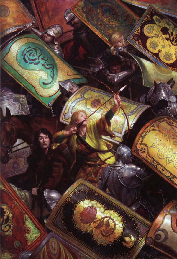
As I recently said on Facebook, “How have I not been aware of Donato Giancola before now?” This one stopped me as I was going through Spectrum 16, and I’ve kept coming back to it. The Archer of the Rose is the cover for Kathleen Bryan’s The Last Paladin by Tor books. We’ll look at the picture’s development and its use as a cover. Giancola likes to start with strong abstract compositions as the base and then work toward strong realism. We’ll look at the abstract patterns he uses and how they guide the eye, and we’ll also look at some of his finely detailed rendering. Finally, we’ll look at the thought and research that went into the narrative and characterization. For example, Persian manuscript covers inspired the patterns on the shields, yet the armor styles are more western European. What does this tell us about the events in the scene, and how does it contribute to mood and theme?
Time for a different format. Normally I wrap up with Lee Moyer’s Elements of a Successful Illustration. This time I’ll use them all the way through.
Focus
The focus of the painting is the archer, her bow, and the arrow. The person behind the archer, looking up at her and her target, is a secondary focus. While these two are the visual focus of the painting, I’d say the narrative focus is the archer and her target. We only have half the story here, and we’re left to speculate on the rest – to fill in the target ourselves.
Giancola uses contrast and color saturation to attract our eyes to the archer. See that glint on the shield right behind the archer and how her dark forearm stands out against it? Then there’s the bright arrowhead against the dark background. These techniques make that area of the painting jump out at us.
Composition and Design
Let’s look at the basic, abstract construction of the picture. It sets up movement, and it also reinforces the archer as the focus.
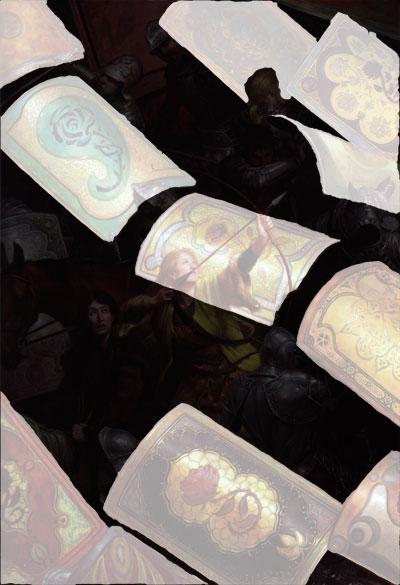
The shapes of the shields dominate the picture. Though they look realistic and have weight and mass, their basic shapes form an interesting pattern in the abstract – a set of diagonal blocks that give the picture an overall grain of upper left to lower right.
One of the ways that Giancola draws attention to the archer is by having her and the person behind her break that pattern. Their gaze (and the archer’s aim) are diagonal to the upper right.
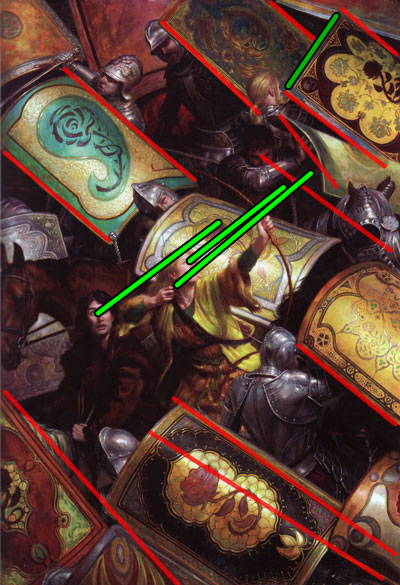
By setting up an overall pattern and then breaking it specifically at the right place, Giancola reinforces the archer as the picture’s focus. Let’s look at one other aspect of the picture: how the golden sections line up. It’s always hard to be sure how conscious artists are about how they place things according to the golden ratio. Whether through intuitive design sense or calculation we can see that Giancola has placed the archer’s hand at the intersection of the upper right intersection of golden sections. The arrow passes right through that point as well.
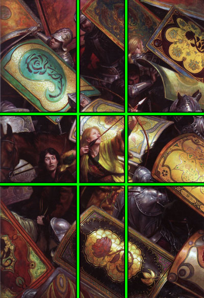
The archer’s body itself takes up the center of this golden section grid, and her head and torso are in the lower left part of the center section. My guess is that Giancola consciously considered the golden sections at an early stage of his composition but didn’t feel compelled to stick to them precisely after that.
Palette
It’s certainly a warm painting, dominated by reds and yellows. I’m not going to spend much time on the colors here, but I do think the green on the shield just above the archer gives a nice accent. It draws attention to the area and leads our eye down into the focus. Contrast it to the dark red area that forms the background.
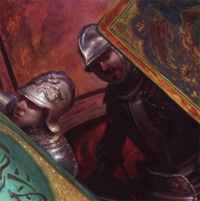
A little side note here. Despite the overall impression of detail and realism, the background area of that dark red is a swirling abstract texture. It’s purpose is to drop back in the picture, to NOT draw the eye. Even in realism it’s counterproductive to render every last part of a scene.
Value
Giancola gives us a dark painting with the brightest area being the shield behind the archer. The other highlights around the painting serve two purposes that I see. The first is to enhance the realism by giving the illusion of solidity and mass. The glints on the armor are a good example of this. Second, some of the shields are generally brighter than the background. They don’t compete with the focus, but as our eye wanders from the focus those brighter areas give us someplace to go. They also show off the shield designs.
Mass
What a teaming throng! I’ve already mentioned how the highlights enhance the illusion of mass, and really Giancola’s whole approach to values and color give us a sense of the solid. Something else, though, that gives a sense of mass and weight is seeing evidence of objects bouncing off of each other. The three shields in the upper right corner are a good example – they overlap and it looks like they’re jostling each other. Their owners are trying to maintain good coverage despite being bumped around. The soldier who holds the shield right behind the archer isn’t just peeking out from it, he’s bent way over and spending effort to keep it where it is. Logically, then, we interpret it as a heavy shield, thick enough to ward off rocks or arrows.
Texture
Again, I won’t spend much time here. Giancola uses textures in the background and on a few of the shields around the border to give us an overall sense of the lighting, but he doesn’t bog us down with details. The sheen on some of the shields indicate smooth, reflective paint. There is no sheen on the clothing, though, since it doesn’t reflect light the same way.
Symbolism
I’ll get to the Persian styling here in a minute, but in the meantime I’ll let Giancola speak for himself. He comments on the painting on his Tor books Hugo nominee profile page, where he says:
‘Archer’ was a tremendous challenge compositionally and technically, and a pure pleasure to render the shields as Persian manuscript covers. I love the subtlety that there are book covers within the book cover, and that knights might love to read rather than fight.
Micro/Macro
This topic is about enhancing the illusion of reality by including just the right details and excluding the wrong ones. Here is a detail of one of the shields.
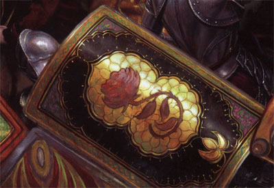
As we look at it we see that some parts of it are bright and crisp while others are impressionistic – almost blurry. The corner on the left side, for example, is not as precise and detailed as the rose in the center where the highlighting is. As our eyes move around the painting they will come to rest on this shield. Not every aspect of the shield, mind you, but rather its focal point. Our peripheral vision can’t take in the detail as we move away from the shield’s focal point anyway. So, Giancola upholds the illusion of fine detail everywhere by giving each object a focus that does have detail but then fading it out as you move away from it.
It’s a fractal idea – the painting as whole has a focus, but so does each object that makes up the painting. Giancola sometimes works in triptychs (three paintings together), so in that sense the entire set will have a single focal point.
Ornament
All right, now it’s time to get to the Persian motif. I’d already noticed it before reading the quote above, particularly in the green shield just above the archer. All of the shields have a rose in some form, and it’s neat to see the different ways that Giancola has portrayed them. Each is different, yet they all seem to come from the same culture. I’m not sure of the specific references that Giancola used, but the link below is a picture that comes from this page and shows a 16th century Q’uran manuscript cover. You can see more pages at their site.
Click to see really big picture of a 16th century Persian Q’uran cover.
Narrative
The introduction to Giancola’s first collection explains how he likes to set up scenes that make viewers fill in the blanks about what’s going on. We become active participants in the painting’s story, imagining what’s going on and making assumptions. I “see” three main characters in this scene, only two of which are visible.
The archer is aiming at something or somebody, and we have clues about the situation. Soldiers wouldn’t hold their shields like that unless they were expecting attack from above, and the archer’s aim is quite high. I think they’re attacking a castle of some sort and our archer is aiming at someone high up on the walls. Perhaps she’s trying to take out a catapult operator or someone about to spill boiling oil. Whoever the target is, the archer’s companion seems to have some reservations.
Juxtaposition
Speaking of that companion, let’s have a closer look.
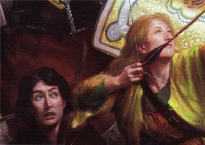
This detail could go in the Characterization section just as well, but I’m putting it here because I like the contrast between the subtle fear in the companion’s expression and the archer’s calm assurance. Each person has a distinct look, bearing, and expression, but putting them next to each other strengthens those impressions.
There are other juxtapositions in the painting, both conceptual and visual. One of the most striking to me is that I read the archer as having Asian features but blond hair. I also like the flowery, ornate shields contrasted with the fairly simple armor of the knights and horses.
Stylization
Giancola specifically cites Velázquez as an influence. A clear part of his style is the marriage of Velázquez’s realism with modern notions from abstract art. Giancola uses abstract shapes and textures as the foundation and then constructs realism on top of it.
Character
I’ve already mentioned how the two main characters are foils for each other. Costuming is another aspect of character, so let’s take a look at the archer’s clothes.
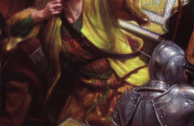
The cut and patterns of her clothing also suggest a Persian influence. It’s a little difficult to see, but her belt is braided. Giancola gives us the detail here because we’re looking at a center of interest. The fabric’s colors and patterns, along with the sleeve fringe, tell us that this person is pretty well off and probably quite respected. She’s at least minor nobility.
Back to her companion, I love his expression. It’s an ambiguous and subtle mix, but I read both fear and hope in it. And frankly, we don’t usually see subtlety or complex expressions in most fantasy art. It’s one of the reasons I wish I’d come across Giancola sooner.
Oh yeah, almost forgot. That archer? She’s pretty cute, too.
Tension
There’s narrative tension around whether the archer will hit her mark or be on the receiving end of some giant rock. Will the siege be successful? Will those beautiful shields get scratched? Mood-wise I think the deep reds in the background add a mood of danger and tension.
Line
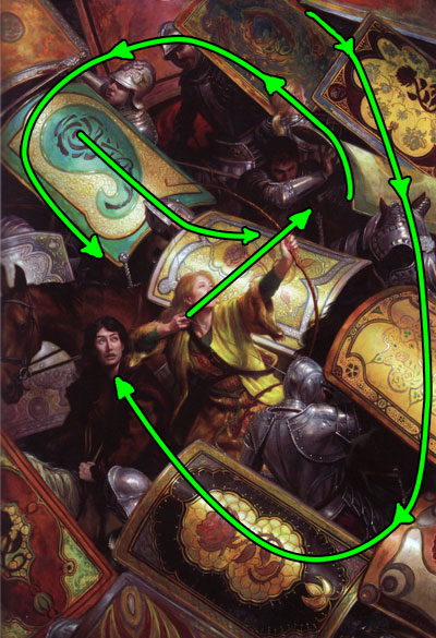
Since it’s a realistic painting we don’t see lines, at least not in the Mucha or Dürer sense. There are, however, edges that tend to direct our gaze through the painting. I suppose I could have put this back up in the composition and design section, but I’m putting it here instead. Here are some of the paths I see.
Research/Reference
Irene Gallo, art director for Tor books, has a blog page on The Archer of the Rose. Giancola initially submitted this sketch as a possibility for the first book in the series. Gallo didn’t use it, but liked the sketch enough that she brought it back for the third book.
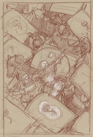
We can see at this point that the basic concept is there. Giancola already knows where the light and focus will be. On the other hand, things like the details of the shields and the full idea of the companion are still unformed. Next up we see the finished drawing Giancola worked out prior to painting.
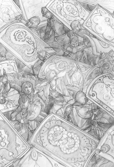
Here’s he’s worked things out completely. There is detail where he wants it. The background areas without detail are simple shading – that comes as part of the painting process. Notice that the companion’s face and expression aren’t yet final, though. Here, his mouth is closed and the hair is different.
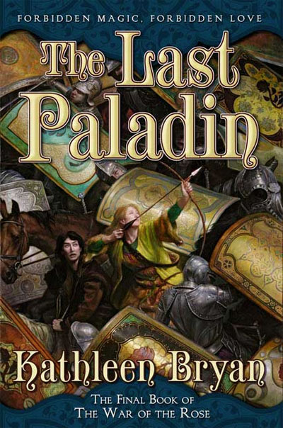
One final thought on this progression: the painting above looks complete as it is, but we have to remember its ultimate purpose as a book cover. Here is a look at the book itself. How do you feel that the title and other graphic elements change the picture? How did the cover designer use the arrow head?
Vignette
We get a strong silhouette and posture from the archer. The rest of the people in the painting are only shown in bits and pieces. I’m sure, however, that Giancola worked out the complete positions for each person and the horses. You’d have to in order to get everything to look like it’s part of the same scene.
Perspective
Most of the perspective cues here use occlusion – that is, overlapping. The archer’s figure overlaps a shield and is therefore in front of it. One thing to note is the viewpoint. We’re obviously up above the action, but probably not on the defenses themselves. The horizon line is a ways above the top of the painting. This kind of angle is a modern technique to make pictures more dynamic.
Wrap Up
One of the major ideas I take from this painting, which I hadn’t thought of like this before, is the notion of building up a composition from abstract shapes and ending up with realism. I really like that. In this painting, at least, that foundation sets up motion and flow through the whole picture even before we get to elements like value and color.
The Archer of the Rose is also a prime example of thinking your picture through completely. It’s no easy task to work all those people and horses into a crowded scene, but we clearly see how the objects interact with each other. There’s a coherent cultural feel to the painting coming from the combination of Persian and European influences. Giancola works out enough of the narrative to help us figure out what’s going on. On the other hand he leaves us free to fill in large parts of the story. The whole approach is a standard to emulate.