#34: Once there was a poor old woman… by Arthur Rackham
Once there was a poor old woman who lived in a village, by Arthur Rackham, 1920.
Originally in Hansel and Gretel and Other Stories by the Brothers Grimm, 1920.
This scan from Rackham’s Fairy Tale Illustrations in Full Color, edited by Jeff Menges, 2002.
This analysis copyright Scott M. McDaniel, 2010.
The Image
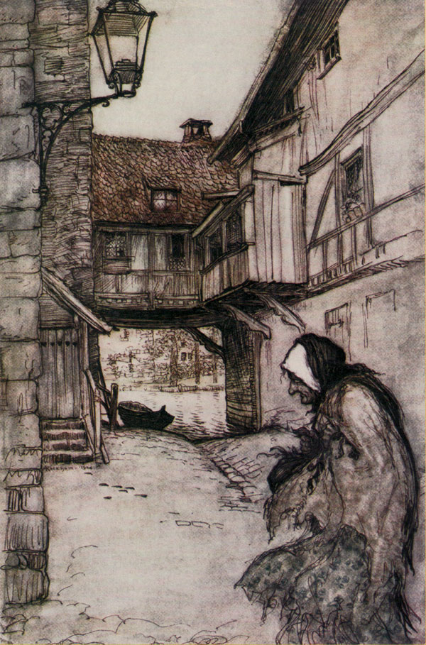
What a difficult choice! There are a lot of great illustrations in the Dover book Rackham’s Fairy Tale Illustrations in Full Color, and it was hard to decide which one to look at for an analysis. If you’re a fan of golden age illustration, you should definitely check this one out. I chose this one in the end for a few reasons. For one, we get a clear sense of character – to me this seems like more than just your generic old woman. She’s been through a lot. Also, Rackham gives us lots of texture and line work that is fun to get lost in. The recent analysis of Dürer was an example of highly precise, controlled linework. This drawing, though, shows linework that is loose and flowing, yet still controlled. Rackham’s picture has clearly separated foreground, midground, and background elements, and it also has an effective silhouette and composition.
The Composition
Let’s take those things in reverse order. First off, we have a profile of the old woman, and it’s an effective silhouette.
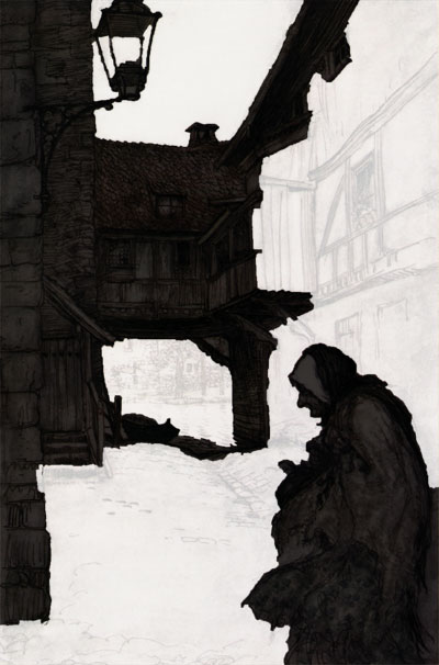
Starting with the woman, we can see that her head and shoulders are darker than the background – Rackham sets her apart with contrast. Except for her, the rest of the foreground is light. The midground is darker in value, and the distant background is again light. Looking back up at the silhouette version again, it’s obvious (to me, at least) that Rackham is using the midground elements to put a curved frame around the woman.
Here’s a detail image of the boat.
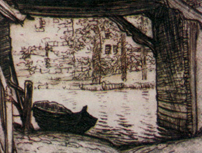
To boat is particularly dark. Logically it makes sense since it falls in the shadow of the building above it. This detail also shows the lightness of the distant background, the darkness of the midground, and the lightness of the foreground. The main reason I show it, though, is to point out the boat’s role in the overall composition. Because it’s so dark, the contrast with the distant background draws our eye. It’s a secondary focal point of the drawing, and I think it keeps the drawing more interesting visually. There is, in fact, somewhere else for our eye to go once we’ve taken in the old woman. The boat is small, though, and clearly secondary.
The Line Directions
Contrast isn’t always just about light and dark. If you look back at the drawing, how many curved lines can you find, and where are they? Yes, there are lots of little curved lines in the rooftop, but for now I’m talking about the lines that define shape – contour lines. The woman’s entire figure is a curve – she herself is bent. Plus her dress flutters in the wind, resulting in more curves. The only other curved lines I see in the picture are the boat and one part of the gas lantern at the top. Neither of those are very large elements. So, Rackham draws attention to the old woman by contrasting her flowing, curved lines with the straight lines of the architecture all around her.
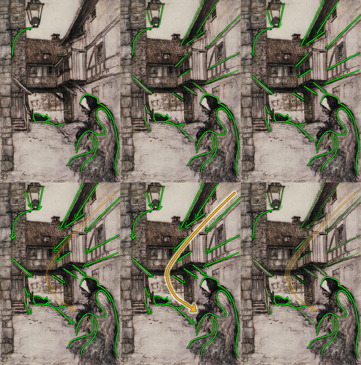
Now let’s look at the diagonal lines. If we start at the top of the illustration and follow the diagonal lines down, we see a pattern. Rackham uses perspective so that the diagonal lines we see mostly point down and left. As we get to the other side of the picture, though, the single point perspective means that the lines reverse and start pointing us down and to the right. That takes our gaze right to the old woman. In particular, the support braces just above the old woman’s head point us right to her.
Because of the buildings, most of the lines are either vertical or horizontal. Rackham’s selective use of curved lines and diagonal lines contrasts with the overall horizontal and vertical sense, and he uses those contrasts to make the woman the drawing’s focal point.
The Line Textures
OK, here we go with quite a few detail images. As we go through each one take a look at how the individual line strokes are often imprecise. It looks like his muscles were relaxed and he was setting the lines down on the paper quickly, without making sure each one was individually perfect. Some of the brick texture, for example, almost looks like scribbling. In each detail, look at how Rackham made sure that the overall spacing and direction of the lines combines to build up a texture that gives just the impression he was after.
First up, let’s take a look at the roof in the midground:
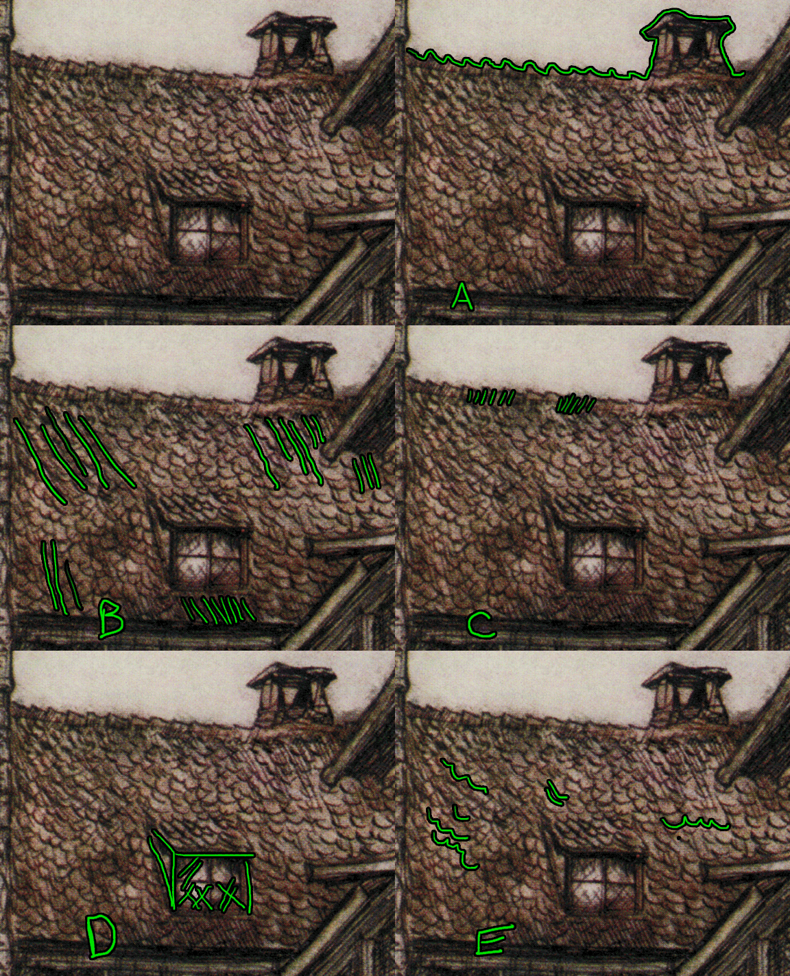
In terms of directions and lines, we have:
A: Contour lines that define the top and the chimney.
B: Diagonal lines that follow the slant of the roof. These are for shading and values.
C: Diagonal lines that slant the other way, showing the form of the ridge at the roof top.
D: Cross hatched diagonal lines in the window for shading, values, and texture.
E: Small curved “C” lines that suggest shingles and provide texture. Sometimes they chain together diagonally, and other times horizontally. This keeps the texture from getting geometric.
Finally, there is a wash beneath all of the lines that contributes to the values and the texture of the area. All of these elements combine to give an immediate impression of a village rooftop. It’s in decent repair, but it’s obviously not the high precision work that we might see on an expensive, upper class home.
Here’s another detail that shows a door, steps, railing, and stonework. See if you can pick out the different ways Rackham used lines to show form, value, and texture. How does he differentiate the wooden door from the stone wall? What does he do to communicate that the steps are worn?
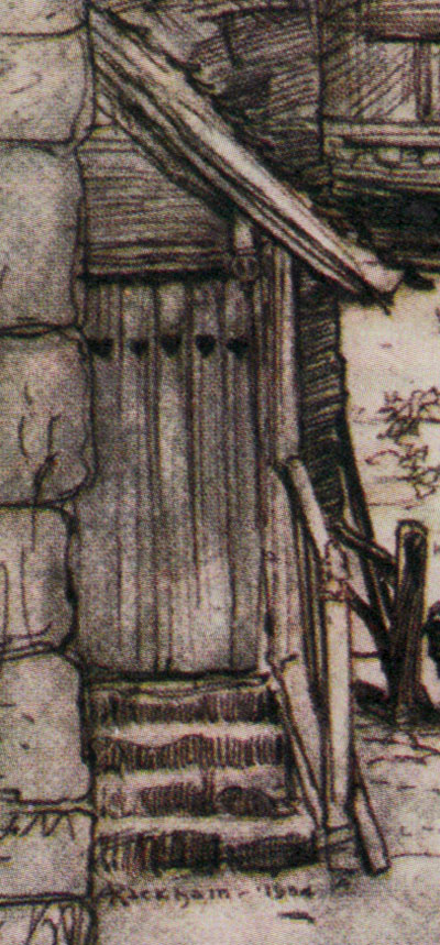
One thing to notice is that Rackham doesn’t use line thickness much in this drawing. Mucha, for example, used line thickness to help the basic shapes of his drawings pop out at us. Rackham keeps his line thicknesses the same and instead varies direction and spacing to show value and texture.
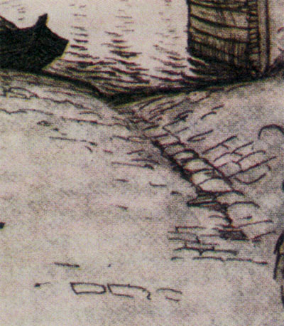
This detail above of the the street is a good example of Lee Moyer’s Macro/Micro principle. Rackham really only gives us a few cobblestones, yet we understand the whole street to be made of them. Most of the stones he outlines for us form a dip in the road which, because of the perspective, lead our eye to the old woman. Also take a look at the transition from street to water and the few quick strokes that effectively read as ripples.
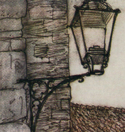
The lamp is a good example of how Rackham uses line direction to show the form of different surfaces. The lines on the wall both outline bricks and provide an overall texture for them. He obviously drew them quickly and loosely.
The Woman
Since this is a character portrait, let’s take a closer look at her.
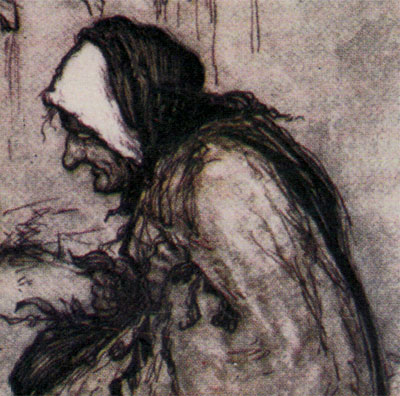
The lines in the upper part of her body and face are more defined and clear than those in the lower part of her body where the dress is fluttering.
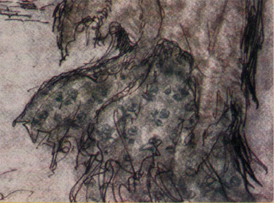
One of the things that makes her the drawing’s focus is how Rackham handles her textures. Everywhere else he uses lines to show the texture, from the water to cobblestone street, to the roof. For the old woman, though, he uses ink wash. Look at the pattern on her dress or the way her scarf wraps around her head. He’s still using lines, but they serve more as contour lines. At least, they do around the top. I love the bottom of her dress and how the scribbles show that it’s tattered and blowing around in the wind. There’s a floral pattern painted in wash on the dress, but it’s far from crisp and clean. All these details contribute to her character. The match her bent posture and downcast eyes. She seems to be holding something, though. Maybe it offers some hope.
The Elements
To wrap up we’ll go through Lee Moyer’s Elements of a Successful Illustration.
Focus: The woman is the primary focus, and the boat is a secondary focus. Visually, the secondary focus makes the drawing more interesting and turns it into more than a simple portrait.
Composition and Design: The woman in the lower right is darker than her background. There’s another darker arc that frames her. As we move from the woman to the background the overall values alternate: dark (woman), light (street around her), dark (midground buildings/boat), light (distant background).
Palette: Mostly monochromatic, though Rackham did use muted reds as part of the wash.
Value: Rackham uses line more than values to define form. Instead, he uses values to establish the basic composition.
Mass: The sense of form comes from line direction, as seen in the lamp and the rooftop shading.
Texture: There are two sources of texture, line and ink wash. The wash contributes to the downtrodden, dirty feel of the setting.
Symbolism: I don’t see much. The illustration’s purpose is to introduce us to a character and setting. Not having read the story, though, I’m missing some context.
Micro/Macro: I pointed out the cobblestones on the street. Also see the suggestions of buildings and trees in the distance and the worn shape of the steps leading up to the wooden door.
Ornament: Check out the bracket for the gas lamp.
Narrative: This illustration is the equivalent of the establishing shot in movies, TV shows, and comics. It sets up the story and gives us a framework on which to hang the action.
Juxtaposition: There’s not much conceptual juxtaposition – perhaps the gaslamp’s bracket is nicer than the surroundings would suggest. It’s not opulent, though.
Stylization: Rackham’s loose, almost scribbled lines give this drawing a clear style. The wash adds to it.
Character: The woman’s posture, expression, and clothing all reinforce an image of a worn down person with faded hopes.
Tension: Not much yet. As an establishing scene, the only hint of tension I see is to wonder what’s in her bag.
Line: Rackham uses lines to outline objects (contour) as well as for texture, values, and form.
Research/Reference: It wouldn’t surprise me if Rackham used reference for the village architecture or sketched it from life beforehand. I don’t know if he used a model for the woman’s figure, but I wouldn’t be surprised either way.
Vignette: There are clear silhouettes, but this is a full illustration that shows a complete setting.
Perspective: Rackham uses single point perspective, and the directions of the lines follow the rules of perspective to guide our eyes to the old woman.
Coming up in the next week or two will be a painting by Charles Vess with lots of mysterious cats.
[…] This post was mentioned on Twitter by maiasylba, Terri Robin Vernon. Terri Robin Vernon said: fascinating! http://bit.ly/dAZ3uV In-depth formal analysis of one Arthur Rackham illustration. […]