#28: The Men’s Bathhouse, by Albrecht Dürer
The Men’s Bathhouse, by Albrecht Dürer, 1498
In The Complete Woodcuts of Albrecht Dürer by Dover Press.
This analysis copyright 2010, Scott M. McDaniel
The Image

Last week I said that this time I’d write about something old. I hope 1498 qualifies. Thanks to a timely birthday present from my brother, I’m doing a woodcut by Albrecht Dürer, a German painter and engraver best known at the time for his highly skilled prints. At Illuxcon a couple of years ago I saw some fantastic ink work by Ian Miller, like Castles. He was kind enough to do a portfolio review for me, and during the process recommended that I start with Dürer. So, here we are.
I chose The Men’s Bath because we can clearly see the techniques Dürer used in the linework. This in a medium in which the artist and craftsmen who then cut the blocks had to be aware of and consider every line, every mark. We’ll look at examples of how Dürer handled form of the body, textures like wood and stone, and background elements like buildings and trees. He used hatching, feathering, and cross-hatching to establish values in what is basically a black and white medium. While that medium may be woodcut, the principles apply equally well to inking with brush and pen today.
In this print I can see lines fulfilling several purposes:
- Outline (showing edges)
- Shading (showing values)
- Texture (indicating how objects might feel)
- Form (wrapping around objects)
Let’s look at different parts of the print to see how Dürer has combined these purposes.
The People
Three people share the focus. The first is the musician playing the flute, and the second and third are the men talking in the foreground. Let’s start out by taking a look at the musician.

Dürer surrounds the musician with a dark area so that the contrast with his face and figure makes him stand out. We can see that the light source is in front of the figures and a bit to our left. It’s a key thing to decide before putting lines down so that he knew where to have the shading. Look at the musician’s arm and biceps on the right side. We see a heavy line defining the outline. In the right side of the arm, that line is crisp and clear on the arm side but a little less clear on the background side. Also, we can see that the forearm is in front of the biceps because its line occludes (interrupts) the line of the biceps. So, based on line weight and occlusion we’re already getting a sense of form.
Now for the shading. Dürer uses feathering to build up shadow. Feathering (also called hatching) is a series of lines parallel to each other that, when viewed from a distance, combine to form grey. Now, the darkness of that grey depends on how thick those lines are and how close together they are. The musician’s pectoral muscle on the chest is pretty dark because it is both in the shadow side generally and also under a shadow cast by the forearm. So it’s lines are thick and close together. Compare that to the feathering on the forearm, where the lines are thinner and further apart.
The hatching does double duty because it lets Dürer show the form of the arm and chest there. He curves the lines so that they seem to wrap around the forms, almost like a contour map. This is a bedrock technique that’s used extensively in comics today. We’ll look at more examples of it here shortly. Finally, the musician’s beard and cap are examples of how Dürer used lines for texture.
Let’s also look at one of the men in conversation.

We can easily see the outline around him. On the right side of the rib cage we see a thick line with a white line just inside it. Since the hatching lines don’t come right up to the outline, we see a little bit of reflected light. Outlines aren’t just for the outside of the figure, though. This kind of line symbolizes an edge, and we can see lots of internal edges. As artists we have to decide which internal things merit a line and which don’t. Some of the things Dürer chose to give lines to include the eyes, mouth, nose, jawline, nipples, and veins in the hand. He chose not to put down a single line for the cheekbone but instead used light hatching.
Like the cheekbone, Dürer handled the borders between muscle groups with shading. On the figure’s left side (toward the light), we have open expanses of white. The feathering is light, with thin lines. As before, the lines both provide shadow and describe the muscle’s form. On the right side of the figure, where the shadow is darkest, we see some fine examples of cross hatching. What I think is neat to note is that even when the areas of hatching intersect to form that cross hatch pattern, each individual set of lines is still describing a form. On the lower part of that rib cage, for example. the vertical lines show where the rib cage curves down into the abdomen while the horizontal lines show the curvature from the man’s side to his mid-line.
Here’s another shading technique. Just above the rib cage’s darkest part is some hatching heading up into the chest. It’s basically two columns of horizontal lines, though they don’t connect (except for a single line). There are other examples of close-but-not-touching groups of hatching throughout the print. There is relatively little texture on this person, but look at his hair wrap on the upper right side. Perhaps those lines are edges that show each individual fold in the wrap. As we get to the right side, though, they begin to merge into texture.
The Structures
Speaking of columns of hatching, take a look at the stones of the foreground wall.

On this stone we see outlines of the sides. The light source is above the blocks, so we see no shading or texture on their upper surfaces. The surface facing us, though, is in shade. Overall we see a curved grain to the stone. Inside that overall grain the groups of lines give us additional texture. On the left half of the stone there are what look to be several white lines – they’re formed by the border between the groups of feathered lines. This is one way to get keep the overall grey value the same while still injecting some texture. Another technique is to change the curvature of the lines, like Dürer does on the left side.
When using all these lines for shading, it’s quite easy for everything to just start merging together into ill-defined blobs. It gets hard to tell the different objects apart. (I know this from personal experience.) Thick outlines around objects help with this, but another important technique is to have the hatching lines go in different directions on different objects. In the detail above, see how the plant’s shading lines are generally up-and-down while the stone’s shading lines are horizontal? Parts of the plant are white and therefore easy to see against the stone. The parts that are in shade, though, have a shadow pattern that clearly differentiates the plant from the stone behind it.
Dürer also gives us some wooden structures, and these show the clearest use of lines that illustrate texture. The first case is the water pump on the left side of the print.

Here the lines obviously depict not edges but the wood grain itself. On the side we still see the wood grain pattern but the lines are closer together. They’re not any thicker, but the closer spacing makes the side of the block appear to be more in shadow. Because the grain also follows the form of the wood, we can also say that these lines are doing triple duty: texture, shading, and form.
(As a side note, I have no idea if the German translation holds, but I wonder if Dürer was throwing in a little joke what with the placement of the water pump’s spout next to the person behind it. It even has a rooster as the handle. I got a laugh out of it, anyway.)
Now let’s look at a more complicated wooden structure, the join of beams in the shelter’s roof.

Right here we all four purposes for the lines.
- The beams have clear outlines around the edges. There is an internal edge representing the crack in the beam coming in from the roof.
- The thick and close lines of the roof thatching provide a dark value, while beams all have light and dark sides according to the light source.
- We see the lines following the form of the thatching and curving around the beams. So we don’t confuse the structures, the lines on the various beams change direction at the borders between them or at the very least change curvature.
- The horizontal beam in particular uses rows of feathering to both indicate shade and provide some texture. We can see that it’s a smooth surface overall, but kind of bumpy as well.
The Background

Dürer certainly put a fair amount of detail into the buildings back there. As it turns out Dürer was one of those interested in perspective theories and did some writing on the topic, but at this point in the Renaissance they were still working out the details. In this print, anyway, we don’t see lines converging on a vanishing point. Nevertheless we get a good sense of space and distance.
Dürer uses feathering to shade the buildings, and the direction of the hatch lines helps us tell the buildings apart. Because they’re in the distance, though, the objects are more flat than the people and structures in the foreground. So, we don’t see shading lines that curve around the buildings or define forms. Even further back we see the hillside and trees. These have no details and only the barest hint of shading. Though he may not have used the term, that’s clearly atmospheric perspective in play.
So, in this background detail we see Dürer using lines for outline and shading, but not form. Actually, that’s not entirely true. The direction of the shading lines do help us distinguish the buildings’ forms. We can also see texture in the form of the bricks in the far wall and the indication of thatching (that “W” on one of the roofs).
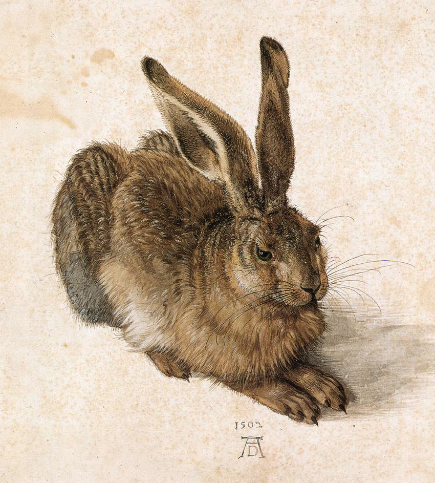
Before wrapping up I wanted to point out that while Dürer is certainly best known for his prints, he was a quite talented and well-rounded artist in other media as well. Take a look at his gouache and watercolor hare, study for praying hands – more good hatching reference, and his self-portrait.
The Elements
To wrap up we’ll go through Lee Moyer’s Elements of a Successful Illustration.
Focus: The main focus is on the flute player, which is helped by the contrast with the trees and bushes behind him. His flute points to the left conversationalist, who we consider next.
Composition and Design: I didn’t go into composition, but Dürer’s compositions were quite advanced. Look at the placement of the figures, for example. There are many triangles, like the one made by the heads of the observer on the left, the flute player, and the left conversationalist. Then there is the one formed by the two conversationalists and the flute player. The two musicans and the right conversationalist. The beer guzzler and the… Well, you get the idea. Sometimes objects like the flute or the beer tankard direct our eye, and other times its people’s gazes.
Palette: Black. Oh, and white too.
Value: Value happens with feathering and occasional cross hatching. This kind of shading depends on the spacing and weight of the lines as well as a certain distance from the picture.
Mass: Lines wrap around bodies and structures. Combined with shading we see volume and mass.
Texture: We see wood, stone, thatch, bricks, plants, and fabric. All of these have their distinct textures, all accomplished with lines.
Symbolism: Dürer produced lots of religious work, along with the religious symbolism common at the time. As others did, he would work local dignitaries into those pictures to enhance their social status. I’m probably missing things, but this print doesn’t seem to have much in the way of symbolism. It depicts local life.
Micro/Macro: Dürer includes a lot of detail in his prints and in the linework. Sometimes I have difficulty telling what’s going on in a print at first glance. One of the reasons I chose this one is that we’re not overwhelmed with detail and can clearly differentiate the figures.
Ornament: Take a look at Dürer’s monogram just above the lower border. It serves as both an attractive decoration and as a signature.
Narrative: While a relaxed scene, we see various things going on. It’s not a stiff, static scene, and the focus is on the two musicians.
Juxtaposition: I think I already commented on the water pump.
Stylization: Dürer’s linework set the standard for generations to come – his approach obviously still relevant today.
Character: Each person has distinct personality. The guy next to the water pump is intriguing, and I imagine that the two men in conversation are discussing local Nuremburg politics.
Tension: There’s little tension – it’s a relaxed scene. If you want some tension take a look at some of his depictions of the Apocalypse, like this one of the four horsemen.
Line: They fulfill a variety of functions, as I noted above.
Research/Reference: I’m not sure. I did read that outdoor baths like this one were fairly uncommon at the time – it’s likely that Dürer was looking for an opportunity to work with landscape and perspective.
Vignette: We can easily see the figures and get an idea of their mood and actions based on posture. I’m amused by the large guy guzzling his beer.
Perspective: Occlusion and relative sizes do most of the work here, with some atmospheric perspective. I don’t believe he used vanishing points to line things up, however.
That’s it for this round. Next week I’ll do something new (compared to 1498), but I’m not sure what yet. Maybe I’ll do a companion piece to this one from Ian Miller.
[…] This post was mentioned on Twitter by Dirk Johnson, Dirk Johnson. Dirk Johnson said: Brought to mind Durer http://www.scottmcd.net/artanalysis/?p=702 http://twitpic.com/25lewj […]
[…] #28: The Men’s Bathhouse, by Albrecht DürerFeb 22, 2010 … In The Complete Woodcuts of Albrecht Dürer by Dover Press. … I’m doing a woodcut by Albrecht Dürer, a German painter and engraver best ….. of Pellucidar by Frank Frazetta · #36: The Archer of the Rose by Donato Giancola … […]