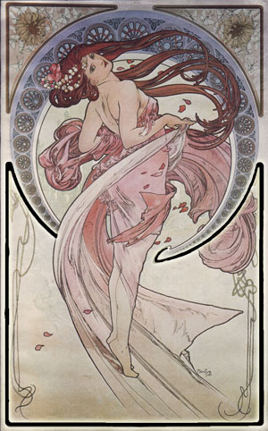
#10: Dance, by Alphonse Mucha
By Alphonse Mucha
This analysis copyright Scott M. McDaniel, 2009.
The Image
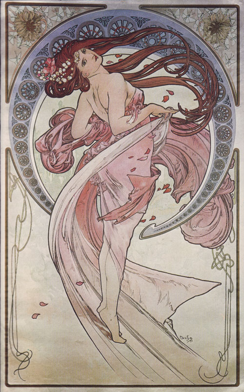
I ended up last week by saying I’d do a Maxfield Parrish piece this time, but I lied horribly. The Parrish piece I’d picked is Daybreak, one of his most popular and well known. It’s based on the principles of Dynamic Symmetry. I need some more time to work through that, so I’ll do it three weeks from now. Instead, I’m going to do Dance by Alphonse Mucha. It’s part of a series of four panneaux based on the muses (some of them, anyway). Aside from Dance, there are (from left to right) Poetry, Music, and Painting. This Art Nouveau style may have come before the term “pinup,” but hey, these are pinups.
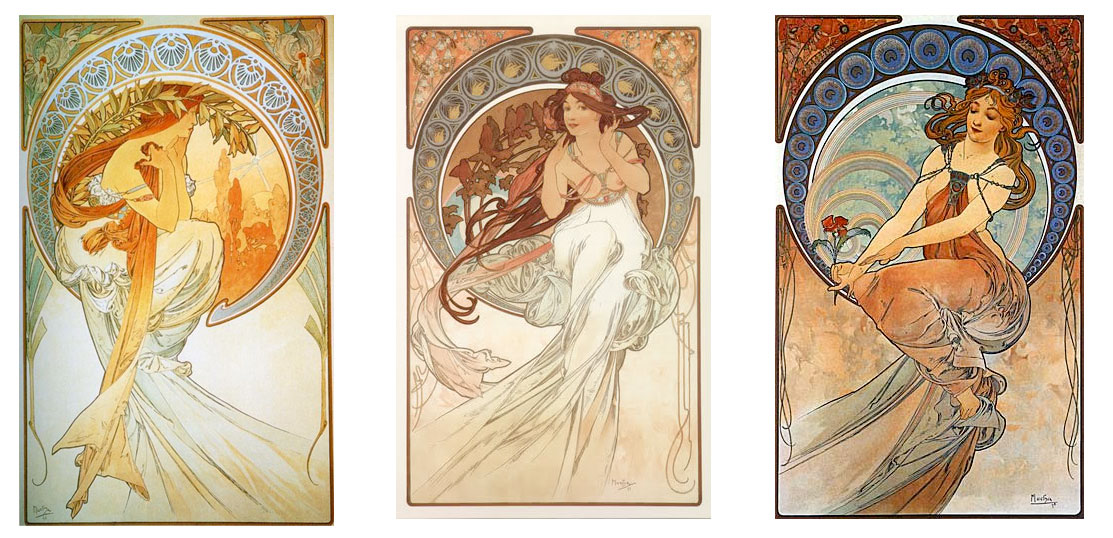
You can see the common layout and circular frame motif. I’ll concentrate on Dance, but keep in mind that they’re a set designed to be displayed together in a room. Mucha was one of the first to do prints for wide distribution (as was Parrish in America). These panneaux (posters, essentially) were printed on quality paper or satin. As you can see from the images of the other parts of the series, color quality varied widely.
The Color Problem
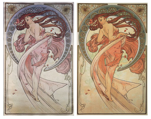
In fact, the color differences show up in different prints of the same work. The scan at the top of the page is from the book Alphonse Mucha: The Complete Graphic Works published in 1980. Another book, simply titled Alphons Mucha by Renate Ulmer, published 2007 also has a print of it. I scanned both of them from the books and put them side-by-side below.
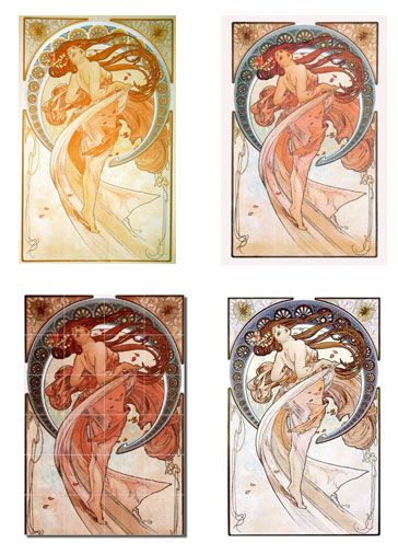
Just to drive home the point, here are some other versions from around the web:
As Marina Henderson writes in The Complete Graphic Works,
“The variations in colour can be attributed to the frequent occasions when Mucha was not able to supervise the final printing. As time went on and he increasingly lost interest in this sort of work, the colouring often tended to become coarser and more harsh.”
We can add to that fading and aging of the various prints and you can see how we get to the variety above. These days the problem hasn’t gone away. Artists have their monitors calibrated at different settings, for example. Pantone colors assist printers in standardization but you can still end up with a fair amount of variation.
All this to say that I’m not going to do a detailed palette analysis of the piece, because I’m not sure what the original coloring was. I picked one that I liked and had access to.
Composition
Let’s get back to something we can look at in detail. To start with, we have the composition and silhouette. I’m gearing up for more of this with Parrish, but one of the first things to notice is that the piece is, itself, the golden rectangle. That is, the ratio of the long side to the short side is approximately 1.618. In the golden section grid below, I also added in the pixel measurement of my scan. Had I been more precise, I’m sure it would have come out even closer to 1.618 than it did.
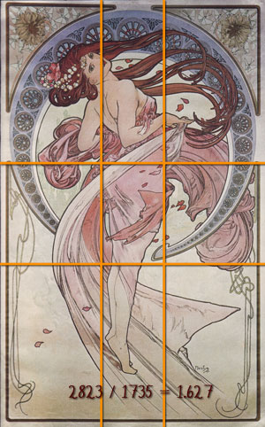
I’ll get to more on this stuff in about three weeks. For now, notice that the woman’s face is on the left golden section line. I’d hazard a guess that if we do the golden section grid on that upper left rectangle, we’d find her nose is right on its upper golden section. Overall she’s centered in the composition, but because of her posture she does tend a little bit toward the left side.
Other things to check out are that the lower edge of the circular frame behind her lines up with the lower golden line, and the break in the side borders occurs at the upper one. The break in the upper border line up with the break in the circle. I’d love to keep breaking the rectangles down into their golden sections, but that way lies a never-ending spiral.
Last week when discussing Erik Jones’ cover, I mentioned how silhouettes are especially important in vignettes. Since this is also a vignette, let’s vet its silhouette.
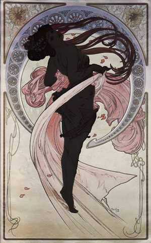
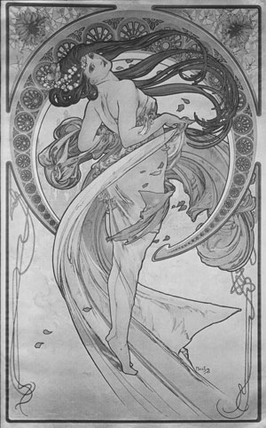
When I first filled in the silhouette with the hair, it didn’t form a clear picture. What I didn’t take into account, though, was the color and value difference between the figure and her hair. Because we can separate them so easily, we actually have two silhouettes that fit together. In the example above, I made the body darker than the hair so we can see them better. Really, though, it’s the hair that’s darker in the unaltered version. Here’s the greyscale version, in which we can see that Mucha isn’t using shading or values to make the silhouette pop out, but rather the linework.
What we have is an intriguing pose. It’s graceful, as befits the title “Dance,” and it’s dynamic. As a pinup, the silhouette gives us a clear view of her breast and a fairly sexy pose overall. With the aid of the linework it’s what we pick up on right away. Before we’ve had a chance to process all the lovely detail here, we already know what the picture is about.
Lines, Lines, Everywhere There’s Lines
Art Nouveau was one of the first styles to use lines as design elements not in the service of realism. My understanding of inking and line comes largely through the field of comics, and Mucha certainly foreshadowed that heavy outline approach. His specific use of line, though, differs from what you read in modern books about comic inking, like The DC Comics Guide to Inking Comics by Klaus Jansen. (This book obviously came from the Dept. of Redundancy Dept. at DC.)
There aren’t set rules about how to use line weight, except perhaps that it’s not good to have all your lines be the same thickness (called “dead weight”). Usually, though, it’s considered good to pick a light source and have the thinner lines on your figure be toward the light source and thicker lines away from it. This suggests shadow. Another possibility is to give closer objects thick lines and farther with thin lines. Or, you can give the object of focus thick lines whether it’s near or far, in the light or out of it. (Being consistent helps, of course.)
Here’s a detail from Dance to help us look at how Mucha used lines in this piece.
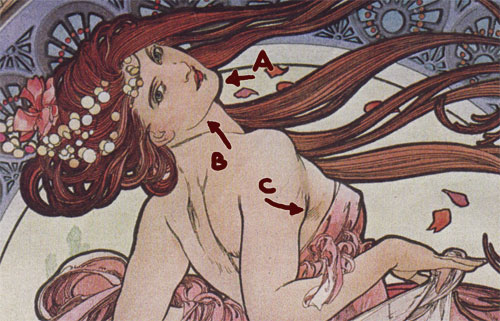
Mucha uses a thick outline to surround the figure and thin lines to provide detail inside it. Look at the difference between the line of her chin (A) and the line of her jaw (B). It’s consistent all around the figure. At the juncture of the arm and breast (C) we can even see a little feathering (repeated thin lines to suggest shading).
One of the hallmarks of Art Nouveau is the way its lines form long, swooping curves. Here we see it in the hair, the ornamental lines throughout, and even the thin lines of the fabric. There are no sharp corners – even the breaks in the picture’s border are quick, sharp curves and not points.
Detail and Ornaments
Here’s another detail that gives us a good look at some of the linework and intricacy of the picture.
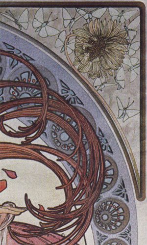
I love how Mucha handles hair here. It’s a defining part of his style that you see repeated throughout many of his illustrations. I’m sure he gave his French curves a workout. The hair becomes a curving graphic element, with the thick outlines emphasizing the graphical aspect and the thin inner lines emphasizing the texture of hair. It’s the combination of those two things that I think works so well. You can also see how the stem of the sunflower becomes a curving line that’s part of the border. I don’t have much to say about the detail work in the purple circular border except, “Cool!”
Not only does Mucha use lines to move from figure to graphical element, he also plays games with the more decorative lines. Look at the outlined border below. You’ll see that a line that’s part of the circle frame becomes part of the page border.
The Elements
Time again to wrap up. Lee Moyer’s essay on the Elements of a Successful Illustration is the order of the day.
Focus: Clearly the focus is the figure of the woman. Mucha brings our eyes there by framing her within a circle and then a larger border. She’s on a golden grid line, which also helps, and finally he surrounds her figure with the thickest, darkest outline in the image.
Composition and Design: The placement of the elements follows classical conventions and nesting variations of the golden rectangle.
Palette: The palette is uncertain. If I had to guess, I’d guess that I’ve got the right one above. My wife works for the Archives of American Art and the book with this scan is from its collection. The other versions seem more washed out, less rich.
Value: Mucha doesn’t use values extensively here – one of the first pieces we’ve looked at that doesn’t. It’s the linework that does the heavy lifting to help us read this image.
Mass: Within the figure there is some shading and variation, and some of the linework helps with feathering. Despite the highly stylized approach, we do get a basic feeling of mass. This isn’t like the cutout, block color style from the golden age of comics. (Or, I might add, like you see in some other Art Nouveau work.)
Texture: Texture comes from the linework and from the lovely detail work in the frame and borders.
Symbolism: Mucha is showing four of the muses in this series. Known for his “flowers and women,” he often embodied concepts in a figure to sell as prints.
Micro/Macro: I could spend lots of time on this concept. For now I’ll just say that though there are many lines in the main figure, there aren’t any unnecessary ones. Mucha has picked only those lines that define the shape (outlines), suggest form (feathering lines), or provide texture in the fabric.
Ornament: Art Nouveau is famous for its ornament and fancy lines. As the leading artist of the movement, Mucha does not disappoint.
Narrative: Mucha did do story-based illustration though he’s not as famous for it. There’s not much narrative here, though. It’s about embodying a concept, not showing an event.
Juxtaposition: The main contrasts here are curving, swooping lines against the overall rectangular frame. The elements are designed to interact and show each other off.
Stylization: We tend to see Art Nouveau pieces through a lens of a hundred years or more. To us it has connotations of “old fashioned” or “classic.” I can only imagine how strange and striking this style must have looked to an unprepared populace in the 1890’s. Mucha’s first work in the style was for Gismonda, a stage play starring Sarah Bernhardt, and people stopped to gawk at the posters. Within weeks he was famous and had more commissions than he knew what to do with.
Character: We get a sense of her character through the pose, expression, clothing, and hair choices. We see someone who is both carefree and in perfect control. Quite the ideal.
Tension: There’s not a lot of tension here. It’s all about elegance and grace.
Line: Linework is the very foundation of the piece, as discussed above.
Research/Reference: Mucha did use models, though I don’t know much more than that.
Vignette: The vignette is set up with clear linework. The circle and border frame her.
Perspective: Nothing to note here. Move along. Oh, wait – yes there is. Take some time to look back at the image to see which elements overlap which other elements. She overlaps the circular frame, for example, but her flowing dress is behind it on the right side.
Fun: Mucha made his name with this style and on pieces like this. As time went on he grew less and less enchanted with the style and the format. This one, though, is from 1898. He’d worked in the style for a few years, but overall it was still new and something worth playing with. Personally, my own reaction to this piece was, “Oooh, pretty!”
Well, giving a preview last time backfired on me. Since I’m doing a rotation of classic illustration – modern illustration – and work appearing on DeviantArt, the Maxfield Parrish piece will show up in three weeks. Plenty of time to figure out the dynamic symmetry, right? Next week will either be something from Terry Moore or Mort Kuntsler. At this point, toss a coin.