#33: Seven Handed Musician by Artur Sadlos
Seven Handed Musician by Artur Sadlos, copyright 2008.
This analysis by Scott M. McDaniel, copyright 2010.
The Image
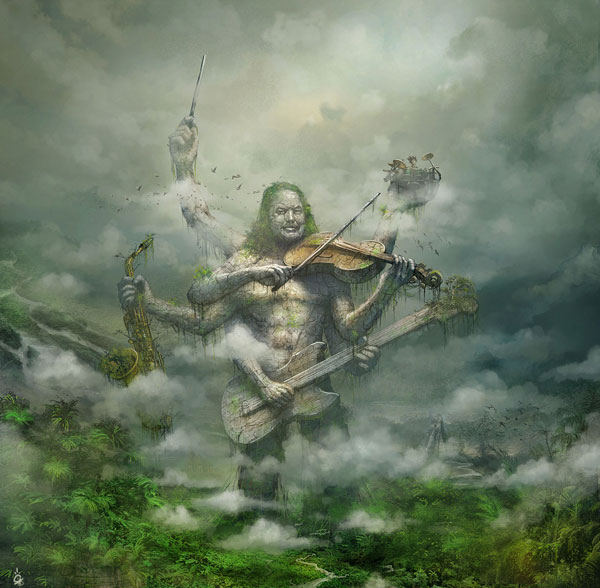
I added Seven Handed Musician to my favorites the day it was featured as a Daily Deviation on DeviantArt.com. I’d never seen anything like it. Here’s what Sadlos has to say about it in the image’s description:
Cover for new album of some multiinstrumentalist. The idea of giant creature, ancient and multihanded with different instruments is clients idea. Ive done all in photoshop using some textures of stones and trees. Hope You like it C&C most welcome.
Best Regards
Torturr
I’m particularly impressed by the sense of scale Sadlos gets into the picture. There’s no doubt that this guy is huge, but in the wilderness setting we don’t have normal geometric cues like vanishing points to help us. We’ll look at the image’s perspective, plus its lighting, colors, textures, and overall design. I’ll also point out a probable mistake and take a guess as to how it came about.
The Scale
To start things off, let’s look at the musician here without all of the surrounding background.
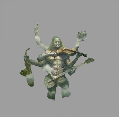
There are few size cues, but at a quick glance he’s pretty normal sized for a dude with seven arms and a skin condition. The reason we read him as being so massive in the picture is his size in relation to the other things around him. For example, is that a river in the background on the left? And what about the Mayan pyramid near the thigh on the right?
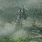
Then there’s a couple of bird flocks flying around. Oh, and a tree growing out of the end of the guitar’s neck.
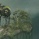
Finally we have the cloud formations both in front of and behind the figure. Because we have preconceived notions of how big each of these things usually are, we assemble the whole picture in our head and come to the conclusion that this stone musician could compete in size with any skyscraper. No one size comparison does it – Sadlos had to think through the image and make decisions about each element so they would all hang together and add up to the right impression.
I initially thought that the drummer behind the kit in the hand on the upper right was a the size of a normal person. Now I’m not so sure. Compare him with the birds nearby and that tree from the guitar’s neck. How big do you think he actually is?

The Composition and Design
As those of you who have read other columns know, I often look at golden sections and eye guidance in paintings like this. (See, for example, the Moyer/Kaluta and James Jean columns.) This time I thought I’d apply a different principle I hear regularly, that of using triangles in the composition. That is, it’s a good idea to arrange the areas of major focus so that they form triangles. Often more than one.
Look back up at the original picture and pick out the parts that you think are the areas of major visual interest. What are their relationships? My answer to that question is in the picture below.
I see five triangles that form a loose pentagon. The musician’s face is the only element that’s a part of all five triangles, and it’s at the center of the pentagon. I think this is one of several reasons that his face stands out as the focal point of the entire painting.
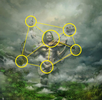
I can certainly understand objections to this kind of breakdown. For instance, I didn’t include the hand on the guitar’s neck as a focal point. Personally, I don’t think it is one – it has no distinct highlights and there aren’t any points of high contrast. It blends into the area around it fairly easily. You could make a better case, though, for the hand on the violin’s neck. I could see moving the circle at the end of the violin’s neck in to the hand.
Also, I have no idea if this is the kind of thing that Sadlos deliberately planned out or if it just emerged as a happy coincidence in his design. Either way, though, I can easily see a number of different triangles in the picture.
Before moving on to textures, let’s look at a couple of other things that I think establish the musician’s face as the painting’s focal point. First there’s the color saturation. Sadlos uses a few areas of (relatively) intense color. One of them is the jungle canopy. It forms a semicircular frame around the figure on the bottom. Second, the “hair” on the musician is a more intense green than anything else in the surrounding area. The violin is noticeably more saturated than the surrounding areas, plus it’s one of only two areas to feature a warm color. Those two facts draw our eyes to the face and violin.
Sadlos also uses values to bring our eyes to the figure and its head. Here is a greyscale version of the picture that alternates with a posterized version (only 4 gray values).
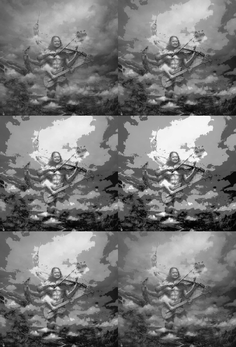
What I notice here is that the jungle canopy is darker than the figure, so its semicircle shape uses both value and saturation to frame the figure. The other thing I notice is that the clouds behind and above the figure’s head are the brightest part of the image. The contrast with the face and hair also draws our attention to the area.
A final note on composition. This is a CD cover. There are two things that draw our eyes to the place that the musician’s name and CD name will go: the conductor’s baton and the yellow patch of clouds just above the statue’s head. That second area of warm, saturated color should help integrate the painting with whatever logos or typography will appear toward the top.
The Textures
This painting uses a wide variety of textures, and it’s a good job that Sadlos has managed to make them all work together. Let’s start off with the musician’s face.
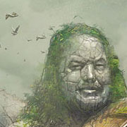
The cracked stonework is neat. The cracks effectively suggest stone, but they also suggest to me that the figure might actually be in motion. That brings up logical paradoxes when you look at the vines and plantlife, which suggests that it’s been still for a very long time. (The figure’s stance also looks like it’s in motion, and the contradiction is one of my favorite things about the painting.) This detail also has the brightest spots in the painting – namely the highlight on the nose and lower lip. These highlights are small and reasonably sharp, which suggests a moist coating on the whole statue. We can also see the birds nearby for a size comparison.
Now let’s look at the jungle canopy.

What I see here is an impressionistic texture of greens as a background. Sadlos has then painted a few specific leaves and plants over that, though not in great detail. The effect, though, is sufficient to get us to read it as a massive, detailed jungle canopy.
The clouds form yet a third texture. Sadlos uses them both to suggest size and to create layers of depth in the picture. Some clouds are in front of the figure, others are behind it, and some surround parts of it.
The Problem
So, now to the possible mistake. While it may have been intentional, I think it is probably an example of getting so into the details of working on a painting that you forget to step back occasionally and let it rest. Here’s a detail of it.
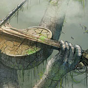
The arm holding the drummer seems to disappear. We ought to be able to see the rest of the forearm and elbow behind the violin and the hand on the violin’s neck. Now, that shape below the violin is a nice bit of negative space, and I think it helps us read the figure overall. It’s possible that Sadlos left it like that because filling it in would be visually confusing. Still, I find the disappearing arm to be jarring. I didn’t actually notice it until I’d been looking at the picture for a while, so at least for me it wasn’t immediately obvious. The easiest fix, I think, would be to have some cloud behind the violin but obscuring the part of the far arm that forms an edge with the violin’s neck. Then I’d darken the negative space below the violin some to suggest vague forms back there but nothing definite.
The Elements
To wrap up we’ll go through Lee Moyer’s Elements of a Successful Illustration.
Focus: The musician’s face and violin are the piece’s focus. A secondary focus doesn’t actually appear – the title and artist’s logo. The conductor’s baton, though, points to where it would go.
Composition and Design: Sadlos arranges the picture with a series of triangles that keep our eyes moving around the picture. Also, the brightest area of the image appears just above (and overlapping) the musician’s head, right where the title and logo would appear. One other thing – it’s an interesting point of view. Where might we be, observing this scene?
Palette: Cool greens and greys, with areas of spot saturation to frame the lower part of the painting (the jungle) and the musician’s head. The violin also has some saturation and has the most notable warm color in the painting. That draws our eyes to it and makes it pop.
Value: Dark overall, though a few specific highlights on the musician contribute to the wet, humid atmosphere. Sadlos uses values to define the musician’s form. The bottom jungle is dark and forms a semicircle around the musician – a frame for him. The clouds above the musician are brighter and draw our eyes to the musician’s face and the logo area.
Mass: The musician in particular look solid and heavy. It’s not just the values that make this happen, though they do most of the work. The rock texture, crags, and cracks effectively convey stone, and therefore solidity.
Texture: Lots of textures going on here. Compare the textures of these different areas: musician’s body, jungle canopy, violin, saxophone, and clouds. They all work together to add realism and a humid, sticky atmosphere.
Symbolism: The most obvious symbolism to me is a reference to the multi-armed Hindu gods. The setting and background pyramid, though, suggest a Mayan, central-American setting. Because it’s a CD cover for a multi-instrumental musician, the instruments probably match those that the musician plays.
Micro/Macro: The jungle canopy is a great example of using spot details over a texture to create a realistic looking setting. Sadlos doesn’t go in and try to paint every leaf of every plant – that way lies madness. There are enough detailed plants, though, that our eyes fill in the rest.
Ornament: Not a lot to speak of, but I’m sure the musician’s name and CD title will have some.
Narrative: Not a strong one, but we do wonder things like whether this musician was built or is supernatural? Is it still, moving very slowly, or moving in real time? What did the Mayans have to do with this?
Juxtaposition: There are many indications that the musician has been in that exact pose for many, many years. Yet, the pose is fluid and music is associated with time. I keep wanting to assume that the stone musician is playing in real time, and that contradiction makes the picture for me.
Stylization: It’s a mostly realistic painting with texture and impressionistic touches in the jungle.
Character: I have no idea of the stone musician’s face resembles that of the actual musician, but it wouldn’t surprise me. It’s got a great expression and the hair style adds to the character.
Tension: I’d call this a peaceful picture. If the musician is in fact a statue, then not much is about to happen next.
Line: There are relatively few clear, high-contrast edges in the picture. I think that adds to the misty, humid atmosphere.
Research/Reference: I’m not certain, but wouldn’t be at all surprised if Sadlos used a series of reference photographs of the musician holding different instruments. It’s one of the ways I’d have approached it.
Vignette: The pure silhouette is a little difficult to read, but the with the values added the figure easily resolves into the seven handed musician.
Perspective: Given the setting, Sadlos doesn’t need to use vanishing points and other elements of geometric perspective. Instead, he relies on relative sizes and atmospheric perspective to make us see the scale and space in the painting.
Next week I’ll be doing an illustration by Arthur Rackham (assuming I get the book from Amazon in time). About time, yes?
Oh my Dear Lord, this is simply amazing. For the first time someone looked so closely on my artwork. Ive learned so much about illustration from Your analysis. Youve catched so many detail. BTW Your analysis is very kind for me. There are tons of mistakes 🙂 One more time thnks!!!
Torturr
BTW Youre right in every statement including face of client and his instrumental skills 🙂
I’m glad you liked the analysis – it’s a great picture! 🙂