#8: Starstruck, by Michael Wm. Kaluta and Lee Moyer
Writer: Elaine Lee
Pencils and Inks: Michael Kaluta
Colors: Lee Moyer
Published (this time) by IDW
This analysis copyright Scott McDaniel, 2009.
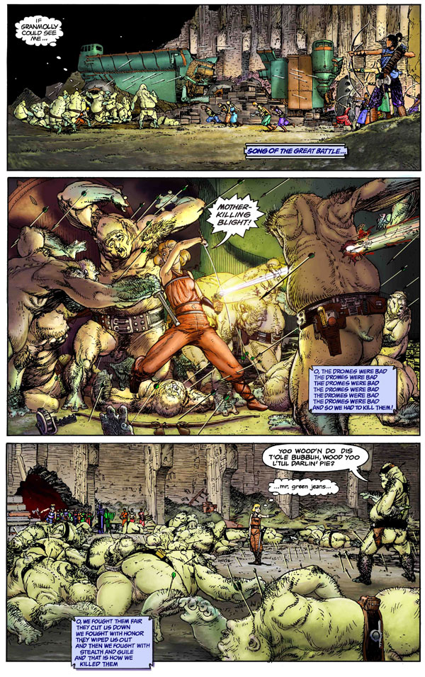
The Image
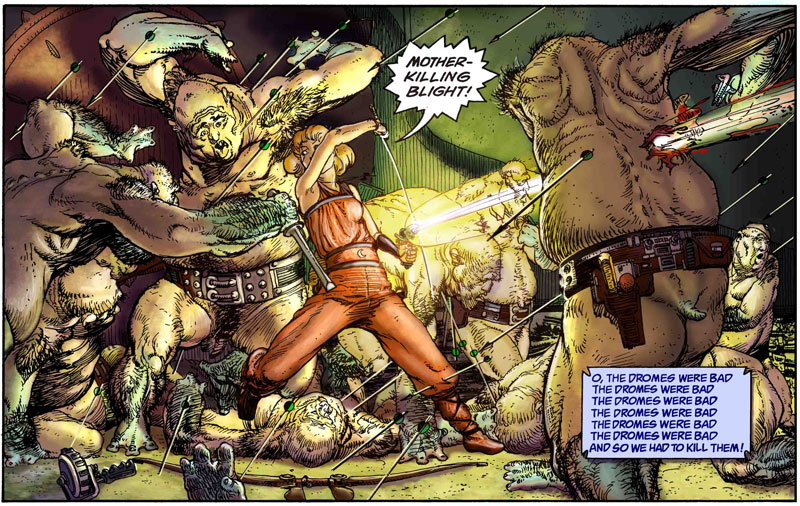
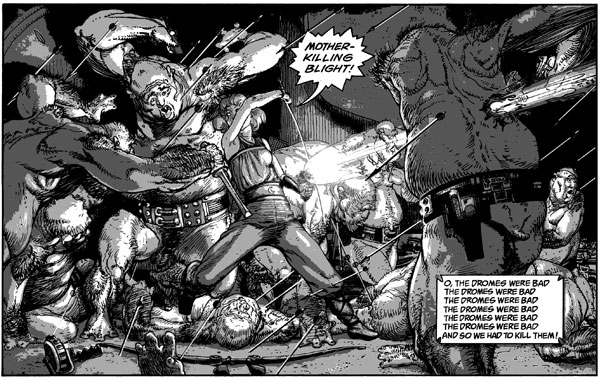
This is a page from an upcoming issue of Starstruck. There’s a lot of history to this story – see the Starstruck Wikipedia entry for more. Michael Kaluta did the pencils and inks. What I’m going to focus on here, though, is the recent color work by Lee Moyer.
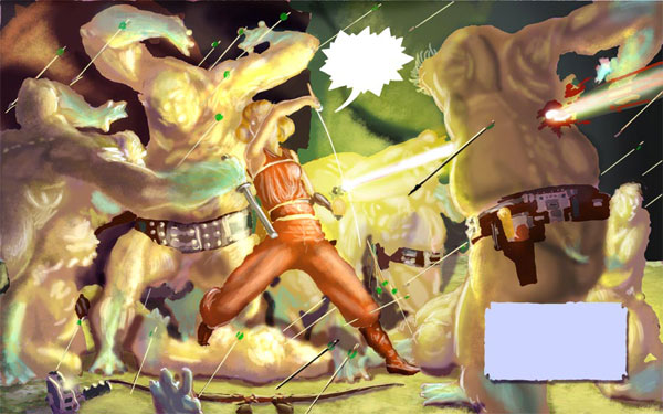
And here is the page as Moyer received it, without color.
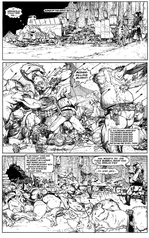
I’ll go over the whole page first, but then we’ll zoom in on that center panel to talk about specifics.
The Point of Coloring
Take a look here at a detail from the linework at nearly full size (you may need to widen your window to see all of it).
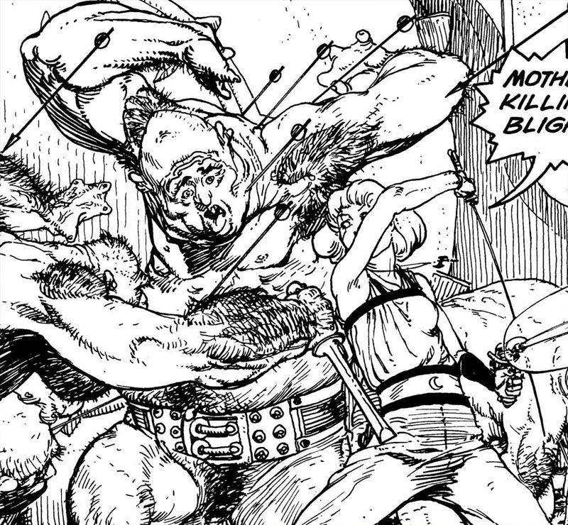
There’s a lot going on here – lots of lines and detail. This isn’t a case where Moyer can just use the paint bucket to fill in solid lines. In fact, it’s so busy that it’s a challenge to tell what’s going on. One of the points of adding color to this is to make the image read better – it should be clearer what is background and what is foreground. We should be able to tell better what the action is in the panel. Here’s the color version of this same detail.
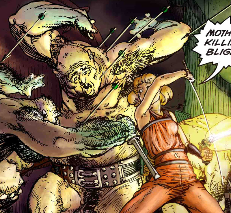
What Moyer is doing here is using both value and color to define the forms. The background wall is dark, so the ogre in front of it (lit by the light of the blaster) stands out as a clear silhouette. The inking on the woman’s arm gives a slight sense of volume based on variations in line weight, but the shading and tones on her arm enhance that sense of depth significantly. The warm orange of the woman’s costume brings her forward from the greens and purples in the background. The brighter shade on the ogre’s face brings our attention to it rather than to any other part of him. So the point of this coloring is to help us read and interpret the image, as well as to provide mood and be pretty.
Color Palette
I did a little experiment to look at the palette that Moyer chose for this page. I took the entire color version and converted the file to an Indexed Color version with 32 colors. There was black and white, of course, and below you can see how the rest fit onto the color wheel. This particular color wheel shows fully saturated colors at the outside edge and desaturated colors toward the center. It doesn’t indicate values (brightness), which I’ll talk about later. The plots are approximate – I looked at the color value and the saturation value and placed them by eye.
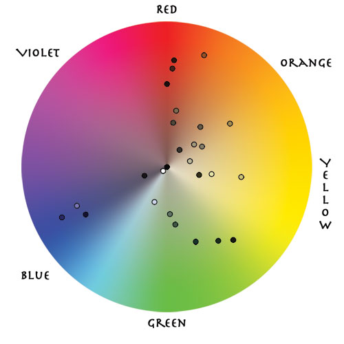
The first thing I see is that most of the colors are in the green and yellow range, edging into orange and red. There is not much violet. There are a few dots in the blue, but not many. This would lead me to think that Moyer was using blues as an accent color while greens yellows and oranges take up most of the picture. A quick look back at the entire page confirms this. There are bits of blue – the archer’s pants for example – but not lots of it.
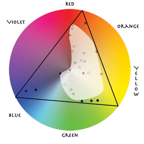
This color scheme forms a triad on the wheel. The most saturated of the colors (toward the outside) are near two of the corners of a triangle that bounds all of them. Most of the colors, though, are not all that saturated. The fact that the dots on the wheel all fall within this triangle indicates that there is an overall color scheme in play – it’s not an accident that there is no bright purple in this image. What this tells me is that the main colors Moyer used in the image were a reddish-orange, a yellowish-green, and blue. If he’d done this with paints, mixing these three main colors, along with black and white, would produce all the other colors in the image.
Frank Morley Fletcher uses a system of color key construction (like keys in music). This post on ConceptArt.org explains his system.
So why use those three as the main colors? Why concentrate on the greens, yellows, and oranges with blue as an accent? I’m not completely sure, but the last panel gives us a clue. The flesh tones of the ogres are mainly yellow-green. That helps us read them as monsters who have an inhuman pallor. The woman’s coloration is pink and orange, healthy and human. The people in the background, emerging from the hole in the walls use small bits of highly saturated color to draw our attention. They’re an accent, though, not the main focus of the scene.
That Center Panel
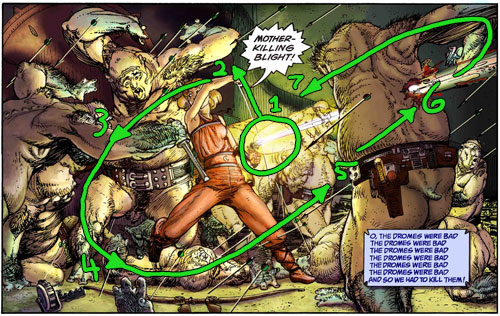
Here are two versions of the center panel. First is a larger version of the center panel in color, then comes one with color but without the linework.
This isn’t a view of the artwork we usually get to see. The most detail in the lineless version is in the woman. Most of the rest of the coloring establishes form and volume, not detail. Detail is the province of the linework in comics. Try squinting your eyes while looking at the color-only version. The definition of forms and volumes really stands out thanks to the values Moyer uses. I mentioned above how the palette helps set the mood and alien-ness of the setting. Let’s see how the values affect the picture.
In this case I made a greyscale version of the panel and then used the Posterize feature in Photoshop to reduce it to four value zones. Moyer reserves the darkest values for the background and closest ogre’s gunbelt. The blaster is the obvious light source. He uses the two middle value zones to define the figures. Notice, for example, how you can see the structure of the woman’s right leg even though it’s not apparent in the lines.
Here’s something else – there isn’t much brightness contrast between the woman and the figures surrounding her. Look back up at the color version, though, and she pops out visually. What we’re seeing here is not a brightness contrast but rather a chromatic contrast. The greens of the ogres’ skin recedes a bit while the warm orange color comes forward.
A Guided Tour For The Eye
Let’s see how this panel guides our eyes. There are several tools available: lines, color, and value. Let’s look at the lines first:
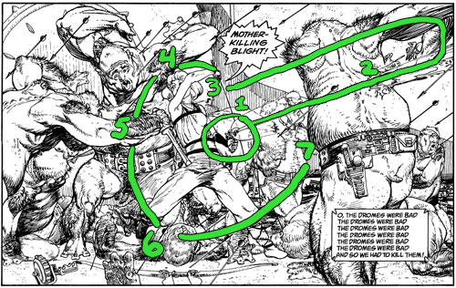
The area of highest contrast is #1 – the dark wrist next to the blaster, so this gets our eye first. Since I looked at the blaster first, I followed its discharge to #2 where it emerges from the ogre. At that point my eye didn’t quite know what to do but ended up following the elbow and arm back around to the troll’s torso and then back to the woman’s head (#3). From there I followed a trend of darker lines and texture through #4, #5, and #6, ending up at the gunbelt at #7.
Now let’s look at how my eye traveled the picture with the color only.
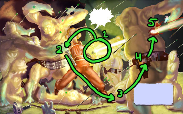
Here, the brightness at #1 catches my eye first. The linework and color support each other in drawing attention to the blaster first. This time, though, my eye traveled up the thinner edge of her blade and along her arm to end up at #2. Because the dark linework is absent for the larger loop my eye follows the ogre’s dagger to the woman’s leg and fallen ogre at #3. Now I go up to the gunbelt because of the contrast and finally to the blast-through at #5.
Both versions have a basic counter-clockwise loop to the picture. Before doing each of these I did this exercise on the complete picture, with these results:
Number 1 is still the blaster. In this case the glint on the sword took precedence over the blaster discharge. I went up to the woman’s arm. Then the linework takes over and takes my eye on a wider arc than just the colors did. I end up at the ogre’s elbow (#3) and down the other ogre’s leg to #4. The bow on the ground takes the eye over toward the gunbelt at (#5). From there it’s a short leap to the exit wound at #6. Though it didn’t happen in the color version, the lines take over and my eye follows the elbow and arm back toward the center of the picture where it picks up the blaster and starts again. Working together, the colors and lines compliment each other and show us what’s going on in the panel.
The Elements
Let’s turn Moyer’s essay on the Elements of a Successful Illustration onto his own work (insert evil laugh here).
Focus: The main focus of both the page and the center panel is the blaster that the woman is firing, and then the woman herself. Kaluta and Moyer use line, values, color, and composition all to draw our eyes to the center of battle.
Composition and Design: The design of the page shows the beginning, midst, and aftermath of the battle, with a horizontal panel for each. The center panel has a clear counterclockwise loop to guide the eye.
Palette: The palette is a triad on the color wheel. Greens and yellows predominate, with reds mixed in. Highly saturated blues are an accent color that both provides visual variety and draws our eye to secondary details after we’ve looked at the main focus of each panel.
Value: Moyer uses values to establish the figure-ground relationship and to better define the forms.
Mass: The sense of mass comes from two sources. Kaluta’s ink work gives heavier weight to the contour lines than to the detail and texture lines. Variation in that weight helps as well. Moyer’s values carry the bulk of the load – the shading makes us see volume and three dimensional form.
Texture: The texture in the page comes not from the color but rather from Kaluta’s linework. Look at the background walls in the top and bottom panels for examples. The hair on the ogres’ bodies is also a pretty interesting texture. (I’m glad I can’t smell those ogres.)
Symbolism: I don’t see much symbolism here – it seems to be a pretty straightforward action scene. I don’t know the overall story here yet, though, so maybe I’ll change my mind later.
Micro/Macro: The macro/micro concept is about including the right details and omitting the unneeded ones. As soon as you’ve reached a critical mass of the right details, the viewer gets a sense of a fully realized scene. At that point, it’s time to stop adding things. To my eye the linework version of this page has too much detail – it’s hard for me to parse – to tell what’s background and what’s figure. The color helps this immensely.
Ornament: The captions have just a touch of ornament – the treatment of corners to be specific. In the picture itself there is some ornament on things like the ogre belts, but generally what we see is pretty functional.
Narrative: Before having read a word we know that this page presents the onset of a battle, the furious fighting, and the aftermath. It also sets up a conflict at the bottom that makes us want to see the next page.
Juxtaposition: The first panel shows a set of sickly green ogres vs. a group of brightly colored humans. The last panel shows us a standoff between the woman and the ogre who is hiding something behind his back.
Stylization: I mentioned the high level of detail earlier in the micro/macro part. This is part of Kaluta’s style. The style of the ink lines uses heavier weight for contour lines and some variation to indicate form, though not a lot. The style of coloring is what’s generally called “painterly.” We don’t see large blocks of solid color – rather the palette and values work together to give a 3-D feel.
Character: The first panel gives us a bit of characterization of an anonymous ogre using words. The second panel uses both words and gesture to show us how badass the woman is. The third panel shows the standoff with the ogre clearly hiding something behind his back. He’s not trustworthy. His pidgin English evokes southern redneck stereotypes.
Tension: The top panel is an establishing shot of the battle. The tension here is about how the battle will turn out. Then we’re in the thick of it – will she survive? Finally we see a resolution of the tension from the first two panels and a setup for the next conflict.
Line: Nothing new to add to what I’ve said above.
Research/Reference: I’m not sure what kind of research or reference went into the page. I’m pretty sure Kaluta wasn’t there in the battle to do a life drawing. I’d bet that he got a couple of ogres to pose for him, though.
Vignette: The top panel sets up a clear figure/ground relationship with the ogres on the left. It’s there for the archers on the right as well, but the amount of linework there makes it harder to separate the figures from the background. In the center panel the woman stands out as the figure thanks to both the orange and the values.
Perspective: The third panel has the clearest example of perspective, though all of the panels use occlusion and relative size to indicate depth.
Fun: To be honest I have no idea what’s going on with Mr. Green Jeans, but it’s obvious that Starstruck has a quirky sense of humor. It manages to be a good pulp sci-fi story as well as being a bit silly. The amazing trick (from the first issue, anyway) is that they keep the silly from undercutting the story. I’ll be reading to see how it progresses.
Many thanks to Lee for providing the linework and color versions of this page to work with for this analysis.
Next week I’ll take a look at a comic cover that Neil113 suggested on deviantart.com:The Unknown #6.
[…] saturation value color wheel scottmcd.net […]