#24: Mind Machine, by Andrew Jones
Mind Machine, copyright Andrew Jones
This analysis copyright 2010 by Scott M. McDaniel
Many thanks to Andrew for supplying a large version to work with for this analysis.
The Image

I came across this piece at this thread on conceptart.org, which is well worth a look. Here’s a bigger look. You can also see an even larger, slightly earlier version of this painting here.
I haven’t really analyzed a painting that has significant abstract elements before. The closest is a comic cover by another Jones, Erik Jones’ cover for The Unknown #6. In that case he used abstract versions of gun silhouettes, bullets, and targets. They were still recognizable as those thing, though, whereas Mind Machine uses abstract shapes for layering and textures that build up form on their own – to a point. We’ll look at how Andrew Jones does that to control focus and direct the eye.
The Macro
The texture and detail in Mind Machine is amazing, and I’m tempted to dive right into it. First, though, I want to look at the whole thing. I’ve been told a number of times that a good way to see if a drawing is “working” is to squint at it so that you see only the major shapes and values. So let’s do that here (after a fashion).
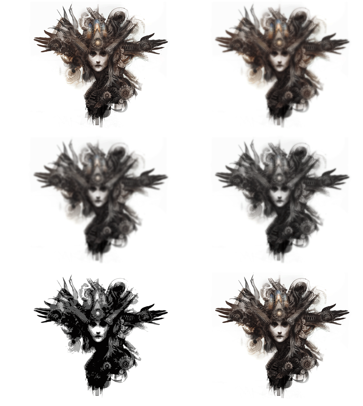
This GIF cycles through several stages. First we’ve got the original version. Then I applied a Gaussian blur, and then I desaturated it. Finally, I posterized that version down to 4 grey levels. What does this show us?
The first thing I notice is that we never lose a sense of mass, particularly around the face. Despite all the fantastic textures and details we’ll look at shortly, they’re used in service of the overall picture. Next, as we move away from the face and forehead area the picture flattens out and becomes more abstract. The silhouette breaks down some around the edges, though the hands remain clearly visible. They are flat, but still definitely stylized hands. Third, though there is not a great deal of color in the picture I find that when it fades out the focus shifts.
The Focus
Here’s a look at the painting placed on the golden rectangle grid. (I’ve left the original without a border because I think it’s an interesting effect with the white backgrounds of the painting and the web page. The rest have the correct border, though.)
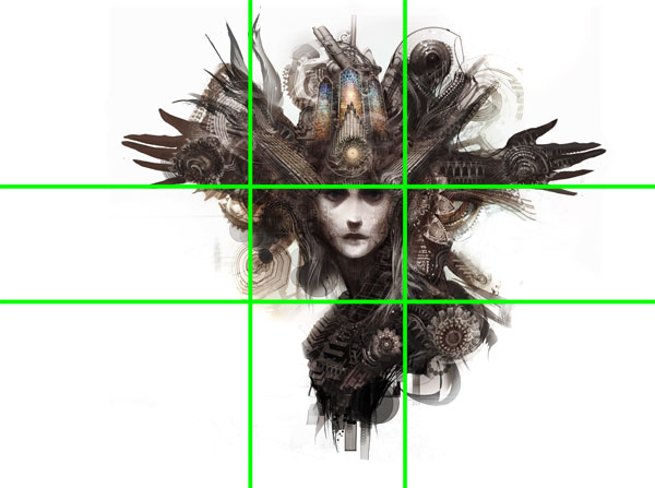
Jones gives us two foci in Mind Machine, and the transition between them is on the upper golden section line.
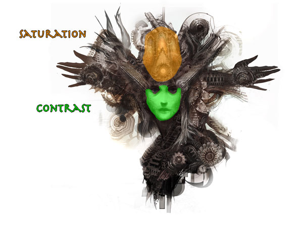
One of them is the woman’s face. The sharpest contrast inside the image is the face, shaded green above. The second one is the area right over her forehead – what I’ll call the headdress for now. If you look back at the posterized version you’ll see that there is some contrast there, but what’s really different is the spot color saturation. Our initial look at the painting goes between these two areas of interest. But when the color fades out in the animated version my eye drops lower in the painting to the face.
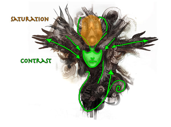
Color and contrast do the heavy lifting, but Jones also sets us up with lines in the picture that focus us in on the face in particular. Two diagonal structures come right into the temples, where the face and the headdress join. The two hands thrusting help here two. We follow the lines of both into the center of the painting and outward in the direction they are reaching. So there’s a little internal tension there about where we are supposed to look. And what about that spiral?
While we’re supposed to take in the picture as a whole on first glance, Jones does want us to step closer and have a look at all the details, shapes, and textures. Whether intended or not, I think the spiral does a good job of transitioning us from the big picture to the parts.
The Micro
Jones uses patterns, textures, and shapes to build up his values rather than simply painting them in. Here is a detail of the woman’s face.
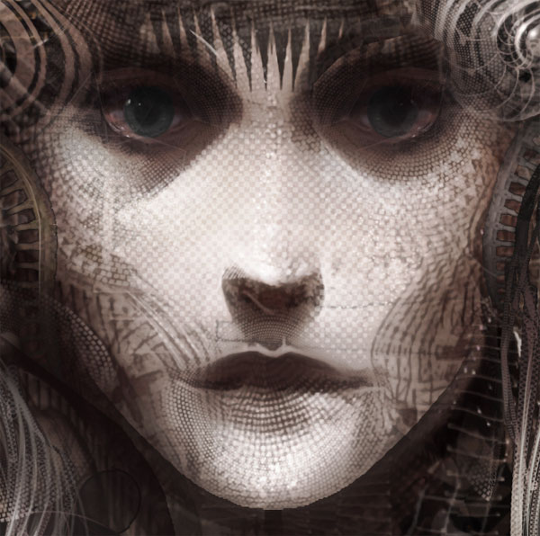
This reminds me of H.R. Giger to an extent, though without some of the underlying sickness. Jones uses a half-tone texture across much of the face, which provides some basic values. A curved triangle pattern defines the area under her eyes, and the interaction of those patterns gives us the effect of more shade on the sides of the cheekbone and face. Which other facial planes do you see defined by patterns?
Mixed into all this, though, is actual rendering of the eyes, lower surface of the nose, and the upper lip. Eyes, nose, and mouth are critical to our perception of faces, so I think Jones lays a foundation with representative versions of them. Only then does he start building up value with more abstract shapes.
Now let’s look at the headdress.
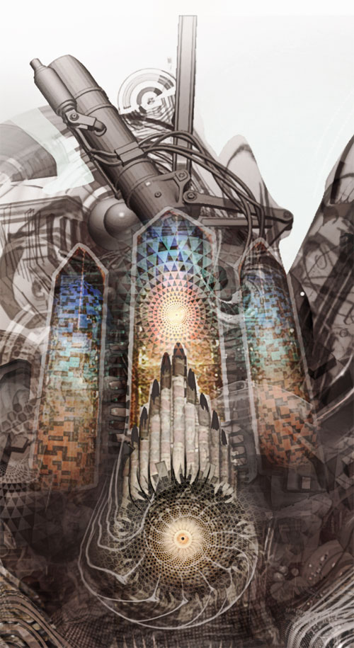
Here we have another invitation to move from the big view to the detailed view: a spiral just above the forehead. Sitting atop the spiral are a set of structures that look like church organ pipes framed by cathedral windows. We’re also starting to lose the precise modeling of form by values as the textures and patterns become transparent in parts. The organ pipes are firmly sitting on a hole, and they occlude the windows. The circular color pattern “in” the windows, though, escapes their borders and appears in front of the organ pipes, though transparently. Up at the top we see a few cylinders with wires Jones appears to have rendered in a 3D modeling program. It’s digital multi-media of a sort.
Now let’s move from the headdress to the right hand.
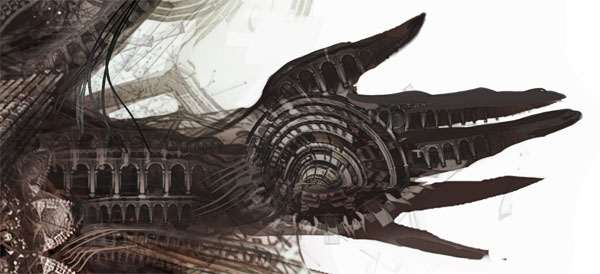
The columns in the forearm show up all over the painting. They’re relatively undistorted in the forearm, but they’re quite distored in the hand. Like the triangle pattern beneath the woman’s eyes, it’s a texture that shows up repeatedly. Partly Jones is playing with it because it’s interesting visually, but he’s also warping it to see how he can make it fit into the other structures. Here are the arches at the base of the woman’s neck.
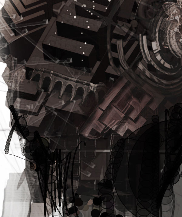
In this case arches makes a fringe at the base of a bunch of blocks that lead up the woman’s neck. Though the angle is a little off, I also get an impression of architecture forming the base of a larger structure. I’m not sure, but I think he also uses them as the basis of at least the circle in the lower right part of the neck. It’s interesting to look at the earlier version that he has posted on the web site and compare it to the version above, which he was kind enough to send me for this analysis. It shows experimentation, what I imagine is largely an intuitive process to see which textural combinations look best.
The arches are an example of using a recognizable image as a pattern. Jones also uses completely abstract shapes like circles and triangles. We associate columns and arches with stability and structure, and perhaps we carry some of that over to the picture. The circles in the detail above, though, don’t carry any underlying associations. Jones uses them for their values and to add vertical “lines” to the painting since he stacks some of them vertically. Others he overlaps, which creates a collage style depth in certain areas. Most likely he’s using brushes and tools in Photoshop, Painter, or another tool and not carefully placing each individual circle.
One last note about the circles. He repeats them in a number of places, often creating an effect of vertical cords or machine wires. He also does this with triangles in other places. The repetition result in a rhythm and texture of its own that falls somewhere between the micro, detailed view and the macro, blurred view. It manages to unify the picture’s “look” without being initially obvious.
The Elements
To wrap up we’ll go through Lee Moyer’s Elements of a Successful Illustration.
Focus: The main focus is the woman’s face, based on contrast. A close second is the headdress, based on saturation.
Composition and Design: Since I haven’t mentioned it yet I’ll say that using a white background is pretty unusual. I usually hear that using pure black or white tends to flatten images out. Here, though, it’s part of the effect. In another way Jones follows convention by having the focus be off center.
Palette: The palette is warm but very muted, with the exception of the spot saturation of the headdress.
Value: Jones gives the woman’s face a rounded effect by layering textures to get the values he wants. Overall the other textures are dark.
Mass: The image is flat overall with a few exceptions – the face and the headdress. The 3D rendered cylinders atop the headdress are an interesting exception.
Texture: Jones layers patterns to guide the eye and to create visual interest. He blends them with different opacities uses both recognizable objects and abstract shapes to make them.
Symbolism: It wouldn’t surprise me if there is a good deal of personal symbolism in this painting. I’ll just point out that the shapes I’ve been calling pipe organs and church windows in the headdress are actually more basic shapes that symbolize those objects.
Micro/Macro: Usually this aspect refers to including just the right details and no more to create the illusion you’re looking for. Since this isn’t a narrative drawing and isn’t really even that representational I instead interpret it to mean looking at the picture as a whole and looking at the details up close. You could spend quite a while looking at how individual details support or detract from the piece overall.
Ornament: I’ll just pose a question here. What do you think of the three bands on the woman’s face in the earlier version that I linked to at the beginning. Jones obviously decided to remove them. Why do you think he did that, and do you think it’s a good decision?
Narrative: I don’t see any narrative here. Perhaps it makes narrative sense in the dreamscape. (Wait, did I just go flaky for a second there? I take it back!)
Juxtaposition: Jones plays basic shapes, colors, values, and textures off of each other to see how their proximity affects things. The proximity play is in the level of shape and form, not narrative concept.
Stylization: If you look at Jones’ other work in the conceptart.org thread I linked to at the beginning you’ll see that this picture is consistent with many other paintings. The most obvious aspect to the style is building up form and value out of repeating geometric patterns. You’ll also regularly see smaller shapes that conceptually relate to the main shape overall.
Character: I get a sense of detachment and perhaps serenity based on the woman’s expression. Individual character isn’t the piece’s focus, though.
Tension: Earlier I mentioned the tension between the outreaching hands and the various directional lines that lead us inward. Honestly, I’m not sure but I might be making that up out of whole cloth.
Line: Jones isn’t using lines in the conventional sense of defining outlines or providing shading. He does use repeated lines as textures to lead us around the image, like he does in the two diagonal structures pointing to the woman’s temples.
Research/Reference: No idea. At all. He may have started with a photograph of repeating arches and columns, or maybe he drew them first and made a brush out of them.
Vignette: We see the woman’s face, neck, and general shoulder placement. Obviously I think the top area reads as a headdress of some sort, but it doesn’t have to be that.
Perspective: Perspective doesn’t enter in much here in the macro view. It plays a larger role in the micro view, though, as we look to see which shapes lie in front of which other ones based on occlusion and transparency.