#9: The Unknown #6, Cover A, by Erik Jones
See this image on DeviantArt.
By Erik Jones. Suggested by Neil113 at DeviantArt.com.)
Image copyright by BOOM! Studios.
This analysis copyright Scott McDaniel, 2009.
This is the first of two covers for the upcoming comic “The Unknown,” published by Boom! Studios.
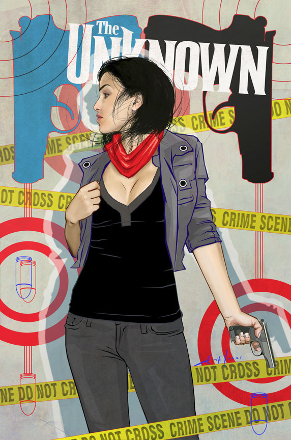
While I’m not that familiar with the comic overall, I do know that the main character, Catherine Allingham, is a detective with only a few months to live. This cover doesn’t illustrate a specific scene but instead sets a tone and a mood. Its purpose is to catch the eye (stand out from the other covers) and give us a hint of the kind of story we might find inside the pages.
Focus
Jones puts the focus squarely on Catherine with several techniques. For one thing, she’s front and center – the largest thing in the picture. This may sound stupidly obvious, but we also instantly perceive that she’s a person. We’re wired to perceive people and faces, and Jones gives us a clearly recognizable pattern. In other words, the silhoutte itself is unambiguous.
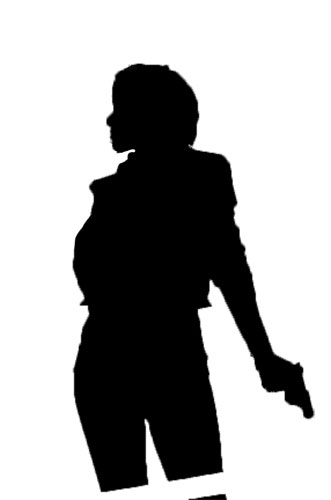
Clearly readable silhouettes make it so much easier to read the picture and see what’s going on. As important as they are in an illustration of a scene, they’re even more important in a vignette like this cover. In this silhouette we not only identify the figure of a woman, but we also see that she’s holding a gun and that she’s standing with attitude – a “vogue” if you will.
While on the topic of silhouettes, I’ll add in the other elements of the cover design that I see is part of the figure in the figure/ground relationship.
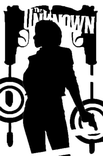
Here we see that the guns and graphical elements effectively frame her. They’re tilted slightly to keep the image from being too static. Now we have a clear silhouette inside a frame that draws our attention to its center. While Catherine is the main focus, now we clearly see the secondary focus – the gun that she’s holding. Just from the silhouette we already have a good sense of The Unknown’s mood and subject.
Now let’s look at the values.
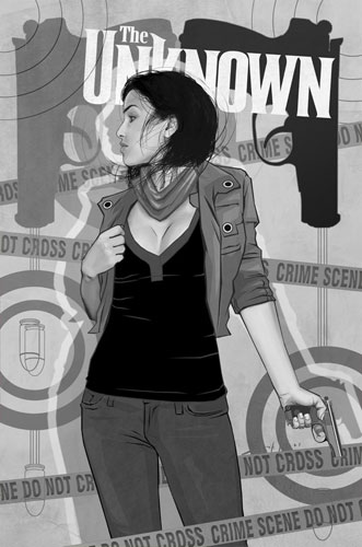
There are two clear blocks of dark here – her shirt and her hair. The areas of highest contrast, then, are:
- The contrast between her hair and the skin of her face.
- The contrast between her shirt and her cleavage.
I’ll leave it as an exercise to the reader as to why a comic cover would call attention to cleavage. The third area of dark is the silhouette of the gun in the upper right corner. Note that the gun in the upper left corner isn’t nearly as dark. It stands out anyway not because of the value but instead because of the color contrast.
Guiding the Eye
Here is the path my eye took when I first looked at the picture.
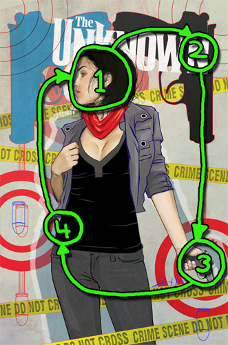
In my case the contrast between the hair and the face won out, so that’s where I started. (At least I think so – so much is sub-conscious these days.) The dark value of that gun (2) pulled my eye from her face right to the title. From the point of view of telling me what the comic is about it’s a good job that my focus lands first on the character and then immediately on the name of the book.
After that I followed the lines from the gun barrel down to the secondary focus (3) – nicely framed by the target. The repetition and rhythym of the gun silhouette helps also. At this point my eye would be lost if it weren’t for that police tape bringing me back to the main figure. The curve of Catherine’s hip (4) is a contrast in both value and straightness of the line, so I follow it to her arm and the barrel of the blue gun. The gun’s handle takes me right back to Catherine’s face, where I can start the loop again.
If my gaze had skipped over the hip, I still would have been OK because I’d have landed on the bullet (part of the frame) which then guides me back onto the path.
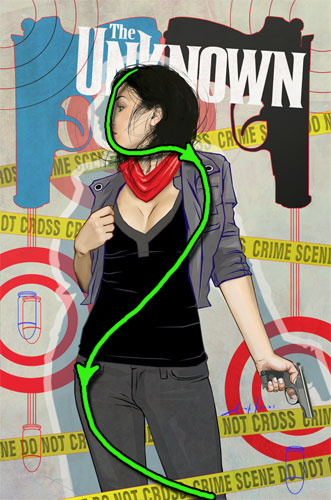
Iconic vs. Representational
I can’t believe that I haven’t yet mentioned Scott McCloud in these analyses, so it’s time fix that. In Understanding Comics he introduced the idea of the big triangle. Essentially, there’s a continuum for cartoon images between iconic – the classic happy face, for example – and realistic. (See this image of the triangle, from the book.) One thing I think is interesting about this cover is that Jones uses one level of realism for Catherine and a more iconic look for the other elements like her scarf, jacket, and the bullets.
Here is a detail showing Catherine’s face and scarf.

The face has a smooth, clear outline, something that is fairly iconic. The coloring, though, is smooth and fairly realistic. I’d put this picture closer to the representational end of the scale, maybe a third of the way along it. Contrast that to the scarf. Jones doesn’t use an outline on the scarf, but it’s made out of straight lines and solid blocks of color. There’s none of the blending we saw in the face. Instead we have abstract shapes standing in for the shading and folds of fabric. If we look over at the jacket, we’ll see that it does have outlines (blue this time) and tends to be made of straight lines. Finally, the targets and bullets on the cover are almost all the way over to the iconic side of the scale. This mix of line and style could easily go awry, but it doesn’t because Jones uses them methodically.
Catherine’s Figure
I haven’t focused on figure drawing much in the earlier columns, but because the figure is such a prominent part of the drawing I will this time. I highly recommend the book Force: Dynamic Life Drawing for Animators by Mike Mattesi. If we look at the direction of force in a figure we should see a clear rhythym to the line – at least for those figures that aren’t stiff. Usually force refers to the distribution of physical weight, but it also refers to the line and rhythm there as well.
I start the force line here at her head, where it moves over to the raised shoulder. When force changes direction we should see more of a bow to the figure. It’s subtle but there as jacket lines start bringing us back over to the other side of the figure. On the other hand, it’s quite obvious in the curve of her hip. That hip is bearing her weight, and as we continue to move back down a little bit of the weight shifts back in the other direction.
Jones supports the lines of force with a simple rhythm to the linework. (In this case simple means uncomplicated, not necessarily easy or obvious.) In a figure drawing like this we should see curved lines matched up to straight ones. Think of a bulging bicep for example – there’s a clear curve to top of the bicep, but the bottom of the arm will be a fairly straight line as the tricep relaxes. Here are a few of these lines in this cover:
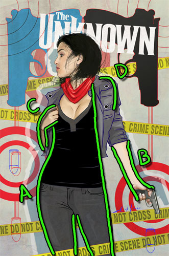
The one that jumps right out is the curve of A against the straight line to its right. The left side of her body (our right) is the main straight line in the figure. It contrasts with A as well as the curve of her shoulder at D. A couple of other examples are her forearms at B and C.
The Elements
It’s time to wrap up with Lee Moyer’s Elements of a Successful Illustration. I haven’t focused on everything in this image, so this will let me touch on some of its other aspects.
Focus: Jones uses strong silhouettes, clear blocks of dark color, and framing to make Catherine the focus.
Composition and Design: The image guides our eye by using the blocks of dark and the framing elements. The frame and the police lines are at angles to keep the picture from becoming static. Also, the elements of focus tend toward the realism side of the scale while the parts that aren’t the focus tend toward the iconic side.
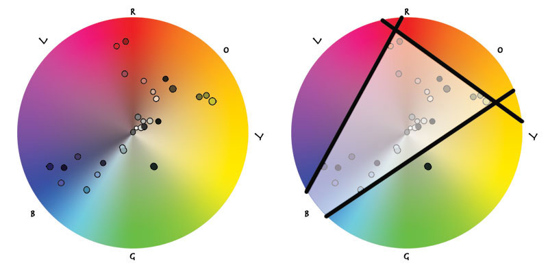
Palette: The background is grey, with the clothing responsible for blues and the skin for oranges and reds. In plotting the simplified palette on the color wheel, we see that it’s close to a triad. (Colors are desaturated in the center and saturated towards the edge. This color wheel doesn’t show brightness.)
Value: For this cover Jones chose not to use values to define mass, but rather to give us clear blocks of similar value to guide our eye around the picture. Also, note that Jones has opted to use shadow as a graphic element rather than strictly adhering to a single light source.
Mass: Even though he’s using values for other things, there are still indications of mass. Note the color variations on her legs, for example, which are an iconic indication of shading.
Texture: There are subtle textures throughout – note her jeans and the background grey itself. Interestingly, her skin is extremely smooth.
Symbolism: The symbols here are obvious and made even moreso with their iconic/graphic nature. Bullets, targets, and guns help the viewer reach the conclusion that this book is probably noir, with the twist that this time it’s the pretty woman that’s the PI.
Micro/Macro: Since he’s doing this as a vignette, Jones doesn’t need to create an impression of a fully realized background and scene. I’ll note the wispy hair, though. That one detail makes the drawing of her head in particular seem much more realistic than it otherwise would.
Ornament: The frame of the gun silhouettes, the bullet paths, and their targets are the best kind of ornament. They add visual interest and style to the image, and they’re also a key part of the composition that guides the eye.
Narrative: This is image is about tone and mood, not narrative. We do get the idea, though, that she’s prepared for a certain amount of danger what with the police tape and her drawn gun.
Juxtaposition: There are strong contrasts in terms of color (the scarf and the upper left gun), value (hair and face), and graphic style (bullet and face).
Stylization: Jones is clearly playing with style here, blending realistic with iconic to achieve an overall mood.
Character: Since it’s a vignette, getting a sense of Catherine’s character is key. Her clothes, posture, expression, and handgun all tell us about her. She’s calm, cool, and prepared for anything.
Tension: We can tell from the vignette that she is about to deal with something or someone. We don’t know what, and I doubt she does either – thus the tension.
Line: I could have written a lot more about this. Jones uses a thin outline without much variation around Catherine. It’s close to black but I think has reds in there too. The line has smooth curves. Contrast that with the lines for her jacket. Here we have blue lines of varying weight and mostly straight segments. This difference leads to one of the few parts of the image that doesn’t work for me – the way her hand is hanging onto the jacket. The hand seems to be hovering over the jacket, not grasping it.
Research/Reference: I’m not sure, but I’d guess that Jones used a reference photo for the basic drawing. He did the entire thing in Photoshop, so there aren’t any preliminary drawings.
Vignette: Have I mentioned that this is a vignette?
Perspective: The depth in the image comes from the police lines – the fact that she’s in front of all of them except one.
Fun: I don’t know about Jones, but certainly enjoyed looking at how the different graphical styles interact and support each other. I imagine he had fun playing with that and getting it to come together.
Next time: Maxfield Parrish and the case of the disappearing figure.