#7: A Vision of Peace, by Alex Raymond
by Alex Raymond, 1942
Published in Look magazine
This analysis copyright Scott McDaniel, 2009.
The Image
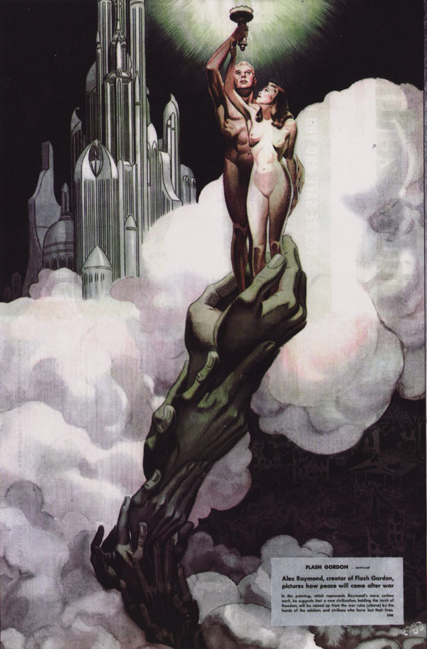
This is the last page of a 3 page article published in Look magazine in 1942 called “The Creator of Flash Gordon Envisions the World’s End.” Until just a few years prior to this Alex Raymond had worked mostly in comics with ink and line. He’d begun working in color, though, and delved into it in full force during World War II. A year or so after this image he joined the Marines and produced a number of works for them. This image, though, shows a blend of both his comics experience and an illustration style influenced by the likes of J. C. Leyendecker.
A Vision of Peace is a piece of war propaganda. Based on the text in the book Alex Raymond – His Life and Art by Tom Roberts (the source of this scan), I have every reason to think that Raymond fully believed in the war and its cause. Whether we agree with it or not, we should meet every piece of propaganda with critical thinking. In this case, we’ll look at how this image works both as an illustration and as propaganda. The text at the bottom of the image says,
FLASH GORDON … continued
Alex Raymond, creator of Flash Gordon, pictures how peace will come after war
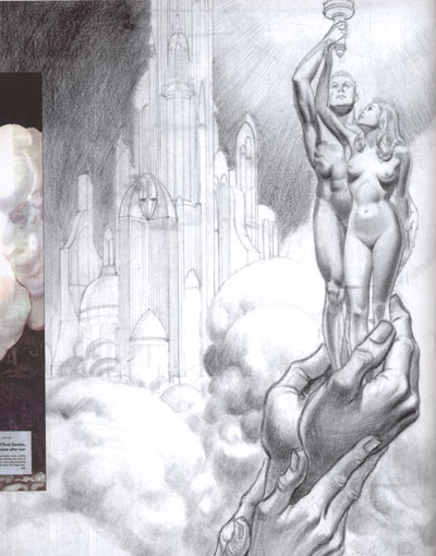
In this painting, which represents Raymond’s more serious work, he suggests that a new civilization, holding the torch of freedom, will be raised up from the war ruins (above) by the hands of the soldiers and civilians who have lost their lives.
END
The first two pages of the article show scenes of the war (both battle scenes and the home front), as well as an interesting page where airplanes of his own design bomb the “head of the Axis octopus.” This painting then, was to communicate what we were fighting for. It’s quite symbolic and quite idealistic – a 1940’s American’s version of Utopia.
Composition and Influences
In the analysis of the Leyendecker piece, I said this about its composition, “In all three of the previous analyses I’ve drawn arrows showing how background elements guide your eye to the central focus. But here, there is no background. The closest thing I see to that is the tassel that leads the eye down to the woman. Rather than many different things pointing to her and, secondarily to him, the technique that brings our eye to the right place is the curve in the picture above.”
In this case we do have a limited background, but a simple, elegant curve is the basis of the composition yet again. In the picture below I’ve shown the main curve that the eye follows in yellow and a secondary curve in green. The secondary curve supports and frames the main eyeline.
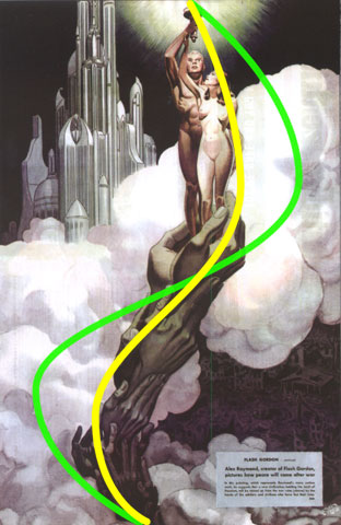
To show the frame more clearly, here are the main bright and dark areas of the painting:
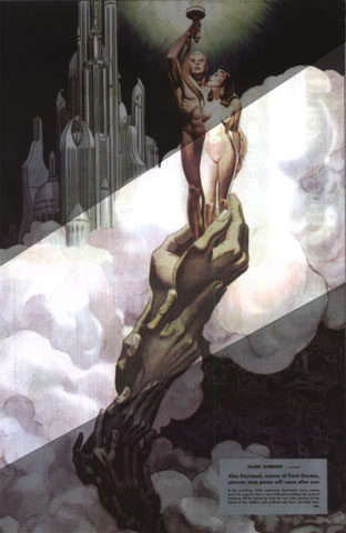
The lesson I take from this is that one way to control the viewer’s eye is to eliminate almost all background detail and make the focus of the image a pleasing, high-contrast shape. Detail work inside that shape is fine but still shouldn’t go overboard. Finally, let’s look at the grid of golden sections applied to the image.
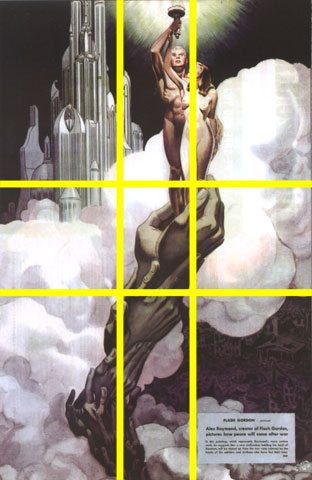
See how the right vertical line goes right through the woman? The S-curve of the composition weaves right through the center section and ends up at the torch at the top, which is nearly on that line as well. The background city takes up the upper left rectangle. While not as bright as the clouds and figures, it is on the lighter side, which balances darker war ruins in the lower right.
Symbol and Message
As propaganda, if this painting is to work it must both persuade the undecided and motivate the already converted. It does this by setting up an ideal image of what we were fighting for. Like most propaganda it’s heavy on mood and symbolism but light on details or specifics. Too many details in the image would interfere with the basic communication. Here’s a detail of the war-torn landscape at the lower left.
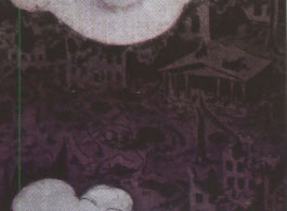
You can see blasted out buildings and general wreckage. This is the area of the painting that has the most actual drawing in it, with hints of detail and perspective. But look at how low contrast it is. It’s not supposed to be noticed first, second, or even fifth. So why is it there at all? For two reasons. First, it’s a reminder that no matter how we feel right now, how grim the situation, we’re building towards something better. Second, it’s a reminder of the sacrifice. It’s where that column of the hands of the dead originates. We must endure it if we are to ascend to the heavens. Without that reminder in the image, it loses a level of symbolic meaning.
So if the wreckage indicates where we are now, what about the city in the upper left?
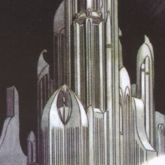
The city is the bright counterpoint to the wreckage. As such it’s brighter than the background, though notice that Raymond is careful not to make it bright enough to compete with the main focus of the painting. As the creator of Flash Gordon, Raymond was one of those who created our visual language for the “futuristic city.” From my perspective in 2009, this looks like a generic utopian city from the golden age of illustration. Then, it was a fresh image. What it’s like is left vague – that’s in keeping with the propaganda nature of the painting. But we see the symbol of light and advancement and fill in our own details.
Let’s look at a couple of other things. The torch of freedom is at the very top of the image – the place of supreme importance. It’s supported by the ideal man, who is himself supported by the ideal woman. He is primary and higher up in the image, while she is looking up at him and the torch. She’s helping him hold it (see her hand at his wrist), but he is also protecting her (see his hand at her wrist). There’s obvious sexism in this, though I’m going to skip a discussion of that here.
The ideal man and woman, as good as they are, can’t lift the torch high enough on their own. They are supported by a weird tower of hands emerging from hands. Knowing from the caption that they’re the hands of the dead makes this whole thing more than a little creepy. Their desaturated yellow and green contrasts with the healthy pink of the figures. I believe this symbol is to comfort those of us who have already sacrificed and to assure us that the sacrifice is to a good purpose. The last two symbols I’ll mention are the clouds and the city. A city in the clouds evokes heaven. So what we’ve got is the sacrifice of the dead lifting the ideal man and woman (Adam and Eve) back to heaven and the light of freedom.
Color and Palette
One of the first things I noticed about the color in this painting is how desaturated it is. There’s quite a range of values, but none of the color is all that intense. I’m not sure exactly why, but I think it may be a combination of several things:
- The quality of the reproduction may have an impact. This scan is from a 1942 magazine. You can see in the image some of the print bleeding through from the other side of the page. Look magazine was the major competitor to Life magazine, so though I suspect the production values were decent it’s hard to know how well it’s aged.
- Raymond was relatively new to color and may have been conservative in his use of high saturation. The other two pages have similar saturation levels.
- The mood of the piece and the time did not necessarily call for bright, happy colors. Despite the hope this piece is to communicate, it was still being done in a time of hardship – both war and the recent Depression.
The second thing I notices was how Raymond used warm colors in the figures and cool colors in the column of hands. The hands are a yellowish green. Since warm colors tend to come forward while cool colors recede, we have the figures as the brightest, closest element while the column of hands recedes back into the clouds. The shading on the clouds is mostly neutral but tends slightly to purples, especially toward the bottom of the picture.
Lines and Form
Raymond was moving from ink work in comics to painted illustrations during this time, and we see a little bit of both in this image. The hands, the figures, and the city have linework while the rest does not. For the figures, the lines are just there for contour. They’re thin, and Raymond uses lighting to provide the form and the mass. The hands are similar with the exception of the nails and a few creases between finger segments.
Unlike the figures and the hands, the city uses lines both for contour and to suggest detail. The dome on the left side, for instance, uses line just as much as shading to suggest roundness. Those arches wrapping around the cylinder do just as much to indicate roundness as the shading itself. It’s almost as if Raymond couldn’t quite convince himself that he could do without the lines. Within a year or two he would – his later paintings don’t use them.
Preparation
Tom Roberts’ book also includes a preparatory sketch for this painting. It’s neat to see the intermediate step.
As a fairly new artist, it’s good for me to stop and remember that these images don’t just spring unbidden from the artist’s brush. Raymond obviously spent a fair amount of time on this sketch to work things out before he began painting, and I’m sure this wasn’t the first study he did for it.
I see that he’d worked out the lighting patterns for the hands and people but hadn’t settled on the final values. You can also really see those lines in the column of hands.
The Elements
Lee Moyer’s essay Elements of a Successful Illustration provides us with a framework to look at this vision of peace.
Focus: The clear focus are the man and the woman. They’re framed by the curve of the clouds and they sit on the right vertical line of the golden section grid.
Composition and Design: The clouds form a frame of brightness. The rhythm of the design is dark to light to dark as you go from upper left to lower right. The figures and column of hands form a rhythm with their S curve.
Palette: Desaturated, with the focal figures being a warm color and most everything else a cool color. The saturation suggests to me a serious image to match serious times.
Value: There is near white in the figures and the torch and near black in the background elements. Values are also essential in providing the form and mass of the two figures.
Mass: Communicated mostly through values. The linework is thin enough that it contributes only a little to the perception of mass, and that mainly in the background city.
Texture: Texture is not emphasized, though the scan itself provides some interesting texture in the clouds. (The scan, in this case, that was used in the book.)
Symbolism: Since this is propaganda, there are many symbols and they’re fairly obvious. Propaganda doesn’t work through subtlety.
Micro/Macro: The most complete detail work is the blasted landscape in the lower right, which is quite low contrast. Some of the linework in the city suggests detail without actually providing much of it.
Ornament: The caption itself is a type of ornament in the image. There is also some in the city.
Narrative: The narrative is secondary to the symbolism. All we really know is that a couple has been lifted to the heavens from desolation, holding a torch. I’d kind of like to know how that column of hands came together. What did this scene look like 10 seconds ago?
Juxtaposition: Living people vs. dead hands. Bright, shining city vs. war-torn battlefields. The light of freedom vs. the darkness below.
Stylization: The style incorporates elements from painting and from the tradition of ink comics. It’s a snapshot of a person in transition between the two.
Character: The two figures do not stand out as specific individuals, nor are they meant to.
Tension: I’d say this picture is more about the resolution of tension than the tension itself. That came on the previous pages of the article. There is a disquieting tension, though, between the living and the dead. Or maybe that’s just me.
Line: Raymond uses line to support and emphasize his key elements: the figures, the hands, and the city. He does not use it to define mass.
Research/Reference: See the preparatory sketch above.
Vignette: The hands and the people are figure, while everything else is ground. Raymond uses the clouds both to frame them and as something to give them contrast.
Perspective: There’s some perspective in the city, but it’s not integral to the painting overall.
Fun: I don’t know that I’d say this image communicates a sense of fun. I don’t know that Raymond had a great deal of fun painting it. However, I do think he felt a sense of satisfaction and earnestness.
There we go. All this time I’ve been using Lee Moyer’s essay to wrap up these critiques. Next week I’ll take apart some of Lee’s work on the new release of Starstruck. It will focus on how color adds to and defines linework.