#19: I Have Been Reserved for This, by Howard Pyle
I Have Been Reserved for This – to Free the Land From Spiritual Tyranny, by Howard Pyle
This scan from Pirates, Patriots, and Princesses: The Art of Howard Pyle
This analysis copyright 2009, Scott M. McDaniel
The Image
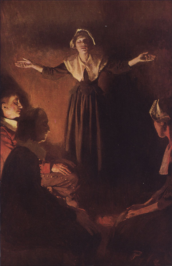
This illustration is for a story in McClure’s magazine in 1906 called “The Hanging of Mary Dyer.” There was an actual Mary Dyer who was an early Quaker martyr. She was executed for repeatedly returning to Massachusetts to preach Quakerism after having been banned from the colony. Pyle himself was Quaker, so the illustrations for this story likely had an extra dimension for him. Also, though it may not be apparent from the picture, this is the very act that led to Mary Dyer’s execution, so it’s a key moment of the story. As was the style, illustrations were often tied to specific sentences or phrases in story. The accompanying quote for this one, then, is “I Have Been Reserved for This – to Free the Land From Spiritual Tyranny.”
I chose to do a Howard Pyle piece because his name keeps cropping up when you research other 19th and early 20th century illustrators. His students included N.C. Wyeth and Frank Schoonover. Maxfield Parrish went to his school, but Pyle told him that he should go ahead and get started directly in the field. He’s the granddaddy of American illustration.
The Character
Pyle takes a plain, unadorned pilgrim woman and gives her incredible presence and intensity. All we can really see in the picture is that she is leading a prayer service. Everyone’s eyes are closed and they are in a pose of contemplation and prayer. Pyle establishes her as the leader by placing her higher than the others in the picture. Further, she is the only one active – all the others are sitting quietly.
The figure’s gesture is critical. (A gesture is the posture and attitude that it conveys. A figure can be anatomically correct and balanced yet still come across as stiff or wooden. The gesture is the loose aspect of the drawing that communicates a “living” quality.) Solely through pose Pyle takes a slight, unassuming person and gives her intensity and authority. She’s leaning forward slightly, and she has a basic rhythm to her stance.
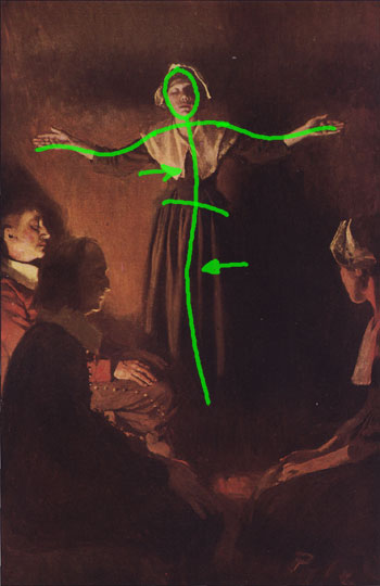
Though it’s subtle, the shoulder line tilts against the line of the hips. In living figures it’s rare to see head, torso, and pelvis all lined up. Because Pyle tilts the torso and pelvis differently, there’s a basic curve to Mary’s body, and from that we can tell where she’s placed her weight.
Mary’s expression also communicates a lot. Her eyes are closed, so she’s as much in prayer as those around her. The slight up-tilt to her head is common in religious paintings.
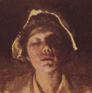
It’s just a masterful expression. The face is mostly relaxed, but her eyebrows are raised slightly. Combine that with the closed eyes and the dramatic lighting and it’s quite an effect. Posture and expression are the keys to a character-centered illustration, and Pyle nails them here.
The Rhythm
I mentioned the subtle back and forth rhythm to Mary’s figure. Pyle displays several kinds of rhythm in this painting. That backwards S in her figure is probably the most important, but there’s also an example of a couple of other kinds. Pyle plays fundamentally straight edges against curved ones in several places.
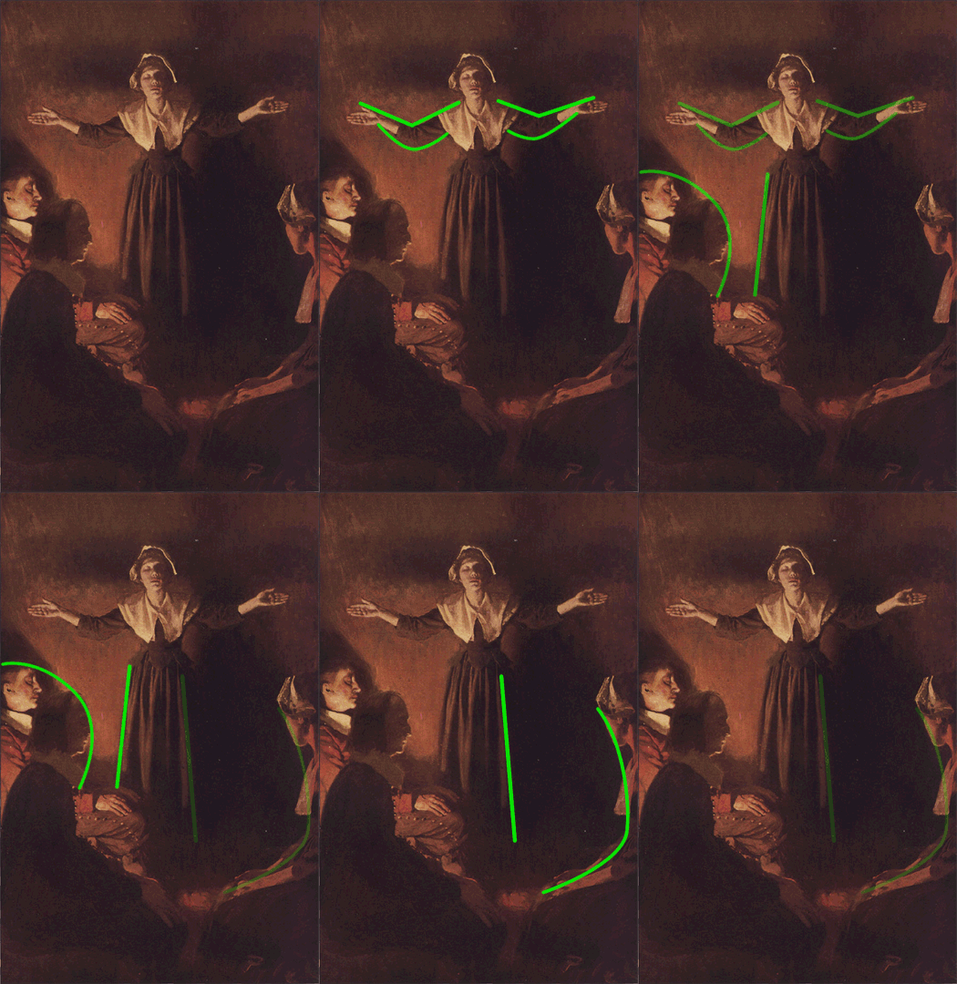
The tops of Mary’s arms tend to be straight while the bottom of her arms form a curve based on how the fabric hangs. Pyle also defines the negative space around Mary by contrasting the straight fall of her dress with a curved contour of the people around her.
A third kind of rhythm is the alternating light and dark pattern as we move from left to right. At the left edge of the painting he begins with a light block (the first seated man).
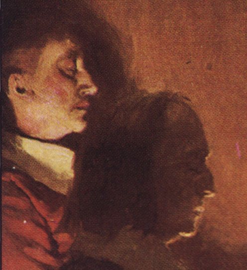
The first man’s bright face alternates with the darkness of the second seated man, followed by a light area between him and Mary. Mary’s dress starts out light on that side but quickly moves into darkness. Or look back at Mary’s face. If we move down her head there is a bright strip of her bonnet. Then there is the darkness of her hair, a highlight on the hair, more darkness of hair and forehead. Then comes the brightness at her brow, a dark bridge of the nose, and a lighter tip.
The point here is that you we see alternating light and dark, not dark areas next to even darker areas.
The Lighting
Let’s take a look at a high contrast version of the image.
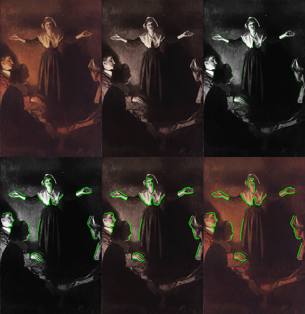
The two areas of highest contrast are Mary’s face and the seated man on the left. Mary herself is the focus, and the dramatic contrast on her face brings our eyes to her. And, therefore, to her expression. Aside from her face, the areas of high contrast bring our attention either:
- The other people who, because they are facing her, direct our attention back to Mary, or
- Mary’s hands. I’ll get to the effect of making her hands pop out at us in a minute.
Pyle’s placement of the light source is, if you’ll pardon the pun, brilliant. Presumably it’s an indoor setting at night, so the low light levels make sense. Having the intense light source lets Pyle use sharp shadows to define both form and space. The shading on Mary’s face is a good example. Also, look at the relative flatness of the closest man as compared to the one behind him, illuminated by the light. The further man has more shadow definition than the one in silhouette.
Speaking of silhouettes, the light’s placement also lets Pyle define several layers of silhouettes.
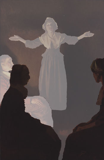
The silhouettes overlap each other logically, and the overall lighting on them defines their position in space. With a more diffuse light source that would not have come through as well. (See the Moyer and Kaluta analysis for another example of layered silhouettes.)
One final note on the lighting – the fact that Pyle places it behind one of the participants means that we don’t have the area of high brightness and contrast competing with Mary herself for attention.
The Symbolism
I tend to be the kind of guy you have to whack over the head with symbolism before I get it. Well, consider me whacked. The high contrast of Mary’s hands brings out the other aspect of her stance – Christ on the cross. The final brilliance of the light source’s placement is how it lets Pyle cast a shadow on the wall. The shadow doesn’t follow Mary’s form exactly but instead forms an actual cross. To put too fine a point on it, we’ve got foreshadowing (or “behind-shadowing”) of Mary’s fate and sacrifice.
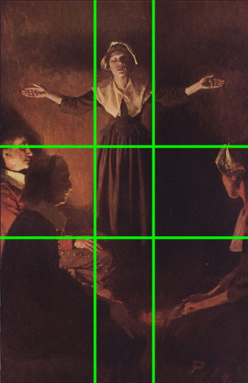
Here’s the painting again with the golden section grid. Notice how Mary takes up the upper two central blocks. Her hands fall right at the center of the rectangles on either side. (By the way, centered compositions are generally static. It’s common in character illustrations to put them in the center, though. She’s not centered vertically, plus the sway to her gesture keeps things fluid.)
The Elements
To wrap up we’ll go through Lee Moyer’s Elements of a Successful Illustration.
Focus: Mary herself is the focus of the image. Pyle uses position in the image and strong contrast around her and her face to bring our attention there. She’s also framed by the other people.
Composition and Design: Mary is in the center horizontally but not vertically. The overall composition, however, is not centered. There are two people framing her on the left side of the picture, and the light patterns are more interesting there.
Palette: Dark reds and browns – earth tones – dominate the picture. It’s set inside, presumably at night.
Value: The brightest spots in the painting that I found have a brightness setting of 79%. Obviously most of it is darker. The light source is low down – probably on the floor – and is between the two seated folks on the left side. This placement gives Pyle the chance to define Mary’s face with sharp contrasts that also define form.
Mass: This is a Quaker service, so I don’t think they’re doing a proper Mass. Other than that, though, look at the person on the left side who is lit up and compare him to the darker silhouette. Pyle is able to use the light to define the further person’s mass, while the silhouetted person comes off as flat by comparison.
Texture: The texture of the wall is neat. It doesn’t suggest a specific substance – if anything it looks earthen.
Symbolism: The symbolism is pretty direct. Both Mary’s pose and the shadow on the wall suggest Christ on the Cross. Given that the story’s name is “The Hanging of Mary Dyer” and is about her martyrdom, this symbolism isn’t a stretch.
Micro/Macro: There’s very little detail in the painting. We don’t know much of the setting other than it’s indoors. True to the time the clothing was very simple. The most elaborate part is the buttons going down the side of man’s pants on the left side. Aside from that element, Pyle reserves his areas of greatest detail for Mary’s face and hands and the leftmost man’s face.
Ornament: There’s very little ornament to the painting. That fits with the setting and subject of Puritan Massachusetts.
Narrative: Mary leads a Quaker prayer group. That’s about it, but that’s enough to get her condemned in the story. Pyle was known for his research, and he was also a Quaker himself, so his depiction of the event is likely authentic. Mary is moved to speak and to lead prayer. Such a simple thing, in its way.
Juxtaposition: Look at Mary’s position compared to the men. I like the contrast of her slight frame with her strength of presence and intensity.
Stylization: It’s a realistic portrayal, though not photo-realistic. It recalls the classic work of Rembrandt, which also makes sense with the story’s time frame.
Character: The painting is all about Mary. Her posture and expression are key. They convey conviction and confidence, earnestness and leadership. The others in the painting follow her lead. Her clothing is simple and places the story in time.
Tension: There is not much tension in this painting itself. This is a case, though, in which the painting’s context matters. Because it is a story about Mary’s execution, and because this action is the reason she was executed we bring a tension and urgency to the picture that would not otherwise exist.
Line: No lines here, just a few clearly defined edges.
Research/Reference: Unknown, though I’m certain Pyle brought his own Quaker background to this illustration.
Vignette: Mary’s posture – the figure’s gesture – is critical to the painting’s success. I’m amazed at how much subtlety Pyle works into her posture and expression.
Perspective: The sense of space comes from the layering of silhouettes and from the clear placement of the light source between two of those layers.
Next week: We’ll answer in the affirmative with Roger Dean.
I like your analysis. I have heard of Pyle but didn’t know he was a Quaker. I’m also familiar with the story of Mary Dwyer. She was hung with 3 other Quakers that returned to Boston after being repeatedly kicked out so I’m wondering if the other 3 people in the picture are supposed to represent her fellow conspirators.
As you mentioned, the people in the picture are at a Quaker meeting for worship. Men sat on one side of the meeting house and women on the other but they all faced each other so that everyone was considered equal. If you notice in the painting, there are 2 men on one side and one woman on the other in keeping with the traditional meeting.
All MfW back then were silent and people only spoke when they felt led by God to speak. To correct your above statement, no one really “leads” a Quaker MfW like a preacher (at least not back then) but people can be moved to speak. To be correct, Mary is most likely “speaking” at a Meeting, instead of leading it. The “Christ pose” is added emphasis that Mary is essentially delivering an inspired message from God, not just spouting her own opinion. (We don’t believe that people receive dictation from God but are inspired and use their own words.)
As I mentioned before, when someone speaks in meeting, we (Quakers) believe that they are directly inspired or moved by God to speak. The Friend stands up, says their message, and then sits back down. Some people open their eyes and look at the person, others stay with their eyes closed. This also is the only time that you will see a Quaker man remove his hat in respect. This practice goes back to the time when all men would doff their hats to those above them in social class (i.e. nobility). Because we believe that everyone is equal under God, Quaker men will not “doff” their hats to those above them in social class (i.e. nobility) or remove them for things like the singing of the national anthem or while indoors. (They don’t wear them around the house but will keep them on for meetings for worship and for shopping.) Since, someone speaking in Meeting is speaking from God, thus men remove their hats to acknowledge that. The men in the painting do not have their hats on, which I suspect is deliberate, further emphasising that Mary is acting from God.
Hope that helps explain a bit more about the painting. Thanks for posting your analysis of it!
Cool, thanks for the additional background. I was aware of some of the information but not most of it. Now I need to carve out some time to actually read the story. 🙂
[…] This post was mentioned on Twitter by Art Globe, Flocco Glocco & Art. Flocco Glocco & Art said: RT @artglobe: Howard Pyle (the grandaddy of American illustrators) & his painting 4 The Hanging of Mary Dyer #art http://bit.ly/6j3g9l […]