#15: The Wall, by Henning Ludvigsen
Image copyright 2007 by Henning Ludvigsen
This analysis copyright 2009, Scott M. McDaniel
The Image
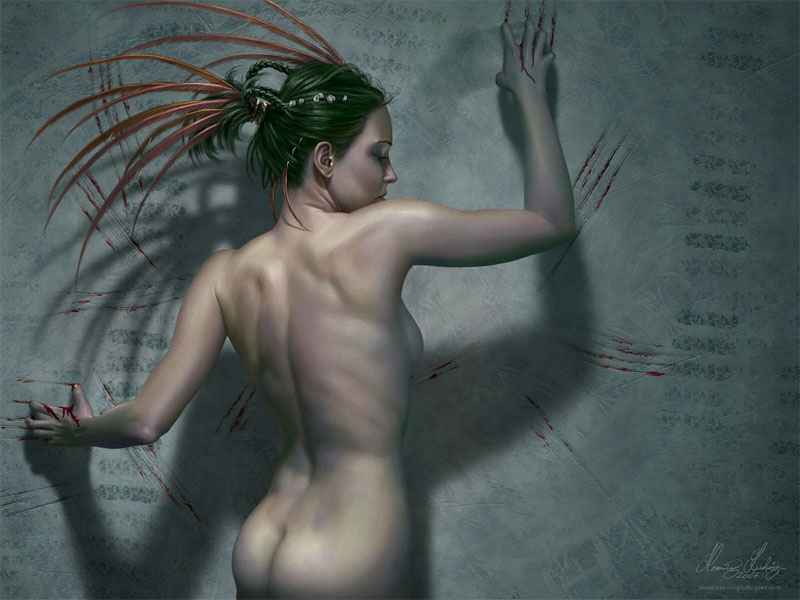
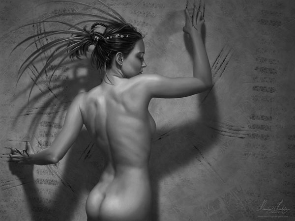
This is a personal painting by Henning Ludvigsen. You can see a larger version of it here, as well as a step-by-step of its development at his web site. For this analysis I’ll talk about several things, including composition, eye guidance, values, process, and texture.
The first question to ask about it, though, is what’s going on? What is the point of the illustration? While there is certainly information about character and hints at a story, my take is that the painting is most about setting a mood and presenting a concept: that of a bleeding wall. It’s a pretty striking mental image, and Ludvigsen wanted to present his take on what that might look like.
The Composition
One of the first things I noticed is that the composition lines up quite nicely with the golden section grid. The aspect ratio is 1 : 1.333. Putting the grid over the painting shows us this:
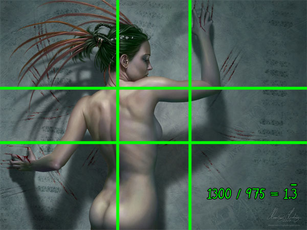
The woman’s body lines up on the left vertical golden section, while her raised arm is right on the upper golden section. The elbow extends beyond it, but the hand comes right back to it at the upper part of the painting. This is hardly accidental.
When we look at guiding the eye around the painting, mine starts at the edge of highest contrast, which is the one between the woman’s shoulder and face. It’s also quite close the upper left intersection of grid. I don’t know if everyone’s eye would take the same path mine does, but I see two loops in the painting.
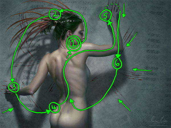
My eyes followed the left loop first. So I started at (1) and then followed the curve of her face up. I believe that we naturally look at faces, so that’s why I went there next. I followed the curve of the head over to its top (2), where the feathers pick up my gaze and point me down to her hand at (3). Here I have a choice. I could either follow her arm back to the body or I can follow the shadow down further. Maybe it helps that I’m a guy, but my gaze travels down to her butt and hip (4). From there I follow the curve of the torso back up toward (1). This is the first loop.
The second loop follows her arm not to her face, but out to the elbow and up to the hand at (5). This seems to route us off the painting. What I think redirects our gaze back down is the motion of her hand. Based on the marks on the wall she’s clearly scraping downward. That, plus the scrape marks pointing to her forearm bring the eye back down the elbow at (6). From there we either follow the arm back to the main body or, as in my case, we follow the shadow on the wall back down to her hips where we rejoin the main flow of the first loop. If we should stray too far, note how the scrape marks tend to point us back at the woman.
The Character and Narrative
Let’s take a quick break from the mechanics to look at how Ludvigsen characterizes the figure and hints at a story. It’s not the main point of the painting, but enough of it is there that we can fill in details on our own. Let’s look at her head and face.
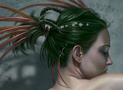
The first thing I notice is that she’s got a neutral expression. We may not know why she’s scraping the wall, but it doesn’t seem to be from a sense of rage or angst. In fact, she seems almost lost in her thoughts, barely aware of her setting. This is the main reason I think that the Ludvigsen’s point here is to present the concept of the bleeding wall and not to tell a character driven story. The green hair, beads, and braids are visually interesting and help to keep the woman from being a cypher. Her overall posture doesn’t give us too much to work with either. I believe we’re meant to see the overall shapes of the human body more than we’re meant to read into them and figure out her thoughts and mood. Thus the nudity. In other words, there is more focus on shape and form than on storytelling.
The Process
On his web site Ludvigsen posts a step-by-step for this painting. I’m going to show a couple of them here, but there are many more of these snapshots there. It’s well worth a look.
To begin with he used reference for the figure. As we can see, he used a grid to make sure he got the proportions correct when he began the drawing in Photoshop. Grids like this are quite helpful for scaling when you want a high level of accuracy.
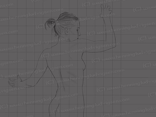
From this basic contour he worked in the entire figure in greyscale, even getting to a high level of rendering before beginning with color. You can see another example of this in his really cool time-lapse video for another painting, Owner. While not everyone waits as long as he does before bringing color into the picture, doing it this way makes absolutely sure that the picture reads well based just on its values. It’s encouraged me to do that as well and it’s worked nicely the couple of times I’ve tried it. I’m not sure, but I think he probably puts in the color on an Overlay layer.
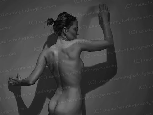
Finally we have the finished version in greyscale.
The Color and Texture
Once he does bring color into the picture, it’s muted and desaturated. Let’s look at the skin of her back.
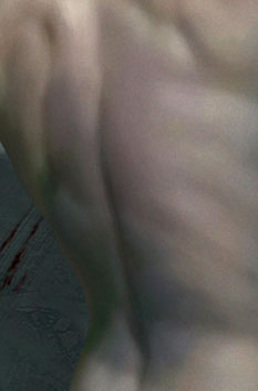
I think it’s a great illustration of the way skin isn’t just one color but a mix of many. There are oranges, tans, blues, and greens. The shadows of the lower back tend more to the blues and greens (cool colors that recede). We can see reds along the spine and yellowish greens toward the left shoulder blade.
Even more interesting than the colors, I think, are the textures throughout the painting. The wall is an integral part of this, so a blank and smooth surface wouldn’t fit the bill. Here’s a detail of a bleeding scrape.
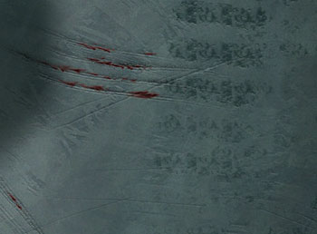
See how the wall’s coloration has subtle variations like the woman’s skin? The coloring and textures lend a lot of credibility to the pretty far-out notion that a wall might bleed. (I do think it’s the wall that’s bleeding, not her hands. Her expression would probably be different if she was the one doing the bleeding.) The scrapes also add texture (and guide us back to the main figure). I’m fascinated by what almost looks like tire tracks there. Aside from being a cool texture, the ones on the right side guide our eyes down to one of the scrapes and takes us back in to the picture. While we don’t know how they got there, these almost-tire-treads give us a little hint that something has happened here.
The Elements
I chose this painting because of it’s interesting concept and striking visuals. I also find it interesting how little narrative there actually is, but I don’t feel that it detracts from the image. In fact, I think adding more would have interfered. Let’s go through Lee Moyer’s Elements of a Successful Illustration to finish things up.
Focus: The woman is the main focus of the painting. Though the overall concept is the wall, the woman helps bring us into the painting and understand what’s going on.
Composition and Design: The composition is firmly based on the golden section, and two loops guide our eye around the picture.
Palette: It’s muted, but the woman has more warm colors than the wall, which helps her pop out visually. Ludvigsen added colors only after he finished rendering the woman in greyscale.
Value: It’s clearly important to Ludvigsen that we be able to read the image and understand it completely with just its values. From a practical point of view, this image would work nearly as well if it were printed in a black and white publication as it would if it were printed in color. He’s kept all his options open in terms of licensing the image to different publishers.
Mass: Another benefit of the focus on values is that Ludvigsen works out a clear sense of mass and depth. The woman is obviously in front of the wall – this image doesn’t feel flat in the least.
Texture: Texture is critical to this piece and helps sell the idea that this wall is somehow organic and bleeding.
Symbolism: While there may be symbolism in the picture, I’m not picking it up. If it’s there, I’m either missing the references or it’s a personal symbolism that not many others would get.
Micro/Macro: Ludvigsen saves his most detailed rendering for the woman’s face and hair and for the scratches on the wall. Take a look at the detail of the woman’s back and you’ll see that the level of rendering there isn’t nearly as photorealistic as the detail of the woman’s head.
Ornament: There is no ornament in terms of frames or borders. The only ornament in the picture are the woman’s braid and beads and the feathers in her hair.
Narrative: The woman’s unusual action, her hair ornamentation, and the textures on the wall hint at a narrative but ultimately don’t reveal much.
Juxtaposition: I think the contrast between the woman’s expression and her actions is quite interesting. The contrasts and similarities between her skin and the wall textures are cool too.
Stylization: While quite realistic overall it’s not a photorealistic rendering. There aren’t any obviously graphical elements. I think Ludvigsen painted the wall textures with a textured brush, probably layering those textures on top of each other.
Character: She seems to be at peace while scraping the wall bloody. While she’s wearing hair decorations, she’s not wearing clothes. All of this suggests to me that the point isn’t to portray a clearly defined character but rather to focus on form and shape.
Tension: Scraping. Blood. Tire treads. The tension is about what’s going on and an underlying discomfort with pain and blood. Personally, I find this more unsettling than the typical gory battle scene from a Conan comic.
Line: There are very few hard edges, and the ones there are appear mostly around her face and arms. The only other ones are in the scrapes on the wall.
Research/Reference: On his Deviant Art page for this picture Ludvigsen states that he did use reference for the figure.
Vignette: The pose is clear and it’s obvious what she’s doing, if not why.
Perspective: The warm/cool color contrast between the woman and the wall brings her forward. More important than that, though, is the shadow on the wall.
Fun: In many ways this is a very simple painting that brings up questions and unsettled emotions without resolving them. While not fun in the typical sense, it is certainly fascinating and beautifully executed.
That’s it for this round. Next up is… well, I’m not sure actually. I’m considering both Rackham and Magritte. Any preferences?