#14: Strangers in Paradise #67, by Terry Moore
Strangers In Paradise #67, by Terry Moore and Brian Miller of Hi-Fi Colour Design
Strangers In Paradise copyright by Terry Moore
This analysis copyright 2009 by Scott M. McDaniel
The Image
Strangers In Paradise is a long-running series, now complete, by Terry Moore. His artwork is among my favorite in comics, so it’s past time that that I get to one of his pieces. (I almost chose one of his Art Nouveau covers, but I picked this one instead since I did an analysis of Mucha so recently.)
Terry Moore did the inks, with colors by Brian Miller.
The Concept
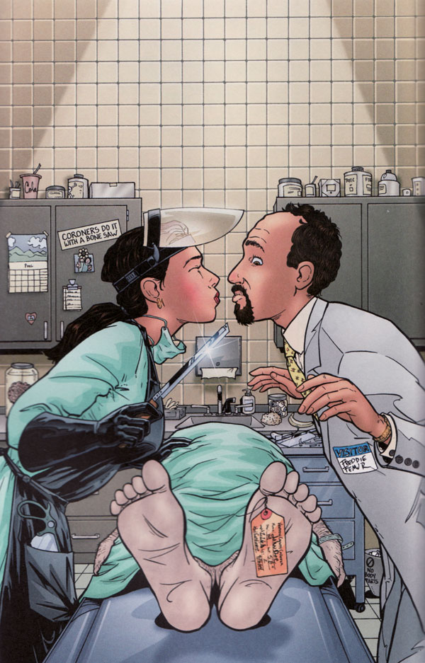
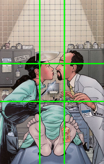
This is a comic book cover. Imagine yourself at the comic shop looking at shelf after shelf of muscular he-men and impossibly endowed babes, and then you come across this. This picture has several goals. First and foremost it must stand out from the other covers and pique your interest. “SiP,” as it’s called, is certainly not your normal superhero comic. Do you get that from the cover?
The comic has elements of romance, humor, slice-of-life, and action-thriller all rolled up together. Do you get that from the cover also?
The cover has a few more things to accomplish as well. It should give a hint of the story inside the issue and tell us something about the character and personality of the two people. Since I’ve read the series I know these two characters. I’m going to pretend as though I haven’t read it, though, to see what hints about character we can glean just from this image. The one on the right is a series regular named Freddie Femur, as we can see from his name tag. The woman appears to be a coroner based on her outfit and tools.
Now that we know what Moore is trying to do with the cover overall, let’s see how he gets there. The most important part of this illustration is not its colors, style, or linework but rather its concept – a situation. We’ve got a man and a woman about to kiss – over a dead body. She doesn’t seem weirded out by this. Freddie, on the other hand, seems game overall but unable to shake off the creeps from the situation. It doesn’t help that she’s also pointing a nice, friendly blade at his chin as well. Still, he’s a trooper – he’s going to try to pull it off.
The scene works because of juxtaposition and expectations:
- Romance in an inherently unromantic setting
- A woman as the sure one and a man as the tentative one (role reversal)
- Odd and amusing background details, like a trash can labelled “No Body Parts.”
- A young and pretty woman as a coroner
- A guy with the last name “Femur” hooking up with a woman weilding bone saws
The humor in particular comes through. Let’s look at some of those background details.
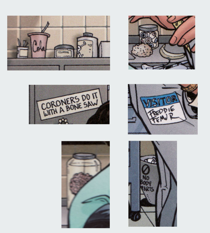
Moore doesn’t put in so many of these easter eggs that we get distracted, but because he has a clear idea of what he wants to do with this cover he puts in just enough for the observant person to understand the kind of humor in Strangers in Paradise.
The Characters
What can we tell about the two people here?
Let’s start with the coroner. First off, she’s comfortable in the setting. Notice that she’s got her hand on the corpse for balance. She’s also the type of person who would put the sticker “Coroners do it with a bone saw” on the cabinet. It’s at an angle, so she just slapped it up there. There’s also what looks like a kid’s drawing in the background. Maybe the kids are hers or maybe not – we can’t tell. We can tell, though, that she’s got a life and people who care about her. She also seems to be a wee bit impulsive. The slapped up sticker matches that, but she seems to be bending forward for the kiss with no idea how close that… tool is to Freddie. We can see that she wears some make-up and jewelry, though she doesn’t go overboard with it.
Now let’s look over at Freddie, starting with his hands. While she’s got her hand on the corpse for balance, he obviously has the heebie-jeebies. He’s not at ease in the slightest. He’s looking down with a combination of disgust (with the body) and alarm (at the knife). Getting expressions right is key, and they’re one of Moore’s strengths. Next let’s look at his posture. He’s got rounded shoulders and back. (Coroner girl, on the other hand, has a straight posture as she leans over.) In a nice piece of visual rhythm, the line for the back of Freddie’s hand echoes the line of his back.
How is Freddie dressed? The grey suit and yellow dotted tie are pretty conservative. He seems to be a professional white collar worker of some sort. The receding hairline tells us that he’s probably in his thirties, well on the way to middle age but not quite there yet. The combination of the van-dyke facial hair and receding hairline gives the impression of someone trying to appear masculine and smooth, with an emphasis on that word “trying.” He certainly doesn’t have an imposing, masculine physique, and there’s an air of the nebbish about him.
The point of all this is that without a strong understanding of the character when drawing an illustration, it’s impossible to make things like posture, clothing, and expression work together and create a compelling story. This cover puts character front and center, just like Strangers in Paradise as a comic does.
The Composition
Moore sets up the composition to bring us right to a bit of empty space. That space happens to be between between their lips. I regularly hear that centered, symmetrical compositions are static and lack visual interest. Let’s look at this cover’s basic composition:
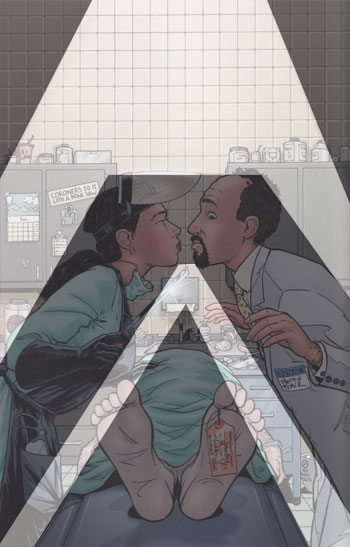
Well, we seem to have both a centered and a symmetrical composition. I’m not sure what Moore would say, but I think that the centered composition works because the main focus of this piece isn’t spectacular visuals but rather character and situation. It should be transparently easy to interpret the scene and putting the focus in the center helps in this case.
Personally I think the symmetry adds to the overall effect. It draws our attention to the line of symmetry itself, and also sets up a compare and contrast situation. Because of the symmetry it’s easier to compare her assured posture with his uncertain one. We naturally compare their expressions and look for other differences.
The strong diagonals of the upper lighting, their figures, and the table between them contrast nicely with the straight horizontal and vertical lines of the background. These lines provide the dynamic feel to the picture that might normally come from an off center, non-symmetrical arrangement.
While we’re looking at the composition, let’s take a look at the golden section grid when overlaid on the picture.
The two upper intersections fall right on the characters’ heads. In particular Moore has placed Freddie’s eye right on that upper right point – a key place of interest. The lower points are close to the hands, and below them the corpse’s feet fall right on the vertical golden sections. I don’t know whether Moore actually laid the grid down as an aid, but whether it was purposeful or instinctive the picture fits quite nicely.
Finally, the single point perspective also brings our eye to the picture’s focus.
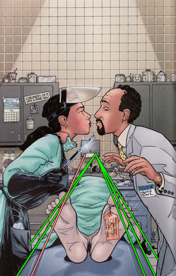
The vanishing point is on the paper towel dispenser, but as we follow the perspective there we keep going right up to the impending kiss. I did notice one curious line. The red one on the left side of the gurney doesn’t meet up with the rest. This would seem to be a mistake, though not a drastic one. At least, I didn’t notice it until I was plotting the lines in Photoshop to get the vanishing point.
The Line
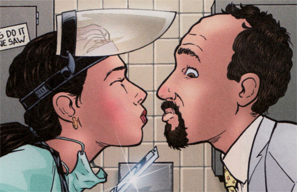
I’ve loved Moore’s style and linework from the moment I first checked out a Strangers in Paradise book from my local library. Let’s use this detail to look at it in more detail.
Moore does the drawing and inking here, and this cover is the same as his style in the books. He uses clear outlines with some internal detail but not too much. For example, have you noticed that Freddie doesn’t have an eyelid? We can see some lashes, but additional lines around the lid aren’t needed to tell the story or reveal character. The style is clearly cartoon, but on the realistic side of cartooning.
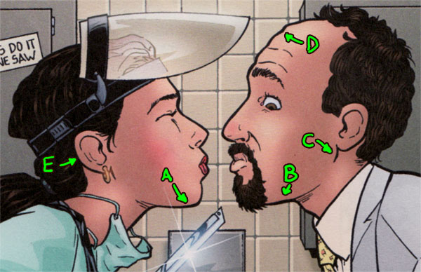
Here are some specific observations about the linework above:
A: Good variation of line weight. The underside of the coroner’s chin is thicker than the vertical part of the line. Aside from a more natural look that comes from varied line width, this tells us that the light source is above. The thicker line is a symbol for stronger shadow, and our eyes perceive it that way.
B: Freddie’s chin shows a thicker line around the figure’s outline. The line of Freddie’s jawbone is thinner, and the feathering (repeated smaller lines) indicates shadow. If you recall, one of Mucha’s trademarks was a thicker outline around the character and thinner lines for the internal details.
C: The line for Freddie’s jawbone near the ear indicates a reasonably strong shadow, but it also thins out quickly and disappears. The perceptual principle of closure means that our brains complete the line and see structure there in Freddie’s jawbone.
D: Overall there’s not much indication that Freddie’s brows are raised and his forehead is wrinkled, but it comes through clearly anyway. That’s because of the good silhouette Moore gets with his line, plus the two thinner lines above Freddie’s eyebrow. Those few lines are critical to Freddie’s expression of worry and disgust, because the wrinkled forehead is a hallmark of both emotions.
E: Notice that Moore doesn’t always complete lines. Closure will help us see them anyway, and a broken up line is even less emphatic than a solid, thin line. We can also see more omitted details – neither of them have much anatomy to speak of in the outer ear. Moore could have put that in, but added detail in the ears would draw focus away from the kiss, so he leaves it out.
I’m certain that for Moore most of these decisions aren’t conscious anymore. With enough practice we develop our own styles based on the decisions we make about line weight, amount of detail, etc. Personally, I think Moore’s style is an ideal mix of these ingredients.
The Color
I’m not going to do a complete breakdown of the colors for this image, but I do want to point out a few things. The colors are basically neutral and slightly on the warm side. The blues in the coroner’s gown and the corpse’s blankets are the exceptions. Second, I was surprised by how unsaturated the image is. Let’s use the same detail again. This time I plotted the Saturation percentage as reported by Photoshop.
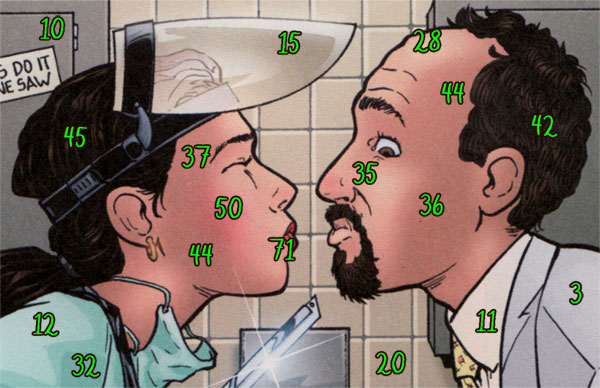
Not surprisingly, the area of highest saturation is the image’s focus. The only place I found that had more than 50% saturation is the coroner’s lips, at 71%. Their faces are generally from 30 – 40%, while the cabinet and background tiles are 10% and 20%.
I had expected the cover to have higher saturation levels overall. That was also the case with Michael Zancan’s Tears for Joy in the Garden of Giants, which suggests to me that I should dial the saturation back some in my own work.
One last point is about a problem that I notice but don’t easily see how to solve. Specifically there is negative space between Freddie and the corpse. It’s hard to see Freddie’s silhouette there because the grey of the drawers in the background isn’t that different from the grey of Freddie’s shirt. They’re similar in brightness (the drawers are even a little darker) and saturation. The coroner’s black apron makes it easier to distinguish the negative space between her and the corpse. The light grey of Freddie’s suit is useful in establishing character, but it doesn’t leave easy choices for the background.
The Elements
Time to wrap up, so here’s a look at this cover through the lens of Lee Moyer’s Elements of a Successful Illustration.
Focus: The focus is the entire situation in general and the space between their lips in particular.
Composition and Design: Despite conventional wisdom, the composition is both symmetrical and centered. That it works anyway is a helpful reminder that guidelines are only guidelines, not rules. The strong diagonals set against the vertical and horizontal background give the composition motion and interest.
Palette: Generally neutral, slightly to the warm side but with a few areas of blue. Compare the saturated warmth of the main characters’ skin with the desaturated cool grey of the corpse.
Value: The colorist does use value to help with mass, but the linework carries most of the load in helping us parse the picture. The cabinets in the background frame the two heads well and provide good contrast for them.
Mass: Moore communicates mass by giving the main figures a thicker outline and by varying line weight according to light source. The coloring reinforces it some with its values.
Texture: The texture is smooth overall. One exception, though, is the folds in the coroner’s gown and the corpse’s blanket. The solid, discrete areas of color are a nice stylistic touch that suggests fabric wrinkles without having to use many lines.
Symbolism: Who is holding the knife, and in what position? I suppose a bone saw is sometimes just a bone saw.
Micro/Macro: I’d be upset if I didn’t have eyelids, but Freddie gets by quite nicely here without them. The background details don’t overwhelm us but do give us a information about the coroner. She’s got a cup of soda next to some poison up on the cabinet and a banana next to a jar of eyeballs. And is that a brain in a jar? We’ve got enough to piece together a situation but not too much to distract us from that situation.
Ornament: I didn’t mention the expanse of open space at the top earlier, but that’s where the title goes. It, of course, provides some ornamentation. We don’t see ornamentation on the level of Mucha, though, because it would get in the way. Moore uses it to great effect in many of his covers, though.
Narrative: We can tell ourselves a complete story just from this picture. It’s a pretty funny story too.
Juxtaposition: I mentioned juxtaposition earlier, but just to throw out a couple of others we have a dead body next to the living and strong diagonals with strong horizontal and vertical.
Stylization: On Scott McCloud’s continuum of realistic vs. iconic, I’d put Moore’s work just about in the middle with perhaps a slight lean to the realistic.
Character: I’ve already talked about character above, but I have to say that the corpse comes across as a bit stiff.
Tension: I’d say so. Can Mr. Femur hold up his end of the transaction? Will she gut him with that knife? Somehow, though, I doubt this turns out well for Freddie.
Line: I talked about linework above. Notice the effect of the visor on the the lines beneath it.
Research/Reference: I’d guess that Moore did not need figure reference. I’d also guess, though, that he looked up various coroner tools and saws, though, and then picked the couple that looked the most outrageous to put in the drawing.
Vignette: The character silhouettes are easy to identify and communicate posture and attitude.
Perspective: One point perspective helps bring our eye to the focal point.
Fun: Moore often includes fun details in his background, like the brain in a jar or the jar of eyes. It keeps things fun for him and keeps us on our toes.
That’s it for this time. Next will be a piece from here on Deviant Art: The Wall by Henning Ludvigsen.