#25: Relativity by M. C. Escher
Relativity, by M. C. Escher, 1953
This analysis copyright Scott M. McDaniel, 2010.
The Image

Click here to see a larger version.
Man, I love M. C. Escher’s stuff! I know I’m hardly alone in that, but I thought I’d get it out of the way right in the beginning. And Relativity is one of my favorites. In college I had a poster of it, and I’d bring in dorm-mates after they’d been drinking too much and sit them down in front of it saying, “Look at this, man!” OK, college humor.
A few years back the National Gallery of Art in Washington DC had a showing of Escher’s work. Something that really caught me by surprise was how much you could see on the actual pieces that doesn’t show up even in the good quality, coffee table books of Escher’s work. Sure, he’s known for the perspective tricks, tessellation, and space warping, but he’s also a great artist and draftsman. I love Relativity because of the wonder and imagination, but it’s also a great example of things like lighting and defining mass and form. We’ll look at all of these things in this analysis.
The Perspective
Escher uses three point perspective for Relativity. That’s not too unusual. When you’ve got three vanishing points they form a triangle. Usually when we use three point perspective two of the vanishing points are on the horizon and the third is either above (the zenith) or below (the nadir).
In Relativity Escher played with this concept. Because he set up the vanishing points as an equilateral triangle, it meant he could build a structure in perspective that didn’t look distorted if you changed the horizon from one side of the triangle to the others. Here’s a preparatory drawing that he did to work out the vanishing points. (From The Magic Mirror of M. C. Escher by Bruno Ernst.)
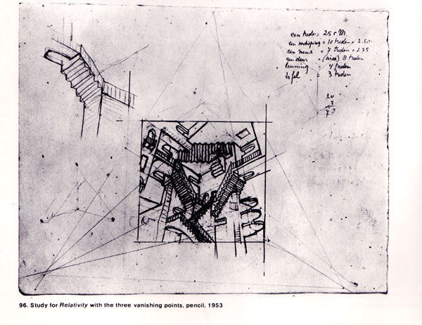
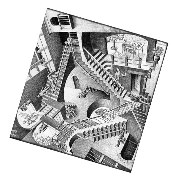
In the actual version, these vanishing points are about two meters outside the picture’s borders. The first perspective most of us notice is the one with the vanishing point triangle’s horizon at the bottom and the zenith directly above. It’s only natural, that’s how we usually see the world. The other two orientations, though, treat the other lines of the triangle as the horizon. Let’s spin the picture to see what it looks like when each of the other sides serves as the horizon.
Rotating the basic triangle counter-clockwise we have:
Rotating it clockwise we have:
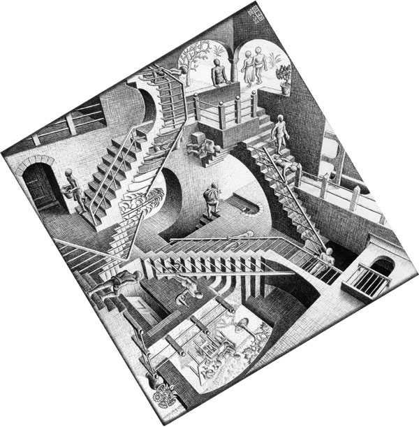
The building, stonework, and doors all appear to make visual sense from any of the three orientations. It may not make logical sense to put a door in the floor, but visually we can see that it doesn’t look distorted. The three points are just three points. Assigning “up” and “down” happens in our heads – at least when it comes to the building. One other thing to mention – my first assumption was that the triangle of stairs at the core of Relativity’s composition was one of those impossible shapes that Escher uses so well in other pieces. It’s not. It doesn’t need to be because the structure isn’t an impossible one. To prove the point, if you haven’t already seen it, here’s a link to Andrew Lipson’s Lego version of Relativity.
When it came to the people, Escher had to go ahead and choose an up and down for each one. Regardless of their orientation, though, none of the figures appear stretched or pinched. They make visual sense too. This is all possible because the vanishing points form an equilateral triangle.
The Lighting
What initially fascinates us about this picture is the illusion of three “ups” and the way they’re all mixed in together. Working out the perspective isn’t enough, though. If Escher hadn’t given the scene a sense of depth, mass, and solidity Relativity wouldn’t have nearly the impact it does. Values and shading are critical to this sense, but how do you handle light sources in a scene with three different horizons? He could have used sculptural lighting – a general non-defined light source, kind of like being outside on a cloudy day. Instead, though, Escher chose the three outside areas as light sources and then added two others to help with the composition.
Here are the light sources in Relativity.
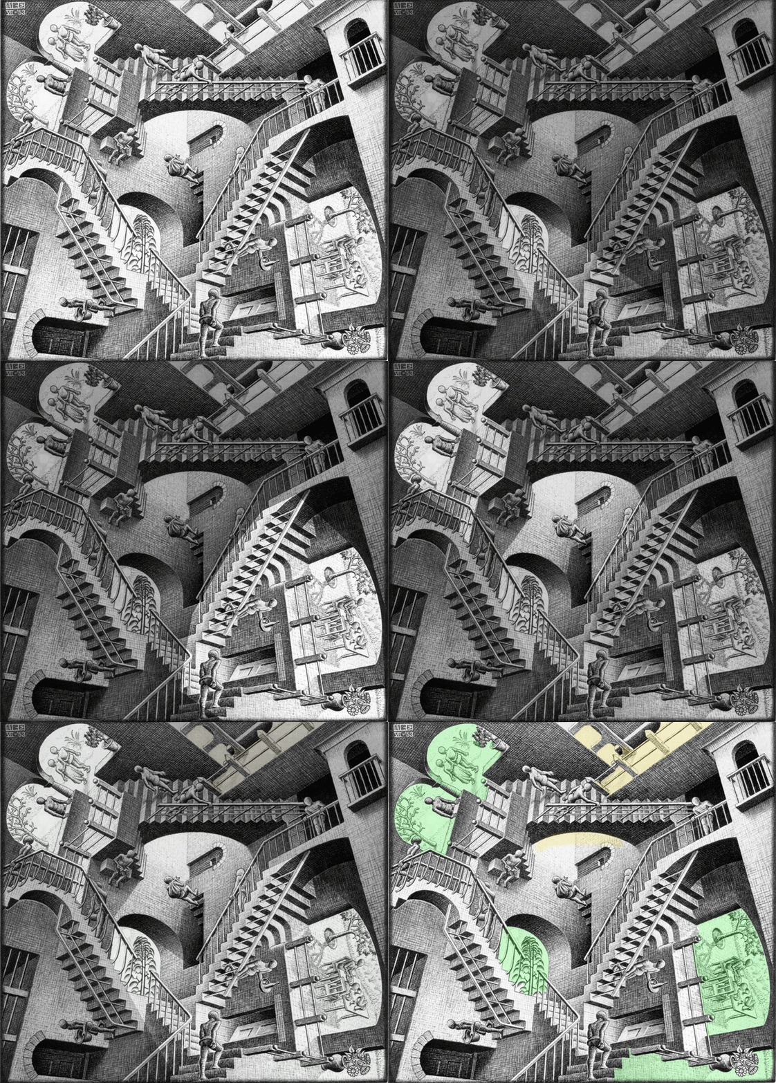
The light coming from the outside makes sense. In fact, we even see the sun itself (or a sun symbol, anyway) through one of the windows.
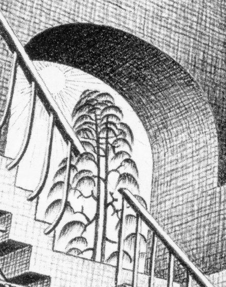
There’s another light source that I find curious – it’s the most enigmatic in the whole picture. See the guy who has just come up the staircase from a basement carrying a sack? He’s lit from the front and is about to walk off down a hall, heading into the light. Where is that light coming from? What’s down that hall? The space down there would seem to be a tunnel beneath a sidewalk or perhaps a chimney above the sun. I’ve indicated that light source and one other with yellow in the graphic above to show that those sources are more ambiguous than the daylight coming through the three windows/porches.
One of the effects of that mystery light is to create a nice curve of sharp contrast in the upper center of the picture. Our eyes can follow that arch in either direction and we end up traveling around the picture in many loops. That curve of contrast, though, is critical to getting us started, and it depends upon an unseen light source that seems to come from some other dimension.
The Lines
Now that we know where the light sources are we can look at the shading Escher used to create forms that look solid. He uses lots of cross hatching and feathering in both the figures and the structures. In just about every case we can see that the direction of those shading lines acts as a contour map that indicates a 3D shape. Here are some examples.
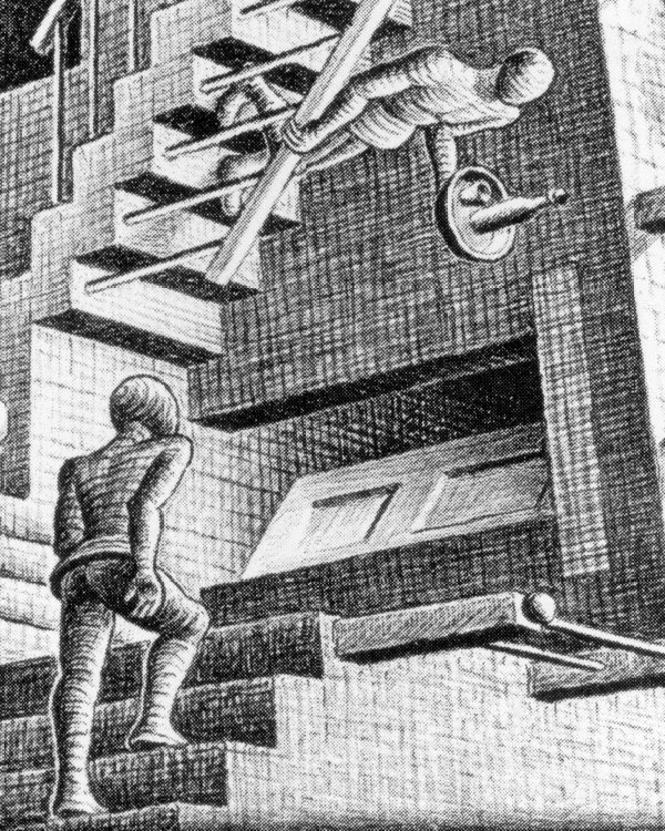
This is the guy at the bottom of the picture in it’s normal orientation. He’s our gateway into the image and our viewpoint character. He’s lit most strongly from the front right, although the window with the sun and tree provides secondary lighting. Let’s look at the hatching on the figure’s legs, back, and head. They all clearly follow the figure’s form like a contour map or wood grain, which helps us see it as a rounded shape rather than a flat one.
Now notice the white outline on the left side of his legs. That lines up well with the secondary light source and keeps the form of the legs crisp. As the lines wrap around the legs their number and thickness drop away until we have a highlight on the right side of the legs corresponding to the strongest lighting. There is a thin outline to the figure on that side – most noticeable on the arm and head. The line their symbolizes an edge. On the darker side of the head and arm, though, there is no outline. Just an edge, chiaroscuro style. Escher follows this general approach on all of the figures, using both lighting and the direction of the hatching lines to define the form.
Now let’s look at the the guy in the center with the sack, emerging from the basement.
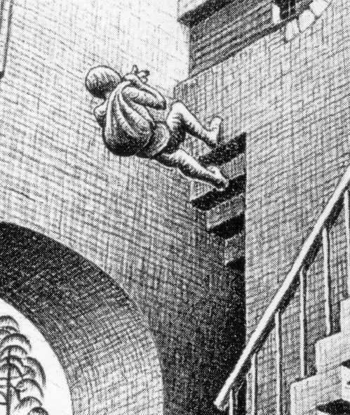
This time let’s focus on the texture and shading of the walls. Escher uses a basic cross-hatch to give them a mid-value grey. Going “down” that stairwell we see that the lines get thicker to produce a darker tone. There aren’t more lines, though, just thicker ones. For the most part the hatch lines point to one of the three vanishing points. Despite the fact that they’re the same grey tone it’s easy to tell which way the walls are going. In the arch in the lower corner of the picture, we can see some hatch lines pointing to a vanishing point down and to the left. On the side of the arch, though, we see the hatch lines curve to follow the arch’s form. They start off headed toward the zenith but then bend around to the left where they thicken into darkness.
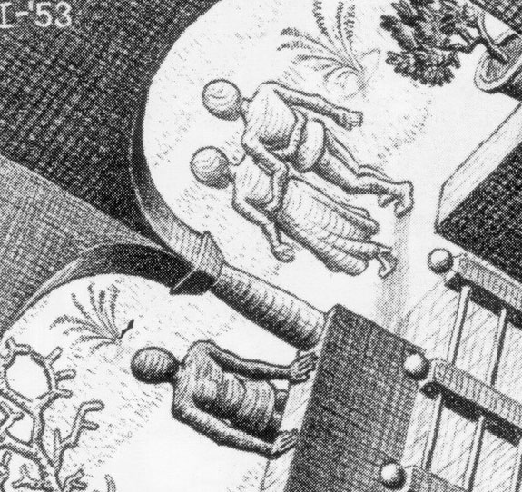
Now we’re in the upper left corner of the picture. Here’s an interesting lighting choice. Why are the walking figures so much lighter than the one with his hands on the balcony? We can see from the shadow that the light is coming from the couple’s right side. Logically I’d think that the shadows on them should be nearly as strong on them as on the other figure, but he’s much darker. I think the main reason is that Escher wanted to push them into the background detail and bring the other figure forward. A second reason could be that there’s reflected light from the building on the walking couple but not on the single figure.
Here’s a final detail of the couple at the table in the right of the picture. Once again, see how the shading and lines wrap around the forms.
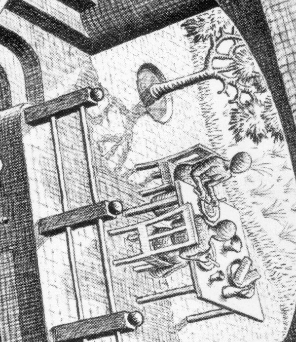
I believe this shading and linework is just as important to the illusion as the perspective. Without the impression of solidity and mass we’d get the idea about the perspective intellectually but it wouldn’t seem as real and powerful as this version does.
The Elements
To wrap up we’ll go through Lee Moyer’s Elements of a Successful Illustration.
Focus: The initial focus is just about in the center – it’s the guy walking vertically up the wall carrying the sack. After that, the strong contrast curve above him begins to move our eye around the picture where it is supposed to wander and take in the contradictory details.
Composition and Design: Like most of Escher’s work, it’s got a strong theoretical and geometric design. The core pattern is a triangle of stairs that’s a flipped version of the unseen triangle of vanishing points. (Unseen because they are beyond the border of the drawing.)
Palette: Greyscale, defined through hatching.
Value: Escher carefully controls the light source and value to enhance the illusion of 3D, solid figures moving around a spacious interior.
Mass: Defined through value and line direction.
Texture: Escher uses the hatching to produce a clear texture formed from cross-hatching in the walls and structures. He wraps the lines around the figures to produce a wooden texture on them.
Symbolism: Why do you suppose that Escher didn’t give the figures individual identities? Perhaps he didn’t want to distract us from the main idea of the painting. Maybe, from a certain perspective, people are interchangeable.
Micro/Macro: Escher chose not to draw every stone in every wall. The texture takes care of most of that. There are stones in the archways over the doors, however. For the most part, though, lots of detail would distract us from looking at the perspective paradox.
Ornament: There is only minimal ornament. The figures wear a loincloth of sorts, but you won’t see knobs on the stair rails or other decorations. They’re not the point.
Narrative: A story isn’t the point here, but there are a few hints. The walking couple have their arms around each other. There seems to be a servant or waiter. Is the guy with the sack on his shoulder stealing something or just retrieving it. We don’t know the answers, but we have enough information to pose the questions.
Juxtaposition: The main juxtaposition here is the perspective itself.
Stylization: Normally I talk here about how people handle lines and shapes. Like Magritte, though, a key part of Escher’s style is how he thinks and presents us with an image. We see something that, try as we might, we just cannot take for granted. While he often did lithography, prints, and woodcuts, Escher’s most identifiable style is a sense of awe and wonder.
Character: Like the narration comment above, we see only enough about these figures to make some assumptions and ask questions.
Tension: The tension here is a perceptual one. We know that there can’t be more than one “up” in a single scene, yet there we see it before us. We feel compelled to resolve the problem.
Line: Discussed above.
Research/Reference: I showed the preparatory drawing above, and I got to see more of them for other works at the Escher exhibition at the National Art Gallery a few years back. Rest assured that he did not produce these images from the air on his first try.
Vignette: While the lighting is critical, there is not a single silhouette that is key to the picture. The core of it, however, is the triangle of stairs in the center.
Perspective: There are three vanishing points set in an equilateral triangle. Pick any two and you will see evidence of the line between them as a horizon line. It’s the foundation of the drawing.
That’s it for this time. Next time we’ll venture into multimedia and symbolism with David Mack.
[…] …. for an more detailed analysis please see Scott M. McDaniel’s analysis , http://www.scottmcd.net/artanalysis/?p=548 […]
[…] y angustia. Bellas en su oscuridad. Su recuerdo tendrá un eco intelectualizado en la obra de Escher (1898-1972), que elevará el elemento de abstracción de las Carceri hasta el paroxismo en sus […]