#12: Tears for Joy in the Garden of Giants, by Michaël Zancan
Tears for Joy in the Garden of Giants
By Michaël Zancan, Copyright 2005
This analysis copyright Scott M. McDaniel, 2009.
The Image
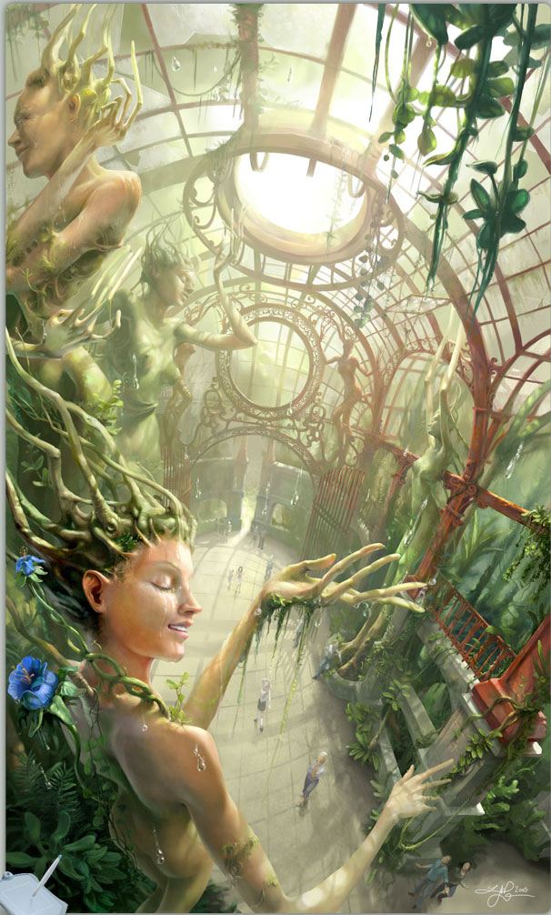
I saw Tears for Joy in the Garden of Giants because it was a Daily Deviation here on Deviant Art on January 18, 2009. It immediately stood out from the many fantasy paintings because it didn’t focus on scantily clad women (though they’re there, sort of), nor did it have a horrible monster, nor vicious violence. On his web site, Zancan explains what he was going for this way:
In the immense diversity of emotions one can feel, I choose to extract a striking and rare one and turn it to spectacle. This emotion is a joy so immense that it makes cry tears; smiling and weeping at the same time, the widest range of behaviors concentrated in one single emotion.
That’s no small challenge for an image. For me, anyway, he got there. If you’ll forgive the jargon, having such a “mission statement” for an image at the outset helps crystallize your goal and helps you make decisions every step of the way. Without one you might produce something nice and intriguing, but it will be missing focus. Let’s look at the choices Zancan made to get there. (There is a story to go with this picture. See his web site or Deviant Art page for that.)
Colors
There are lots of greens here, with some spot blues and faded reds. Saturation is generally low – I’ll get to that in a minute. Let’s start with the greens, though. The color choices suggest calm and peace. These are the colors you find in a stroll through the woods with sunlight filtering through. Since the point of this is joy and wonder, Zancan doesn’t give us stark color and brightness contrasts. We don’t see bright, highly saturated reds, purples, and oranges. Since the palette suggests nature and safety, that means it’s OK for us to slow down a bit and experience the wonder and joy.
One thing that does vary is saturation. Zancan uses high saturation to bring our eyes to the picture’s focus. He also uses atmospheric perspective – things further away are generally less saturated. Notice the blue flower on the lower left side of the picture – this bit of high saturation tells us that the tree-woman there is both the primary focus and is closest to us. Here is a look at a sampling of saturation levels around the image. I’ve separated out the foreground, midground, and background to make it easier to see how saturation decreases as we go further back.

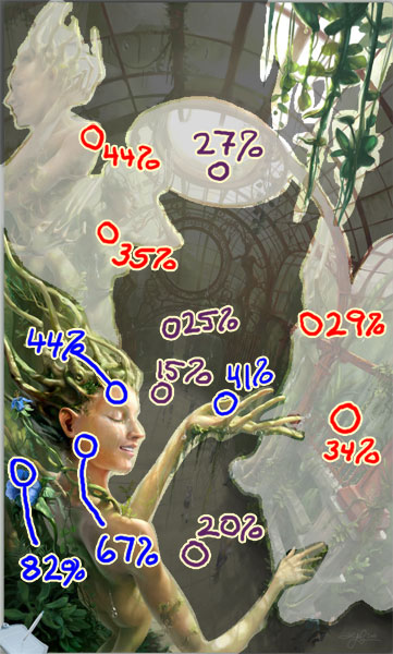
A quick look shows that the background saturation levels tend to be around 20 – 25%. The midground saturation is around 35%, and the foreground colors range from 45% to the low 80’s.
Composition
The joy and wonder relies strongly on the near figure – the focus of the painting. Her expression and posture communicate it most clearly, so Zancan must bring our eye to her. When we overlay the painting with a golden section grid, we see that she occupies the lower left rectangle – a shape that’s the same as the shape of the overall painting. I’ll go into the golden section more next week with the Parrish analysis, but for now it’s good to note that part of the natural, organic feeling of the painting comes because its composition lines up with the golden ratio. I dislike the word “organic.” Often it just means that the person likes it. I use it here because the golden ratio appears regularly in natural, organic things from leaf distribution patterns to the curve of a seashell. It’s even there in the spiral of galaxies, though that’s not strictly organic. Here’s the picture with the golden section grid overlaid.
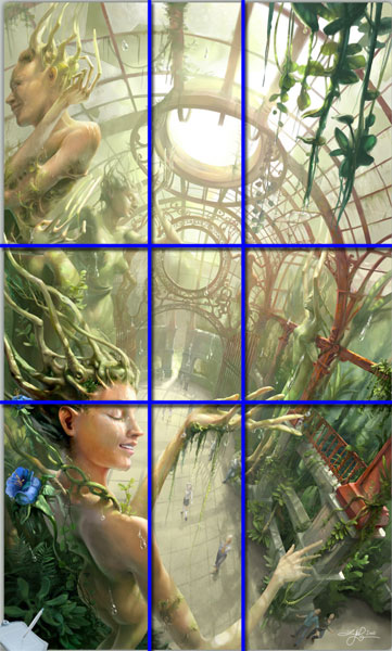
We can also see that the secondary figure occupies the upper left rectangle, and hanging vines take up the upper right rectangle.
So far we have a combination of saturated colors and “organic” placement of the central figure to draw our eyes to her. There are plenty of other compositional lines and elements here that also bring our gaze to her.
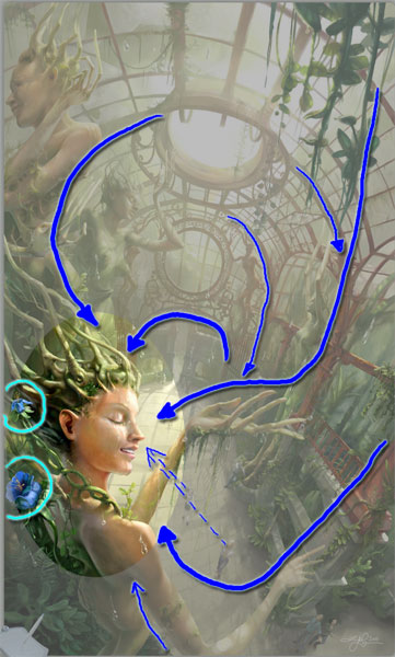
Almost all of the metal grillwork leads us to one of the main routes to her face. On the left side we have an arch that goes into the secondary tree’s shoulder. That figure brings us right down to the main figure’s face. On the right side, the foreground vines point down to a large metal column that intersects the figure’s outstretched hand. The hand brings us right over to her face. Lower down, the metalwork lines up with her other arm, which also brings us back up to her face. The spot saturation of the blue flowers pulls our eye in that direction. Most of the background figures are even looking at her. Visually, there’s no escape.
Perspective
The perspective lines of the metal greenhouse also point straight at the tree-woman’s face, as we can see below.
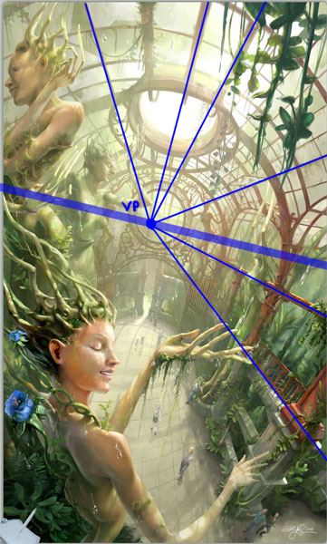
The railing in the greenhouse roof brings our eyes to the vanishing point. From there it’s a short skip to the tree-woman’s face. (The lower part of the gate at the vanishing point is an arrow taking us right to her.)
Aside from guiding our eyes, the perspective choices give a sense of space to the picture. Coupled with the saturation-perspective, we see a vast open space despite the fact that the picture’s aspect ratio is tall and thin. (1.6 to be precise – quite close to the golden ratio.) The choice of viewpoint is particularly important to the picture. Why do you suppose we are viewing it from so high up – so far away from the people looking up at everything? Why is the horizon tilted like that?
The answer to the first question goes back to that “mission statement.” Zancan was aiming for overwhelming joy. Had we been stationed on the ground looking up, like the background figures, the primary emotion would have been awe and wonder. As cool as those trees are, they would be remote objects of wonder. In this scene, the tree people are waking up after a long hibernation. The rain and sunshine together is what has awoken them, and they are delighted with them. It’s the tree people feeling the joy, so they are the ones we need to identify with. Our viewpoint needs to be on their scale, not the scale of the people. To give us a good look at the expressions on their faces, we have to be this high up. The downward viewpoint adds to the joy, though, because those people are in the background. Though we don’t identify with them first, as we take in the picture we realize the sense of surprise and wonder they have, which then mixes with the overall joy.
Faces and Details
Since the expression of the tree-woman is so critical in communicating the joy, let’s have a closer look. (These details are from Zancan’s web site.)

We’ve got a relaxed, gentle smile here. We can see that her face is wet, both from the rain and from her tears. She’s completely in the moment. Most of her face is relaxed. Use your fingers to cover the mouth for a moment and you’ll see that it’s that smile that’s the key. In his book The Artist’s Complete Guide to Facial Expression Gary Faigin classifies joy as one of the six primary emotions that our faces express. Combining the six leads to all manner of subtlety, but in this case Zancan shows us a fine example of that primary emotion. Hallmarks include a rounded bulge on the cheek just next to the nose wings, an arched upper lip, smooth forehead and relaxed brows, and the mouth showing the upper teeth. If this were a wider smile, we’d see the top bit of the lower teeth and more of the gums along the upper teeth.
On a sideline, take a look at the eyebrows and those eyelashes. They’re plantlike. One of the elements that we look at each week is “micro/macro.” Which details should the artist include to help us build a complete picture? One answer is that we need more detail where the focus is. Those eyelashes help us accept her plant/person hybrid nature. They’re excellently placed because our eye hits that face over and over as we look at the picture. Contrast that to the detail below, showing the gate and some of the background people.
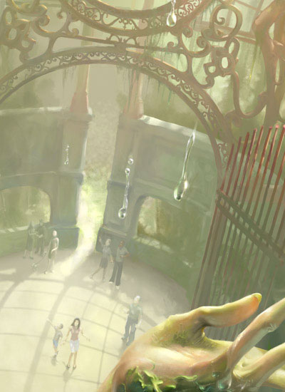
And here we have some of the metalwork.
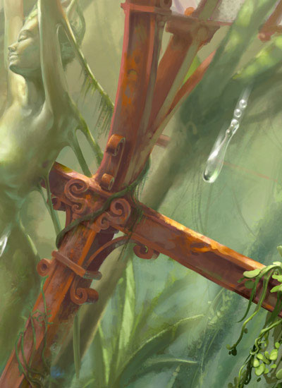
In the first case we can see that the people don’t even have faces. We can see complexity in the metalwork, but that’s mainly silhouette, not something as intricate as the fully depicted veinwork to the left of the tree-woman’s eyebrow. In the second detail we see swirls and shapes, but not the level of rendering we’d see on the face. Zancan has put the detail where it matters most and not distracted us with more than is necessary elsewhere.
The Elements
Time again to wrap up. Lee Moyer’s essay on the Elements of a Successful Illustration comes to the rescue again.
Focus: The focus is the tree-woman and, more specifically, the emotion of all-encompassing joy.
Composition and Design: Many elements work together to bring our attention to the focus, including use of golden rectangles, lines and contours, and saturation.
Palette: Primarily we see cool, natural greens. There are spot blues with the flowers, and warm but desaturated colors creep in with reds and yellows to give some balance.
Value: The brightest parts of the picture are sky above and the main figure’s face. The most brightness contrast is just to the left of the main figure’s face – something else that draws our eyes to her.
Mass: Zancan uses perspective to give us the sense of space. Shading and values on the main figures make them rounder and more solid than the background figures and gates.
Texture: I’d like to see this one at full size to get a better sense of texture. The veinwork on the main figure is neat.
Symbolism: There is a clear sense here that the tree people are natural and good. It’s the man-made structure that contains and constrains them. Yet the people aren’t evil – just clueless. We see their amazement through the postures Zancan chose for them.
Micro/Macro: Discussed above. There is a lot of detail in this image, but it’s used with control. We can spend our time with it, but we read the picture easily the first time without being overwhelmed.
Ornament: We see natural ornament in the flowers and twisting vines. It contrasts nicely with the ornament of the gates and treehouse structure, which is also beautiful.
Narrative: At his site Zancan provides us with a narrative for the image. Without that I wouldn’t have known that it was the combination of sunlight and rain that was waking up the trees. In fact, I didn’t register the fact that it was raining. While this may be a failing in the storytelling of the image, it doesn’t get in the way of the understanding of the tree figures’ joy – which is the ultimate point. We don’t need to know all the details of what’s going on. We understand that something is, in fact, happening even if we don’t have the details.
Juxtaposition: The contrast of the natural plant-life with the elegant symmetry and regularity of the metalwork is interesting. At the same time we see a theme of man-made structures binding the natural world, we also see the two of them combining into something wonderful.
Stylization: It’s a realistic style for the most part. I like realism in fantasy since fantasy is inherently unrealistic. It lets us focus on things like the extra-long fingers and wood hair without being distracted by distinctive linework or other stylistic tricks.
Character: The trees are at peace and completely in the moment. We see that through expression and posture.
Tension: There’s not a lot of tension here, but there is a little. What will the people in the background do next? Will they participate in the experience or just stand there gawking?
Line: Lines appear most strongly in the greenhouse structure. There are no outlines, however.
Research/Reference: Zancan has two pages for this painting. This page shows his approach for creating a physical painting based on this digital version. This page is his gallery page for it. I believe he used a 3D rendering program to work out the structure of the greenhouse, and then he moved over to the painting. I’d be interested to know whether he used figure models for the trees or background people.
Vignette: The figures are in clear poses against their backgrounds – more so as you move toward the front of the picture. The primary character has her hand out in the classic “feeling for rain” pose.
Perspective: Zancan uses traditional perspective and atmospheric perspective to give us the sense of space in the picture.
Fun: I hope Zancan had as much joy painting this picture as appears in it. Fantasy art so often tends to the dark and the violent. While I can appreciate those kinds of pieces, a fantasy image that shows wonder and joy is so much less common. We need more work like this.
Next time I’ll finally get to that Maxfield Parrish piece. I’ll be doing Daybreak – the 20th century’s single most popular print in America. Because it’s founded on Dynamic Symmetry principles, I bought Jay Hambidge’s book on the topic. I’m finding it to be clear and fascinating, despite the fact that it’s a math book written in the 1920’s. So, next up – using math to get to that “organic” feeling everyone likes so much.
i love this picture it is very fantisyic and mind blowing…i love how you connect the persons/creture with the plants.