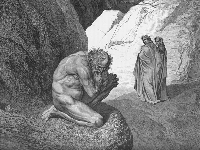
#1: Plutus, by Gustave Doré
Image by Gustave Doré
This analysis copyright 2009, Scott M. McDaniel
This is the first in a series of analyses of various illustrations. I want to look at the nuts and bolts of these pictures to see what makes them work. It’s not enough to vaguely talk about “bold linework” or “lush textures” – why is the linework bold? What do the lush textures accomplish?
So, to begin:
The Illustration
Canto VII of Dante’s Inferno begins with Dante and Virgil descending to the fourth circle of Hell – the Hoarders and Wasters. Plutus, a Roman god of wealth recast here as a demon rises to block their way:
“Pape Satan, Pape Satan, Aleppe!”
Thus Plutus with his clucking voice began;
And that benignant Sage, who all things knew,Said, to encourage me: “Let not thy fear
Harm thee; for any power that he may have
Shall not prevent thy going down this crag.”Then he turned round unto that bloated lip,
And said: “Be silent, thou accursed wolf;
Consume within thyself with thine own rage.Not causeless is this journey to the abyss;
Thus is it willed on high, where Michael wrought
Vengeance upon the proud adultery.”Even as the sails inflated by the wind
Involved together fall when snaps the mast,
So fell the cruel monster to the earth.
The wood engraving, done in 1870, is by Gustave Doré from Dante’s Divine Comedy: Hell, Purgatory, Paradise.
Composition and Guiding the Eye
This picture is great at pulling your eye right to the demented, surly old dude in the foreground. Then the eye moves to Virgil and Dante in the mid-ground, and then back to Plutus. How does this happen? First, the area of highest contrast is Plutus’ forehead against the white rocks in the background. That pulls your eye right there. But, just in case, most of the lines and surfaces of the background also point right at him:
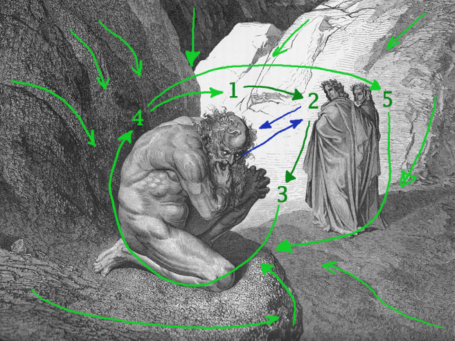
So, at least for me, my eye travels in a spiral around the picture:
1. Plutus’ forehead.
Note that the head is also one of the areas of greatest detail.
2. Virgil’s face against the white background.
It’s high-contrast, and it helps that Plutus is glancing that direction.
3. Plutus’ hands against the white background.
Again it’s high-contrast, and Virgil and Dante are looking back that way.
4. Plutus’ back against the grey cliff.
We’re to middle contrast now, but from the hands I follow the arm down to the leg and follow the curve of the back.
5. Dante’s back.
Actually, the curve of Plutus’ back takes the eye to the head again. It’s possible to go around that loop a couple of times. There’s also an area of medium contrast at Dante’s back, though, so one of the times the eye flicks that way it’s bound to land there. But, even then, it drifts back to the main object of focus.
Let’s look a little more at the background elements that focus attention on Plutus. First up, notice that big dark triangle pointing right down at his head. It’s formed by the white rock on the right and the grey cliff on the left. Speaking of the white rocks, most of the lines on it slant down and left to Plutus. Same with the grey cliff, but now it’s down and right. Even the loose textures in the lower right mid-ground generally move toward him. So to summarize, the composition gives us high contrast at the focus points and guides our eye back to the focus whenever possible.
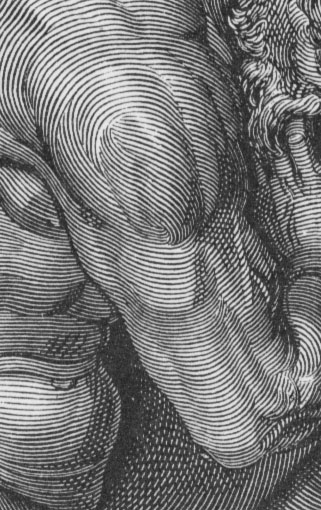
Lines and Form
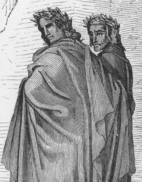
I often read and hear that hatching lines need to follow the form to best define it. It’s something I need to improve in my own work, and this picture is a fantastic example of it. Part of this style of engraving is finely detailed hatching and linework – like on the U.S. dollar bill. Look at the details below. On Plutus’ arm you can even see veins defined by the hatching. On Virgil and Dante the lines obviously follow the flow and drapery of their robes. The lines on the rock face behind them also define some form. Importantly, they flow in a different direction so as not to be confused with the figures. Only in areas of deep shadow does Doré actually use cross hatching itself. Everything else is line weight and direction.
>
Storytelling and Character
Even if you had no idea that this was an illustration from Dante’s Inferno, you’d still be able to clearly see that something is going on. Look at this silhoutte:
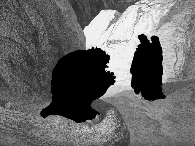
The old guy there is obviously in a deferential position. His head is lower than Dante’s and Virgil’s and he’s bowed down while the two figures are upright. The facial expressions communicate a lot too. Plutus is cowed, but he’s not happy about it. Virgil has an expression and posture of authority – he seems to be thinking “…and STAY down!” Dante is safe behind his mentor and guide, looking out from behind with disapproval. To my mind, though, there’s no indication of who Plutus is – that he’s a god/demon of wealth and wanting. The most you get of that is his general bearing and his eyes, but it could have been more explicit. He’s just cowed, not totally beaten. He still looks like he wants something – not the least of which is to get back at those figures over there.
The Elements
I plan to wrap up each of these analyses with a quick run through Lee Moyer’s excellent essay on the elements of a successful illustration. See The Elements, copyright Lee Moyer.
Focus: As I said above, the eye’s focus is clearly Plutus and secondarily Virgil and Dante.
Palette: Not applicable since this is effectively greyscale.
Value: Wide range of values from the white of the rocks to the dark behind Plutus.
Mass: The use of lines to define form provide a good sense of mass on Plutus. Less so on Dante and Virgil, who are further away.
Texture: Lots of texture here, from the organized linework on the figures to the simpler linework on the background cliffs and almost a stippling effect on the foreground rock.
Symbolism: Draws on Greek/Roman mythology put into a Christian context. Not overt, but present.
Micro/Macro: The areas of great detail are the faces and body, and the figures. There are bits of detail in the rock, but mostly it’s texture and not too much detail.
Ornament: Things like Plutus’ hair wisps and the leaf garlands in the poets’ hair are the main ornaments. It’s there, but sparse.
Narrative: Good sense of story in this image, as I described above.
Tension: There’s certainly tension between Plutus and the poets. We see the picture and want to know what’s been said and why the guy looks so angry and fearful.
Line: The linework mostly supports shading and form. There are relatively few contour lines that define edges.
Research/Reference: I’m not sure, but I imagine that Doré either had models to work from or had extensive, extensive experience with human anatomy. Probably both.
Vignette: If the background weren’t there, you could still tell the broad outlines of the characters and their relationship.
Perspective: Atmospheric perspective dials down the details on Virgil and Dante and keeps the border between the white rocks and the mid-ground from being high-contrast. There’s also more detailed texture in the foreground and mid-ground.
Fun: There were plenty of other illustrations in the book with a lot more going on, but the simplicity of this picture made me pick it. It’s a good one.
That’s it for this time. I aim to do one of these a week, but we’ll see how it goes. Let me know what you think – either of the critique or of the picture itself.