#21: Welcome to Lovecraft #2, by Gabriel Rodríguez
Cover for the comic Locke & Key, Welcome to Lovecraft #2 by Gabriel Rodríguez
Copyright 2008, Joe Hill and Idea and Design Works, LLC
This analysis copyright 2010, Scott M. McDaniel
The Image
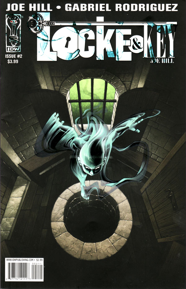
It doesn’t happen often that I buy a comic based on the strength of a cover, but Locke & Key is an example of a comic that I knew nothing about before I saw it on the shelves of my local shop. I picked it up and flipped through it on the strength of this cover. I thought it looked interesting, but put it back on the shelf. A few weeks later, though, I noticed another cover that was just surreal and slightly disturbing without being overtly horror. Just my cup of tea. I picked it up again and saw that the guy crawling out of someone’s head was literal, not just metaphor. I’ve been reading it since. I decided to do this cover because it was the first one that did the job of making me notice the series.
It’s not obvious from this scan, but the ghost on the cover has a spot-gloss. It’s reflected glare from the shop’s overhead lights was the thing that actually caught my attention first. It’s effect added to the ghost is really neat, and you can see a bit of it here in the way the scanner sort of washes out everything else. It’s a case where the added production value was worth the cost. See the version of Rodríguez’s cover that he posted himself for a version better tweaked for digital viewing.
The Composition
If you compare this scan with the version of the cover with that he posted, you’ll see a couple of differences. The most noticeable is that I chose to leave in the title of the comic and the UPC symbol. While the version he posted is cleaner and optimized for computer viewing, to me it seems imbalanced. In other words, the title is an important graphical element that we have to take into account in the composition.
Rodríguez’s composition here is quite simple. If you squint your eyes just a little you see just a few basic shapes stacked vertically.
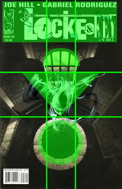
We start with the title, which is a rectangular block at the top. Then comes the semicircle of the window. Next comes one of the two focuses of the picture: the ghost. It is a triangle pointing down at the second focus of the picture, which is the well – an ellipse. Those are the shapes that stand out, and I think it shows how effective a simple composition can be. If we see how it lines up on the golden section grid, the picture is largely centered horizontally with the basic shapes taking up the center column of the grid (except for the title).
The Foci
The cover presents a mystery: what is down that well? Rodríguez can’t actually show us or he’d ruin the mystery. So one of the two foci of this painting is actually an absence – just a circle of darkness. It’s the conceptual focus of the cover. The visual focus is the ghost. The third focus is the title itself. Let’s look at how he draws attention to each of the foci and gets them to work together.
The title is what I look at first. It’s bright and has high contrast, plus typography attracts our eyes. From there, Rodríguez draws our attention to the ghost with contrast, brightness, and color temperature. The background is desaturated, but browns dominate. Take a look at this posterized version of the cover and you’ll see that after the title the greatest contrast is around the ghost’s head. Additionally, the window, which is the other area of brightness and cool color, frames and points us down to the ghost.
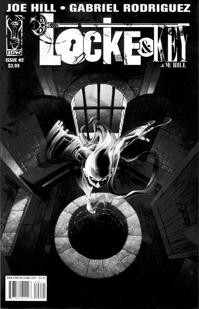
Therefore, I see our eyes as first hitting the title (bright and contrasty) and then moving down to the semicircle of the window, which guides us to the ghost. (Actually, the ghost’s spot gloss produces a higher contrast than the title, but that depends on the viewer’s angle.)
The third focus is the well. Since he’s already used contrast and brightness for the first two foci, he opts instead to direct our attention to the well using perspective and the basic composition shapes. The triangle that is the ghost points directly down the well. The ghost itself is looking down also. Once we see the well, its ellipse brings us back to the ghost, setting up a loop. It’s interesting that the loop doesn’t include the title.
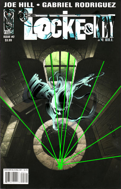
A note on the perspective. In plotting out the lines we see that they don’t uniformly converge on a single vanishing point. Vanishing points are a tool and help us get the basic perspective, but if everything lines up on it exactly we can end up with a mechanical, impossibly consistent environment.
The Ghost
How would you draw a ghost? What style or technique would work best in a comic environment? Often what you see is some sort of glow to suggest the supernatural. In digital artwork we often see the opacity reduced so you can see through it evenly. One of my favorite things about this cover is how Rodríguez makes his ghost.
In this detail you can see that he’s using transparency, but not uniformly. It’s only the dark areas on the ghost that we can see through – look at it’s head for example. There is no glow, but the coloring is bright, though not that saturated. Rodríguez gets good smoke and trails effects, and the ghost has few (if any) straight lines. The curves of the ghost contrast with the lines of the benches, windows, and doors.
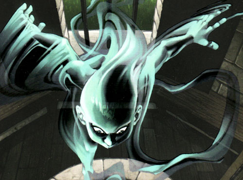
In terms of lighting, the ghost itself seems to be the light source for the room. So, even though it’s not glowing, there is a subtle impression that it gives off dim, cool light. There is a separate light source on the ghost, though, on our left side and possibly a little behind. The separate lighting treatment removes it from the rest of the environment, which makes sense. There are no lines – instead the bluish brush strokes define the basic form and planes, with gradients and blending keeping the look smooth inside the figure. The solid edges show where the ghost stops and starts (see the arms), but inside the ghost we don’t see those kinds of edges.
The Textures
I love the textures in this painting. Let’s look at a few of them.
Grass:
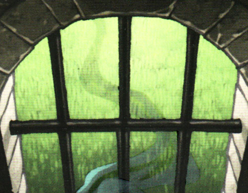
The grass is impressionistic. Here Rodríguez is using the texture to help us identify the grass without using so much detail that it competes with other parts of the picture.
Wood:
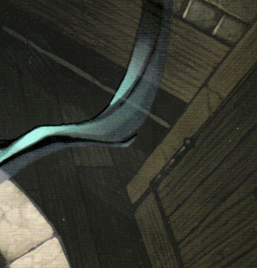
The bench and floor show us a wood grain that is more realistic than the grass, though still stylized and impressionistic. The direction of the wood grain helps define the boards and is parallel to the long edge of each board, so we parse the scene more easily.
Stone:
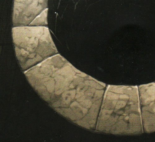
The stone texture is more impressionistic than the wood. We see a few explicit cracks and suggestions of others.
Title:
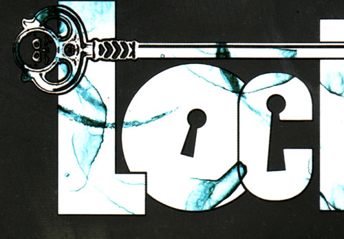
The title’s texture is abstract, though it suggests marble a little bit. I believe its purpose is to reduce the impact of the stark contrast between letters and background, plus give us some depth and visual interest in one of the three foci of the cover.
Textures are a strength of digital media, and here Rodríguez shows us several ways to use them.
The Elements
To wrap up we’ll go through Lee Moyer’s Elements of a Successful Illustration.
Focus: There are three foci: the title, the ghost, and the well.
Composition and Design: The overall design is a simple, geometrical progression from the top to the bototm of the page. Once at the bottom, the lines of the well bring us back up to the ghost in the middle.
Palette: Desaturated and warm, except for the ghost and the background grass. The background is dark, warmer, and less saturated than the areas of focus.
Value: The title gives us the most contrast, with the ghost being a close second. The brightness of the window is a bridge from the title to the ghost. The ghost is its own subtle light source.
Mass: The title is flat, but the other parts have a sense of mass and volume – even the insubstantial ghost. That comes through Rodríguez’ definition of planes and form. The grain, which lines up with the direction of the boards, helps define the wood.
Texture: In separate cases, Rodríguez uses texture to provide visual interest (title), define form (wood), help us fill in detail (grass), and enhance realism (stone).
Symbolism: The cover isn’t steeped in symbolism that I see. The idea of a well suggests mystery and unseen depths – getting to the root of something.
Micro/Macro: There are relatively few finely rendered details in the cover. That’s not the case for all of Rodriguez’s covers. If you think of having a budget for the amount of detail you want to put in a painting, I’d say that Rodriguez spent that budget in the texturing and definition of the ghost. It’s pretty complex in terms of brush strokes, edges, and transparency, and he didn’t want other things to compete with it.
Ornament: Most of the ornament is in the title and IDW logo.
Narrative: We see that a ghost is hovering over a well, looking down at it. We see from the trail that the ghost entered through the window. Who is the ghost? What will it do next? What is down the well?
Juxtaposition: The contrast of bright and dark are key in guiding the eye around. I also like the difference between the smooth, snaking strokes of the ghost and the straight and geometrical lines of the background.
Stylization: Textures are a key part of the style. Rodríguez also has a distinctive cartooning style, as you can see in the ghost’s face.
Character: The only character here is the ghost. Its posture and expression suggest curiosity.
Tension: The tension ties to the narrative. We want to know what’s going on and what will happen next.
Line: This painting uses edges more than lines, for the most part. You can see them in the background work, though. In the main comic Rodriguez uses strong linework, with the line’s weight defining the objects of focus. There’s something kind of coloring book-like about it. It can be detailed, but it also leaves plenty of room for the colorist to add depth and texture.
Research/Reference: I’m not certain that he used reference for this cover – I suspect that he didn’t. The wellhouse was an important location in this part of the series, so I’m sure he did lots of prep work when determining its layout, etc.
Vignette: The unusual perspective leads to an interesting profile of the ghost. Did you notice the ghost’s foot? The most recognizable part of the ghost is its head and arms.
Perspective: The horizon line itself is up around the top of the painting. We’ve got a bird’s-eye-view down a well. It’s basically two point perspective, with one vanishing point being on the horizon and the other at the nadir of the viewing area. The unusual viewpoint makes the image dynamic, and the lower vanishing point draws our eye down to the well.
That’s it for this round. Next time we’ll drop in on Scheherazade for a quick bedtime story.