#6: England Expects, by Morgan Penn
by Morgan Penn, copyright Morgan Penn
This analysis copyright Scott McDaniel, 2009
The Image
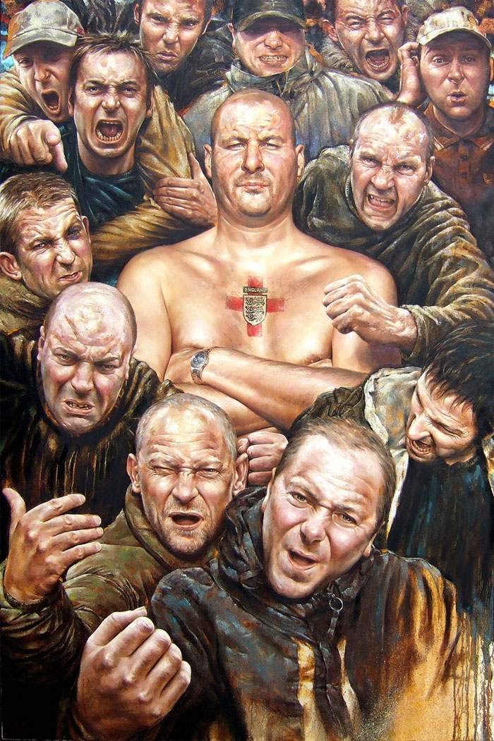
Click the image to go to Penn’s page on DeviantArt for this painting, which features a larger version. This is a portrait of members of the Millwall Bushwackers, one of the most violent football club hooligan groups in Britain. One of their regular chants is, “No one likes us, we don’t care!” According to Penn’s web site, this portrait was exhibited at the Royal Society of Portrait Painters in England in May of 2007.
Composition
Why is it that we see the boss standing still in the middle of all those guys? Why do we look at him first? Part of the answer is in the composition and part of it is contrast. Let’s do composition first.
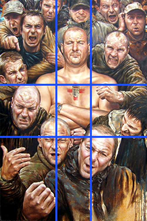
Conventional wisdom says that pictures where the focus is centered are static and boring. In this case the boss is centered horizontally, but not vertically. The broadest part of his chest and shoulders are right on the upper golden section line, and his head is just about the width of the center section. If we look at the intersections of the grid, we see that the top two are right on his chest. (The lower two are occupied by a couple of hooligan heads.)
Size-wise the boss is bigger than anyone else, so that draws our eye to him. On the right side of the picture, the guy leaning over the boss’ shoulder has his fist out in front, and that brings our eye back to the focal point. And let’s not forget that cross that happens to be right on the center of his chest. The splash of red there helps too.
Contrasty Goodness
Good use of contrast always draws the eye, and that’s so here as well. The area of strongest contrast isn’t around the boss’ head, but rather around his broad shoulders. The lighting grows quite dark leading up to the shoulders – unnaturally so to my eye. But this is a case where it’s needed to drive home the focus.
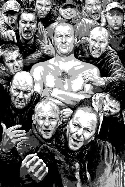
Here I posterized the image down to four values. It’s easier to see the contrast at the shoulders here. Values-wise, the boss is brighter than the surrounding people. While some of their heads and faces have highlights, nearly his whole figure is in the two brightest value zones. Not so for anyone else.
(I will say that I’m not sure the scan captures the colors exactly. The value range for unaltered image has areas of 100% black and 100% white. I suspect that Penn used levels on the scanned image to adjust the values in the image.)
So far we have edge contrasts at the shoulders and brightness contrast between the main figure and the rest. There are other contrasts, though.
The Personality Test
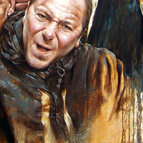
I strongly suspect most of these guys would fail their personality tests. There’s a stark contrast between the stoic, still boss and the shouting, gesturing hooligans surrounding him. He stands out in a sea of angry faces and rude gestures. Not only does that reinforce his position as the focus of the picture, but it enhances the effectiveness of all the rowdy stuff going on around him. This detail shows the contrast in expression and posture:
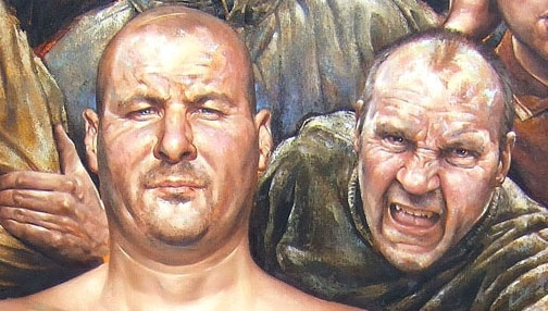
What does this contrast between stoic and in-your-face tell us about him? For my part, while the others are trying to be intimidating, the boss is actually doing it. He doesn’t have to bother with threats, screams, or catcalls – it’s simply beyond question that he’ll trash your ass if there’s anything left of you after the others have their go.
Aside from pose and facial expression there’s another contrast going on. We’re looking at a bunch of tough men here. They’re all wearing coats and sweaters. Isn’t the boss just a wee bit cold? No? That’s one tough dude.
Colors and Saturation
The color palette is mostly warm with a few desaturated greens and greys thrown in. I do see a subtle use of saturation to help define foreground, midground, and background.
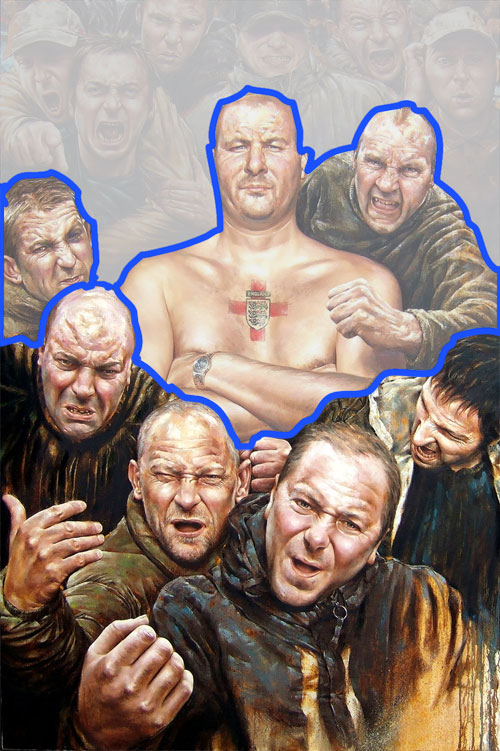
Here I’ve separated the foreground guys from the midground (where the focus is) and the background. It’s enhanced here, but if you look back at the image at the top you’ll see that the foreground people have more saturated colors. The midground includes the boss, and he’s got the brightest values going but not the most saturated colors. He shares saturation levels with the hooligans on either side of him. Everyone behind him is still less saturated. It’s subtle, and even though it’s not exactly a realistic use of atmospheric perspective it’s enough to give the picture organization and depth.
Fun Odds-n-Ends
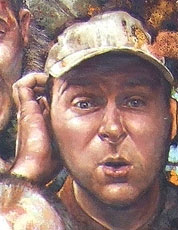
One of the fun things about this picture is looking at the various hooligans and their expressions. The one that cracks me up is the guy in the upper right. What’s he doing, phoning mum on the cell phone? Wondering how he can get out of there without a beating? Who knows, but I love the expression.
Another curiosity is the dripping paint at the lower right side of the canvas. Why is that there? I’m not sure, but I have a guess. It’s not a photo, but this is a pretty realistic painting. And those are a bunch of intimidating, in-your-face thugs. Perhaps having that brief reminder that this is a painting keeps it from getting too overpowering. It’s a little reminder that you are, in fact, safe and don’t have to worry about them reaching out of the painting and throttling you. Somehow, though, I doubt it was Penn being sloppy and rushing to deadline.
Edit: Here’s what Penn had to say about the drips:
The painting was left unfinished in the corner to reveal some of the foundation work, to reinforce the fact that this is a painting, and to add a little bit of chaos. If I feel a portrait is becoming too photo-realistic, I try and fuck it up with some chaos.
The Elements
Let’s look at the painting through the lens of Lee Moyer’s Elements of a Successful illustration.
Focus: The viewers eye goes to the boss in the middle. That’s because of values and several types of contrast.
Composition and Design: The boss dominates the golden grid. Saturation defines foreground, midground, and background. The aspect ratio is about 1.5 to 1, fairly close to the golden rectangle that has a ratio of 1.61 to 1.
Palette: Warm with accents of green and grey. In particular the red accent of the cross on the boss’ chest draws attention.
Value: Values work in this painting – the focal point is brighter than the rest. The light source is generally in front and above, but there’s plenty of ambient light.
Mass: I usually talk about definition of form here, but this time I’m going to mention the size. Compare the boss’ size to the people around him. He’s massive, and he’s intimidating.
Texture: I notice the texture of the coats and wrinkles against the smooth skin of the boss. There’s also interesting texture in the front guy’s coat and the drips on the side of the painting.
Symbolism: Let’s talk about the symbolism of getting your ass whupped. I don’t see a lot of overt symbolism. There’s the crest on the guy’s chest, but I think the point of this piece is to communicate character.
Micro/Macro: This is about using just the right details to help the viewer fill in a complete scene in their head. You can see things like this around the picture. The boss has a watch. The guy in the upper right is wearing a collared shirt buttoned up to the top button. Some guys are clean shaven and others aren’t. These details turn them into “real” people and we start making up background stories for them.
Ornament: There isn’t a lot of design ornament in the sense of panel borders or decorative parts, but I wonder if the incomplete part in the lower right isn’t an ornament reflecting the rough finish of the hooligans. That’s pure speculation, though.
Narrative: Well, it’s pretty obvious that we (the viewer) are facing an angry mob that’s just barely held in check by the bossman. If we know about the English football hooligan scene then we immediately bring a whole new understanding. Even without that, though, we get a sense of impending… doom?
Juxtaposition: Juxtaposition is what this piece is all about. Raging chaos vs. stoic command. Coats vs. a bare chest. In-your-face intimidation vs. confident, measured intimidation.
Stylization: The style is mostly realistic without slavish devotion to photo-realism. I see the style’s purpose here as getting out of the way so that the storytelling aspects come to the front.
Character: Every face in this picture has a story. Every posture informs on a personality. Then, the contrast in character between the boss and the other hooligans reinforce it all. Layers and layers of character here.
Tension: There’s high tension here, mainly over what the next five minutes are going to be like for the person who has this particular viewpoint.
Line: Not a major element of this picture. There are clear edges along the boss’ shoulders and in a few other places.
Research/Reference: According to Penn’s web site the sitting for this picture was in 2006 with the actual members of the Bushwackers. They chose to remain anonymous. I imagine he took photo reference rather than have them all stand like that for a few hours. Especially because he finished the painting in 2007. I’d love to hear the story of how this image came about. Edit: In an e-mail, Penn said,
I usually have live sittings and take reference photos for the periods the model can not sit for me. In the case of the football hooligans, it had to be photographs only. This was because my contact (the guy at the front doing a wanker gesture) was very anxious that my time with his compatriots was as brief as possible. I photographed them in pairs (to keep some sort of control) and then took photos all around their heads so I could gauge the form of their heads.
Vignette: The rest of the hooligans serve as the ground while the boss is the figure. He anchors the picture.
Perspective: Penn accomplishes the depth mainly using occlusion and saturation. The foreground figures are also quite a bit bigger than the background figures.
Fun: Aside from what I mentioned above, one thing that makes this interesting is that it’s far from the average seated portrait. It’s got attitude.
That’s it for this time. Next up will be something from Alex Raymond, the creator of Flash Gordon.