#5: Promethea #24, Pages 8 and 9, by J.H. Williams III
by J. H. Williams III, copyright America’s Best Comics.
This analysis copyright 2009, Scott M. McDaniel.
The Image

For a larger scan and more of J. H. Williams III’s fantastic art for Promethea, see http://members.dslextreme.com/users/davidroel/
To understand this picture we need to know a few things about it. First, it’s a two-page spread in a comic. Second, the story at this point is about a schism in Promethea. Promethea herself used to be a young girl, but she was taken into the lands of imagination where she became, essentially, a spirit of imagination and story. Over the centuries, she could manifest through physical people and become a super hero of sorts. In this story, she has unknowingly begun manifesting through two people, one on each side of the Crusades.
The theme of this part of the story, then, is about two parts of the same whole being at odds with each other. We’ll look to see how this image carries the theme through. Though Williams painted it, Alan Moore wrote the comic. His practice is to cram lots of detail, symbol, and meaning into his comics and Promethea was no exception. So much so that I’d consider him a co-creator of the image. Often the comics process uses different people for the art, and Promethea did too. In this case, though, Williams is the painter and Todd Klein is the letterer. (See this annotation of Promethea 24 for more information.)
Composition
One of the first things to notice about this image is that it is, in fact, a single piece of artwork for a two page spread. Williams and Moore did this on purpose for Promethea, and you’ll find lots of innovative layout work throughout. In this case the layout is a Yin-Yang symbol – two opposing forces that define each other.
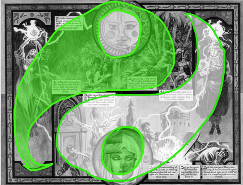
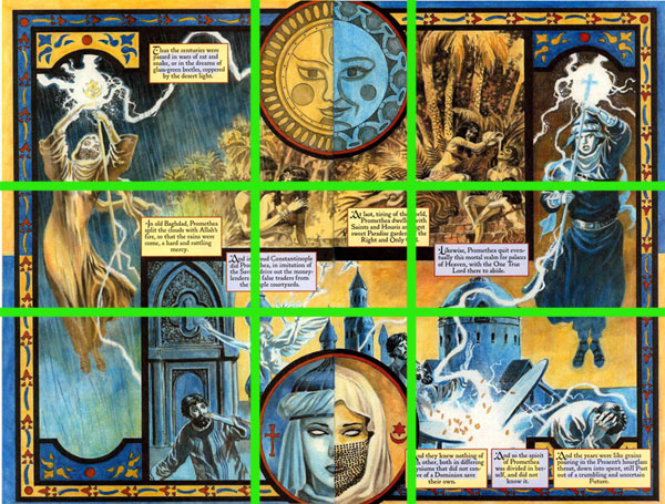
There are also some interesting things to note when we look at the golden section grid. The two circles in the page – the dots in the Yin-Yang – are exactly as wide as the middle section of the grid, vertically. The two Prometheas bridge the middle left and right sections. The interlocked panels, though, have their corners just off the center of those same squares. Interestingly, not a whole lot is going on at the actual intersections on the grid.
Guiding the Eye
Since this illustration is also a comics page, it’s imperative that the image guide our eye correctly, especially so we know the right order in which to read the captions. For me, the image does a great job at directing my eye. The way it guides it, though, doesn’t take me through the captions in the right order. I think Williams sacrificed that part of the piece so that he could work in all the other aspects of the layout and symbols. Let’s take a look at the path my eye takes:
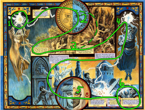
Being a page in a western book, I naturally start at the upper left corner. Williams immediately grabs my gaze with a high-contrast circle of lightning around Promethea’s staff (1). The bolt of lightning itself pulls my gaze over to the sun/moon medallion (2). This is where I have to make a decision. My eye followed the dotted line to (3) – the wrong caption. I started reading it and realized it didn’t make sense, so instead I went back to the other caption next to the yellow Promethea’s fluttering robe. With that decision I’m back on track. From the caption at (3) the bright circle of lighting at (4) attracts my eye. Then it’s down the blue Promethea’s staff and to the beginning of the second panel. In which order do you think we should read the blue captions along the path? Finally, I end up on the lower medallion (5) and the final captions (6).
While I think the composition takes us in the wrong order through the captions, it’s still not that hard to read. The path I show above is the path I see for this two-page spread as a single image, of which the captions are a graphical part. In other words, it’s the path my eye takes if I’m not reading the captions.
Values and Colors
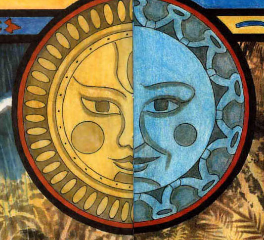
The Arabic Promethea is yellow, usually with a blue background, and vice-versa for the European Promethea. So, the first panel uses a yellow figure against a blue ground while the second panel has a blue figure against a yellow ground. In keeping with the Yin-Yang page layout there are elements of the other color in each panel.
Using the colors to help identify the characters and sides is good, but if our eyes are to make sense of the picture we should be able remove the color and still have a sensible image. If yellow defines Arabic Promethea and blue defines European Promethea, let’s see what the values do.
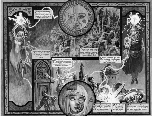
In this case, the Arabic Promethea is light against dark while European Promethea is a dark figure against a lighter background. Except for the lightning, the two figures have the highest contrast in the image, light-dark relationship fits in with their being two sides of the same coin. With the yellow and blue added in, the figures visually define and balance each other.
Just to carry through the yellow and blue relationship for a moment, let’s look at the caption boxes. The ones that pertain to the Arabic side have yellow backgrounds while the European ones are blue. Interestingly, some of the captions apply to both, so they have both yellow and blue backgrounds, as you can see here.
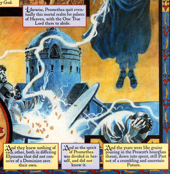
Finally, since the image is mostly made of yellow and blue, it’s nice to see the third color in the primary color triad, red, is an accent color. Williams uses it sparingly but it’s there in the borders of the major elements: medallion, caption boxes, and the page border itself. The page would be perfectly understandable without it, but I like the flair that it adds.
Reflecting Symbols
Let’s play a game. How many balanced, opposing concepts can you find? Here’s an obvious one:
Part of what makes this an engaging picture is that you can slow down and find lots of things, both obvious and subtle, that reinforce the theme.
- Sun (Arabic) and Moon (European) in the top medallion.
- Two halves of a face in the lower medallion.
- Christian symbol and Islamic symbol in the lower medallion.
- Happy people in the yellow part of the top panel and distressed people in the blue part of the lower panel.
- Nature as a background in the top panel and man-made structures in the lower panel.
There may be others I’m missing, and maybe I’m seeing things that neither Moore nor Williams intended. Part of the point, though, is to get us thinking about duality and unity. Throughout the Promethea series the pictures invite us to study them a while and linger. Yes, you can read through this page quickly just for story and move on, but why not stay a while?
The Elements
This is a rich, beautiful image, and there is a lot more I could discuss. Going through Lee Moyer’s Elements of a Successful illustration will let me touch on some of them.
Focus: The overall focus is the two women and how they complement each other. They are both areas of high contrast, and the graphic elements of the page lead us from one to the next and then back to the first.
Composition and Design: Not only is the composition visually pleasing, it also reinforces the underlying theme. At the same time it guides our eyes through the page and tells a visual story.
Palette: The colors are symbolic. See the Subtractive Primaries section of Wikipedia’s article on primary colors for more about the relationship between yellow (Arabic), blue (European), and red (accent).
Values: While the whole picture reads just fine in greyscale, looking at the picture that way makes the two figures visually pop. When the colors are there they still pop, but it’s less obvious why.
Mass: Williams’ painting style here doesn’t emphasize a solid, 3D rendering of mass. That said, it’s easy to see light and shade defining the forms on the main figures. Also check out the faces of those money lenders for good interplay of light and shadow to define mass.
Texture: The painting technique gives a nice texture throughout without calling attention to itself. I love the texture of the sky below the yellow Promethea.
Symbolism: The page layout itself is literally a symbol, and it goes on from there.
Micro/Macro: Several details help us fill in others and give a strong sense of place. If you go look at the large scan you’ll see lovely detail work on the church above the left-most money lender’s head. There isn’t much more detail work in that panel, but that’s enough to establish the setting.
Ornament: Page borders of alternating color, the medallions, the arch over each of the Prometheas, and the stylized nature of the sun and moon are examples of ornament here. Williams used a great deal of ornament in layout throughout the Promethea series.
Narrative: Before getting to the specifics of the story on the page, you see at first glance that there are two balanced and opposing figures. They’re even bent toward each other. The purpose of the page is to set up their conflict and build suspense toward their eventual meeting. It’s a successful comics page in that it’s done that before you’ve even read the first word.
Line: While you don’t see the standard comics outlines around the figures, strong clear lines are evident in the ornamentation and borders. The crisp edges around the two main figures also help them pop out visually.
Research/Reference: I don’t know about visual reference, but Alan Moore is a knowledge gathering machine. I’ve no idea if he did any research specifically for this page, but it wouldn’t surprise me either way.
Vignette: My understanding of the term “vignette” is the simple figure vs. ground relationship. In this case the two figures aren’t directly interacting yet, but they’re turned toward each other and we can tell that collision is imminent.
Perspective: The strongest sense of depth comes from the background buildings in the lower panel. Perspective isn’t an integral part of this illustration, though.
Fun: I like deconstructing things (maybe you can tell), and this is the kind of comics page that feels tailor made for me. The fun that Williams and Moore had puzzling together nearly every two-page spread for Promethea is obvious, as is the invitation to play the game with them. This image we’re talking about here is a good spread, of course, and if you haven’t seen it you should go find the Moebius strip spread that they did.
That’s it for this time. Next up will feature a piece here on DA: England Expects here, by :iconmorganpenn:.
Edit: I traded e-mails about this analysis with Williams, and he had this to say:
Thanks for sharing this. I found it quite enjoyable and fascinating. The only thing I can say that isn’t pointed out is that the style of art being used for that segment of Promethea is sort of based on, or inspired by the techniques found in some of the cultural art from that region of the world.
To illustrate what he means here I’m including an example of an Arabic manuscript. I notice especially that the border styles and geometric arrangement of the page have a similar style to our picture here.

[…] III’s website Info about Jim’s forthcoming comics on the DC comics blog Article on Jim’s Promethea illustrations from a fine art point of […]
[…] III’s website Info about Jim’s forthcoming comics on the DC comics blog Article on Jim’s Promethea illustrations from a fine art point of […]