#3, The Ogre Bully, by Adam Danger Cook
By Adam Danger Cook, Copyright Sony Online Entertainment
This analysis copyright 2009, Scott McDaniel
The Image
Ogre Bully. Adam Danger Cook did this image for Sony Online Entertaimment, who owns the copyright. It is artwork for an online trading card game.
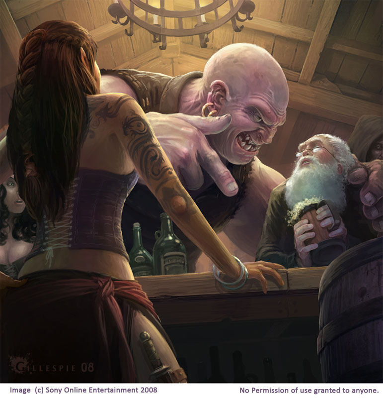
I picked this one for several reasons, one of which is that I plan to analyze artwork from around DA in addition to other sources. Though I don’t plan to only do my friends I thought I’d start with one of Adam’s because he is a friend and because he’s helped me immensely with my own work. Mainly, though, I picked this one because it’s fun and made me laugh when I first saw it (for all the right reasons).
Composition, Contrast, and Guiding the Eye
Though I haven’t done this with the previous analyses, I decided to take a look at how this one fits with the golden section. Here is the square image overlaid with the golden section grid.
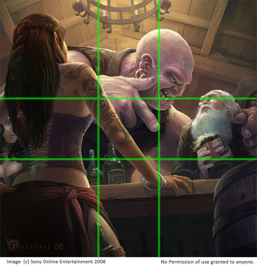
Usually the focal point of the image works best if it’s at one of the intersection points of the grid. In this case we have the ogre’s ugly mug at the upper right intersection. Also of interest is the fact that the guy I think of as “poor St. Nick” has his eyes right on the upper section line as well, and the ogre’s pointing finger ends right on the line. The barkeep on the left side of the image takes up the left golden section almost perfectly. I’m not sure if these alignments with the golden grid were conscious or sub-conscious, but they work. Well balanced images will generally tend to align with that grid, though.
So the image’s focal point is the ogre’s face and Santa’s face. Let’s see how Cook uses contrast and edges to guide our eye there. Here is a version of the image with the contrast turned up a little. The key edges are highlighted in yellow, and the way the characters are looking are dotted green lines.
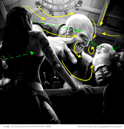
The chandelier and ceiling boards point us to the ogre’s head, and the curve of his forehead brings us down to his face. The ogre’s bicep forms a clear high-contrast edge linking bully and victim and sets up a tight loop that’s completed by the gaze between the two. Further out, the oger’s finger and barkeep’s arm echo this loop and bring us up to Santa’s beard, leading our eye back into the focal point. Finally, all three secondary characters are looking over at the action, which makes us want to do that as well.
One other point I want to make is about how viewpoint and perspective affect the composition. By eyeballing it, I’d put the vanishing point not too far from where the ogre is pointing. Although it’s not a single edge, that perspective also contributes to putting our eyes into the focal area. By having the viewpoint be so low, it lets Cook get more of the ogre and the victim into the frame. It also allows us to see the barkeep for a size comparison. The horizon line is slightly tilted, which gives more of a sense of action to the scene. It’s also good that the ogre is higher in the image than the victim – it’s obviously the position of power.
I mentioned the vanishing point earlier. Aside from that kind of perspective, we have a clearly established foreground (barkeep and barrel), mid-ground (ogre and victim), and background (ceiling and chandelier). Working together, these three layers add depth and space to the picture.
Details
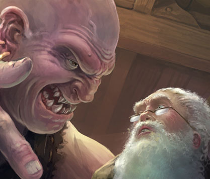
Generally in an illustration you want to put the most detail in the focal area. As viewers it holds our eye there and gives a greater sense of realism. On the other hand you want to dial down the level of detail elsewhere. Sure, you should include enough that you keep the realism, but if there is too much detail there it starts competing with the focal area.
The Ogre Bully shows this strategy put to good use. Here are two details from the image, both the same size. The first shows the face of the two main characters. There is good detail in both faces, and even the spilling foam from the victim’s drink.
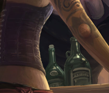
Just to the left and down a bit we have the second “detail” image showing bottles on the bar and part of the barkeep. We’re not really supposed to look much at the bottles – they’re just to register as bottles and add to the setting. Cook could have spent a lot of time and effort getting the labels perfectly clear and legible, but to what purpose? Instead, there’s enough detail there for them to read as bottles but not so much that we stop looking at the Santa smackdown. I could say the same thing about the tattoos on the barkeep’s arm. They’re there and they add both to her character and the atmosphere of the tavern. They’re not distracting, though.
Speaking of those tattoos, one purpose of such details in an illustration is to solidify the atmosphere and make you, as the viewer, feel like you’re looking at a real scene. Rather than a generic barkeep, we have one that has interesting tattoos, a corset, and a dagger strapped to her leg. Now we know that this isn’t a high-end establishment but rather a rougher one. The ogre’s cracked fingernail shows that he uses his hands a lot. Cook has obviously thought through the image and used a background story to fill out the setting and characters.
The Elements
OK, it’s wrap-up time, where I run through Lee Moyer’s excellent essay on the elements of a successful illustration. See The Elements, copyright Lee Moyer.
Focus: The primary focus is the ogre’s face and the secondary focus is the victim’s face. Several elements set up a tight loop that keeps our eyes going between the two faces.
Composition and Design: Aside from edges and contours that guide our eye, we’ve got a good separation of foreground, mid-ground, and background. The dynamic viewpoint adds action and lets Cook get more of the figures in the image.
Palette: Warm, with only a few hints of blue and green. The reds and yellows of the ogre, plus a little more saturation, also serve to bring him forward to our attention.
Values: The image reads well in black and white. There’s a nice fade in value and saturation along the ceiling toward the ogre’s bicep.
Mass: The sense of the ogre’s mass, in particular, comes from good definition of form through lighting. The bright, relatively sharp highlighting on his head emphasizes his height and that he’s pretty close to that chandelier. Oh, and the size difference helps too, of course.
Texture: Although the rendering is loose in places, there is a good sense of texture everywhere. Check out the boards on the ceiling, the barrel, and the splotches on the ogre’s head.
Symbolism: The image uses our expectations of a standard fantasy setting. We fill in a lot of background and story because of the clothing, tattoos, and hints at a rough and tumble pub. Just maybe, though, the underlying symbolism is that of small kids the world over secretly wishing they could tell Santa to just give them the damn presents already.
Micro/Macro: Certain details help us fill in others and complete the story. For example, the spilling foam from the mug shows us that the victim is startled and has just been clapped a little too forcefully on the shoulder. And how about that chunk missing from the ogre’s ear?
Ornament: I don’t see a great deal of ornament to the picture. In some ways too much ornament would go against the feel of being in the fantasy version of a dive. Still, there are things like the design work on the chandelier, the barkeep’s bracelets, and so on.
Narrative: The narrative in The Ogre Bully is the piece’s strongest point. All the details and guiding of the eye that I’m mentioning is firmly in service to the story going on in the picture. The body language and expressions are perfect. The only thing left to find out is whether the victim will melt into a puddle on his own or be squished by the ogre.
Line: While there were lines for the initial drawing and painting (I believe), the final version uses edges and contrast changes rather than graphical lines.
Research/Reference: I’ve seen the reference comp for this image – Cook took pictures of himself (with the help of a friend) in each posture and then sized them and combined them to work out the composition before painting and get reference for the figures. I’m not at liberty to post those pictures under penalty of painful death. 😉
Vignette: The basic relationship between bully and victim is there if you ignore the rest of the image and the background. In other words, the vignette communicates the story and the background supplies atmosphere.
Perspective: The vanishing point guides the eye into the focus area. Atmospheric perspective helps push the ceiling into the background, particularly around the two main faces. Finally, occlusion shows us that the barkeep is in front of the bar, which is in front of the figures, which are in front of the ceiling.
Fun: For me, the fun of The Ogre Bully is that snap of recognition of what’s going on. We can tell so much of the narrative from this image. It’s got dramatic tension, conflict, and humor. It even evokes a certain feeling of empathy – we’ve all felt that sudden dropping in our stomach when we realize we’ve just accidentally said or done something that’s going to make the next few minutes wonderfully unpleasant.
Next up will be an illustration from J.C. Leyendecker, the illustrator with the most Saturday Evening Post covers among other accomplishments.