#18: Hymn, by Yigit Koroglu
Hymn, copyright 2009 by Yigit Koroglu.
This analysis copyright 2009 by Scott McDaniel.
The Image
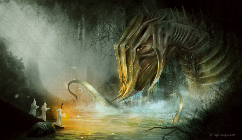
Yigit Koroglu, an artist from Turkey, posted this painting just a few weeks ago. (Click here for a larger version.) I’d been planning to pick something from his gallery when he posted it, and one of the first things I noticed was the way he’d used textures to really sell the realism on a fundamentally bizarre creature. He sets up two foci – the creature and the priests calling to it. There’s also nice stuff going on with depth and composition, so I’ll touch on all of that in looking at how this picture works.
The Composition and Grid
I’m always curious about whether artists use the golden section consciously in their work or not. I’m not sure in this case, but it sure lines up well with it. There seem to be two ways to use it. First, you can put the key elements of interest right on the golden section lines, and particularly on their intersections. Or, you can fill the blocks created by the grid so that the key items of focus aren’t on the lines but rather fill the space using those proportions.
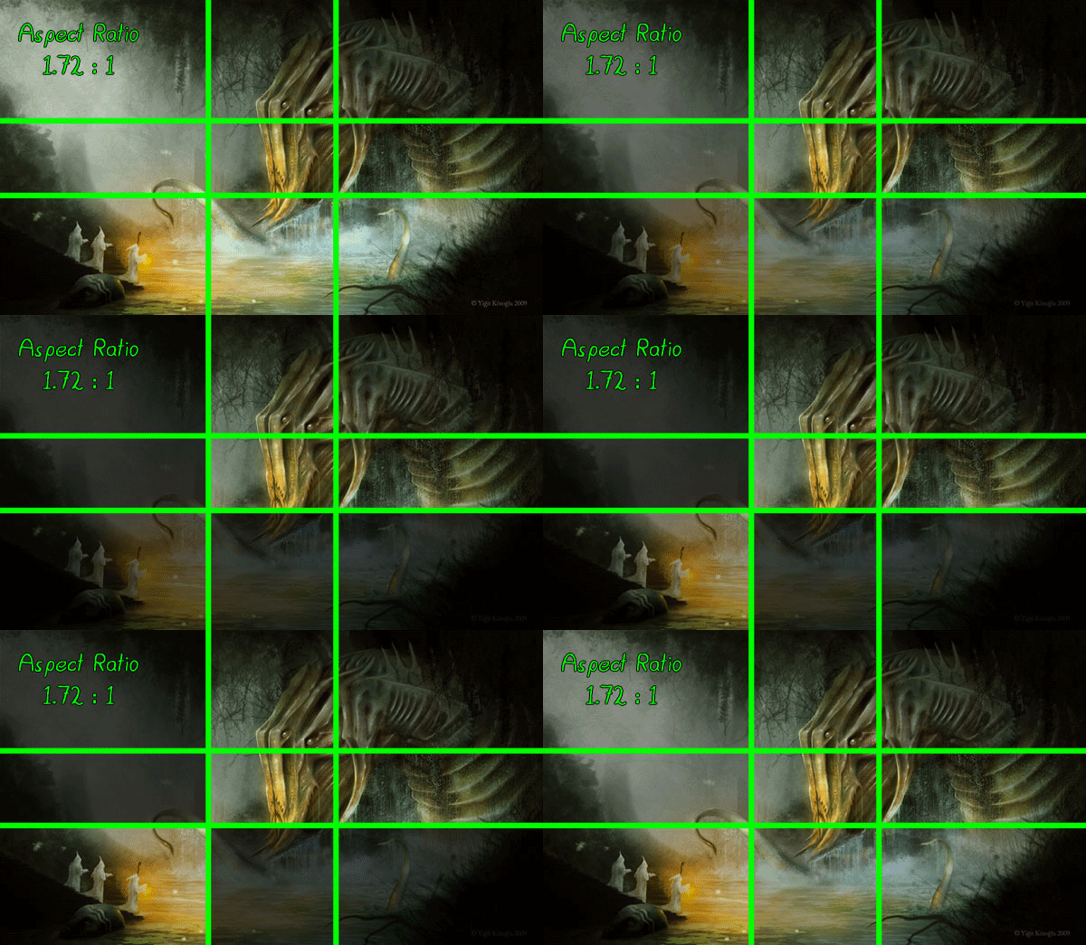
Blocks of the golden section grid.
Here, Koroglu has followed the second method. His creature occupies the four upper left rectangles while the priests take up the lower right one. As we’ll see below, he drives the focus from one to the other and back again, so he’s set up a basic diagonal movement in the painting’s composition, even though the horizon itself is, well, horizontal.
He reinforces the diagonal relationship by having the first priest angling his head up directly at the monster, while the monster also regards the priests. Since we follow gazes, the fact that they’re looking at each other makes that diagonal particularly strong.
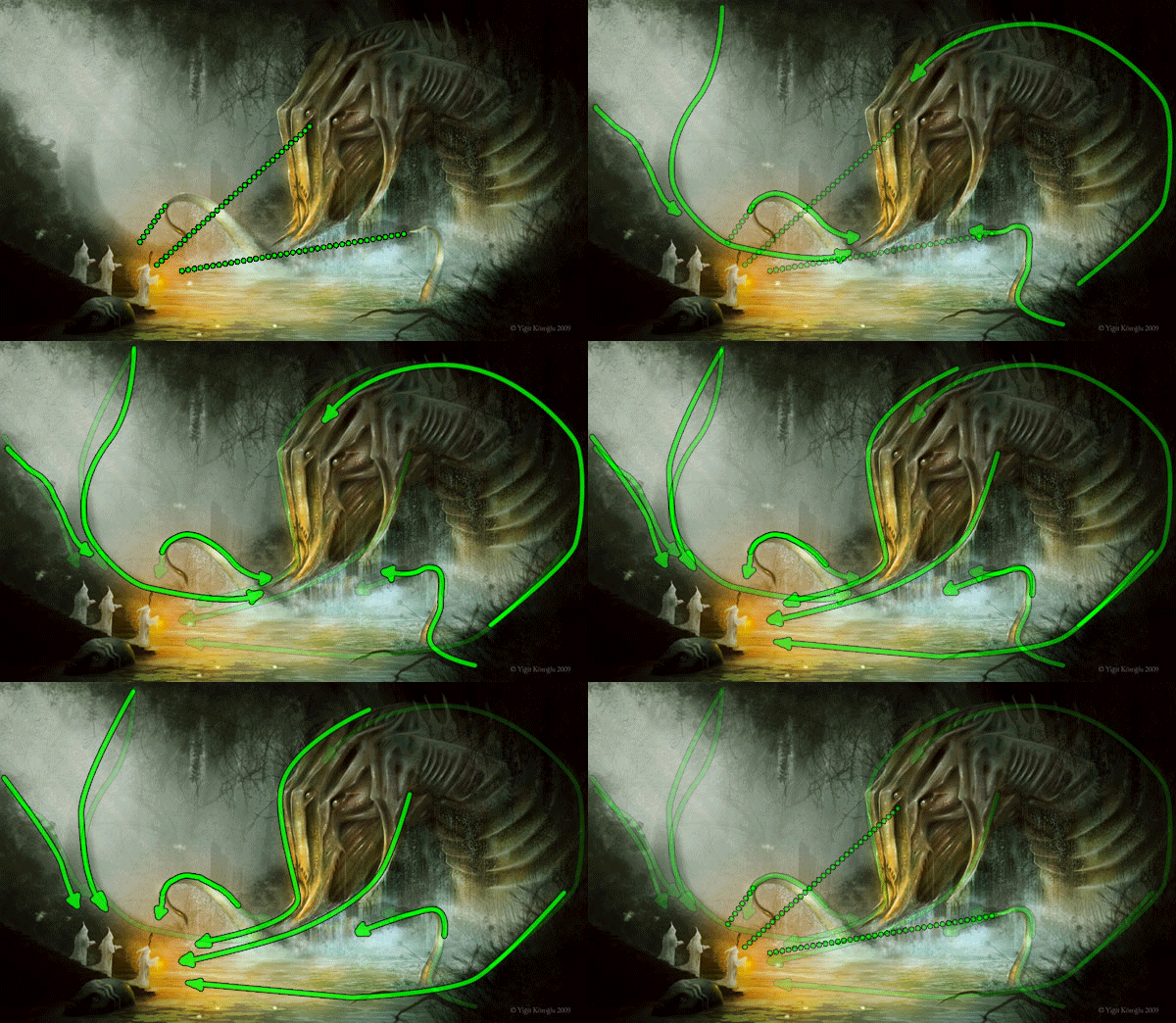
Two foci - monster and priests.
The creature, in fact, is not only looking at the priests, but its entire bearing is centered on them. The foreground tentacles guide our eyes over to them, as do the curves of it’s monumental head. The small eyes in such a massive head wouldn’t be enough to get the job done alone. The background curves on the left side take us down to the priests and keep us going to the creature. It’s a big letter “S” on its side.
The Depth
Some of the same background elements that guide our eye do double duty to create the illusion of depth and open space. Take a look at that patch of ground in the lower right corner of the painting. It guides our eyes up to the monter and left to the priests. It’s also very important in establishing the foreground plane. From our viewpoint, that ground is much closer than the other elements.
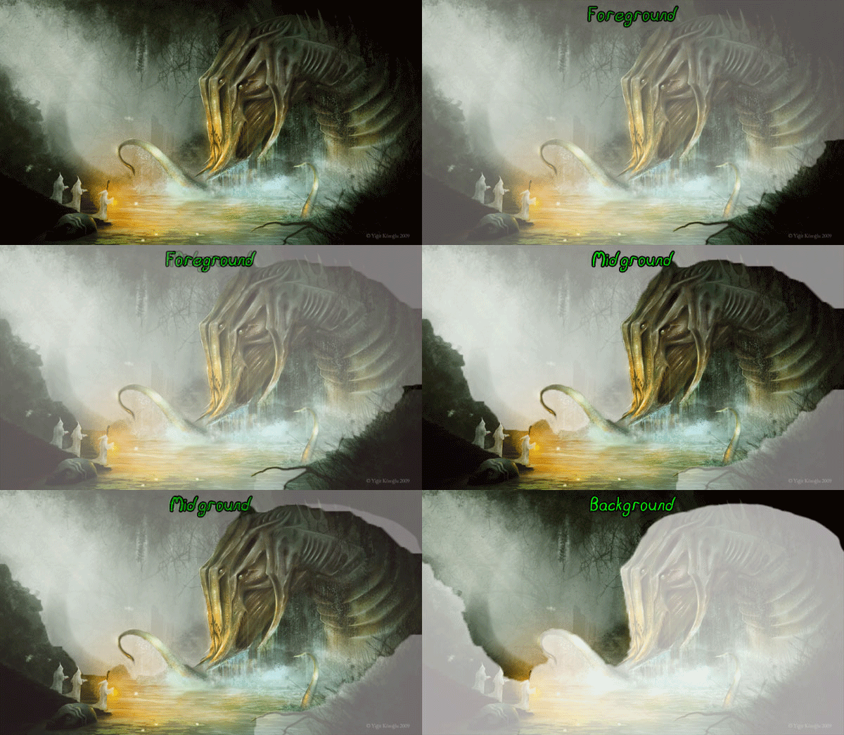
Planes that establish depth.
Having the foreground piece, as small as it is, gives us something to compare the main action to. The picture would work without it, but it enhances the illusion. The focal elements are in the mid-ground plane. The foreground is nearly silhoutte, the mid-ground is where the saturated colors are, and the background is desaturated. The sense of space comes from the fact that we can clearly separate these planes, almost like the Viewmaster slides I played with as a kid.
The planes aren’t the only sources of information for depth, but they’re one of the most important. We also see elements scaled correctly – closer trees are larger and and further trees are smaller. Because the creature is on the same overall plane as the priests, we compare its size to them and conclude that it is huge.
In the background we see a large, indistinct curve. Koroglu doesn’t specifically connect it to the creature, but the suggestion is there. If it is part of it, this sucker is huge!
The Mass
Hand in hand with a sense of scale and depth is the sense of mass. Unlike the Viewmaster slides, which looked like cutout images placed at different depths, Koroglu gets a good impression of weight and solidity to the creature. Values carry the bulk of the load here – the patterns of light and shadow create an effective 3D illusion.
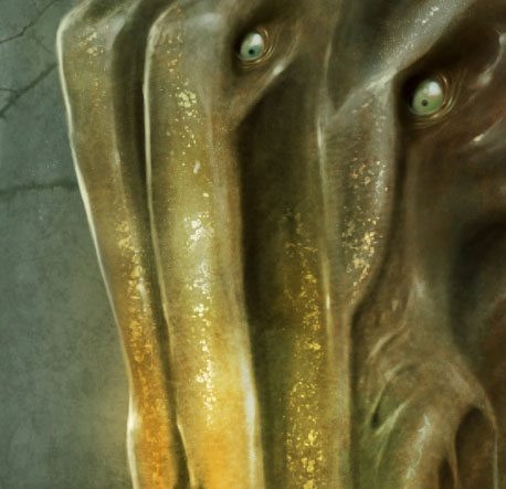
Here’s a look at the monster’s face, if you can call it that. The shadow patterns define the overall form of the head while the highlights and texture sell the realism. Because the creature is wet, it should have sharp highlights. Koroglu has to place the highlights correctly, though, or they’ll conflict with the shadow information. He gets all of that right, and then the texture completes the reality illusion.
As an experiment, I made an image that dulls the highlights and smooths out the texture on the face. The effect isn’t huge, but it’s clear – the smoothed out version is flatter and less interesting than the original.
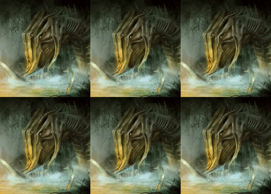
The subtle role of highlights in realism.
This is an animated picture, so look at it for a moment to see the difference.
The Textures
One of the reasons I picked this painting was because there are lots of great textures. Not only do we see it on the head above, but it’s there in each depth plane. Let’s look at the water cascading from the critter.
This is the water coming from the lower part of the head:
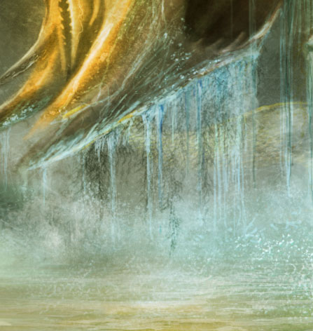
Firmly placing the subjects in your environment – part of that sense of mass – comes from having them interact with the environment itself. If someone is standing on a beach, shouldn’t there be footprints in the sand leading up to them? In this case all of the water falling from the beast places him firmly in the lake and lets us know that he’s rising up out of the water.
Here we have sparkling water around the leftward tentacle:
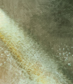
I love the light sparkles in the water. It means that Koroglu has thoroughly thought out the lighting of the sun’s rays and that lamp that the priest is holding – another example of things interacting with each other to form a coherent scene.
The Characters
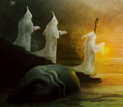
Speaking of those priests, let’s take a look at them. First up, notice the lantern. It’s the most saturated part of the picture – one thing that helps draw our attention.
Koroglu leaves the relationship between the creature and the priests vague on purpose, I believe. Perhaps they’re summoning it, or perhaps they’re worshiping it. The creature itself has a vibe like some of the Lovecraft mythos creatures, and if that’s the case then it’s likely a little of both. Two of the priests are reading books while one seems to be addressing or regarding the creature. I do think the relationship and postures could reveal a little more about the relationship, but it does lead us to believe that the creature has some level of intelligence and power, no matter how alien.
The Elements
To wrap up we’ll go through Lee Moyer’s Elements of a Successful Illustration.
Focus: There are two foci in the picture – the creature and the priest. When looking at one, Koroglu sets up the picture to guide our eye back to the other.
Composition and Design: Koroglu uses planes of depth to both create space and guide our eye. There’s a strong diagonal element to the picture that comes from how he places the foci and how they regard each other. Finally, the elements fit nicely into the golden section grid.
Palette: Being a jungle scene with light filtering through the canopy, we’ve got mostly greens and yellows. The foreground is essentially silhouette while the midground has moderately saturated colors. The background is desaturated, which fits with atmospheric perspective.
Value: The brightest spots are the creature and the priest’s lantern.
Mass: Values and shading, highlights, size comparison, texture, and proper interaction with the environment add up to one massive thingie there.
Texture: I think texture is what makes this painting. It takes the realism to a higher level.
Symbolism: I see a few possibilities, though nothing concrete. I do get the sense that the picture itself is about the danger of playing with forces you don’t fully understand and can’t necessarily control. I kind of wonder what’s up with the sunken statue head…
Micro/Macro: Most of the detail and texture is at the points of focus in the mid-ground. Koroglu could have put lots of detail and texture in the piece of foreground ground. That’s not the focus, though, and would be distracting. Similarly, the background has more of a suggestion of jungle canopy than fully rendered leaves and trees. The most interesting details and textures are right where we’re supposed to look.
Ornament: I’m not sure quite what to say here. If anything, the ornament is in the creature design and execution.
Narrative: A narrative can be strong and vague at the same time. In this case it’s obvious that the priests have called the creature and that they have its full attention. We know little of history and motivations.
Juxtaposition: I think this picture is a creature showcase. We can tell that the monster and the people are radically different in size, and the picture emphasizes this.
Stylization: I’ve always liked realistic renderings of fantasy scenes. It’s just a fun paradox.
Character: Koroglu leaves character ambiguous. The priests are quiet and respectful – neither quaking on their knees nor imperiously commanding the creature. The creature has at least basic intelligence, if not more.
Tension: We may not know much about the history, but there are only a couple of outcomes from here. Either the priests are about to become pretty colored smears or the creature withdraws into the shadows to grant their wishes or bend to their will.
Line: The realistic style means there aren’t lines in the painting, just edges.
Research/Reference: I don’t know which creatures Koroglu had in mind while painting the creature, but this seems like a good opportunity to point out that if you want some strange animal designs look to invertebrates.
Vignette: I mentioned the sideways “S” in the composition. The creature takes up part of that and a distant tail (?) does also.
Perspective: This piece is a great example of planes of depth and how to combine them to get an overall sense of space. Jungle settings and creatures don’t lend themselves to classical perspective. Fortunately there are more tools in that box.
Next week we’ll take a look at one of the granddaddies of American illustration – Howard Pyle.