#31: The Problem We All Live With by Norman Rockwell
The Problem We All Live With by Norman Rockwell, 1964
This analysis copyright Scott M. McDaniel, 2010
The Image

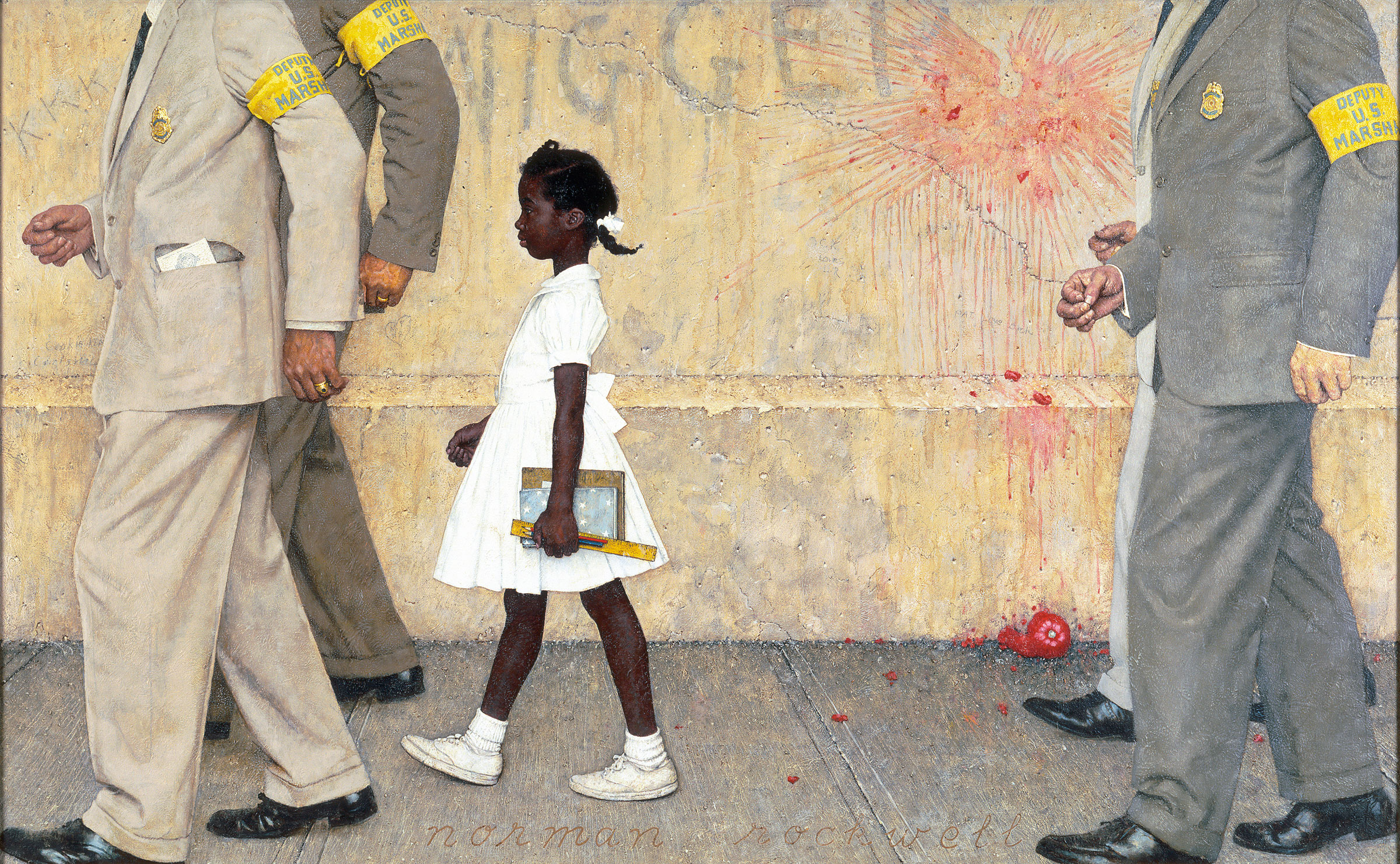
Driving up I could see the crowd, but living in New Orleans, I actually thought it was Mardi Gras. There was a large crowd of people outside of the school. They were throwing things and shouting, and that sort of goes on in New Orleans at Mardi Gras. I really didn’t realize until I got into the school that something else was going on. – Ruby Bridges Hall
On November 14, 1960 federal marshals escorted Ruby Hall to her first day of kindergarten. She was the only black child to attend the school, and after entering the building she and her mother went to the principal’s office while the white parents came in and took their children out. Thereafter she was the only student in her class. You can read more about the story at the link above or at her entry in Wikipedia.
Norman Rockwell painted this picture for Look magazine. Though J. C. Leyendecker did more covers for the Saturday Evening Post, Rockwell is best known for his long run with them. Their art direction and editorial guidelines constrained his work, however, and after his last painting for them in 1963 he moved in a more socially outspoken direction, and Look was buying. In this analysis I’ll look at what makes this very simple painting so powerful.
Black and White
A good illustration needs a clear silhouette. Rockwell certainly provides us with one. In the greyscale version of the picture below, we can see that Rockwell gave her far and away the highest contrast. He does this partly by giving her a white dress, even though she probably wasn’t wearing one at the time. Whenever we illustrate actual events we have to balance accurate depiction of event with the needs of the picture. Here I think the white dress serves several purposes, one of which is creating an area of high contrast that draws our eyes to Ruby first.

Ruby’s white dress works with her dark skin to create the high contrast and to create the silhouette that all by itself communicates the idea of a walking African American schoolgirl. Rather than painting her figure all with dark tones or all with light ones, he instead gives her the extremes of the values range. Everything else appears in the mid-tones, including the marshals. Ruby pops out of the painting at us because she’s the most interesting thing in the painting values-wise.
Direction
I’m not going to go into color palette and choices very much, but I do want to point out how Rockwell uses saturation. If he makes Ruby the focus of the painting using values, he guides our eyes around the painting with saturation. Here is the painting with the areas of high saturation highlighted.

Everything is greyscale except for the areas inside the ovals, which I left as they appear in the painting. Look at the yellow armbands. It may appear that I dropped the color out of the sleeves around them, but I didn’t. Rockwell gave just a few well placed areas of intense color and kept everything else desaturated. Now let’s look at the path our eyes take around the picture.

My eye starts at A. Like I said before, this is the highest contrast place in the painting. Not only that, it has a person’s face, which also draws the attention. Because of the interplay between Ruby’s skin and the dress, as well as the edges formed by the marshal to the left, my eye travels down the figure and back up. That completes a basic loop, and we may follow that several times.
Once we’ve taken in Ruby herself, the values and contrast have done their job. Now the color saturation takes over and we head into a widening spiral. First up, we see the yellow marshal armbands at B. See how they’re arranged to keep our eye moving down and left? From B, we follow the marshal’s figure down, with both the folds in the fabric and his leg position redirecting us from the left back to the right.
From C, we can either look back at Ruby again or continue across the painting to the trailing marshals. Once that happens, we see the splattered tomato and the yellow marshal armband, both areas of high color saturation. Once we’re up at the armband, the splatter on the wall at D draws us back across the painting, to the racial slur, and to Ruby.
Composition
The colors, values, and composition of this painting are all simple. They keep the picture clear so that Rockwell can focus on the real points of the painting: illustrating an event and attacking racism. Just because these things are done simply, however, doesn’t mean that they’re done without thought and consideration. Here is the golden section grid overlaid on the painting. Where does Ruby appear?

Sometimes artists use the golden section consciously and other times their natural sense of design leads them to it unconsciously. Though not certain, I believe Rockwell used the ratio consciously, putting Ruby where he did because it’s on the left golden section line. One reason I say this is that the picture’s aspect ratio itself is the golden ratio. That is, the scan I used is 2000 pixels wide and 1481 pixels tall. 2600 / 1481 is 1.62, the golden ratio.
Message and Symbolism
Symbolism pretty much has to smack me upside the head for me to notice it. In The Problem We All Live With, I think ideas are pretty out in the open. The use of the word “nigger” on the wall and the “KKK” to the left of the lead marshal clearly make this a painting about race and relations. Not only do they set context, I believe they help us identify with Ruby. She’s the visual focus of the painting, and she’s also the only person we can see all of. It’s natural to wonder what it must have been like to walk past those words – to have tomatoes thrown at us.

I take several points from the depiction of the marshals. They’re faceless; representing an institution. Yes, they’re protecting her, but they also box her in. Visually they frame her and define her space, just as they do conceptually. In this painting it is the white people who both keep her safe and keep her in a box. Personally, I like the fact that Rockwell doesn’t treat the marshals as heroes. Consider how in the movie Avatar it’s the Na’vi who are oppressed by humans, but it’s a white human who becomes the focus of the picture. It would have been quite racist indeed to make the marshals the focus of the event instead of the girl.


The Elements
To wrap up we’ll go through Lee Moyer’s Elements of a Successful Illustration.
Focus: Ruby is the focus of the painting. Rockwell uses values to make her so.
Composition and Design: The painting is a golden rectangle, and Ruby is on the left golden section of that rectangle. There are strong horizontals and verticals. The simplicity of the composition serves the message.
Palette: Yellows and greys dominate with the tomato as a spot red. Rockwell uses a few spots of high saturation to guide our eye.
Value: Ruby is the focus, and Rockwell does this by giving her the brightest and darkest values. Everything else is a mid-tone.
Mass: Rockwell uses shading to define mass. He also makes Ruby seem small in comparison to the marshals by contrasting their size.
Texture: I love the texture in the wall and the sidewalk particularly.
Symbolism: As I said earlier, the white figures visually block Ruby in, both protecting her and constraining her at the same time. Ruby is not the one with power here.
Micro/Macro: Rockwell keeps the details sparing but telling. The tomato. The graffiti. The integration order in the lead marshal’s pocket. Ruby’s schoolbooks. There is no detail that doesn’t add to the story.
Ornament: There is no ornament for visual flair or style. That would get in the way of the message, so Rockwell doesn’t include it.
Narrative: The painting depicts an actual event. The details reinforce the narrative, but it carries extra resonance for people from the U.S.
Juxtaposition: The immediate juxtaposition is Ruby’s size as compared to the marshals. There is also a contrast in the way Ruby is personalized while the marshals are depersonalized and represent institutions of both racism and attempts by the government to end racism.
Stylization: Rockwell goes realistic. It’s not quite as cartoony as some of his covers for the Saturday Evening Post, but it’s recognizably his style.
Character: We feel strong empathy for the girl, and we also admire her calm.
Tension: The tomato, the graffiti, and the need for marshals in the first place all point to the tension of the situation.
Line: Rockwell uses clear, distinct edges.
Research/Reference: This site shows several studies and sketches, as well as a girl posing as a model for the painting.
Vignette: The vignette is simple and strong, and it supports the message.
Perspective: Perspective is the illusion of space and depth. The lines of the sidewalk go to a common vanishing point, and the size and relationships of the figures also define the space.
Next week, we’ll shift gears completely and look at a mirage by Boris.
Speaking of symbolism, there are red and white stripes on the wall and white stars on a blue book. Pencils are RWB also.
[…] Uma análise de The Problem We All Live With de Norman Rockwell – Uma análise detalhada e interessante da ilustração (em inglês) Tags: arte, norman, racismo, rockwell 04/04/10 | 07:02 | (1) Comente! Você também vai gostar destes links:Esculturas feitas com lápis de corThe DecapitatorMinimalist Illustrations by Noma BarWe are natureAbu! ele adora, ele odeiaStreet Fighter EvilEscultura feita com um tubo e líquidosO alfabeto macabro do ilustrador Edward GoreyCycles – Mais uma obra de Cyriak35 celebridades registradas pelas polaroides de Andy WarholArtista faz intervenção em vacas da Cow ParadeChat Roulette usado para improvisar no piano. Muito divertidoIsto é pintura 3D. O resto é tentativaA obra 4′33” também pode ser executada ao pianoEm 1952, John Cage compôs "4′33", uma obra feita do silêncio da orquestra e dos sons aleatórios de uma platéia comum […]
[…] http://www.scottmcd.net/artanalysis/?p=818 […]